The latest @ICNARC intensive care weekly report has been published. A short thread to summarise, including a link to the full report.

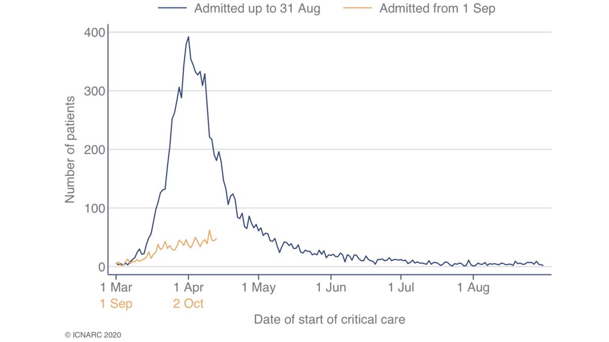
The report covers critical care admissions to 20 November and compares the second wave (1 Sep onwards) to the first. 1/9
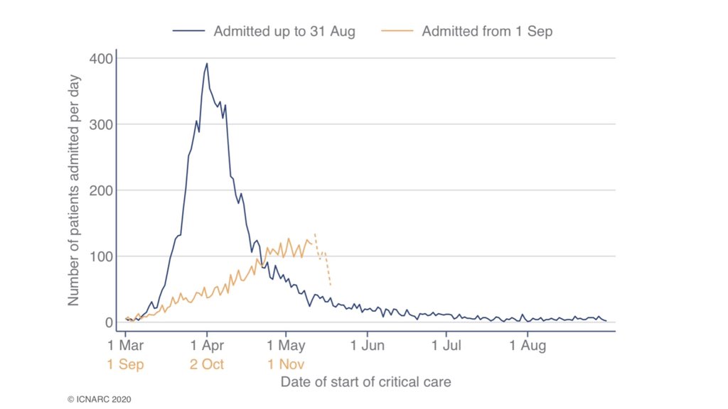
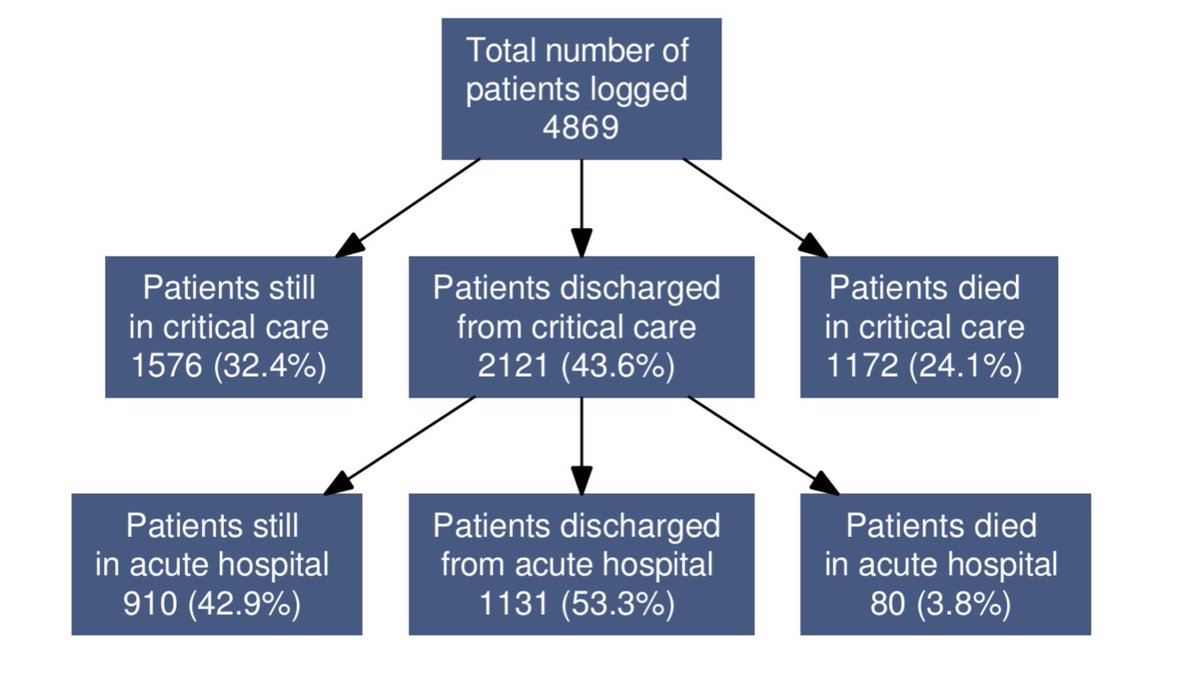
The report now covers 4,869 patients from 1 September. Critical care outcomes are reported for 3,293 of these patients.

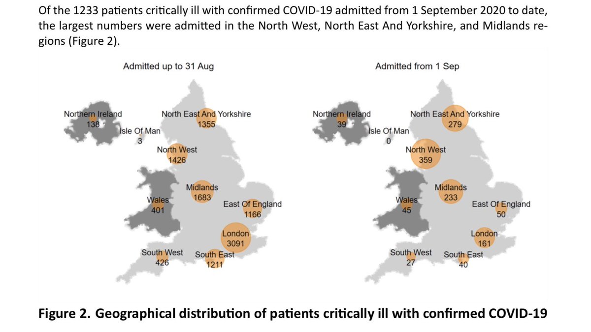
Most second wave admissions in the North of England and the Midlands. Interesting to compare and contrast locations with first wave. 2/9
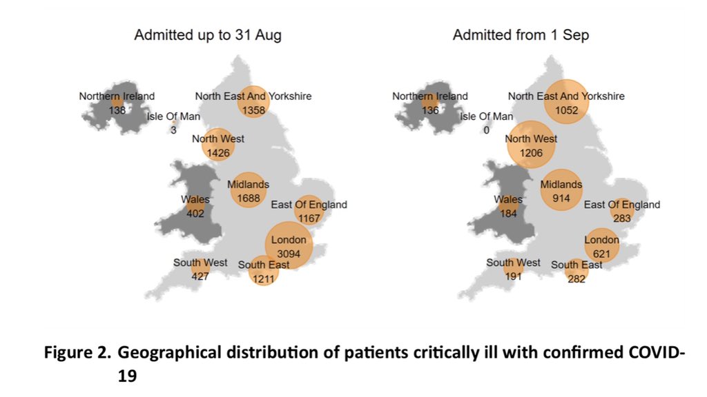
Figure 13 compare all pneumonia admissions in recent years to 2020 (with this years admissions split between COVID and other). It’s clear that relevant admissions this year (orange plus blue lines) are many times higher than normal in both the first and second waves. 3/9
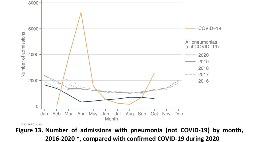
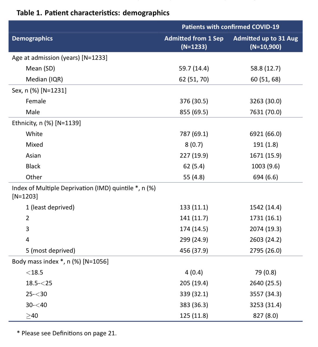
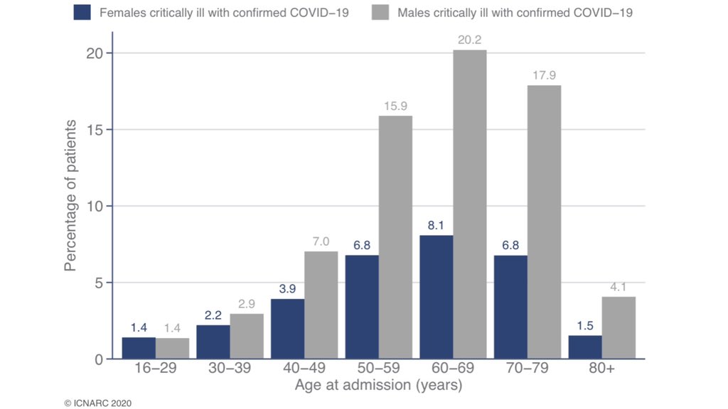
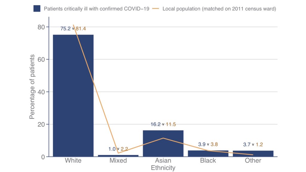
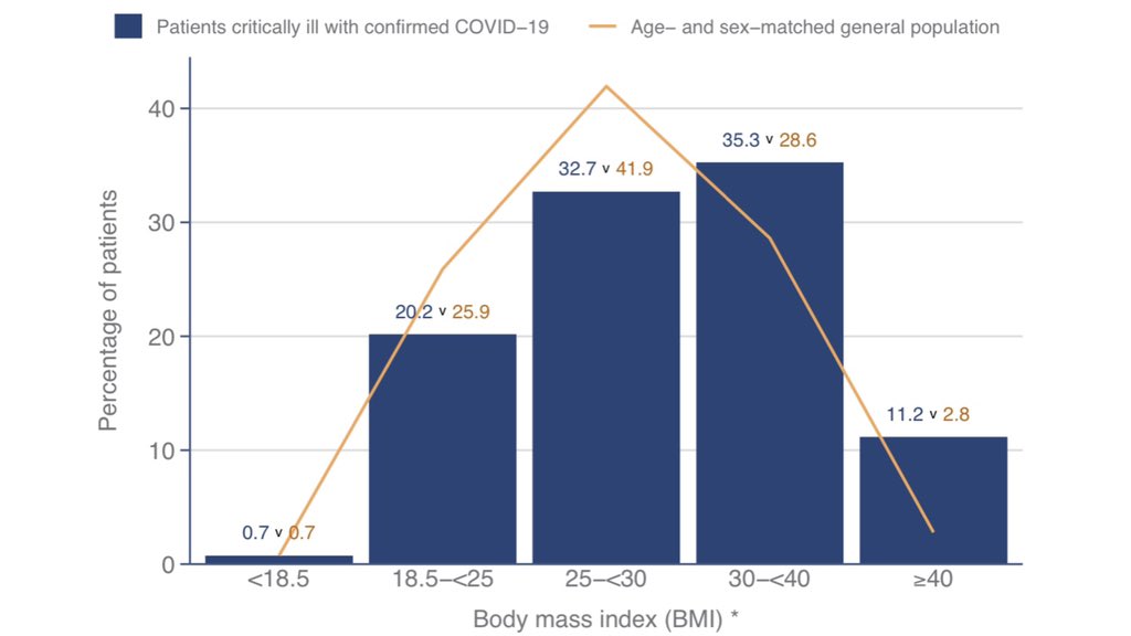
Table 1 and the subsequent charts allow us to examine demographic characteristics compared to what might be expected based on the local population.

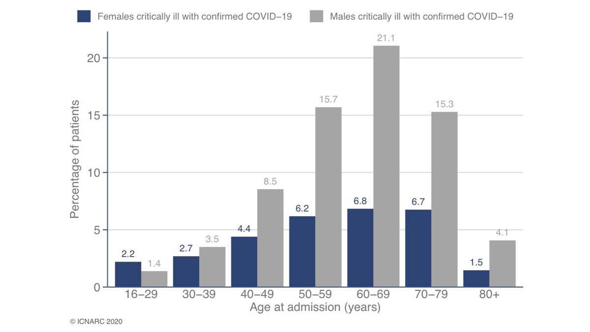
Overrepresented groups include males (7 out of 10 ICU admissions), those of Asian ethnicity and the obese (BMI>30). 4/9
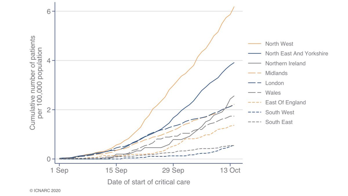
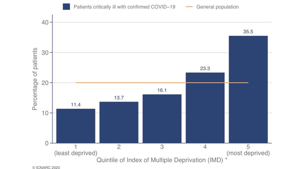
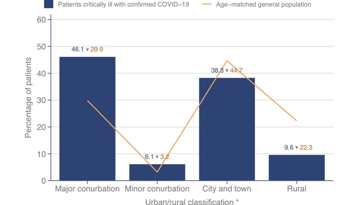
Whilst the geographical distribution of ICU admissions is very different in the second wave compared to the first, the same patterns persist. Deprived groups and those living in large cities are much more likely to require critical care. 5/9
Looking at medical history, nine out of ten needed no assistance with daily activities. A similar number were free of severe comorbidities.

Compared to the first wave, patients are much less likely to be mechanically ventilated within the first 24hrs (23% vs 54%). 6/9
Outcomes are still better than the first wave, but the gap has narrowed considerably since I last analysed this report.

Of those no longer in critical care, around one third died in ICU and two thirds were discharged from ICU. 7/9
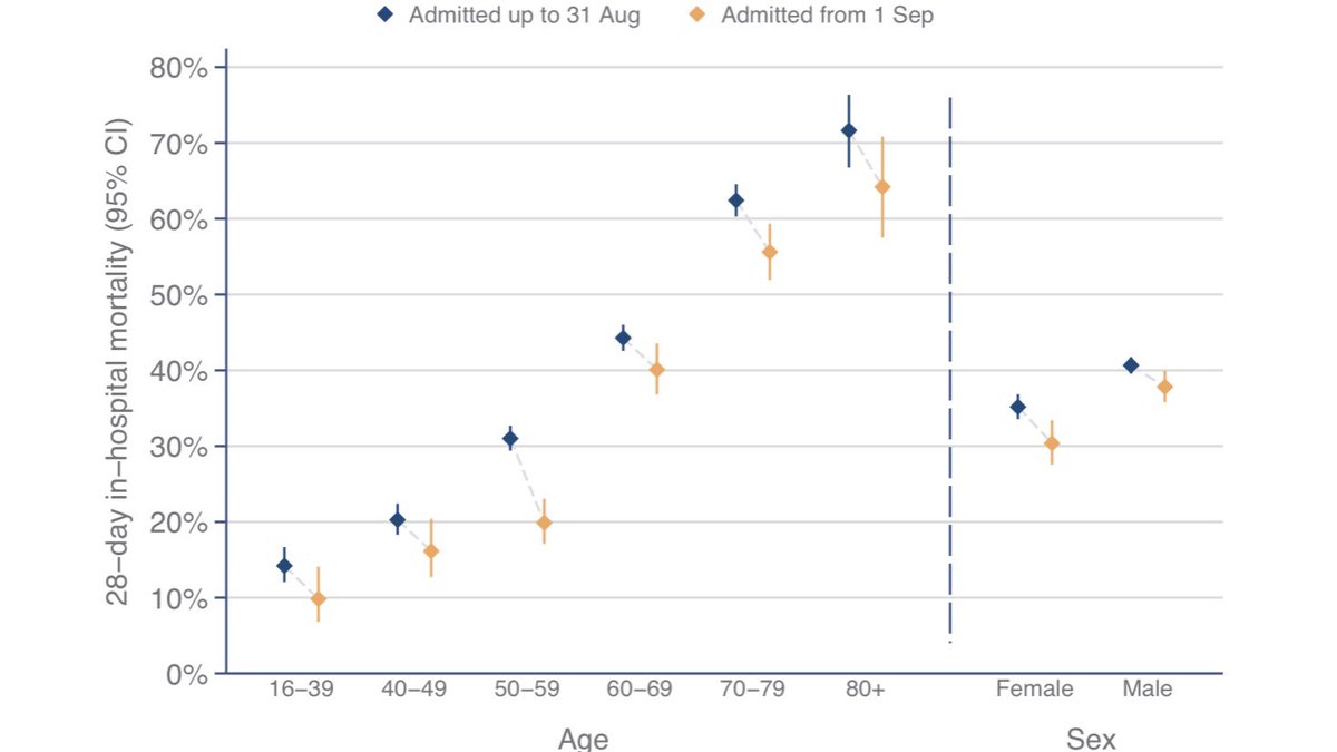
That worsening mortality picture must largely reflect case mix (for example, second wave patients are a bit older on average) as 28-day mortality is improved within each demographic group (though not all of the improvements are statistically significant). 8/9
Here is a link to full report which contains lots of extra information as well as the items I’ve highlighted. In particular more medical breakdowns (I focus more on demographics).

Stay safe! The best way we can help ICU staff is by not catching and spreading this virus. 9/9

• • •

Missing some Tweet in this thread? You can try to force a refresh
 

Keep Current with stuart mcdonald

stuart mcdonald Profile picture

Stay in touch and get notified when new unrolls are available from this author!

Read all threads

This Thread may be Removed Anytime!

PDF

Twitter may remove this content at anytime! Save it as PDF for later use!

Try unrolling a thread yourself!

how to unroll video
  1. Follow @ThreadReaderApp to mention us!

  2. From a Twitter thread mention us with a keyword "unroll"
@threadreaderapp unroll

Practice here first or read more on our help page!

More from @ActuaryByDay

17 Oct
The latest @ICNARC intensive care weekly report has been published. A short thread to summarise, including a link to the full report. The report covers critical care admissions to 15 October and compares the second wave (1 Sep onwards) to the first. 1/10
The report now covers 1,233 patients from 1 September. Of these, 643 have outcomes reported and 590 are still receiving critical care.

Most admissions in the North of England and the Midlands. However, allowing for size of local population N. Ireland and London look bad. 2/10
Table 1 summarises patient characteristics, showing how these compare with the first wave.

As before, seven out of ten ICU admissions are males, with most aged 50-80. 3/10
Read 10 tweets
26 Sep
They’re back! The intensive care national audit & research centre (@ICNARC to its friends) has resumed weekly reporting in response to rapidly rising ICU admissions.

A short thread follows in which I’ll draw out key content and add some comments. 1/n
Déjà vu? Newer followers might be unaware that I used this data six months ago to challenge the myth that COVID-19 is only a risk to those who were already “at death’s door”. That thread went a bit viral, with all manner of interesting consequences! 2/n
One positive outcome was an improved relationship between actuaries and the intensive care community. A tangible example is the commitment to @ICS_updates from @COVID19actuary that we would continue to highlight the impact the COVID-19 on intensive care units. 3/14
Read 18 tweets
25 Sep
Latest COVID-19 hospital admissions and deaths data for England has been published.

Daily admissions rose rapidly this week, exceeding 300 on Wednesday for the first time since mid-June.

The increase in the moving average implies doubling time of 10-11 days. (1/4) Image
Based on recent hospital admissions data it looks like the R number was around 1.4 at the end of the first week in September. Over the next week or two we’ll see the impact of schools reopening, but also local lockdowns and other restrictions. (2/4) Image
Average daily COVID-19 hospital deaths in England has increased from under five on 31 Aug to over 25 in recent days.

For more discussion see my recent @COVID19actuary bulletin which explains how we allow for reporting delays.

👉 covid-arg.com/bulletins (3/4) Image
Read 5 tweets
24 Sep
I suspected that today’s ONS life expectancy release would not be met with the usual fanfare, but I guess I hadn’t anticipated complete media radio silence.

Still, it’s not the most “pandemic appropriate” news. UK life expectancy is at a new high!

What’s the story? 1/7 Image
UK life expectancy at birth is up by six weeks for males and seven weeks for females. Here’s the numbers direct from Ed at the ONS 👇

Crucially though, this is just updating National Life Tables to include 2019, which had record low death rates. 2/7
Life expectancy at age 65 has also increased, by around 6 weeks each for males and females.

Life expectancy at 65 is now:
83.8 years for males
86.1 years for females

Note that life expectancy at 65 is 3-4 years higher than life expectancy at birth. 3/7
Read 7 tweets
23 Sep
Latest COVID-19 hospital admissions and deaths data for England has been published.

Daily admissions rose rapidly over last two days, reaching 237 Sunday and 275 Monday, after a few days at around 200.

The increase in the moving average implies doubling time of 10-11 days. Image
For those who’ve asked, here is the same admissions data plotted on a log scale. A straight line increase implies exponential growth. Image
Average daily COVID-19 hospital deaths in England has increased from under five on 31 Aug to over 20 in recent days.

For more discussion see my recent @COVID19actuary bulletin which explains how we correct for reporting delays.

👉 covid-arg.com/bulletins Image
Read 4 tweets
22 Sep
Latest ONS deaths data (to week ending 11 September) has been released.

505 more deaths were recorded in-week compared to the 5-year average.

Year to date there have been 14% more deaths than the 5-year average (2015-19). Image
There are 99 deaths where COVID-19 was mentioned on the death certificate this week, but there were also more deaths from other causes compared to the 5-year average.

Numbers are for England and Wales only and are 11-17 days old.
Non-COVID deaths were 4% above the 5-year average.

Some of the additional deaths recorded will certainly have been catchup from last week, when we saw significantly less deaths recorded than normal as a result of Bank Holiday registry office closures.
Read 5 tweets

Did Thread Reader help you today?

Support us! We are indie developers!


This site is made by just two indie developers on a laptop doing marketing, support and development! Read more about the story.

Become a Premium Member ($3/month or $30/year) and get exclusive features!

Become Premium

Too expensive? Make a small donation by buying us coffee ($5) or help with server cost ($10)

Donate via Paypal Become our Patreon

Thank you for your support!

Follow Us on Twitter!