The unconvincing analysis from your Ontario #COVID19 Science Table; a quick thread… Image
Michigan has been used as a reference point by the Science Table since October 9th…. Image
And again, in the October 29th update…
(case growth not yet worrisome) Image
Fast forward to the November 26th modelling update. Michigan was out of control, and was used to illustrate the potential for Ontario to have 6000+ cases by December… Image
Again, on December 10th, Michigan still a key example showing Ontario could also have large case growth… Image
Now last week, in the December 19th update, where “hard-lockdown” was argued, Michigan is downplayed in the analysis… Image
….in favour of the “hard-lockdown” examples in Europe... ImageImage
Why? Well… I would guess its because Michigan’s case growth and positivity has been flat and declining for some time now…. ImageImage
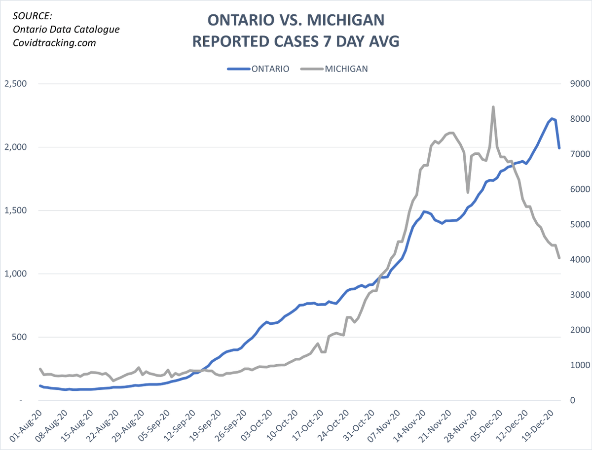
...despite the US election, US Thanksgiving, and much more lax societal/economic restrictions…
(gyms, outdoor dining, etc. open) ImageImage
In fact, our neighbours, the entire US Midwest (MI, WI, IN, IL, OH), have been peaking… ImageImage
But somehow the Science Table still thinks we’re going to be more like Europe, and that we need to hard-lockdown just like them…. ImageImage
Is this epidemiology ??

End Thread.

• • •

Missing some Tweet in this thread? You can try to force a refresh
 

Keep Current with Kelly Brown

Kelly Brown Profile picture

Stay in touch and get notified when new unrolls are available from this author!

Read all threads

This Thread may be Removed Anytime!

PDF

Twitter may remove this content at anytime! Save it as PDF for later use!

Try unrolling a thread yourself!

how to unroll video
  1. Follow @ThreadReaderApp to mention us!

  2. From a Twitter thread mention us with a keyword "unroll"
@threadreaderapp unroll

Practice here first or read more on our help page!

More from @rubiconcapital_

20 Dec
1/ Grab a cup of coffee

We are now seeing striking correlations between (i) the # of COVID19 tests and (ii) % positivity within/across certain important individual PHUs in Ontario.

This has implications for local lockdown policy, and for the global PCR/false-positive debate...
2/

If you are not in Ontario, but involved with / following the PCR debate, this is still of interest to you. We are seeing similar testing/positivity correlation dynamics as seen in the UK. This thread borrows/builds substantially from @profnfenton here:
3/

Upfront caveat: correlation does not mean causation, and it is difficult to draw definitive conclusions from simple testing data. However, it is important to determine whether lockdown policy (for its unmeasurable collateral damage) is informed by false/flawed test results.
Read 27 tweets
15 Dec
1/

Vaccine debate now brewing on (i) who gets it first, and (ii) vaccine rates required for herd-immunity & getting back to normal.

Public Health says no normal ‘til vax rates are 60-70% (*assumed* herd threshold).

The Toronto data says perhaps just 10.9%...

Let’s explore…
2/

I’ll get to the data in a moment, but first, I present two opposing viewpoints, then you can decide what the data says makes the most sense…
3a/

1st view, Dr. Yaffe today in Ontario:

“its gonna take months before…significant % of the pop vaxx’d--usually for infectious diseases 60-70% of the pop is needed for herd immunity; we’re not gonna get there until probably the summer”… 22m:30s:
Read 16 tweets
12 Dec
Link thread of the powerful & thought-provoking short video essays produced by @katewand on lockdown/COVID culture. She's now produced 4 of these incredible videos to date, & frankly I’m a bit shocked her following hasn’t grown faster (although she’s now at 2.3K subs on YT).👇
1. “Lockdown: The Right Side of History”

(essay by @stacey_rudin)

“In the COVID debate, there is a mainstream, 'popular' narrative, and a competing, 'unpopular' narrative — a 'fringe.' The former exploits the common, mediocre desire to be 'popular.'"
2. “Lockdown: The Dark Side of History”

(essay by @katewand)

“The year 2020 has been exemplary for those that believe obedience is a high virtue.”
Read 6 tweets
10 Dec
1/ Ontario COVID19 Testing and You (i.e. The Taxpayer)

Conservatively estimated total cost-to-date to Ontarians for PCR testing (incl. asymptomatics)?

Over $350,000,000

At 61,809 tests today, @ ~$52.50/test, that cost you ~$3.25m, or annualized…

~$1.2 billion (with a “B”)…
2/ The province is putting on a masterclass in resource misallocation…

For perspective, the Ontario Gov’t spends ~$4.3b annually on Long-Term Care.

That’s ~$150/day/resident, ~78,000 residents.

We are doing ~62,000 tests/day at @ ~$52.50 per test (again, ~$1.2b annualized).
3/ We should probably ask the question…

Given (i) the age stratified differences in COVID19 mortality, and (ii) that almost 2/3rds of all COVID19 mortality were of LTC residents, does it make sense to spend 27% of the annual LTC budget on mass PCR testing?
Read 9 tweets
2 Dec
1/ Windsor, Ontario

Some chatter in Q&A’s in last few daily briefs with Premier/health officials re: rising cases in Windsor & potential for moving region to lockdown (just moved to “Red” zone on Mon, Nov 30).

Concern is hospital “overrun”… local hospital trends shown here…
2/

Case picture: yes, cases are rising, but overwhelming majority are traced to close contact or outbreak. Averaging only ~8 reported community cases of unknown origin per day. Image
3/

Overall new emergency admissions for three main Windsor-Essex hospitals appear to be:

*FLAT* for the entire month of November.

(Entire Erie-St.Clair area including Chatham/Sarnia also flat). Image
Read 8 tweets
27 Nov
1/ @globaandmail article today comparing #COVID19 in Toronto and Ottawa, headlined, “Two pandemics”.

In this brief thread will show, with simple data, why this article, in my view, is way off the mark. theglobeandmail.com/politics/artic…
2a/ First, let’s dispel the article’s basic premise:

“The COVID-19 pandemic worsens in [Toronto], even as the situation steadily improves in the nation’s capital.”

While many areas of Toronto are struggling w/cases, roughly half of Toronto’s 140 neigh’hoods are flat/declining. Image
2b/ And here’s the kicker:

Those ~70 Toronto neighbourhoods w/flat or declining cases (appear to be past their peak), including the 13 hoods of Downtown Toronto,

*ARE TRACKING OTTAWA ALMOST EXACTLY* Image
Read 23 tweets

Did Thread Reader help you today?

Support us! We are indie developers!


This site is made by just two indie developers on a laptop doing marketing, support and development! Read more about the story.

Become a Premium Member ($3/month or $30/year) and get exclusive features!

Become Premium

Too expensive? Make a small donation by buying us coffee ($5) or help with server cost ($10)

Donate via Paypal Become our Patreon

Thank you for your support!

Follow Us on Twitter!