Link thread of the powerful & thought-provoking short video essays produced by @katewand on lockdown/COVID culture. She's now produced 4 of these incredible videos to date, & frankly I’m a bit shocked her following hasn’t grown faster (although she’s now at 2.3K subs on YT).👇
“In the COVID debate, there is a mainstream, 'popular' narrative, and a competing, 'unpopular' narrative — a 'fringe.' The former exploits the common, mediocre desire to be 'popular.'"
“…ideologies trend totalitarian. They depend fundamentally on overriding people’s preferences and choices and replacing them with scripted and planned belief systems and behaviors.”
“If people like you would just do what you’re told, we wouldn’t be in this mess anymore. Why can’t you just stay home? You’re irresponsible....you’re the reason we’re gonna stay locked down.”
Vaccine debate now brewing on (i) who gets it first, and (ii) vaccine rates required for herd-immunity & getting back to normal.
Public Health says no normal ‘til vax rates are 60-70% (*assumed* herd threshold).
The Toronto data says perhaps just 10.9%...
Let’s explore…
2/
I’ll get to the data in a moment, but first, I present two opposing viewpoints, then you can decide what the data says makes the most sense…
3a/
1st view, Dr. Yaffe today in Ontario:
“its gonna take months before…significant % of the pop vaxx’d--usually for infectious diseases 60-70% of the pop is needed for herd immunity; we’re not gonna get there until probably the summer”… 22m:30s:
1/ Ontario COVID19 Testing and You (i.e. The Taxpayer)
Conservatively estimated total cost-to-date to Ontarians for PCR testing (incl. asymptomatics)?
Over $350,000,000
At 61,809 tests today, @ ~$52.50/test, that cost you ~$3.25m, or annualized…
~$1.2 billion (with a “B”)…
2/ The province is putting on a masterclass in resource misallocation…
For perspective, the Ontario Gov’t spends ~$4.3b annually on Long-Term Care.
That’s ~$150/day/resident, ~78,000 residents.
We are doing ~62,000 tests/day at @ ~$52.50 per test (again, ~$1.2b annualized).
3/ We should probably ask the question…
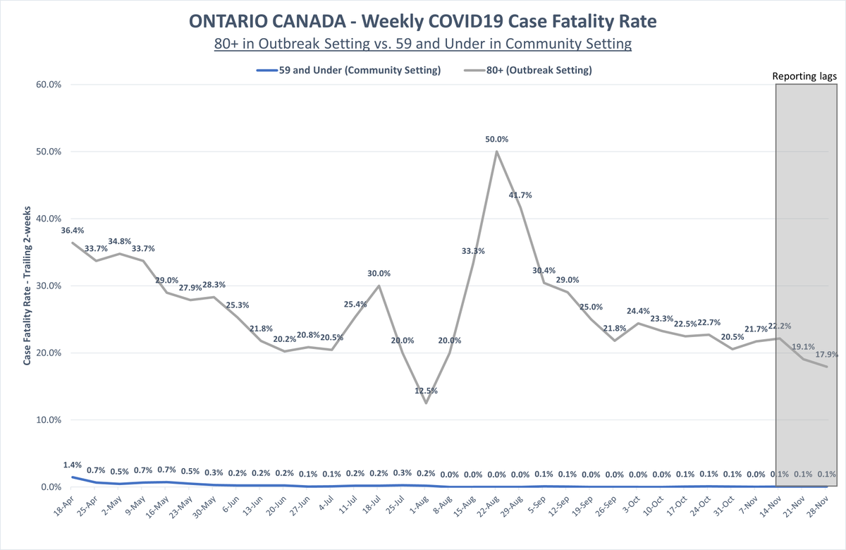
Given (i) the age stratified differences in COVID19 mortality, and (ii) that almost 2/3rds of all COVID19 mortality were of LTC residents, does it make sense to spend 27% of the annual LTC budget on mass PCR testing?
Some chatter in Q&A’s in last few daily briefs with Premier/health officials re: rising cases in Windsor & potential for moving region to lockdown (just moved to “Red” zone on Mon, Nov 30).
Concern is hospital “overrun”… local hospital trends shown here…
2/
Case picture: yes, cases are rising, but overwhelming majority are traced to close contact or outbreak. Averaging only ~8 reported community cases of unknown origin per day.
3/
Overall new emergency admissions for three main Windsor-Essex hospitals appear to be:
*FLAT* for the entire month of November.
(Entire Erie-St.Clair area including Chatham/Sarnia also flat).
In this thread, I’ll show the absurdity of a citywide shutdown, simply using by-neighbourhood case/positivity data, w/ census data integration.
Unmeasurable, unnecessary collateral harm is coming; please read/share.
(get a cup of coffee)
2/ Note: if you are not in Toronto/Canada, you will still find this #SARSCoV2 prevalence analysis and its conclusions compelling, as these same dynamics likely exist in many of the world’s major cities.
3/ Quick note: this analysis follows and adds substantially to a previous related thread, found here (tweets 4a/b sites the data sources/limitations, which are the same as used in this current thread). All %pos/cases data is cumulative since Aug 30.
…focusing in on the correlations between (i) Toronto neighbourhood workforce/demographic concentrations & (ii) #SARSCov2 prevalence (cases/100k) identified in yesterday's thread.
Only a few sips of coffee/tea needed
(but this is no less striking)
2/ These data and observations *MUST* inform public policy on #SARSCov2/#COVI19, in my view.
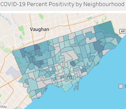
3/ In my thread from yesterday, we examined % test positivity and cases/100k by neighbourhood in Toronto (for its 140 hoods) and then compared them to neighb'hood socioeconomic/demographic concentrations from census data to find (or not find) correlations.
A comprehensive, neighborhood-by-neighborhood review of #SARSCov2 prevalence/trends in the City of Toronto.
% positivity & cases, with weekly trends since Aug, AND:
*cross referenced with neighborhood census data*
The findings are incredible.
2/ Note: even if you are not in Toronto/Canada, I think you will find this data/analysis compelling, and universally applicable re #SARSCov2/#COVID19 learning and public policy implications.
Toronto’s diversity (>51% visible minority) makes it an interesting case study.
3a/ In this thread, I show/illustrate:
1. for Toronto’s 140 neighbourhoods (and groups of hoods, e.g. DT Core, Northwest), which have increasing/decreasing % pos & cases per 100k.
(Some peaked long before the Oct 10th restrictions. Others still increasing despite restrictions.)