Here's a short story about numbers, #COVID19, the scientific process and the misuse of science. And how it affects all of our lives. But it begins with these blokes, sitting in a wood-panelled room in the heart of the City of London. These are the men who decided the "gold fix". 

For nearly a century the gold price was set in London in the room in a building on St Swithin's Lane. Twice a day the five men would meet in that room, call their trading rooms and, between them, settle on the price of the precious metal lbma.org.uk/assets/blog/al…
There's a long tradition of seemingly definitive numbers actually being decided in backroom meetings. Another example: LIBOR, product of a bankers' conference call (u know how that story ended).
Lesson: Most ppl pay attention to the number.
Far fewer to the process of forming it
Lesson: Most ppl pay attention to the number.
Far fewer to the process of forming it
These processes can work well provided they are transparent and not arbitrary. Consider the @bankofengland Monetary Policy Committee meetings to decide int rates. In the early days we had to wait weeks to find out who voted for what. These days we get minutes released instantly.
What has any of this got to do with #COVID19? Well it's a useful reminder that all too often a number most people think is forged out of some algorithm or database is actually the product of a conversation - a meeting. Which brings us to the most important number of the era...
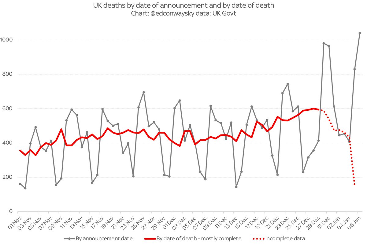
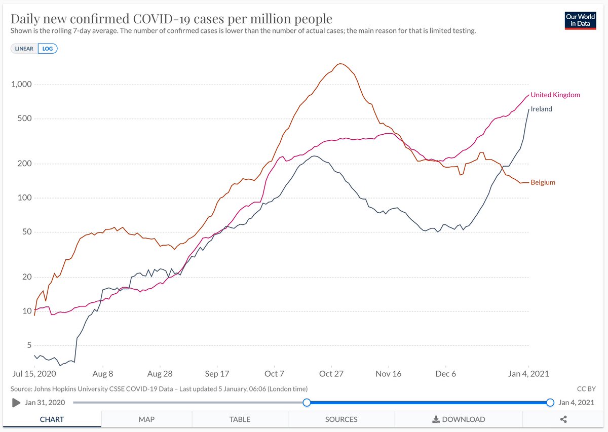
The reproduction rate - most often called the R number - is the crucial number which for much of the pandemic govt said would determine whether lockdown could be lifted or tightened. Above 1 and the pandemic spread is accelerating. Below and the spread is slowing.
For much of this pandemic the govt has explicitly linked its policy - lockdowns, tiers and all - to this R number (or range, to be accurate). Everything has been about keeping it below 1. For good reason. But far less has been said about how the R number is actually forged
https://twitter.com/borisjohnson/status/1255949362548682755
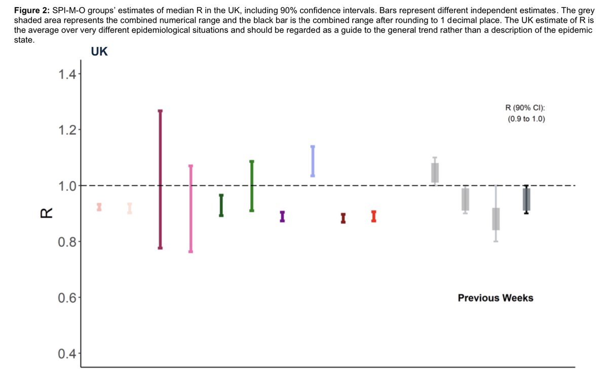
How is R put together? Short answer: a committee, a bit like the MPC meetings, or those gold fix meetings in the City of London. Academics from 11 institutions meet online. This is the Scientific Pandemic Influenza Group on Modelling (SPI-M). Each one provides an estimate of R.
Sometimes there are big differences. As of last week some thought infections were falling, others rising. Sometimes one group will withdraw its submission. Eventually the surviving estimates are combined into a single average. Voila: R!
The process has the merit of ensuring R reflects a range of views and helps to prevent groupthink - though of course a lot depends on the composition of the meetings and the nature of the discussions that go on there. But that raises two problems...
The first is that there is FAR less transparency than, eg, MPC meetings. No minutes. No record of each institution's R - only this chart. We get a statement, but LONG after the number itself is published. Latest statement is for the 9 Dec meeting. assets.publishing.service.gov.uk/government/upl…
Now this is not the fault of SPI-M who have worked hard (unpaid) to forge this process. Many members release their R estimates individually. Most are happy to explain and be scrutinised. Even so, process is less transparent than shd be the case with such a consequential number.
Were the process more transparent then more people would be aware that far from being a monolithic datapoint, R is actually a data-based judgement call - an amalgamation of diverse views. The degree of uncertainty would be evident not just from the range but from the minutes etc
As it is, we get scant information: the R range and growth rate. Which brings us to the 2nd problem: what happens next. For, stripped of nuance or context, R became a totemic number, used by policymakers as a tool for justifying policy. There's a name for this "scientism"
Science is what happens in those SPI-M meetings. It's characterised by doubt and a reluctance to be definitive. It's about probabilistic judgements based on data. Scientism is when those numbers get taken by non-scientists, the doubt gets removed and undue weight is put on them.
The word was originally coined by Hayek about socialist govts attempting to recast policymaking as a kind of engineering, whereby complex societies could be reduced to a few key metrics. Since then, scientism has only grown and grown.
The key figure in the movement is perhaps Robert McNamara, US secretary of defence under Kennedy, whose data obsession meant the White House paid far more attention to the body count in Vietnam than more subjective questions like: have we any chance of winning this war?
McNamara brought this data obsession with him from Harvard Business School and Ford. The mantra there, and increasingly in workplaces around the world? “If you can’t measure it, you can’t manage it.” So data became prized above all else.
Scientism helps explain why in so many walks of life numbers have come to trump judgement. League tables for schools, police, hospitals. In many cases we seem far more focused on metrics than what really matters. Cf this powerful col from @PJTheEconomist thetimes.co.uk/article/9b68ee…
As someone who spends most of his professional life dealing with data I am somewhat torn about this, as you can prob imagine. Data is an extraordinary tool through which one can view the world. It can help you see the wood for the trees and help you make decisions. But...
Ideally data should be the start of a conversation. But too often these days it's used as a way to end conversations. This is a form of abuse.
R, like most datapoints, is not definitive. It's a helpful prism but it also encapsulates doubt. This is often neglected in the debate.
R, like most datapoints, is not definitive. It's a helpful prism but it also encapsulates doubt. This is often neglected in the debate.
It's right that government absorbs scientific judgements before deciding on policy. But last year @10DowningStreet went one step further, casting R as the main metric determining lockdown. This marked the departure from science to scientism
Actually these days govt seems to be somewhat less fixated on this one number & more vague abt the evidence underlying lockdown decisions. Frustrating as this is, this is probably a Good Thing. In the end these are judgement calls - no point pretending otherwise.
Anyway, if you want to read more about this kind of thing, do check out The Tyranny of Metrics by Jerry Muller which is fascinating. Hat tip to @TimHarford since I heard abt the book in Tim's equally fascinating latest book press.princeton.edu/books/hardcove…
My @thetimes column this week is about how science risks being trumped by scientism during #COVID19. Data should be a tool for understanding the world in all its complexity - not a means of stifling debate and providing a false sense of simplicity thetimes.co.uk/article/150238…
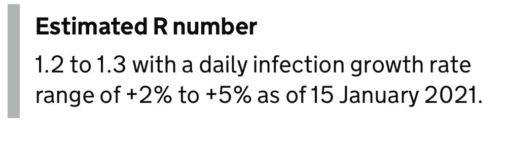
New: the latest reproduction rate is below one! Or rather the median number for the UK range is.
This reinforces the message from other data that the disease's spread has decelerated.
However, as I explain above ☝️let's not get TOO fixated about a single number
This reinforces the message from other data that the disease's spread has decelerated.
However, as I explain above ☝️let's not get TOO fixated about a single number

• • •
Missing some Tweet in this thread? You can try to
force a refresh