Since the question of how far, and how fast, we can relax our current lockdown restrictions is very much current, I have updated my “vax & release” model with the latest data. And it’s mostly good news: we should be able to unlock faster than I previously thought, 1/8
returning to near-normality in June, without causing the many tens or hundreds of thousands of further deaths that were predicted by the Warwick and Imperial models. (I’m sure their modelling is much better than mine – it's just their assumptions are out-of-date). 2/8
However, there is a sting in the tail: there is still a strong risk of a further (fourth) wave in the summer or autumn, with maybe another ~20-30k deaths. To avoid that wave causing a peak of hospitalisations that would overwhelm the NHS, it may be necessary to continue 3/8
continue with ‘light’ social-distancing (e.g. masks in crowded places, work from home if you can) for ~3 months after we unlock. Seasonal factors &/or voluntary behavioural responses might avoid the need for this – but it could be dangerous to rely on these. 4/8
So my proposal is this: follow something like the plan proposed by @andrew_lilico up to the end of May, but then go into a near-normal position until a “full opening” on 1st September once the fourth wave is over. 5/8
Two assumptions are particularly critical to these plans: the effect of the vaccine on severe disease, and its effect on transmission. On the latter, we’re only just starting to get good data, and If I’m wrong in my assumption by 10% one way, unlocking could crash the NHS; 6/8
10% the other way and the fourth wave disappears. So we really need a better handle on this (the vaccine effect on transmission, and also on serious disease and death) before we move to the final stage of re-opening. 7/8
That’s the end of the summary; rather than embarking on another 50-tweet thread to show you the details of the model assumptions, results etc. I've put these into a .pdf on dropbox - see link in next tweet if you are interested. Lots of nice charts and tables included 😀 8/8
This is the more detailed write-up: dropbox.com/s/zqqnjc0qt1ah…. Let me know if the link doesn't work or if you'd really prefer the marathon thread instead.

• • •

Missing some Tweet in this thread? You can try to force a refresh
 

Keep Current with James Ward

James Ward Profile picture

Stay in touch and get notified when new unrolls are available from this author!

Read all threads

This Thread may be Removed Anytime!

PDF

Twitter may remove this content at anytime! Save it as PDF for later use!

Try unrolling a thread yourself!

how to unroll video
  1. Follow @ThreadReaderApp to mention us!

  2. From a Twitter thread mention us with a keyword "unroll"
@threadreaderapp unroll

Practice here first or read more on our help page!

More from @JamesWard73

31 Jan
I've had a lot of positive comments on this theory, and some helpful challenges. The most common of which was: surely a single-day effect wouldn't be big enough to cause the 'twist' in the data that we're seeing in those age groups? So I set out to find out if it was (thread)
This is one of those university / job interview 'order of magnitude' estimation problems. So feel free to disagree with any or all steps on my logic chain, and please explain why - it will help improve / refine (or falsify) the analysis.
So let's focus on the primary-school-age kids as that's where the effect is strongest. We have 3.5m 5-9 year-olds in England. I don't know how many were in school on 4th Jan - we know some regions (London / Kent etc.) didn't go back, and a lot of schools had INSET days etc
Read 19 tweets
31 Jan
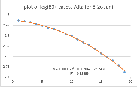
I have updated my analysis of potential vaccine effects in over-80s cases with today’s latest dashboard data. I am increasingly confident that this does show an actual impact of vaccines, for the following reasons: (THREAD)
1) The trend is continuing to follow a clear quadratic curve, as per @BristOliver's prediction
2) The implied rate of rate of protection from that curve matches almost exactly with the NHS vaccination data, if you assume a 2-week lag to protection, and a 50% rate of protection from the first dose: both come to ~0.6% of the over-80s age group getting protection per day
Read 16 tweets
29 Jan
So I have a theory on this. And if I'm right, there's bad news about that acceleration in the overall case trend, and possibly good news about vaccines in the over-80s. WARNING: This is going to be another long, maths-y thread (involving cubic coefficients this time!)
the theory isn't new or original, but I think I've got some data to back it up now. The idea is that there was a single day of strong mixing on 4th Jan, as a result of schools going back for 1 day before the full lockdown came into force, which caused a 'bump' in the case data
I floated this in my thread yesterday (see below). but the unanswered question was: could this plausibly cause an effect of the right size, to create the changes in trend that I'm seeing in my data, and that @bristoliver is seeing in his log plot?
Read 31 tweets
28 Jan
You may be wondering why @bristoliver rather cryptically RT’d a chart that I posted last night. The answer is not just that he loves quadratic fits on log axes, but that this chart may –and I stress may– hint at a vaccine effect amongst the over 80s THREAD
WARNING: this is a long thread, and it’s a bit of a roller-coaster. We find some apparently strong patterns in the data, and then start to unpick them a bit. So if you start getting excited half way through you might find you’re less excited at the end. But we’ll see…
First we first have to go back a bit. @bristoliver posted a thread a few days ago explaining why, with a constant vaccination rate, a log plot of cases should show a quadratic form. In other words, it should fit an equation like: a + b.x + c.x^2
Read 51 tweets
25 Jan
Taking a short break from modelling ‘vax & relax’ strategies, I have updated my model of infections at local level (MSOA) in England, looking for any evidence of impact on infection rates in Wave 3 (Dec & Jan) from accumulated immunity across Waves 1 & 2 (Mar-Nov) THREAD 1/n
TL;DR: there’s a similar pattern to before, with some evidence of high (>15%) attack rates in Waves 1 & 2 leading to slightly more muted attack rates in Wave 3. But there still isn’t any sign of local areas approaching ‘herd immunity’ levels. 2/n
As before, the data is simply aggregated weekly cases per MSOA across England, taken from the gov.uk dashboard. Big thanks to @ArtySmokesPS for lending me his multipliers for case ascertainment, which enable me to estimate actual infections in each area 3/n
Read 17 tweets

Did Thread Reader help you today?

Support us! We are indie developers!


This site is made by just two indie developers on a laptop doing marketing, support and development! Read more about the story.

Become a Premium Member ($3/month or $30/year) and get exclusive features!

Become Premium

Too expensive? Make a small donation by buying us coffee ($5) or help with server cost ($10)

Donate via Paypal Become our Patreon

Thank you for your support!

Follow Us on Twitter!