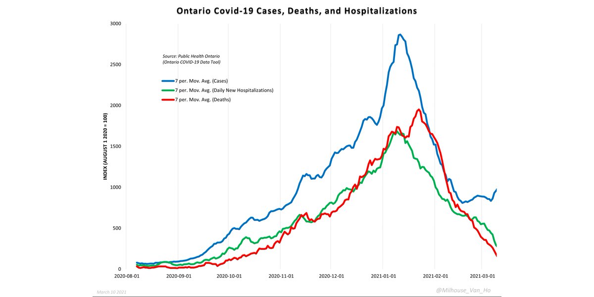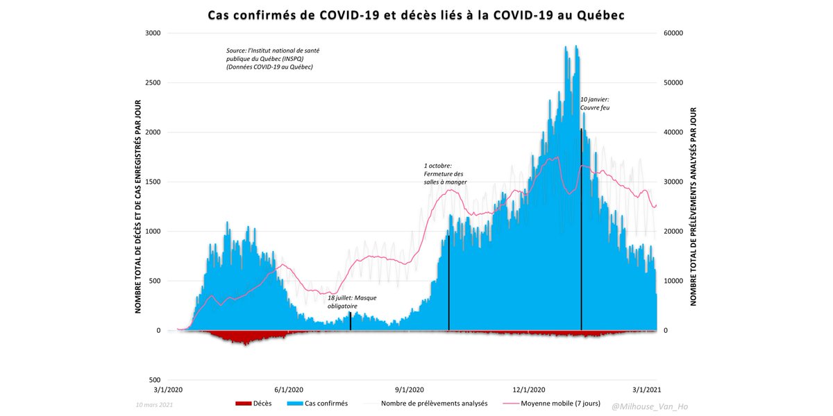
I suspect there's something artificial about Ontario's case numbers because they no longer match hospitalization and death trends, nor comparable trends in neighbouring Québec.
Thread:


Thread:


Charts demonstrating covid seasonality.
Neighbouring provinces of Ontario and Québec both peaked at virtually the same time. However, cases trending up again in Ontario - but not in Québec.
Neighbouring provinces of Ontario and Québec both peaked at virtually the same time. However, cases trending up again in Ontario - but not in Québec.

Looking closely at Ontario specifically, the uptick in cases since early/mid February doesn't conform at all to the continued decline in hospitalizations and deaths. 

• • •
Missing some Tweet in this thread? You can try to
force a refresh


