Oh dear! I thought for a moment this account had been hacked, but it turns out I just haven’t been paying attention.
Disappointing to see this sort of misinformation from someone who should know better.
Let’s do some basic maths, something which seems to have escaped Helena.
Disappointing to see this sort of misinformation from someone who should know better.
Let’s do some basic maths, something which seems to have escaped Helena.
https://twitter.com/morrisseyhelena/status/1375558127727357954
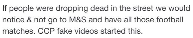
Do we need to see people “dropping dead in the street” to be in a pandemic? Absolutely not!
A projection of the impact of an *unmitigated* spread of the virus was a UK death toll of around half a million deaths. That’s *roughly* the same number as die each year normally.
A projection of the impact of an *unmitigated* spread of the virus was a UK death toll of around half a million deaths. That’s *roughly* the same number as die each year normally.
The age distribution of COVID-19 deaths is *roughly* the same as the ordinary distribution of deaths which allows us to do a simple rule of thumb. If we had completely let things get out of control then we would each have seen one COVID death for each death we normally see.
That’s hardly people “dropping dead in the street” is it! For many younger people it’s very unusual to experience a loss of someone close to them. They would be even less likely to have lost someone to COVID, even in this uncontrolled scenario.
What have we actually seen in practice, with strict social distancing measures?
Since the start of the pandemic there have been 110,800 more deaths than we’d normally expect in a year.
That means one extra death, for every five deaths you would normally experience in a year.
Since the start of the pandemic there have been 110,800 more deaths than we’d normally expect in a year.
That means one extra death, for every five deaths you would normally experience in a year.
https://twitter.com/covid19actuary/status/1374384885092155395
Maybe Helena is talking about 2021 only... saying we are no longer in a pandemic, rather than that we never had one? So far in 2021 deaths are 27% above the recent average.
That means one extra death, for every four deaths you would normally experience between Jan and March.
That means one extra death, for every four deaths you would normally experience between Jan and March.
https://twitter.com/ActuaryByDay/status/1374294329402003460
I’ve made some simplifications. COVID deaths skew older than normal. So younger people are even *less* likely to have experienced loss to COVID than these numbers show.
Still, I hope it clear that a pandemic doesn’t have to look like a Hollywood film to be real and deadly.
Still, I hope it clear that a pandemic doesn’t have to look like a Hollywood film to be real and deadly.
This week, for the first time in 6 months, ONS reported slightly fewer deaths than normal. That is surely a consequence of lockdown and the incredible vaccine rollout.
As we cautiously relax restrictions it is more important than ever to understand what the data is telling us.
As we cautiously relax restrictions it is more important than ever to understand what the data is telling us.
The tweet has been deleted it seems. I guess that means the thread has done it’s job. In case anyone thinks my response unduly harsh, here’s are the words so you can judge for yourself. 
• • •
Missing some Tweet in this thread? You can try to
force a refresh