Breaking: latest IMF World Economic Outlook is out.
Having flicked through, strikes me this is the most positive outlook since the onset of the pandemic (with some important provisos).
- UK, US and most advanced economies get a big vaccine-related upgrade this year & next
Here are the latest IMF GDP forecasts for G7 members. As you can see, an awful 2020 followed by pretty strong growth in 2022. UK actually strongest in G7 in 2022 (and given the OBR thinks 2022 GDP could be over 7% it’s poss the IMF is undercooking it slightly)
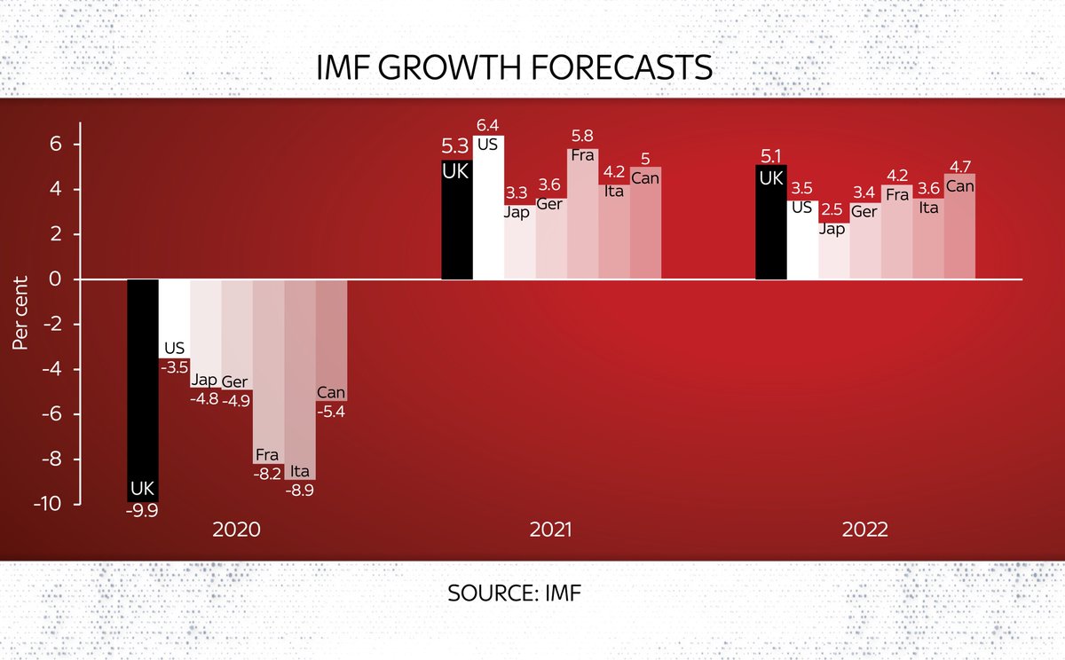
But look at the LEVEL of GDP growth and it’s a somewhat different story. The UK is the second last in the G7 to get back to its pre-crisis peak (Italy the slowest).
One striking line from the IMF is that the global recession could have been THREE TIMES as deep had governments not intervened with rescue measures.
Given 2020 was already the worst year on record, that’s quite something. White bar here illustrates that “three times worse”
Here’s the full IMF World Economic Outlook. If you’re interested in the state of the global economy, the recovery and the extent to which it’s being balanced between advanced and developing economies (not very balanced), it’s well worth a read imf.org/-/media/Files/…
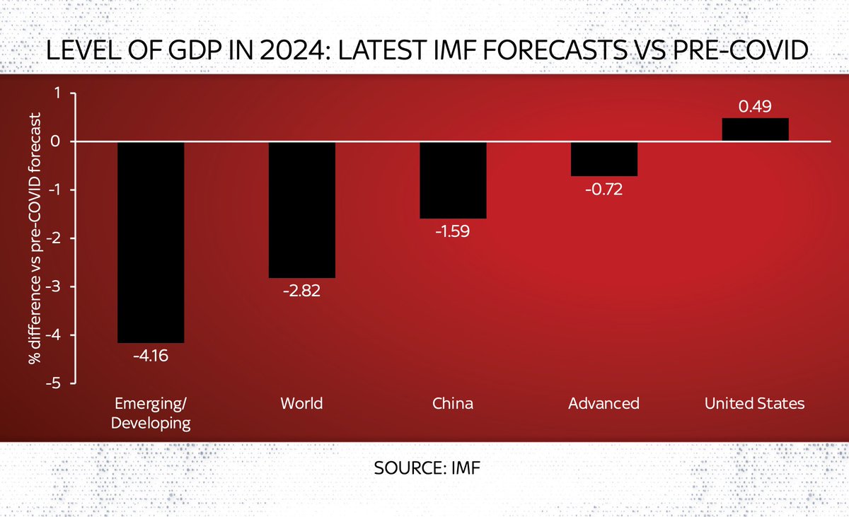
Big deal: the IMF now reckon that advanced economies will almost completely avoid permanent COVID-related economic scarring.
Eg by 2024 their GDP LEVEL will be close to what was forecast pre-COVID.
US GDP will be even HIGHER.
For poorer countries… v different story
The IMF has been wondering aloud about whether countries should be introducing more taxes on the wealthy for some time. In today’s Fiscal Monitor they’ve gone further than ever before, recommending a “temporary COVID-19 recovery contribution” on incomes or assets of the wealthy.
News story on everything IMF related here on the @SkyNews site: news.sky.com/story/covid-19…
The more I think abt it, the bigger a deal this is.
Conventional wisdom is China did best - economically at least - out of COVID, bouncing back first/fastest.
But IMF’s forecasts suggests it will face MORE scarring than advanced economies.
And that the US is the biggest winner

• • •

Missing some Tweet in this thread? You can try to force a refresh
 

Keep Current with Ed Conway

Ed Conway Profile picture

Stay in touch and get notified when new unrolls are available from this author!

Read all threads

This Thread may be Removed Anytime!

PDF

Twitter may remove this content at anytime! Save it as PDF for later use!

Try unrolling a thread yourself!

how to unroll video
  1. Follow @ThreadReaderApp to mention us!

  2. From a Twitter thread mention us with a keyword "unroll"
@threadreaderapp unroll

Practice here first or read more on our help page!

More from @EdConwaySky

1 Apr
Only one of these countries, ranked here by the number of #COVID19 cases, population adjusted, is NOT on the UK govt’s “red list” which stipulates that British travellers should quarantine in a govt-approved hotel upon arrival in the UK.
Can you guess which one?
You guessed it: the answer is France.
Now, cards on the table: I left Uruguay off that chart even though it IS on the red list because, well, I was trying to make a point. Here you can see the full chart of red list countries vs France.
But as for that point…
Clearly case numbers shouldn’t be the only determinant of which countries are on or off the red list.
Clearly some of those countries on the list have dodgy data on COVID.
Clearly this isn’t just about cases but also abt VARIANTS of the virus.
Even so…
Read 4 tweets
29 Mar
Remember when the PM announced the easing of lockdown it was going to be about data not dates? Well now we’ve had a bit more data in this feels like as good a time as any to see how we’re doing (Thread)
Strictly speaking “data not dates” meant a few crucial datapoints, as laid out in the documents at the time. In particular, there were four tests, roughly as follows:
1. Are enough people being vaccinated?
2. Are vaccines “working”?
3. Are infections surging?
4. New variants 😱
Test one: Are vaccines being deployed successfully?
Seems to be going very well. Over 90% of those aged over 70 have been vaccinated which is beyond what many expected. Over 80% for all but those aged over 100 interestingly
Read 14 tweets
25 Mar
Short answer?
Because the population was ageing in that period. It's DEMOGRAPHY!
I'm a big fan of @dannydorling but he's got this one wrong.
As @ActuaryByDay will tell you, once you age adjust the death rates you'll see they kept falling from 2012 to 2019. This is important.
Here are some charts that illustrate the point.
First off is simple deaths per year (England & Wales).
Yes, deaths crept up post 2010, reversing a long trend of falls.
But now recall that a) the population is ageing and b) these demographic trends matter enormously
More old people in a bigger population means, all else equal, that deaths will tend to rise each year. Because older people are more likely to die than younger people. That's why actuaries age adjust their data. And if you age adjust the data here's what it looks like:
Read 4 tweets
25 Mar
Thread: Since the UK has just released its latest data on greenhouse gas emissions, this feels like as good a time as any to look at the numbers and ask: what’s really going on? The broad picture is v promising (see these headlines from earlier): emissions falling fast.
Before we go any further, this is not a thread about “the science”. It’s not a debate abt climate change. Feel free to debate that elsewhere. This is abt the DATA. And while there are some interesting question marks over the data, the overarching aim of govt right now is v simple
The UK has committed, in law, to get greenhouse gas emissions down to zero in net terms by 2050. If you consider the starting point for that effort to be 1990, it’s now nearly (but not quite) halfway there. This is quite something…
Read 14 tweets
23 Mar
Since it’s a year on from lockdown and the second wave of excess mortality now seems to be over, a few datapoints on #COVID19 mortality in the UK.
Starting with this: we’re now at 149k deaths according to the @ONS measure (deaths where COVID mentioned on certificate)
Important to note this isn’t the only measure though: excess deaths, which is deaths from ALL causes vs 5yr historical average, puts the toll at 123k. We’ll get to why there’s a big difference in a moment. Even so: however you measure it we’re talking about high numbers of deaths
Strikingly, on the basis of the most comprehensive @ONS #COVID19 figures, total #COVID19 deaths (149k in total). The second wave was far bigger than the first wave. 91k in the latest wave vs 58k in the first.
Read 7 tweets
21 Mar
Something to ponder as you fill in the census. We’re currently in the midst of the most dramatic fall in the UK population since 1941, as three forces collide to push down the number of people living in this country news.sky.com/story/the-thre…
Incidentally a few people have understandably asked whether the fall in migrants last year might have been a Brexit effect. But while this might have contributed at the margin it doesn’t seem to be the main explanation. Anyway, the exodus was both EU and non-EU workers
That last chart is from this piece migrationobservatory.ox.ac.uk/resources/comm…. The phenomenon of enormous migrant outflows was first pointed out by @StrongerInNos and @jdportes ukandeu.ac.uk/estimating-the…
Read 5 tweets

Did Thread Reader help you today?

Support us! We are indie developers!


This site is made by just two indie developers on a laptop doing marketing, support and development! Read more about the story.

Become a Premium Member ($3/month or $30/year) and get exclusive features!

Become Premium

Too expensive? Make a small donation by buying us coffee ($5) or help with server cost ($10)

Donate via Paypal Become our Patreon

Thank you for your support!

Follow Us on Twitter!