Anyone fancy an #Earthday data thread?
One of my frustrations with this topic is that all too often it’s portrayed in enormously over-simplistic terms: We need to stop flying! Cutting down forests is killing the planet!
So here’s some charts that show you the numbers that matter
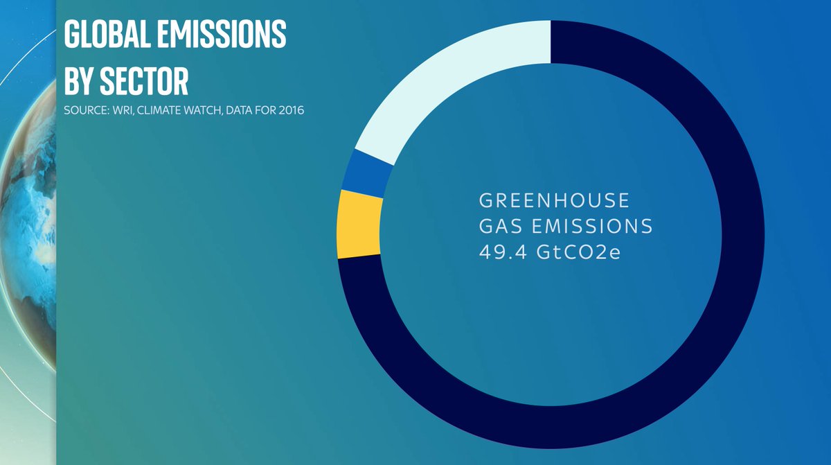
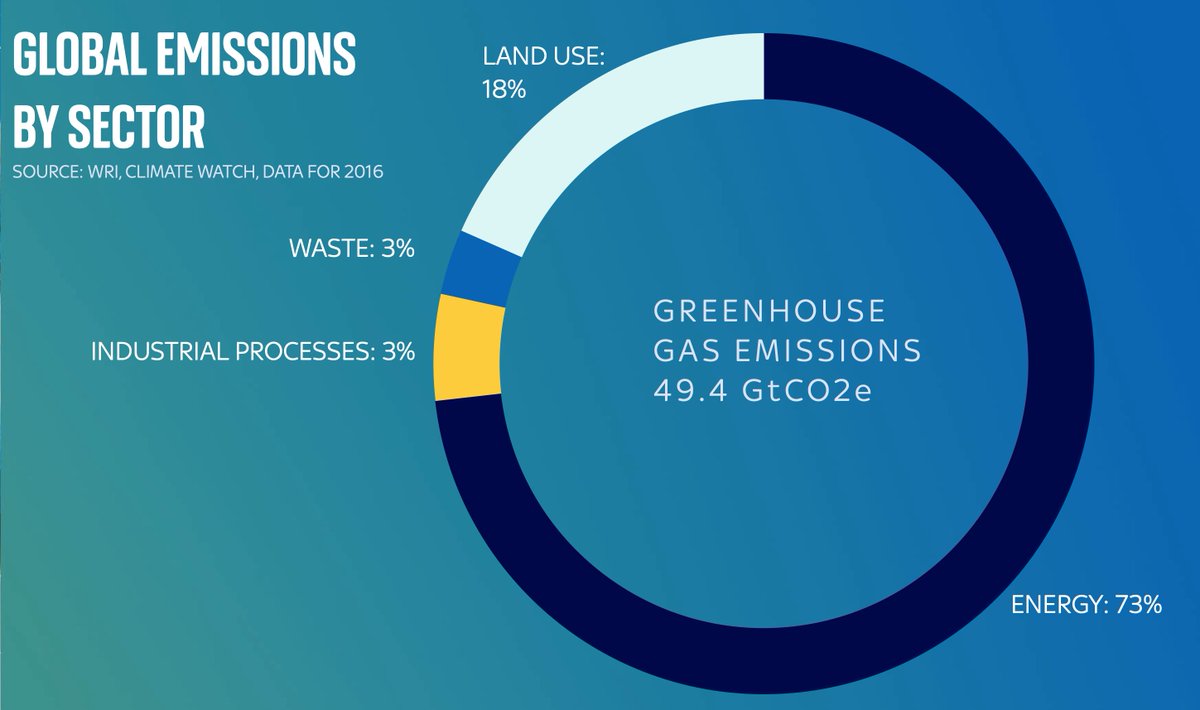
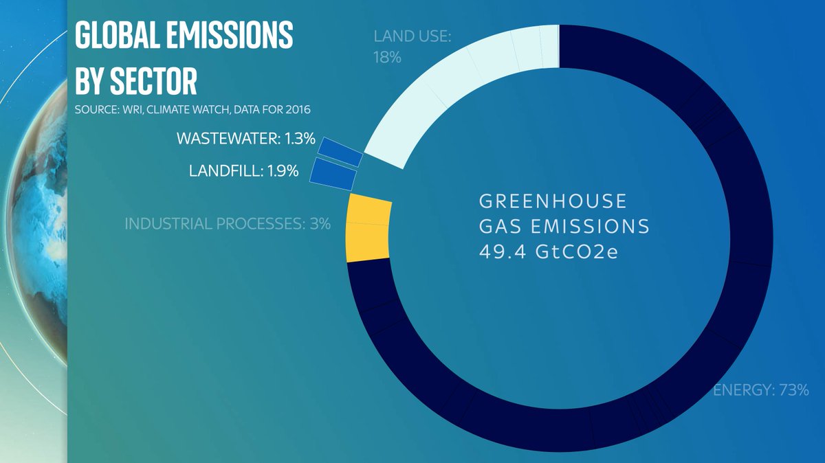
Let’s start with this: this doughnut shows you total global emissions. About 50 gigatonnes of CO2 or equivalent. The numbers are from @WorldResources based on @IEA data which you and I can’t afford to see because they’re stuck behind a mammoth paywall.
First let’s break the doughnut into some primary categories: the vast majority is emissions from energy: everything from power stations to gas boilers to industrial processes. But also note a big chunk is emissions directly coming from the land/farming, and industry/waste
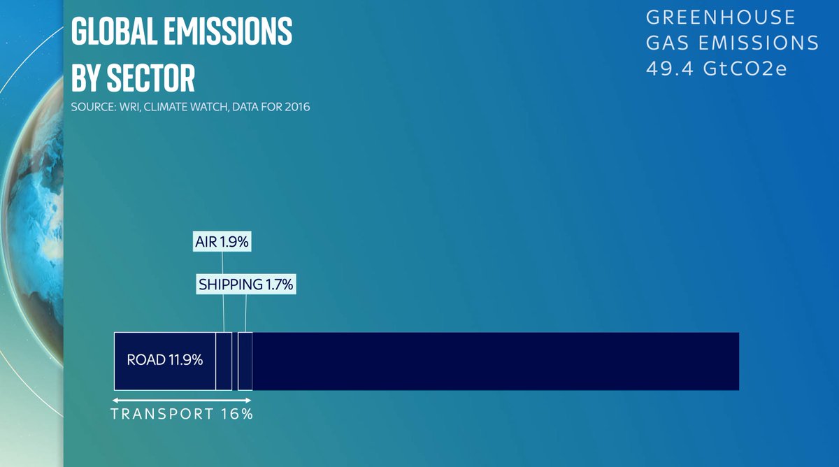
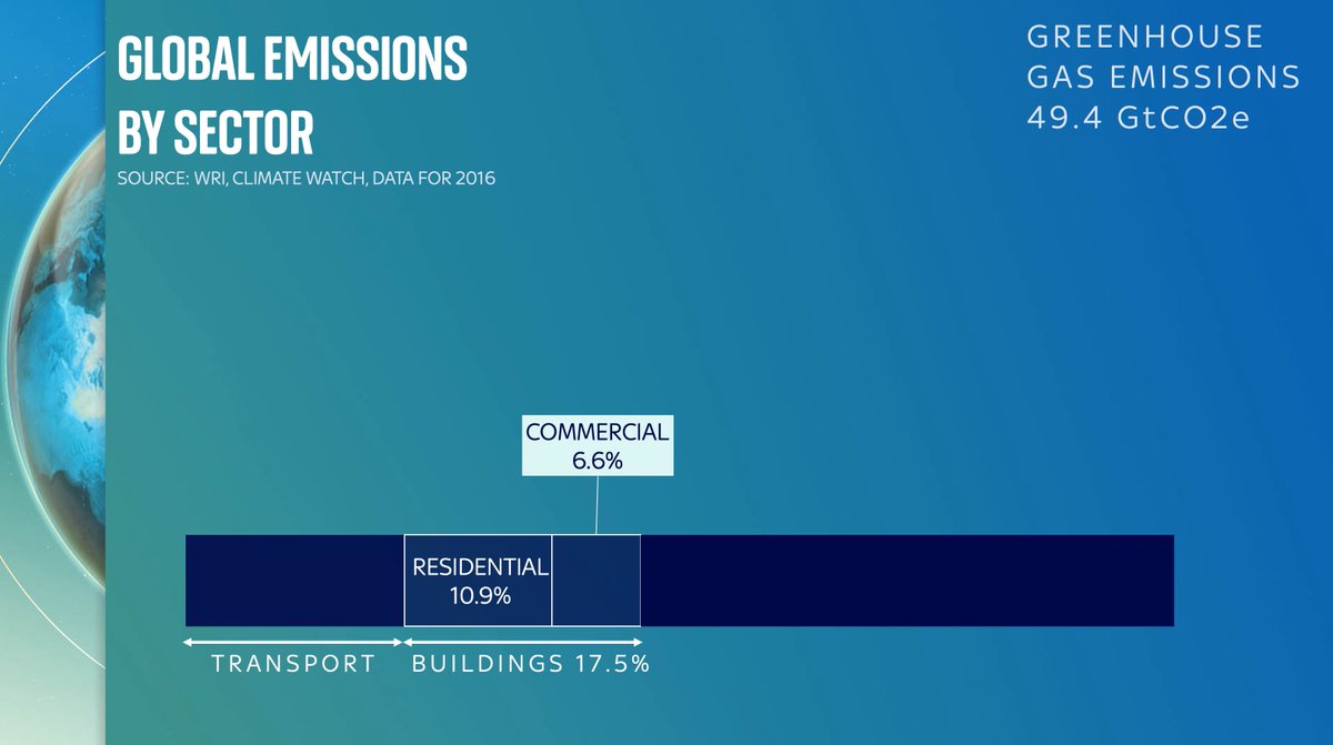
Let’s start with the bits that are probably pretty familiar. First, energy. It’s the vast majority of our emissions. And if you break it down further you can see the main parts. You’ve got transport (car exhausts, planes etc). Emissions from buildings (electricity, heating/AC).
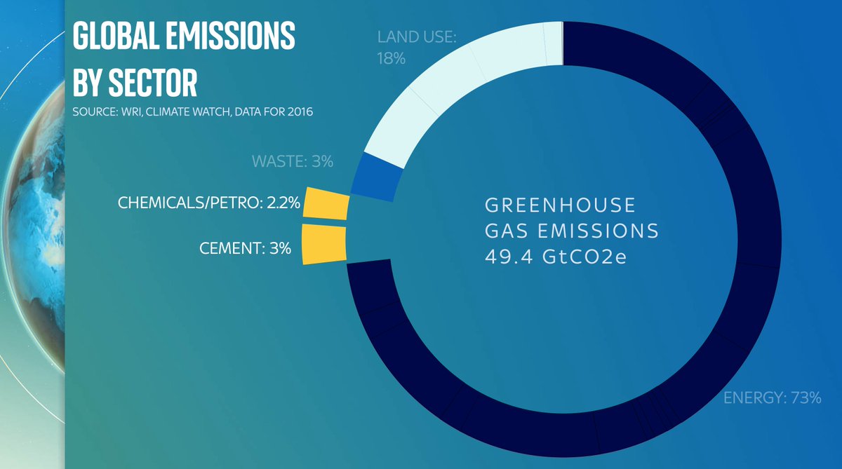
What’s really striking (to me at least) is that the biggest component part of the biggest slice of emissions is not how we get around or how we live, but industrial processes: primarily iron/steel. This is a really, really big deal. Steel is not a sideshow. It’s a massive emitter
In fact, emissions from steel and the chemicals industry are about the same as the total emissions the nearly eight billion people on this planet create in our homes - from electricity, heating etc. A few thousand companies vs eight billion people!
Of course, energy isn’t the only source of emissions. CO2 is also puffed out from the chemical process when we make cement. A LOT of CO2. Methane wafts up from landfill. Then there’s land use, which is worth breaking down because it’s a very big deal…
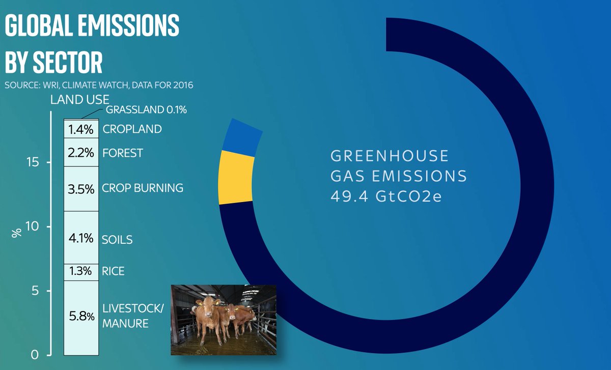
So much is said abt reducing fossil fuel use, but far less about this slice of the emissions pie:
Land use
Lots comes from livestock & manure.
A striking amount is methane emissions from rice paddy fields - more than for every other crop!
Why aren’t we talking more about RICE?!
Dig into the data and it’s also clear that the mainstream narrative about carbon is somewhat divorced from the data. We talk a LOT about aviation emissions, and about deforestation. We talk far less about cement production. Yet it accounts for more emissions than either of those.
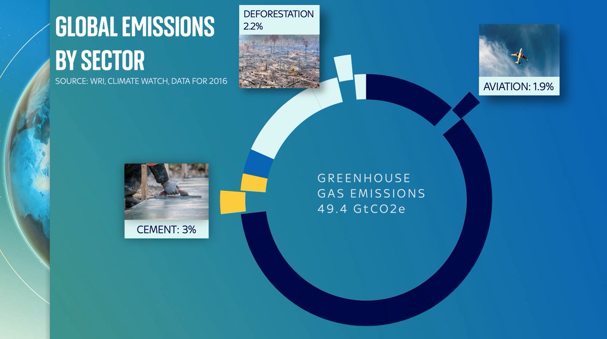
Actually that 3% number for cement production is an understatement since that’s purely the CO2 released from the chemical reaction in turning limestone into lime. We should really add on another 3-4% for the emissions from the ENERGY used to power the cement kilns.
There’s a great @WorldResources sankey diagram of all of this, which neatly shows you which sector is producing carbon and which methane etc here. My data is from there. Worth playing around with yourself wri.org/data/world-gre…
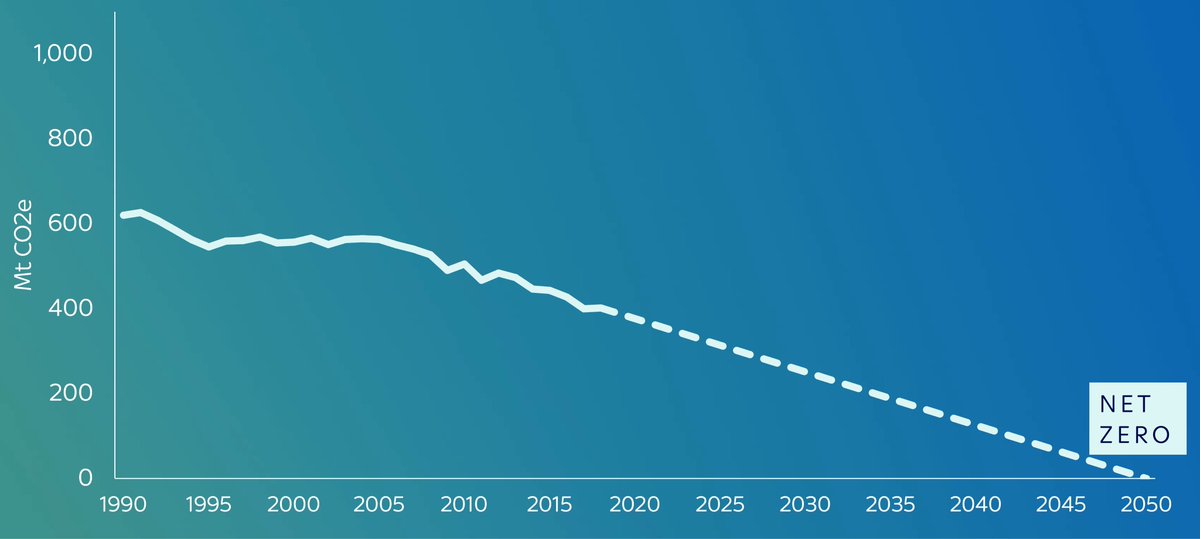
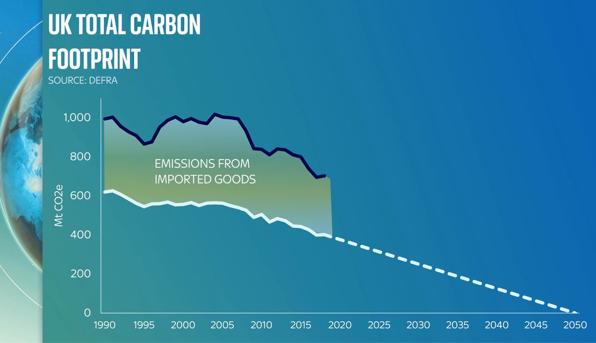
It’s worth saying at this stage: the UK’s specific pie chart is different: less carbon coming from industrial processes, for one thing. One of the upshots is that our domestic carbon emissions are actually pretty low. And falling quite fast. Hurrah!
But now include the carbon embedded in all those products we’re buying from overseas. Steel from Poland, aluminium, cement etc, and you can see our carbon FOOTPRINT - eg the emissions from the products we produce and consume, are far, far higher
It’s worth keeping this chart in the back of your mind as politicians go on about net zero in the coming months. What they’re invariably talking about is the white line. That’s fair enough. That’s what they control. But the black line also really matters.
Overarching lesson: if we’re really serious abt getting to net zero, we shouldn’t just be talking about forests. We should be talking about cement.
We shouldn’t just be talking about coal. We should be talking about rice…
Video here:
Before you say anything, yes there is another way to break down global carbon emissions: not by sector but by COUNTRY.
If you’re interested in that breakdown, you’ll find it in this video. You can probably guess the biggest polluter…

• • •

Missing some Tweet in this thread? You can try to force a refresh
 

Keep Current with Ed Conway

Ed Conway Profile picture

Stay in touch and get notified when new unrolls are available from this author!

Read all threads

This Thread may be Removed Anytime!

PDF

Twitter may remove this content at anytime! Save it as PDF for later use!

Try unrolling a thread yourself!

how to unroll video
  1. Follow @ThreadReaderApp to mention us!

  2. From a Twitter thread mention us with a keyword "unroll"
@threadreaderapp unroll

Practice here first or read more on our help page!

More from @EdConwaySky

13 Apr
One thing we’ve learnt about #COVID stories:
Often something that looks too scary to be true isn’t quite true when you look at the small print.
Often something that looks too good to be true isn’t quite true when you look at the small print.
There have been a few scary stories in recent weeks about “hotspots” of #COVID19 around the UK.
Partly inspired by maps like this (this one from @PHE_uk) which compare local case levels with the national avg. The reddest area here is Barnsley
One problem with heatmaps is that while they do a good job of depicting regional variation, they don’t give you much context.
And they can look more dramatic when the national avg is low (as it is right now). So.
Here are three “hotspots”: Clackmannanshire, Corby & Barnsley:
Read 13 tweets
6 Apr
Breaking: latest IMF World Economic Outlook is out.
Having flicked through, strikes me this is the most positive outlook since the onset of the pandemic (with some important provisos).
- UK, US and most advanced economies get a big vaccine-related upgrade this year & next
Here are the latest IMF GDP forecasts for G7 members. As you can see, an awful 2020 followed by pretty strong growth in 2022. UK actually strongest in G7 in 2022 (and given the OBR thinks 2022 GDP could be over 7% it’s poss the IMF is undercooking it slightly)
But look at the LEVEL of GDP growth and it’s a somewhat different story. The UK is the second last in the G7 to get back to its pre-crisis peak (Italy the slowest).
Read 9 tweets
1 Apr
Only one of these countries, ranked here by the number of #COVID19 cases, population adjusted, is NOT on the UK govt’s “red list” which stipulates that British travellers should quarantine in a govt-approved hotel upon arrival in the UK.
Can you guess which one?
You guessed it: the answer is France.
Now, cards on the table: I left Uruguay off that chart even though it IS on the red list because, well, I was trying to make a point. Here you can see the full chart of red list countries vs France.
But as for that point…
Clearly case numbers shouldn’t be the only determinant of which countries are on or off the red list.
Clearly some of those countries on the list have dodgy data on COVID.
Clearly this isn’t just about cases but also abt VARIANTS of the virus.
Even so…
Read 4 tweets
29 Mar
Remember when the PM announced the easing of lockdown it was going to be about data not dates? Well now we’ve had a bit more data in this feels like as good a time as any to see how we’re doing (Thread)
Strictly speaking “data not dates” meant a few crucial datapoints, as laid out in the documents at the time. In particular, there were four tests, roughly as follows:
1. Are enough people being vaccinated?
2. Are vaccines “working”?
3. Are infections surging?
4. New variants 😱
Test one: Are vaccines being deployed successfully?
Seems to be going very well. Over 90% of those aged over 70 have been vaccinated which is beyond what many expected. Over 80% for all but those aged over 100 interestingly
Read 14 tweets
25 Mar
Short answer?
Because the population was ageing in that period. It's DEMOGRAPHY!
I'm a big fan of @dannydorling but he's got this one wrong.
As @ActuaryByDay will tell you, once you age adjust the death rates you'll see they kept falling from 2012 to 2019. This is important.
Here are some charts that illustrate the point.
First off is simple deaths per year (England & Wales).
Yes, deaths crept up post 2010, reversing a long trend of falls.
But now recall that a) the population is ageing and b) these demographic trends matter enormously
More old people in a bigger population means, all else equal, that deaths will tend to rise each year. Because older people are more likely to die than younger people. That's why actuaries age adjust their data. And if you age adjust the data here's what it looks like:
Read 4 tweets
25 Mar
Thread: Since the UK has just released its latest data on greenhouse gas emissions, this feels like as good a time as any to look at the numbers and ask: what’s really going on? The broad picture is v promising (see these headlines from earlier): emissions falling fast.
Before we go any further, this is not a thread about “the science”. It’s not a debate abt climate change. Feel free to debate that elsewhere. This is abt the DATA. And while there are some interesting question marks over the data, the overarching aim of govt right now is v simple
The UK has committed, in law, to get greenhouse gas emissions down to zero in net terms by 2050. If you consider the starting point for that effort to be 1990, it’s now nearly (but not quite) halfway there. This is quite something…
Read 14 tweets

Did Thread Reader help you today?

Support us! We are indie developers!


This site is made by just two indie developers on a laptop doing marketing, support and development! Read more about the story.

Become a Premium Member ($3/month or $30/year) and get exclusive features!

Become Premium

Too expensive? Make a small donation by buying us coffee ($5) or help with server cost ($10)

Donate via Paypal Become our Patreon

Thank you for your support!

Follow Us on Twitter!