Thread on "Consilience" (tm @EthicalSkeptic)
I hope Dr. Jacobs will engage and discuss with us in good faith.
My intent is to explain how we analyze patterns and look for consilience before predicting or calling peaks.
It's important to know what to expect, right?
/1
I hope Dr. Jacobs will engage and discuss with us in good faith.
My intent is to explain how we analyze patterns and look for consilience before predicting or calling peaks.
It's important to know what to expect, right?
/1
https://twitter.com/TheAngryEpi/status/1382410376105447425
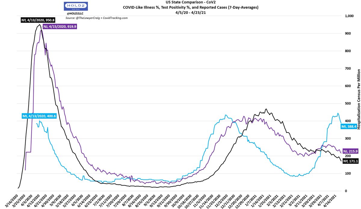
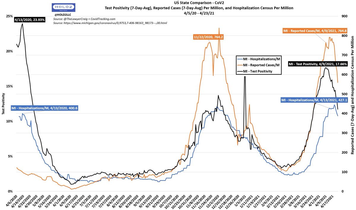
This started with my tweet on 4/12 claiming MI/NY/NJ had peaked and that Hosps would peak next...likely the following week.
I didn't post that based on hopes and guesses. It was based on known data/patterns:
- Historical evidence
- Leading indicators
/2
I didn't post that based on hopes and guesses. It was based on known data/patterns:
- Historical evidence
- Leading indicators
/2
https://twitter.com/Hold2LLC/status/1381743931562586118?s=20
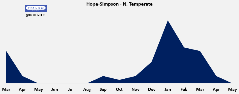
Historical Evidence:
- Hope-Simpson N. Temperate pattern
- April 2020 pattern
Instead of assuming US states dropped in unison at the same time last Spring due to NPIs, we consider natural forces to be predominant.
/3
- Hope-Simpson N. Temperate pattern
- April 2020 pattern
Instead of assuming US states dropped in unison at the same time last Spring due to NPIs, we consider natural forces to be predominant.
/3
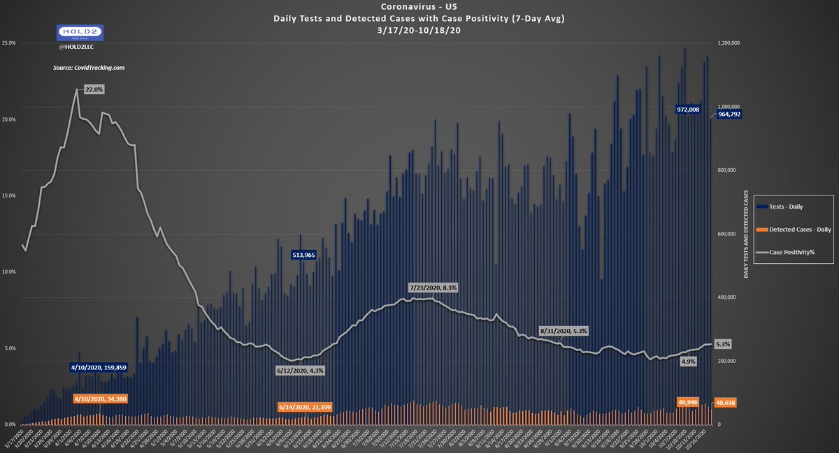
Leading Indicators:
1) CLI
2) Pos%
3) Illness Onset (Actual Date of Case)
4) Reported Cases
We learned long ago that CLI - COVID-Like Illness % of ER Visits - was the best leading indicator.
On 4/12, we saw peak signals on all 4.
/4
1) CLI
2) Pos%
3) Illness Onset (Actual Date of Case)
4) Reported Cases
We learned long ago that CLI - COVID-Like Illness % of ER Visits - was the best leading indicator.
On 4/12, we saw peak signals on all 4.
/4
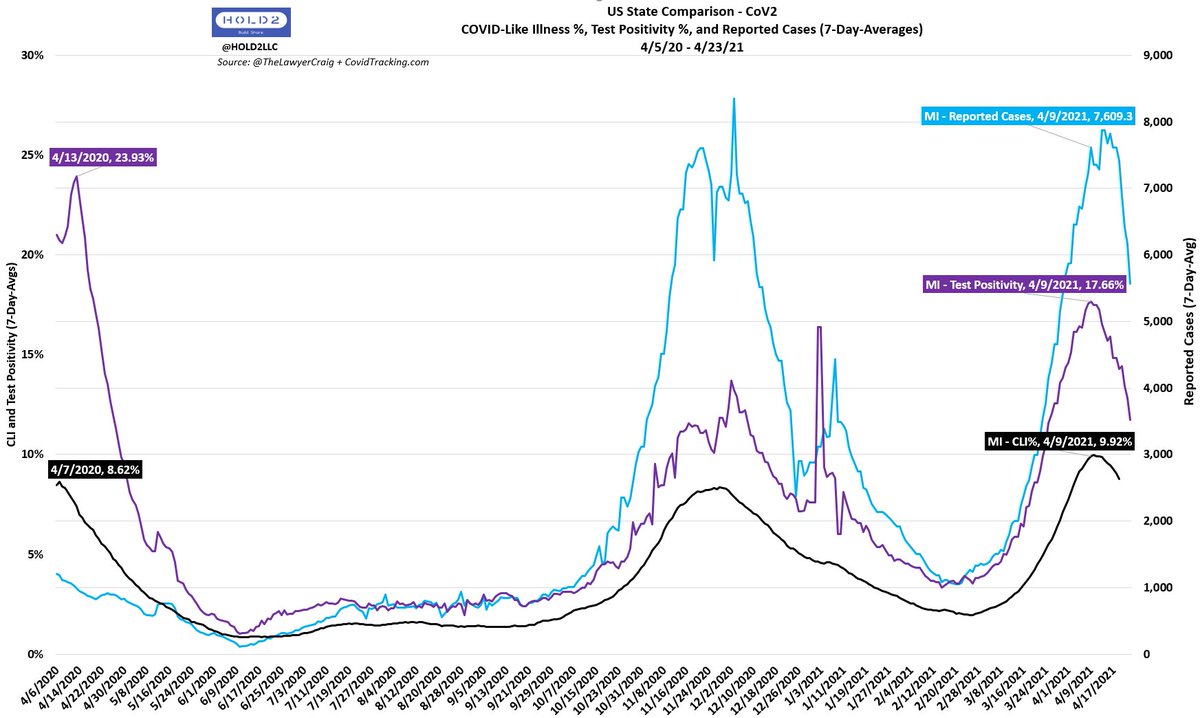
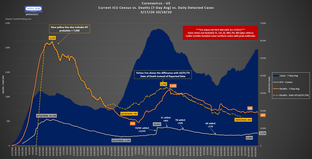
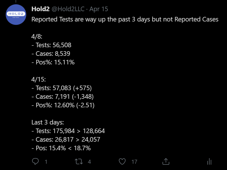
If we did not look for Multi-Factor Consilience, we'd be much more susceptible to single-factor anomalies like the 220% Test dump on 4/14, which gave an artificial rise in Reported Cases trend.
This did not affect us, because we saw Pos% and CLI fall.
/5
This did not affect us, because we saw Pos% and CLI fall.
/5
https://twitter.com/KryptosBC/status/1382402487659937798?s=20
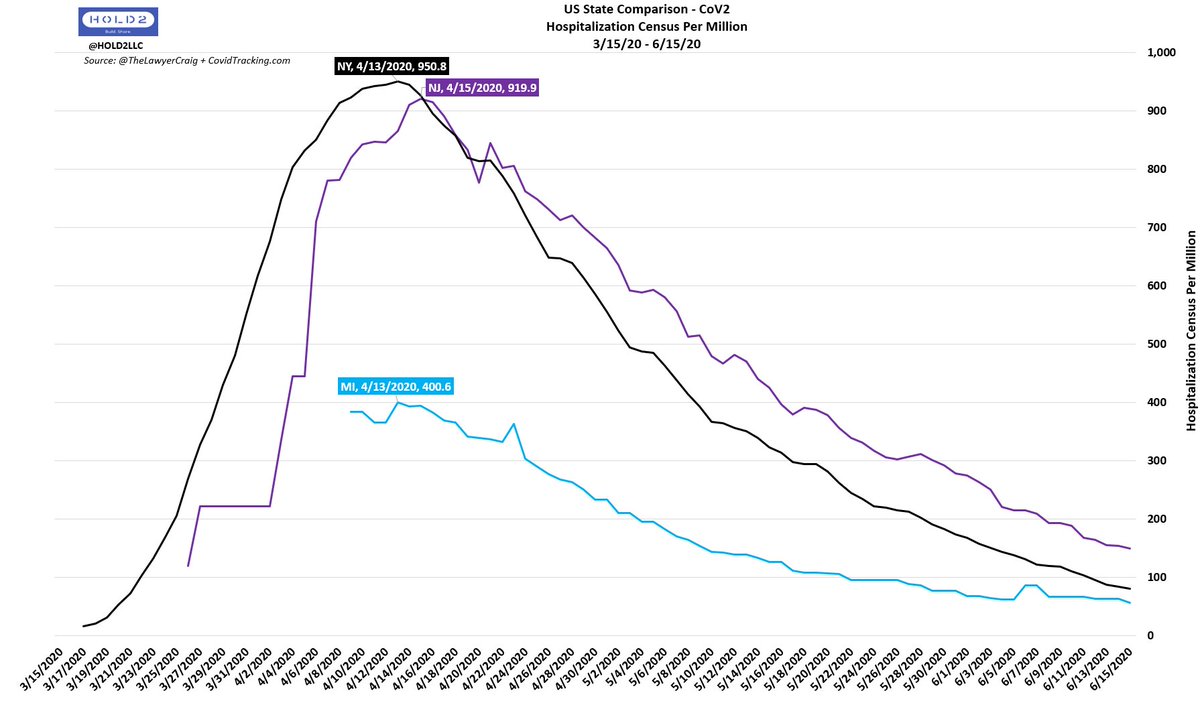
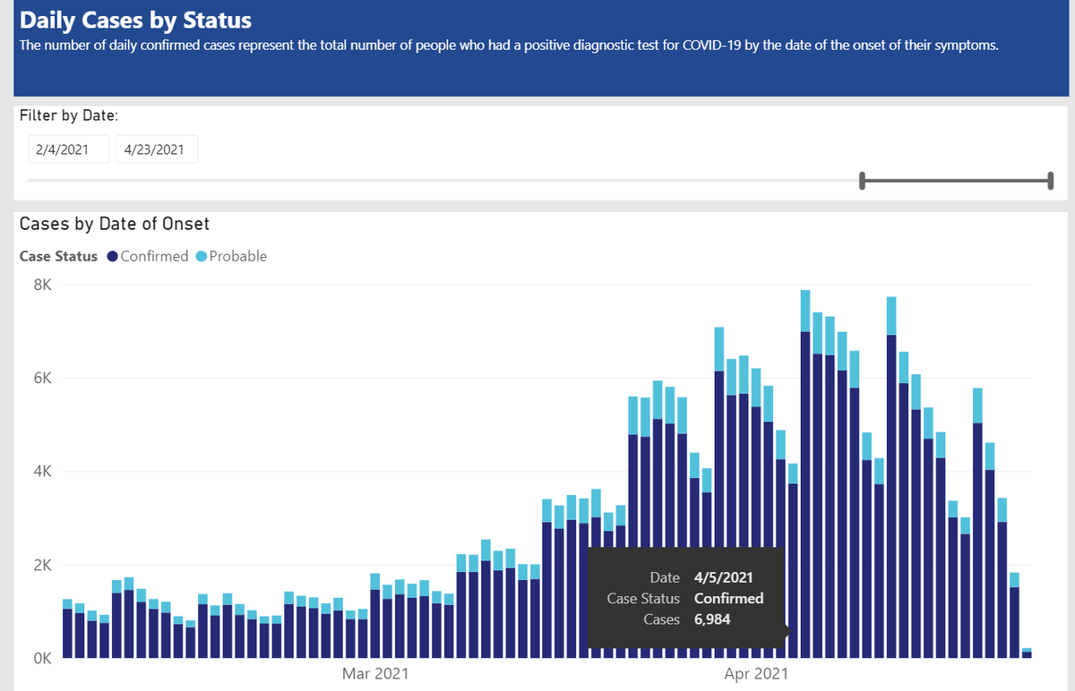
Just 2 days later on 4/16, everything began materializing.
The inevitable drop - despite MI choosing not to lock down again - began in earnest.
/6
The inevitable drop - despite MI choosing not to lock down again - began in earnest.
/6
https://twitter.com/Hold2LLC/status/1383119850051080192?s=20
Now, here we are on 4/23/21 with huge drops in Hospitalizations in MI/NY/NJ just as we expected and stated.
Is this not how Dr. Jacobs (@TheAngryEpi) analyzes data and comes to conclusions on policy advice?
How does the rest of the PH/Epi world do it?
/END
Is this not how Dr. Jacobs (@TheAngryEpi) analyzes data and comes to conclusions on policy advice?
How does the rest of the PH/Epi world do it?
/END
Disappointingly, we have our answer.
No response. No defense of her attacks on me nor her claims about the data.
We can only hope her followers see all of this and incorporate some critical thought into evaluating the rest of what she says.
No response. No defense of her attacks on me nor her claims about the data.
We can only hope her followers see all of this and incorporate some critical thought into evaluating the rest of what she says.

• • •
Missing some Tweet in this thread? You can try to
force a refresh