Not a proof but suggestive evidence that FDA managed to screw up one more time
It could be coincidence - around the same time everyone was becoming eligible so the run up and the decline could be related to that. Maybe supply, but J&J was fairly small anyway.
But, the whole PR around it made zero sense.
#EconTwitter was up in arms when the suspension happened. Do we know epidemiology and medicine? No. But, the extent of risk was public knowledge and the whole thing made no freaking sense. Even if you were extremely risk averse, you should've warned young women and that's it
I'm an outsider, but it sure looks like the model around drug and vaccine approvals and recommendations is broken. It is institutionalized risk aversion that's natural of bureaucracies but also seems to be pervasive in much of the related academic fields
It is the approach that magnifies even minute risk of acting and largely ignores consequences of not acting. It is "scientific" in prioritizing RCTs and completely unscientific in its resistance to incorporate outside knowledge through Bayesian (or alike) reasoning

• • •

Missing some Tweet in this thread? You can try to force a refresh
 

Keep Current with Wojtek Kopczuk

Wojtek Kopczuk Profile picture

Stay in touch and get notified when new unrolls are available from this author!

Read all threads

This Thread may be Removed Anytime!

PDF

Twitter may remove this content at anytime! Save it as PDF for later use!

Try unrolling a thread yourself!

how to unroll video
  1. Follow @ThreadReaderApp to mention us!

  2. From a Twitter thread mention us with a keyword "unroll"
@threadreaderapp unroll

Practice here first or read more on our help page!

More from @wwwojtekk

20 Apr
There are 170,000 gas stations in the US. Did we subsidize building them? Tax carbon and let the market figure out how many charging stations to build and where
Talk about corporate welfare
Read 9 tweets
19 Apr
UEFA consists of 55 national federations. To give an example I'm familiar with, the Polish one (PZPN) has 6679 registered clubs and 500,000 registered players (the country of 38m people). There is a pyramid of different levels of competitions - youth, amateurs, professionals /1
That's a lot of teams (my hometown of 300,000 people has 6, but there is a village of 350 people close by that has one & it competes in a league), a lot of money, a lot of vested interests and a lot of politics too. You have good (inclusivity), bad (corruption) and opaque. /2
What we are seeing is partly bargaining between the small number of teams at the top and the rest and partly an attempt to extract more consumer surplus (and maybe grow the market too), with UEFA and national federations insiders threatened in the middle /3
Read 10 tweets
1 Nov 19
As promised: long and boring thread about income vs consumption tax. TL;DR they are not as different as you might think. Income taxation distorts saving and consumption taxes are harder to make progressive in the short term, but they are close cousins 1/29
Let’s start with (national) income identity:
Labor income (L)+Capital Income (K)+Transfers (G) -Taxes (T)=Consumption (C)+Saving (S)
where T should be thought of here as taxes other than consumption/income tax that we are about to introduce.
I’ll mostly ignore foreigners 2/29
What would be an income tax? It’d be a tax on the left hand side or it could also be a tax on L+K (not the same from distributional and political economy standpoint, but I’ll put it aside). I’ll mostly ignore T and G and think about L+K. 3/29
Read 29 tweets
15 Oct 19
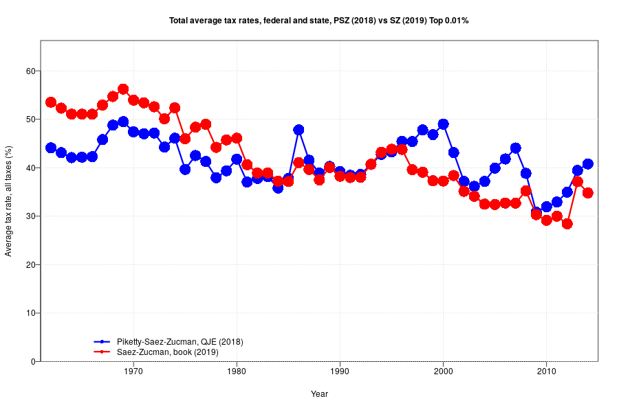
Time for my substantial comments about the @gabriel_zucman and Emmanuel Saez tax series. I'll run with numbers for top 0.01%, over 1962-2014. I'm still to fully digest top 400 and projections to 2018. So, first things first: the QJE and the paper show different patterns:
Just to make sure it is not missed: these are very different patterns. Between 1962 and 2014, the QJE series shows 3.3pp drop. The book one shows 18.7pp drop. Volatility differs to.
What makes them different? This (improved) animation illustrates and the thread goes over it more slowly:
Read 34 tweets
14 Oct 19
I'll post a longer thread with substantial comments later, but for now I'll just describe where the bodies are buried in the comparison of the refereed QJE DINA paper and the book/NYT animation

Tl;dr - here is my animation
/thread
I'll show everything for top 0.01%. Because the QJE stops in 2014, I'll stop there too and I'll show it starting in 1962 when micro files start and QJE has details.

Note the milder pattern in the blue line and a strong trend in the red one - that's where we are heading.
There are two important things that changed. One is assumptions about incidence. Most importantly, corporate incidence is assumed on shareholders only, rather than all non-housing capital (nothing is on labor in either case)
Read 9 tweets
11 Oct 19
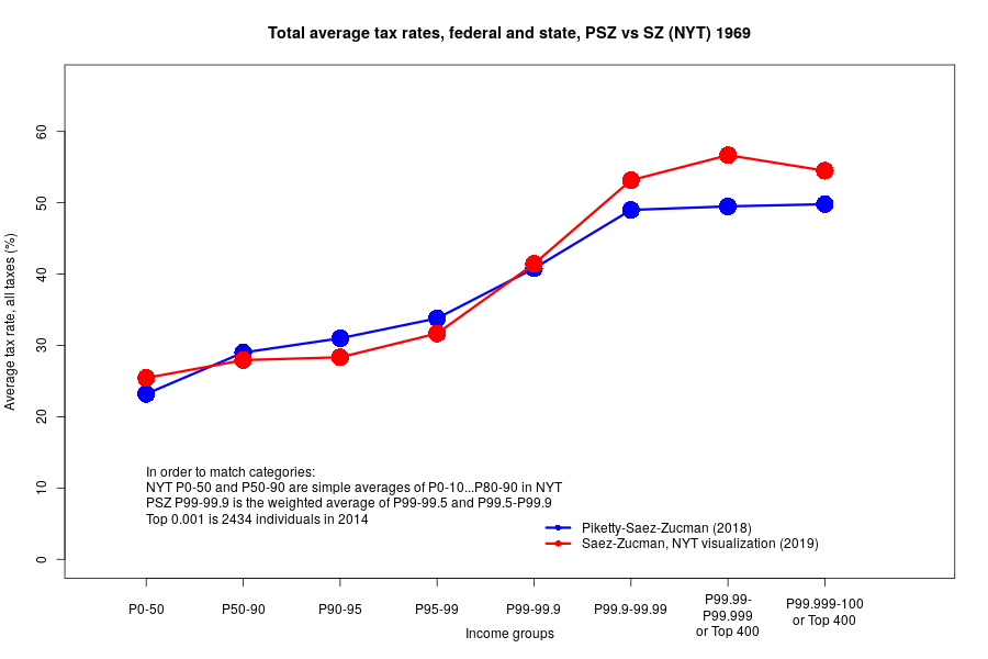
Following up on the major discrepancy between NYT visualization and the published QJE paper (see the quoted thread). Below is the comparison of what is in the two sources. They generally don't line up and the discrepancy goes in the direction of the trend visible in NYT graphics
To illustrate - compare 1969, 1984, 1999, 2014
Just to be clear: PSZ (2018) is a peer-reviewed paper published in QJE, a top economics journal, gabriel-zucman.eu/files/PSZ2018Q…
The NYT visualization is based on data from the forthcoming book that's supposed to follow the same methodology with just some adjustments. Details unknown.
Read 11 tweets

Did Thread Reader help you today?

Support us! We are indie developers!


This site is made by just two indie developers on a laptop doing marketing, support and development! Read more about the story.

Become a Premium Member ($3/month or $30/year) and get exclusive features!

Become Premium

Too expensive? Make a small donation by buying us coffee ($5) or help with server cost ($10)

Donate via Paypal Become our Patreon

Thank you for your support!

Follow Us on Twitter!