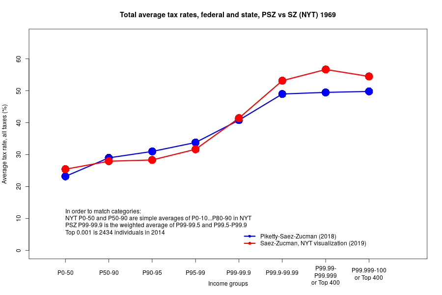
The NYT visualization is based on data from the forthcoming book that's supposed to follow the same methodology with just some adjustments. Details unknown.
-PSZ data: gabriel-zucman.eu/files/PSZ2017A…, Table TG1
-NYT (h/t @davidawaldron): static01.nyt.com/newsgraphics/2…
- I had to merge categories in P0-50, P50-90 (NYT data) and P99-99.9 (PSZ) so that they match
- Top 400 and P99.999-P100 are not the same - 400 vs 2434 people in 2014


