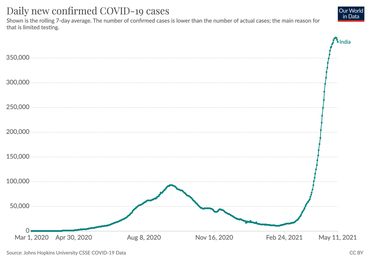
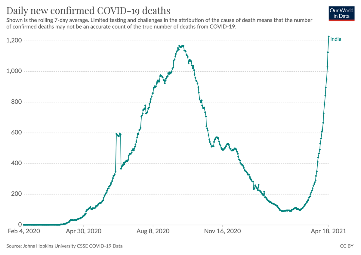
Finally an update from India that shows that things started to change in a positive direction.

Confirmed cases peaked and started to come down.

Cases are still high and insufficient testing means that many cases are missed, but I think it's actually the peak (see next tweets).
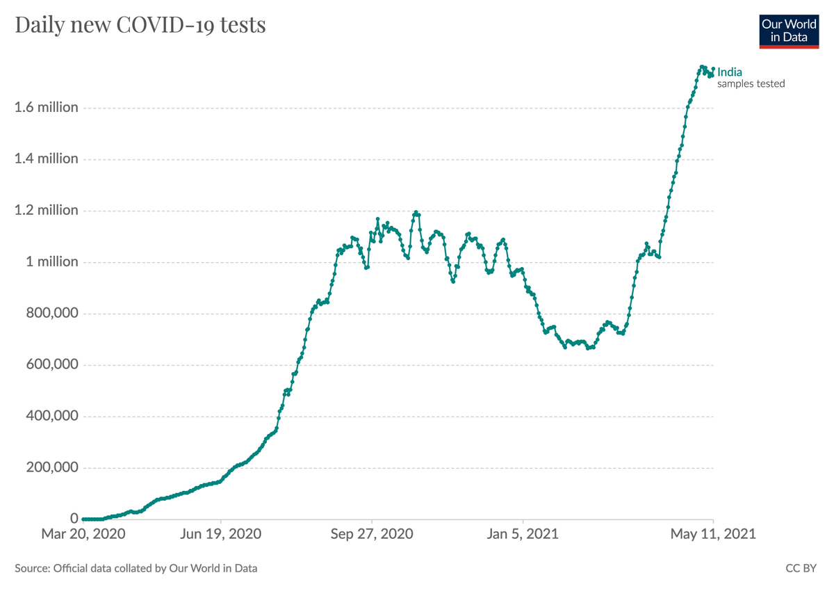
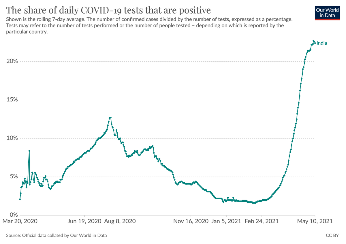
Testing in India has not declined.
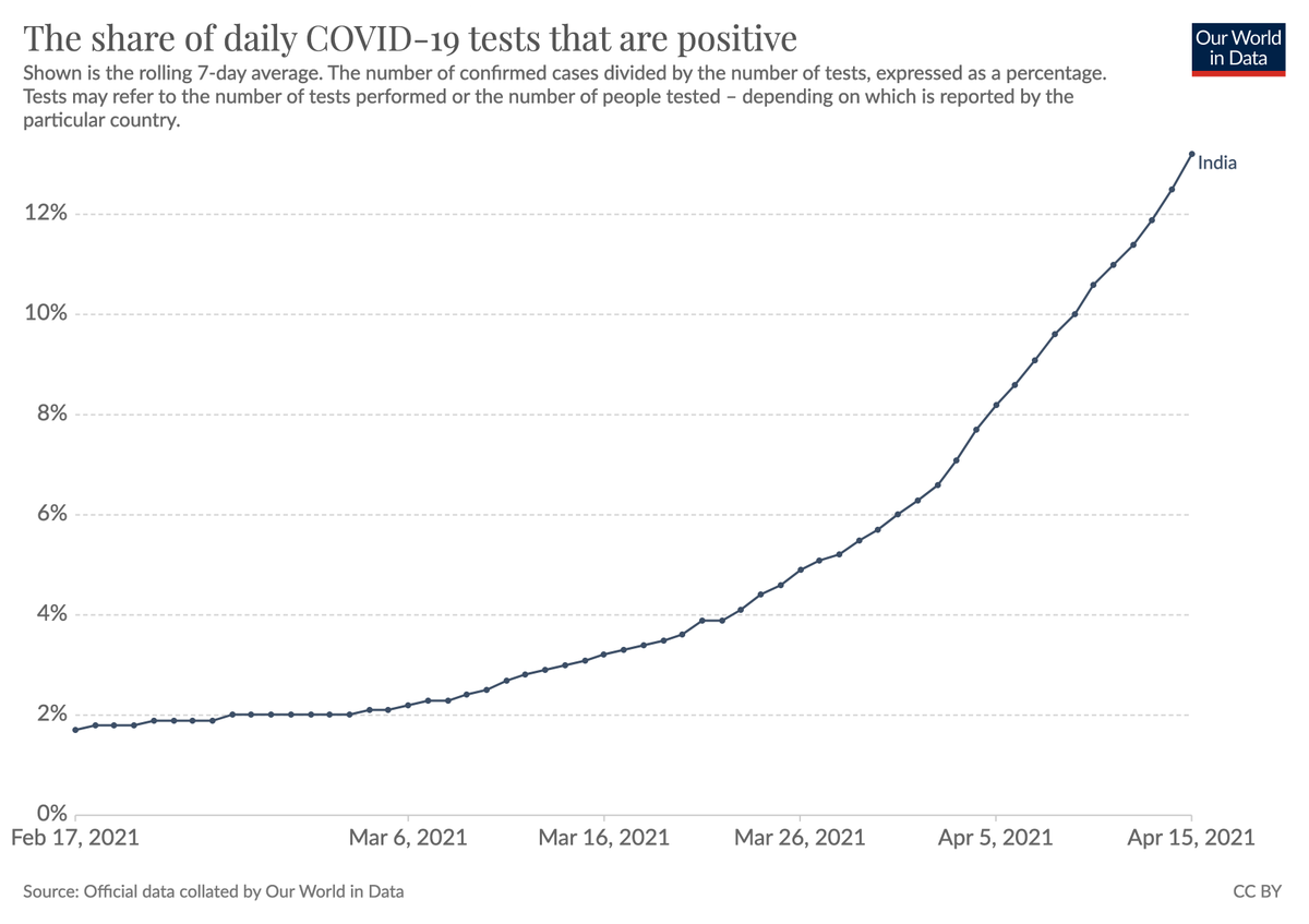
During the rapid outbreak the test positivitiy rate also increased rapidly. This has now largely stopped.

I'd interpret this as suggesting that the gap between confirmed cases and total cases was increasing for a long time, but that this isn't continuing anymore.
As we all have now seen many times during the pandemic there is a large delay between changes in cases and changes in deaths.
People get sick before they die.

We should therefore expect that the number of deaths continues to increase before it follows the decline of cases.
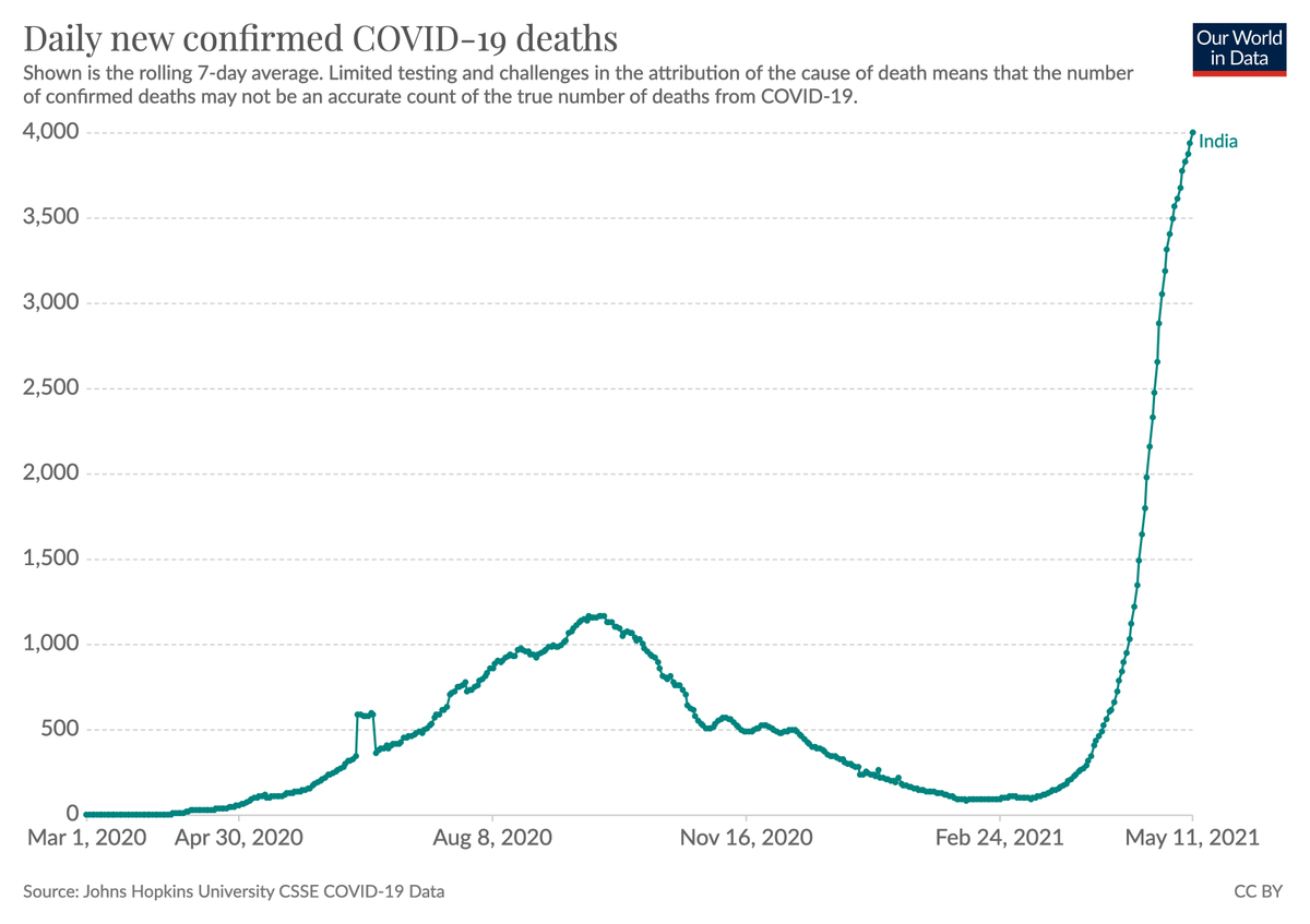
It's a very long way down. It's hard to know large the gap between confirmed and total cases is, but estimates for that ratio are commonly much higher than 10.

This means that many millions are getting infected daily and that means that the situation can reverse quickly.
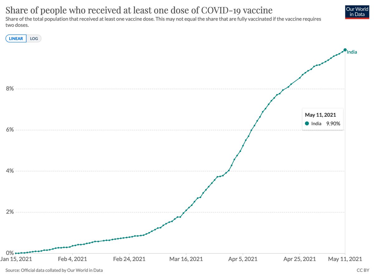
Every tenth person in India has received a first dose of the COVID vaccine and so it's also still a long way until everyone in the population is protected.

In our Data Explorer you find all of the above data (and the same for countries around the world): ourworldindata.org/explorers/coro…
• • •

Missing some Tweet in this thread? You can try to force a refresh
 

Keep Current with Max Roser

Max Roser Profile picture

Stay in touch and get notified when new unrolls are available from this author!

Read all threads

This Thread may be Removed Anytime!

PDF

Twitter may remove this content at anytime! Save it as PDF for later use!

Try unrolling a thread yourself!

how to unroll video
  1. Follow @ThreadReaderApp to mention us!

  2. From a Twitter thread mention us with a keyword "unroll"
@threadreaderapp unroll

Practice here first or read more on our help page!

More from @MaxCRoser

21 Apr
To understand a global pandemic we need global data.

But even more than one year into the pandemic some of the most basic international data on COVID is missing.
Just because there is no international organization that brings this data together.

A thread.
To make it concrete, let's consider one set of measures for which international data is missing.

Cases, hospitalizations, & deaths *by age* would be very useful measures for decision makers, for epidemiologists, and really for everyone who wants to understand what is happening.
For a disease like COVID – for which the severity of the outcome is so dependent on the age of the infected person –, these metrics are absolutely key.

(e.g. differences in the mortality rate accross countries are to a good part due to different age profiles)
Read 15 tweets
20 Apr
Confirmed cases are always only a fraction of all cases as not every infected person is tested and diagnosed.

The question is, how large of a fraction?

The IHME model for India suggests that the number of total cases is 29-times higher than the number of confirmed cases.
As you’ve seen in the chart above the latest data from the model is for April 11.

If the ratio between confirmed cases and total cases has stayed at 29, then the 233,074 cases that India confirms now correspond to 6.76 million cases daily.

(233,074*29=6.76M)
All these epidemiological models, including the IHME model, are far from perfect and that's important to keep in mind.
Read 4 tweets
18 Apr
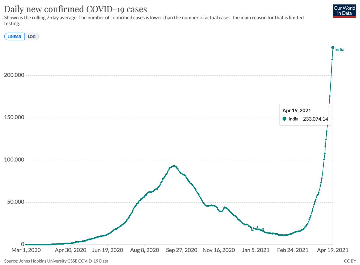
Two months ago India confirmed 11,300 cases per day.

This shows the rise of confirmed cases since then.
A straight line on a logarithmic axis tells you that you are looking at exponential growth with a constant growth rate.

Now India confirms more than 200,000 cases a day.
This is how the rate of positive tests changed in that same period.

A strongly rising positive rate tells us that the testing efforts are not keeping up with the size of the outbreak.

(here is all the data: ourworldindata.org/explorers/coro…)
COVID deaths in India have now surpassed the previous peak from last September.
Read 6 tweets
14 Apr
Forests in England declined for many centuries up until the late 19th century.

Then deforestation came to an end and was actually reversed: the forested area has doubled since then.

From @_HannahRitchie’s work on forests and deforestation ourworldindata.org/forests-and-de…
Many are asking good questions, so I'll write a short thread.

If you want to know more then follow Hannah (@_HannahRitchie), she has a lot of work coming out on forest transitions.
The tweet-sized summary is that humans – throughout history and today – cut down forests for two big reasons:

Because they need the trees themselves or because they find the forested land to be more valuable when it is not forested.
Read 8 tweets
4 Apr
This thread is more personal than most of the things I share here, but I’m at my limit with Jason Hickel.

I want to explain why I dislike him so much and how we got here.

This is a personal story over several years so it’ll take a bit of time.
Jason Hickel is an anthropologist who wrote many articles and tweets about me, my motivations, and my work in the last couple of years.

I’m sure there are good points among them, where he is right and I’m wrong. But some of his big claims against my work are false.
One such big claim he put forward in an article in The Guardian. It was about my work on global poverty and he claimed that it “couldn’t be more wrong” to say that global poverty has declined.

It was shared tens of thousands of times. (theguardian.com/commentisfree/… ).
Read 72 tweets
1 Apr
This just got published and is very good.

A new study that asks: How has extreme poverty changed in the last 2 centuries?

The authors estimate poverty in many ways.
Their main innovation is to rely on 'a cost of basic needs approach' based on Bob Allen’s recent work.

👇 thread
The authors write that in 1820 roughly three-quarters of the world "could not afford a tiny space to live, food that would not induce malnutrition, and some minimum heating capacity.”

As you see in the chart above, the huge majority of the world was extremely poor in the past.
Since 1820 the share in extreme poverty across the globe declined to 10%, "the lowest level ever achieved", according to this study.

But of course more recently the share in extreme poverty has unfortunately increased.
Read 20 tweets

Did Thread Reader help you today?

Support us! We are indie developers!


This site is made by just two indie developers on a laptop doing marketing, support and development! Read more about the story.

Become a Premium Member ($3/month or $30/year) and get exclusive features!

Become Premium

Too expensive? Make a small donation by buying us coffee ($5) or help with server cost ($10)

Donate via Paypal Become our Patreon

Thank you for your support!

Follow Us on Twitter!

:(