#Bitcoin update
1/8
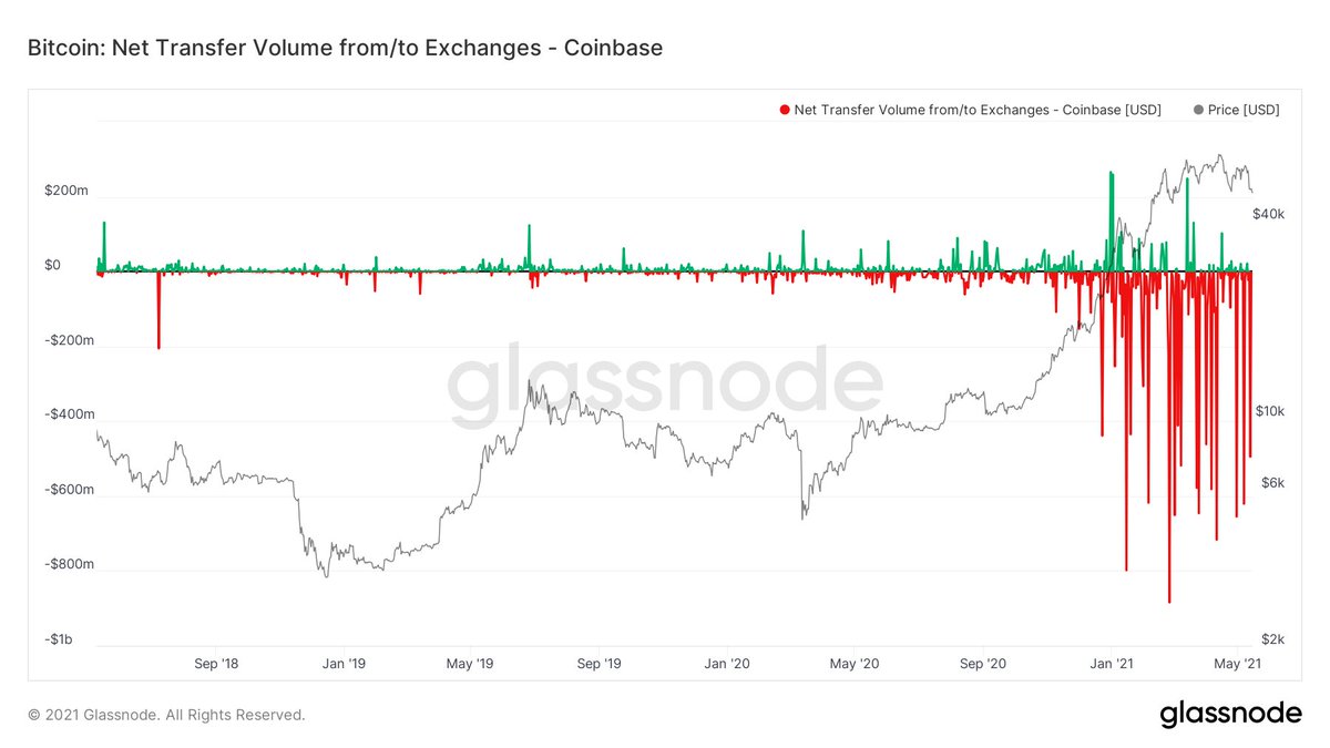
Institutional buyers on Coinbase are accumulating throughout this consolidation phase with another strong outflow just recently.
1/8
Institutional buyers on Coinbase are accumulating throughout this consolidation phase with another strong outflow just recently.
2/8
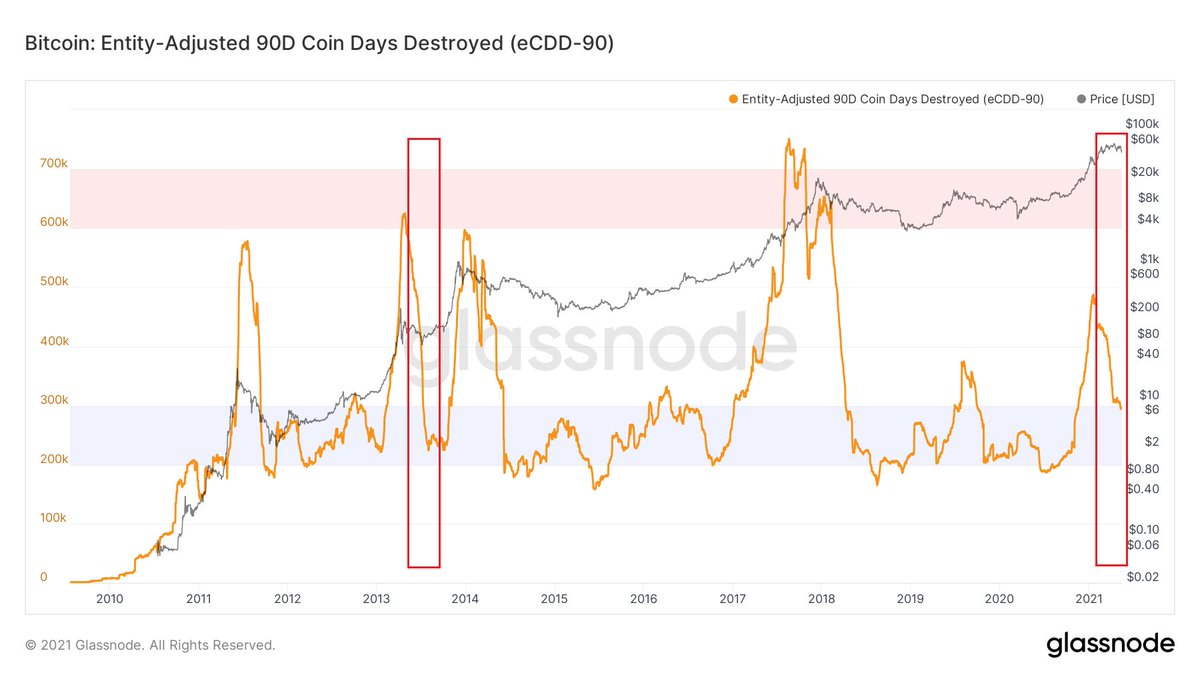
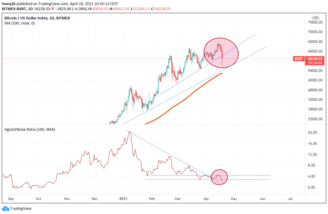
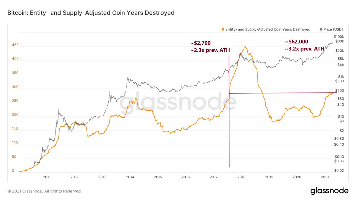
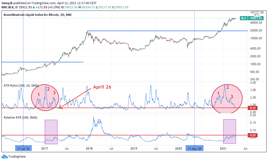
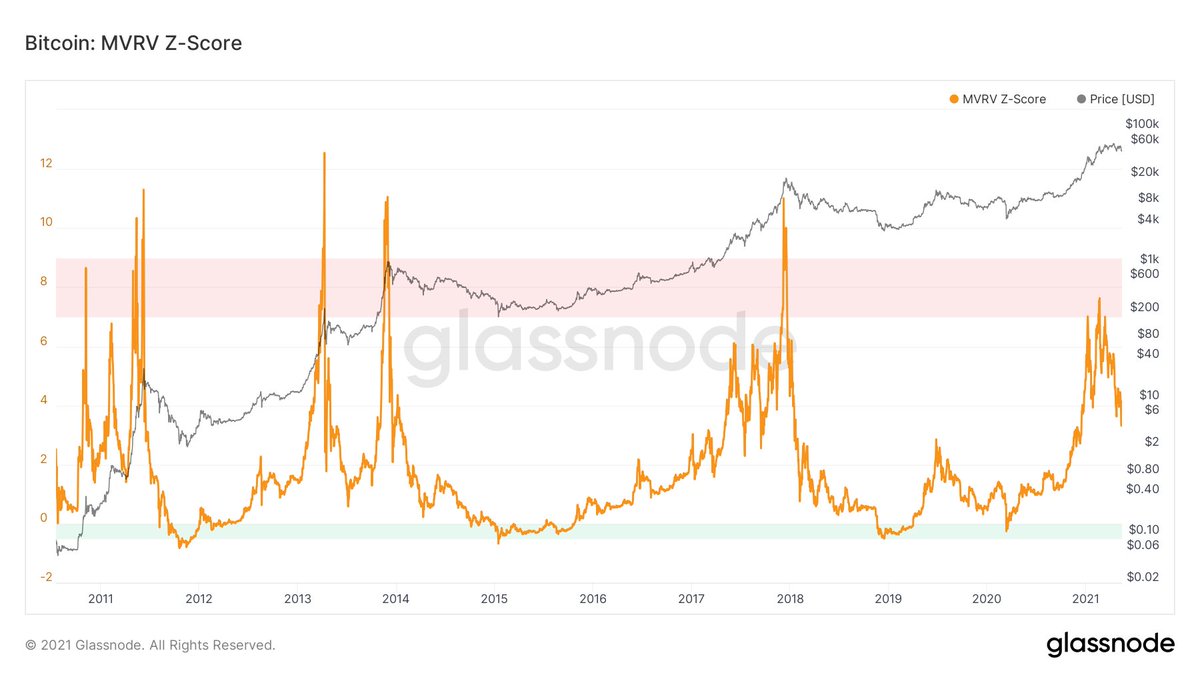
Key on chain cycle indicators are leaving their (over)heated ranges and are now at levels from which significant upside has been realized in past cycles.
Key on chain cycle indicators are leaving their (over)heated ranges and are now at levels from which significant upside has been realized in past cycles.
3/8
When this metric reached values of 4, the bull market was hating up and had in most cases just surpassed the previous high. Average days until the cycle top was c. 240 days. In 2013 it was the longest with 276 days due to the longer interim consolidation phase.
When this metric reached values of 4, the bull market was hating up and had in most cases just surpassed the previous high. Average days until the cycle top was c. 240 days. In 2013 it was the longest with 276 days due to the longer interim consolidation phase.
4/8
I have previously shown that we might have similarities to the first 2013 move due to its duration from a trend perspective.
I have previously shown that we might have similarities to the first 2013 move due to its duration from a trend perspective.
https://twitter.com/2210ft/status/1385652998370627586?s=20
5/8
Today we are in for ca. 145 days since last December when we crossed this threshold. This is c. 60% based on the average duration and c. 50% based on 2013. If history is a guide this bull market is not over but we are consolidating ahead of a next move.
Today we are in for ca. 145 days since last December when we crossed this threshold. This is c. 60% based on the average duration and c. 50% based on 2013. If history is a guide this bull market is not over but we are consolidating ahead of a next move.
6/8
This might mean that we will see longer sideways consolidation over the next months. In 2013 the consolidation lasted from April to October with a big move in the last Quarter.
This might mean that we will see longer sideways consolidation over the next months. In 2013 the consolidation lasted from April to October with a big move in the last Quarter.
7/8
The last strong final move in 2017 was also towards the year end, when also traditionally equities and risk assets tend to perform well.
The last strong final move in 2017 was also towards the year end, when also traditionally equities and risk assets tend to perform well.
8/8
I therefore think given past cycle dynamics and intra year seasonality we could see some more consolidation over even several months from which we could finally go into a massive bull run. Always zoom out and be patient.
I therefore think given past cycle dynamics and intra year seasonality we could see some more consolidation over even several months from which we could finally go into a massive bull run. Always zoom out and be patient.
• • •
Missing some Tweet in this thread? You can try to
force a refresh