HUGE misunderstandings arising from Active Addresses vs Entities.

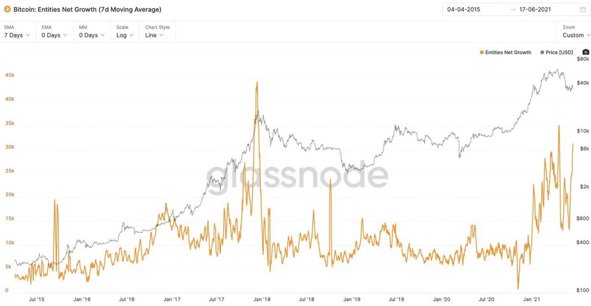
Entities: Estimates users via on-chain forensics

Active Addresses: Impacted by user growth, wallet activity (trade conditions), mempool congestion (drops in hash rate), fees spamming.
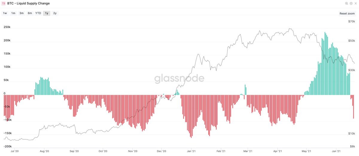
Chart: Unprecedented growth of users joining the network during this price dip while active addresses plummet.

-> It's a time of low volatility (less traders sending coins between exchanges to trade) and at a time when the network hash rate experienced The Great China Migration.
Any analysis using active addresses in this time where China tripped the power cord in April (power outages) and a historic banning of miners in May/June will be stupidly flawed.
Another example of bad address analysis:

The "whales are dumping" meme.

No. It's just a count of addresses that contain more than 1000 BTC.

It could mean exchanges depleting inventory, or whale population is reducing, or just wallet consolidation. Nothing is definitive.
In reality, under entity analysis across ALL participants including exchanges... whales 10k+ are selling, while 1k-10k are buying what was sold. Everyone else is stacking. Speculative exchange inventory is depleting.

(It's bullish supply shock)
In all of these examples, address analysis is bearish based on unthoughtful "past correlation" as a flawed way to draw a conclusion. Address analysis fails to dissect exactly what's going on. Unprecedented times of change on the network is what's going on!
No single chart can be used as a holy grail, there's 100s of views into the network and it's detective work to figure out exactly what's happening.

@glassnode entities data is $600 per month. I'm not seeing any analyst posting bearish charts using this tier of data.

• • •

Missing some Tweet in this thread? You can try to force a refresh
 

Keep Current with Willy Woo

Willy Woo Profile picture

Stay in touch and get notified when new unrolls are available from this author!

Read all threads

This Thread may be Removed Anytime!

PDF

Twitter may remove this content at anytime! Save it as PDF for later use!

Try unrolling a thread yourself!

how to unroll video
  1. Follow @ThreadReaderApp to mention us!

  2. From a Twitter thread mention us with a keyword "unroll"
@threadreaderapp unroll

Practice here first or read more on our help page!

More from @woonomic

8 Jul
As price grinds sideways-bearish, coins are being scooped off the exchanges at a very bullish rate.

PS. The latest sizing of withdrawals vs deposits are at local highs at levels that signal a bottom, whales are scooping.
Here's another view of it, in terms of supply shock... the ratio of coins available on exchanges vs total supply (inverted so it tracks price).

Quantitative supply shock underway.

Last time I saw this, it took some time before price bounced (Oct 2020); it bounced hard.
A qualitative view of supply shock. Measured in holders who ain't likely to sell vs the ones that do.
Read 4 tweets
6 Jul
JP Morgan is bearish on the GBTC unlock coming up.

Here I'll go through the inner workings so you can make up your own mind.

There's 2 impacts, one bullish, one bearish. The key is in how they interact. IMO it'll be immediately bullish.

coindesk.com/grayscale-unlo…
Grayscale is a unique product. It's designed as a black hole that sucks in BTC.

No BTC ever leaves the trust, apart from Grayscale taking its 2% management fees from the holdings, this is the only way to reduce the GBTC inventory.
How does GBTC increase its holdings?

They allow accredited investors to add BTC into the trusts holdings in return for receiving shares in the trust (which normally trades at a premium to BTC).

This is the so-called "carry trade".
Read 8 tweets
20 Jun
Oh my, Rick Astley is back. Coins are moving back to the HODLer who never deserts his BTC.
The previous chart was a 30 day sum of coin movements.

Here's the 7 day view showing greater granularity.

We can see how the mass of coins dumped out to speculative hands are being re-accumulated by strong hands in a pattern similar to the COVID recovery (8 weeks to recover).
So who is selling?

Whales aren't selling.
Sharks aren't selling.
Dolphins aren't selling.

Big holders are holding.
Read 9 tweets
18 Jun
#marketupdate, IMO from on-chain is sideways then bullish in maybe a week or so.

Some downside risk if stonks tank, a lot of rallying in the DXY (USD strength) which is typical of money moving to safety.
The first thing to look at is to answer "are we in a bear market". Welp, bear markets start when no new buyers enter to support price and that aint happening, we have healthy growth of new users joining the network.

Let this frame all other metrics.
Of primary interest is capital rotation from stablecoins back into the crypto markets (I'll say that's mainly BTC since alt coins are reducing in dominance).

All of that dry powder sitting on the sidelines has started flowing back in.
Read 11 tweets
17 Jun
I've updated NVT Signal to correct for upward drift in the metric (due to volumes moving off the blockchain and only L2).

And yes, BTC is OVERSOLD at historic levels.
NVTS was first published in Feb 2018 by @Kalichkin, as a more responsive trading signal based on my NVT Ratio.

woobull.com/nvt-signal-a-n…
Exchange dominance increased over time. This had the effect of making a proportion of the long term investor volume invisible to on-chain analysis, only happening inside exchanges.
Read 6 tweets
1 Jun
A thread about NVT, one of the first on-chain signals first published in Feb 2017.

This is a 2021 re-hash of my NVT learnings since then.

"How to use on-chain volume to establish a fundamental valuation for Bitcoin."
Ever seen this chart of BTC's on-chain volume vs its market cap and wondered why they track so closely?

On-chain volume measures the amount of money moving between investors as seen on the blockchain per day. It's highly correlated to market cap.

But why?
Let's lay down a first principles equation for a pure store of value network:

value moving between investors = value of the network * how much the money supply churns

In short form:
I = M * V

where:
I = Value moving between investors
M = Market Cap
V = Monetary Velocity
Read 13 tweets

Did Thread Reader help you today?

Support us! We are indie developers!


This site is made by just two indie developers on a laptop doing marketing, support and development! Read more about the story.

Become a Premium Member ($3/month or $30/year) and get exclusive features!

Become Premium

Too expensive? Make a small donation by buying us coffee ($5) or help with server cost ($10)

Donate via Paypal Become our Patreon

Thank you for your support!

Follow Us on Twitter!

:(