🧵Well, yesterday, Dr. Vanderhoff in his press conference finally got with the program and said "We are seeing early indicators that cases appear to be peaking and beginning to point toward a decline."
.....
.....
.....

(video: tinyurl.com/3e2khvxx)
I'm so glad he's so timely with that information. Although to anyone who actually looks at the data itself, it's been pretty clear for weeks now that we are declining.
Not 'starting', not 'early indicators' not 'appears' - it's right there, glaringly obvious, nothing but their own data, attached to this post and a hundred others just like it for all to follow along.
So how did our Super Genius Director Vanderhoff determine that we may be seeing those 'early' signs? Some super fancy algorithm? Well-established epidemiological modeling or benchmarks?
Oh no no. He does back of the envelope estimations of what he thinks we'll see with cases/100,000 this week - and says that it'll be the first time in a long time that it will probably be less than the week before.....
Although, looking at their own data, I can see that on 9/23/21 their numbers were 698.7 cases/100,000, and on 9/30/21 it was 616.7 cases/100,000. Correct me if I'm wrong, but I do believe that 616.7 is significantly less than 698.7....
He didn't just do some back of the envelope estimations. He also compared this Tuesday's REPORTED numbers with last Tuesday's REPORTED numbers & this Friday's with last Friday's. It looks like they're lower! He sees a little ray of sunshine that said that maybe we hit the top.
SO.
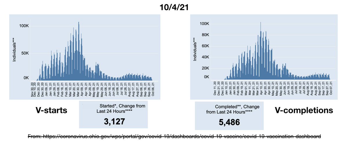
For all of you non-experts who don't want to do it the super duper expert way like Dr. Vanderhoff, but in that silly, let's look at the actual data way, I have attached my daily misinformation graphs, above.
I have also linked a clip of yesterday's press conference where he walks us through his Expert Method. I am for real not making this up. I really wish I were though.

#Ohio
#COVID19
#InThisTogetherOhio
#FactsNotFear
#DataAnalytics
#impeachDewine

• • •

Missing some Tweet in this thread? You can try to force a refresh
 

Keep Current with Kathryn Huwig's 'Beyond the Data'

Kathryn Huwig's 'Beyond the Data' Profile picture

Stay in touch and get notified when new unrolls are available from this author!

Read all threads

This Thread may be Removed Anytime!

PDF

Twitter may remove this content at anytime! Save it as PDF for later use!

Try unrolling a thread yourself!

how to unroll video
  1. Follow @ThreadReaderApp to mention us!

  2. From a Twitter thread mention us with a keyword "unroll"
@threadreaderapp unroll

Practice here first or read more on our help page!

More from @ohio_data

6 Oct
⭐️⭐️⭐️⭐️⭐️⭐️⭐️⭐️⭐️⭐️⭐️

🧵Because Ohio's COVID 'case' definition isn't expansive enough..

Along with yesterday's admission that cases were declining, Dr. Vanderhoff also announce a new adjustment to how we will count 'cases' going forward.
First of all, Ohio has one of the most expansive 'case' definitions (if not THE most expansive) of any state. We count all PCR positives, regardless of symptoms or contact like other states. But we also count 'probables' as full 'cases'.
Most other states separate these 'probables' from the confirmed by PCR cases. Not Ohio. They are full and equal 'cases' with symptomatic, low cycle threshold PCR positives.
Read 11 tweets
7 Jul
So here's a thought experiment as we watch the v-starts continue to fall with no sign of any increased interest from those who have yet to take it.
It has been put out there in the new models that having 68% of people injected is a 'low' coverage number for their calculations, while 83% (for the moment) is their goal.
But what does that mean in terms of how long it will take at our current rate of V-uptake?
Read 7 tweets
7 Jul
I've made comments previously about how 'respectful' this virus is of our holidays both before the weekend and now after -
- for those of you who haven't been following me for the long term, I think I should re-clarify what I mean by its 'respect' & why it is so important in understanding the actual danger of this virus in terms of true illness and not just people testing positive with no ill effect.
Obviously, the virus isn't actually 'respectful' - it's a virus. Holidays and weekends are meaningless when it comes to illness. You get sick when you get sick whether it's a holiday or not.
Read 16 tweets
5 Jul
It's a bit of a short bit of (mis)information today since cases aren't reported on holidays, but V information never takes a break! So here you go, today's V data, telling us the same story of those who want it, have taken it, and those that don't are not convinced. Image
I have also added a bonus graph today - one showing v-starts by reported date (blue line) and v-starts by assigned date (orange line). I haven't taken the time to actually analyze the area under the curve, but - Image
- just from eyeballing it, particularly in the last month, there have been significantly more reported v-starts than those assigned. Image
Read 4 tweets
2 Jul
So some really fascinating misinformation today - we've had a huge 'jump' in newly reported cases! Nearly TRIPLED! Everybody panic!! And they're nearly all confirmed cases! Double panic!
Must be that new Delta variant, right?
Or maybe the brand new 4th of July variant?
But the media tells us it must be bad!
(vindy.com/.../daily-covi…)
Well, interestingly enough, our new probable cases added in the last 14 days is only 19 more than yesterday's (71 vs 53) and the total new confirmed cases increased by just 1 from yesterday to today (139 to 140).
Read 9 tweets
2 Jul
We've recently heard about how it's the unV'd that are now testing positive in the hospital, with a scary % given to us. But what does it mean? How many are there in the hospital? And how do we get a good perspective on it?

Well, good news, I've become a data hoarder.
Attached, please find direct comparisons of how many COVID+ patients are/were in the hospital, how many non-COVID patients and how many empty beds there were for each of the eight regions (map showing what each region is is also attached).
The top graph is from 12/28/20 and includes the absolute height of COVID+ hospital occupancy. The lower graph is from yesterday, June 30th.
Read 11 tweets

Did Thread Reader help you today?

Support us! We are indie developers!


This site is made by just two indie developers on a laptop doing marketing, support and development! Read more about the story.

Become a Premium Member ($3/month or $30/year) and get exclusive features!

Become Premium

Too expensive? Make a small donation by buying us coffee ($5) or help with server cost ($10)

Donate via Paypal Become our Patreon

Thank you for your support!

Follow Us on Twitter!

:(