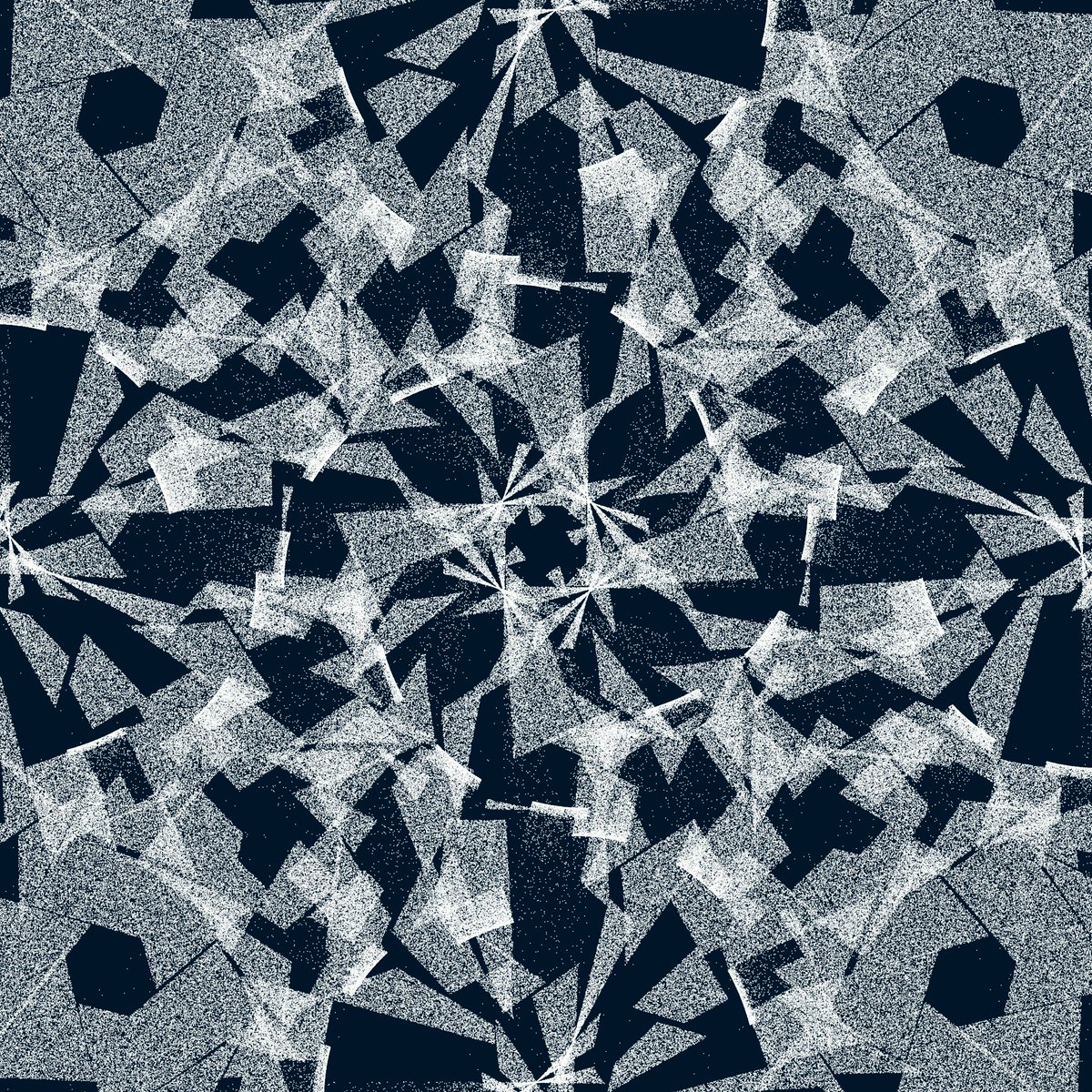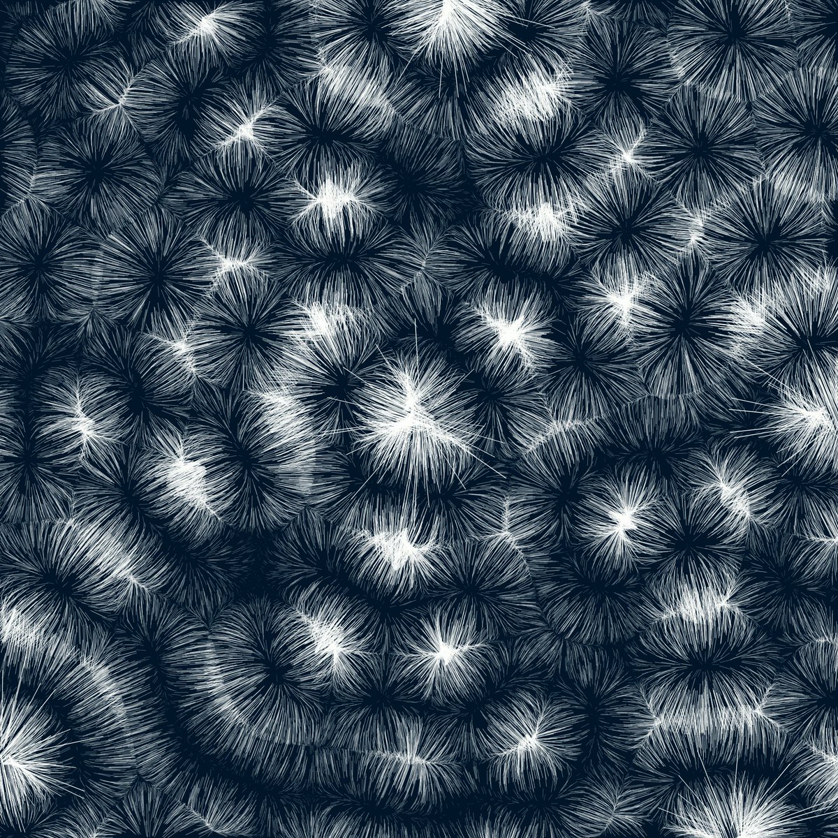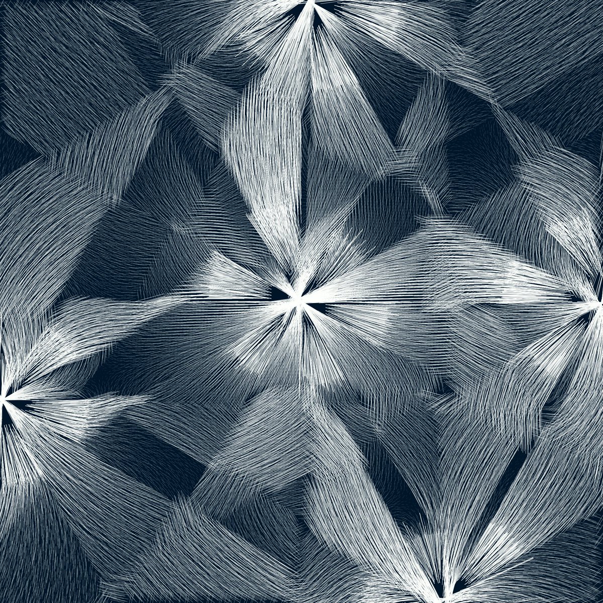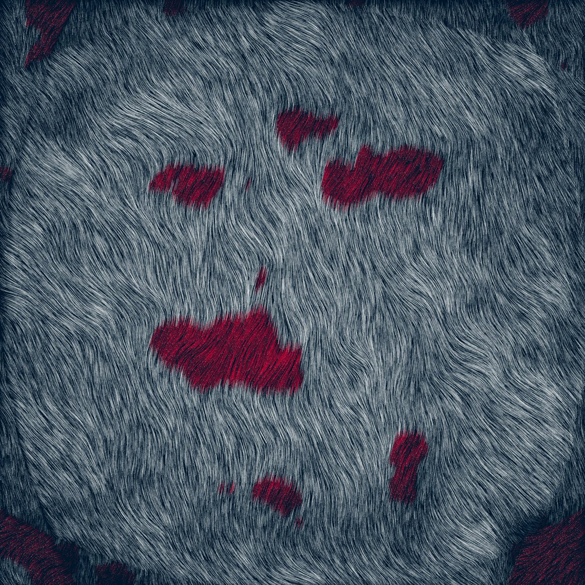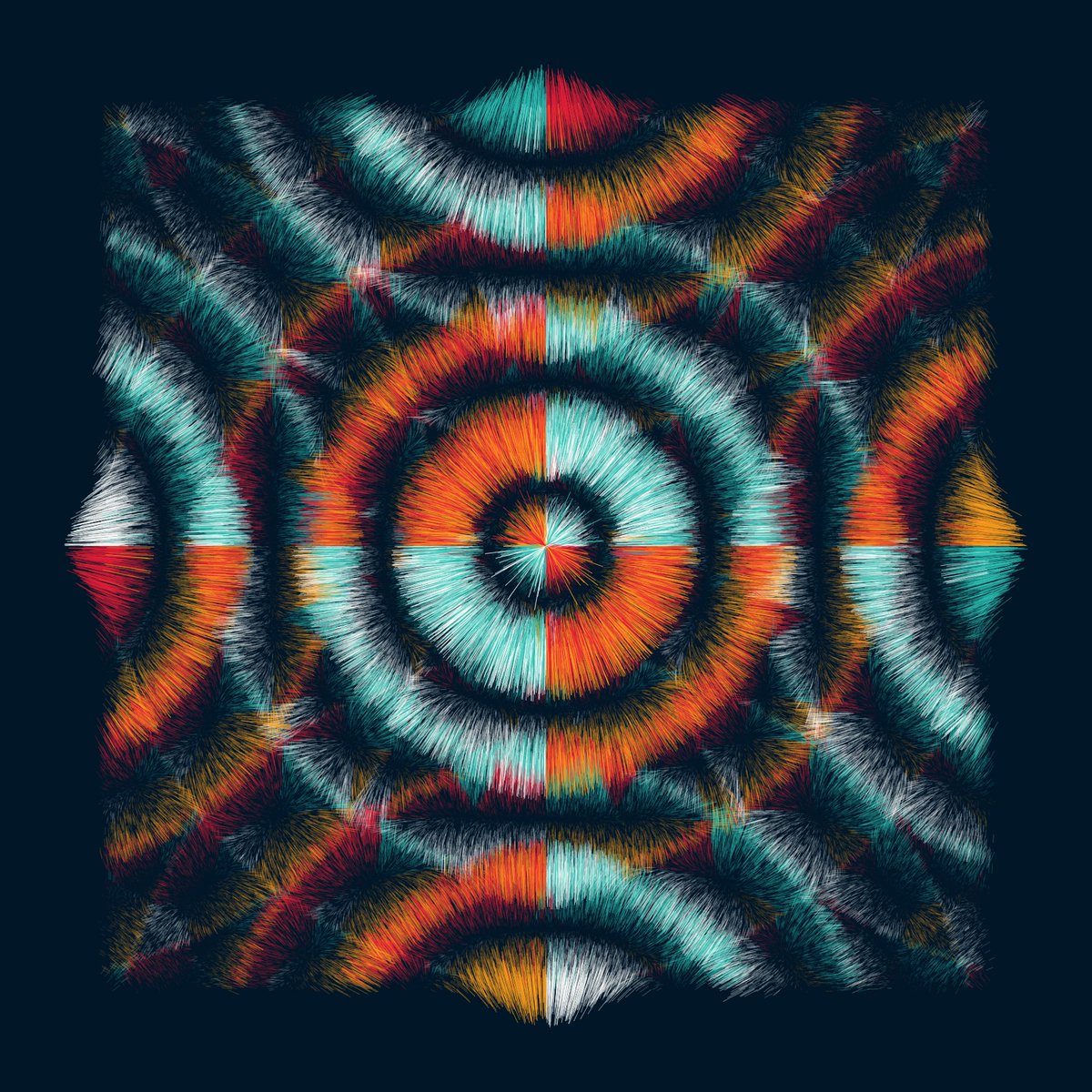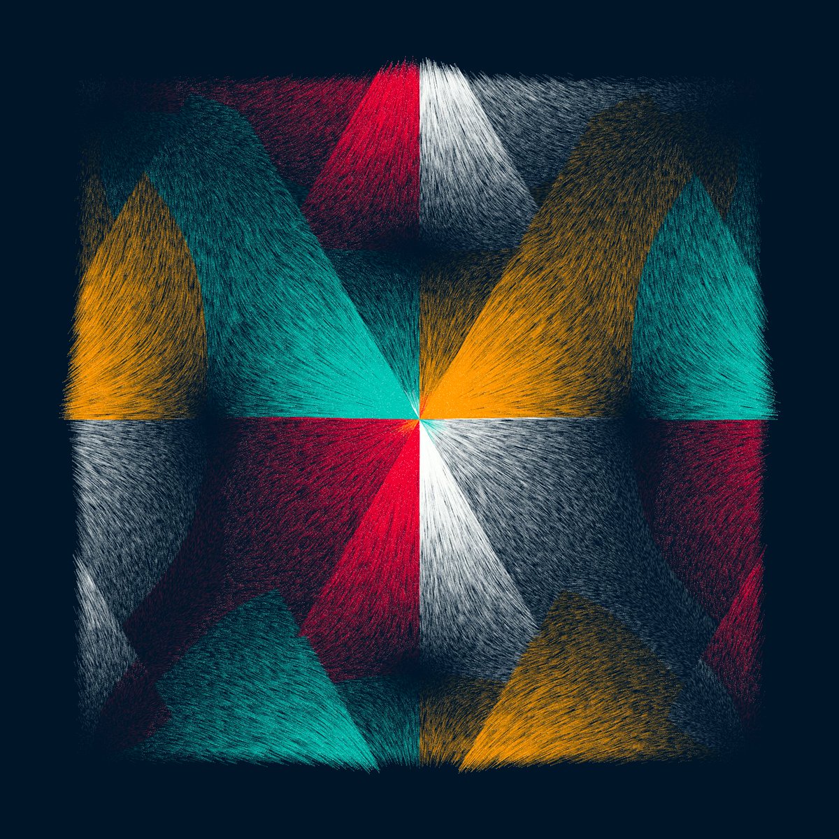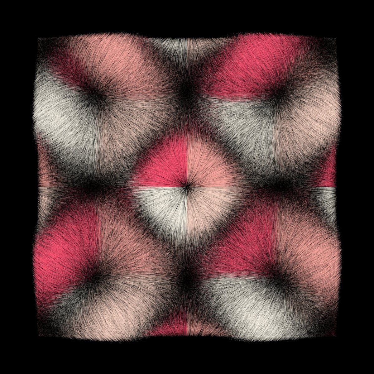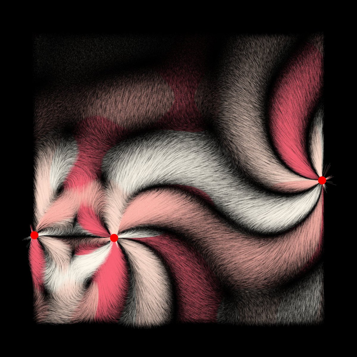
It's time to work on a new #genart project! Let's start with a simple starting idea et an ugly sketch as always🎉
The idea: starts with grid of points then add "local modifiers" that apply a simple rule around them.
The closer a point is, the more effect the rule has.
The idea: starts with grid of points then add "local modifiers" that apply a simple rule around them.
The closer a point is, the more effect the rule has.

A lot of ideas to try...
- how to arrange the points and the modifiers at the start
- a looooot of rules :)
- modifier shape (point? circle? square?), weight...
- modifiers specific to a color ?
- how distance reduces the effect of the rule (r^2 like g?)
Does this inspire you?🤔
- how to arrange the points and the modifiers at the start
- a looooot of rules :)
- modifier shape (point? circle? square?), weight...
- modifiers specific to a color ?
- how distance reduces the effect of the rule (r^2 like g?)
Does this inspire you?🤔
I've already some ideas for the modifiers effects/rules:
- attraction
- repulsion
- rotation
- random
- ...
Effect could depend of distance, cos(distance), angle, cos(angled), points color...
Here is an ugly exemple of attraction depending of angle.
- attraction
- repulsion
- rotation
- random
- ...
Effect could depend of distance, cos(distance), angle, cos(angled), points color...
Here is an ugly exemple of attraction depending of angle.

As always, I love to chat with you about that and get your feedbacks. I'll share my drafts/sketches/fails/research... 😊
I don't know where I'm going at all! But it's going to be fun to see how to have something nice with that idea together! Ready? 🔥
I don't know where I'm going at all! But it's going to be fun to see how to have something nice with that idea together! Ready? 🔥
Let's start with a square of dots... Yes that's ugly 🤣
Should the position or color be random? I've now idea... Let's code the first local modifier and see what's happening :)


Should the position or color be random? I've now idea... Let's code the first local modifier and see what's happening :)


And, as always, I get unexpected results 🤣
I wanted to implement basic attraction at the center... There is still a bug! 🪳


I wanted to implement basic attraction at the center... There is still a bug! 🪳


Ho, I had a bug with attraction, force was to strong at proximity of the modifier. I've to find a way to manage that!
Here an exemple with 5 very simple repulsive modifiers! That starts to be interesting 🔥


Here an exemple with 5 very simple repulsive modifiers! That starts to be interesting 🔥
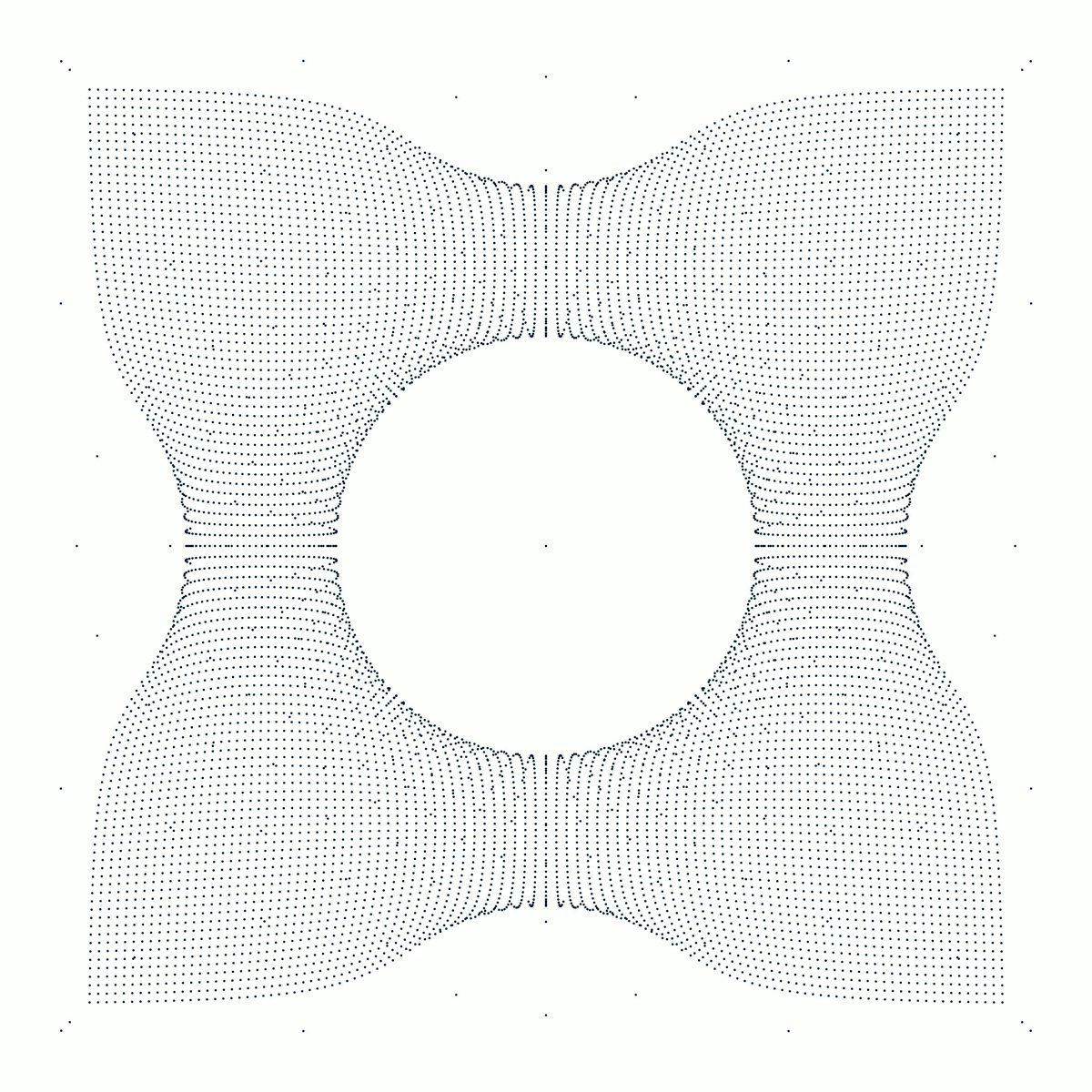

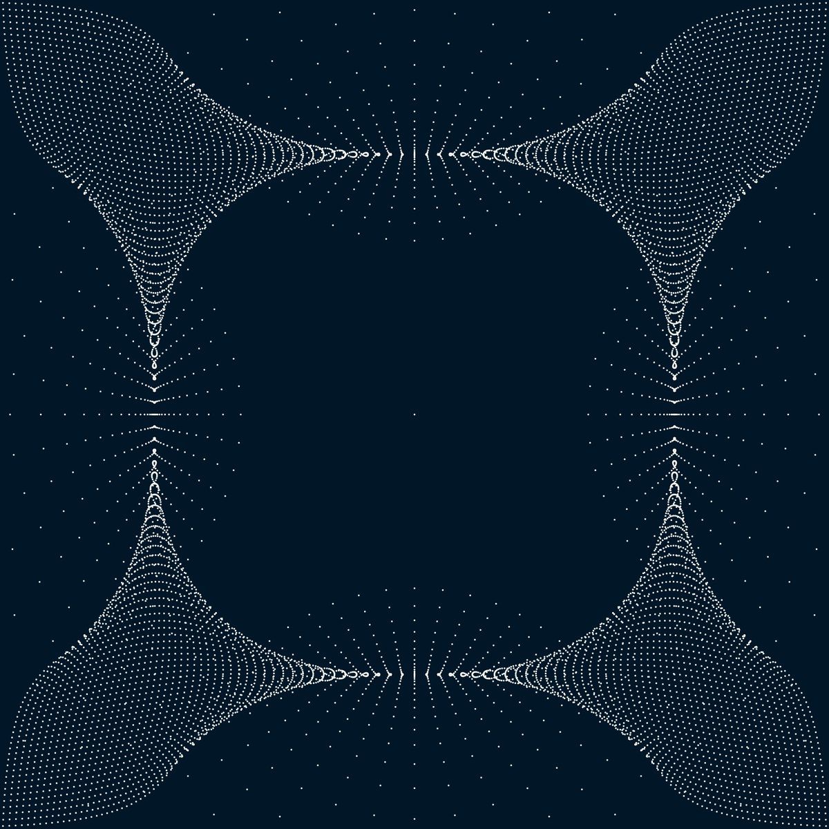
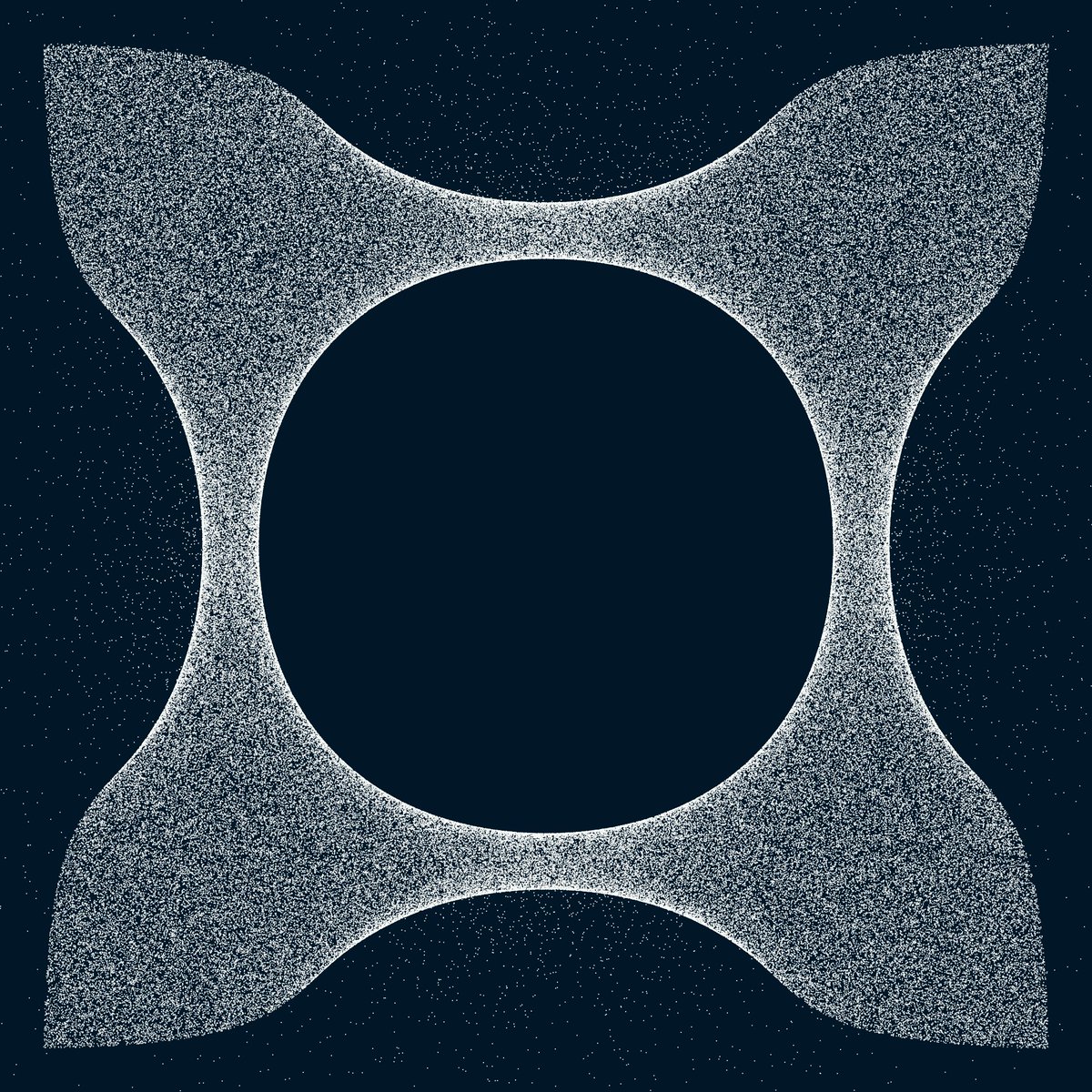
Same exemple (5 modifiers) but force direction depends of a modulo of the angle between dot and modifier 


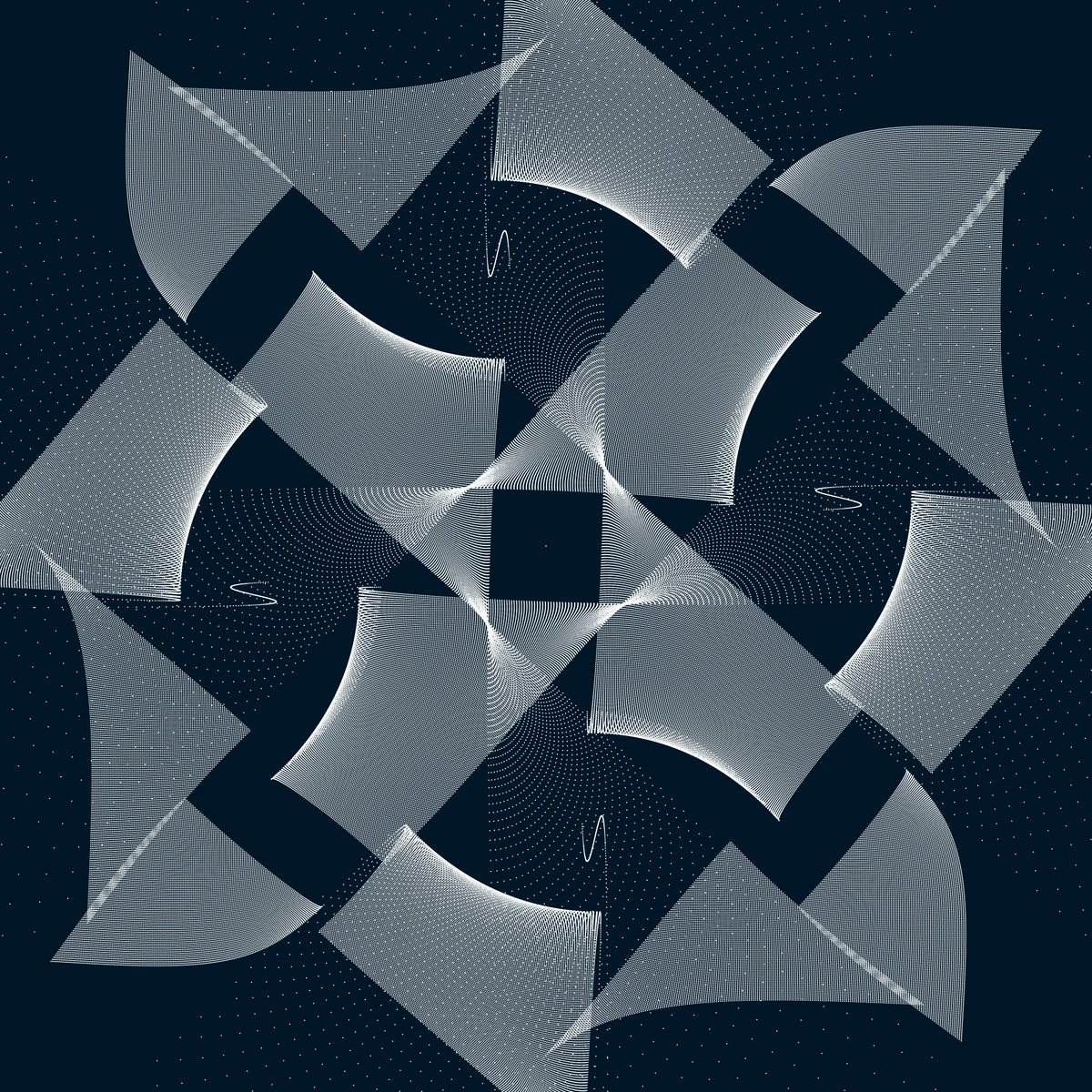
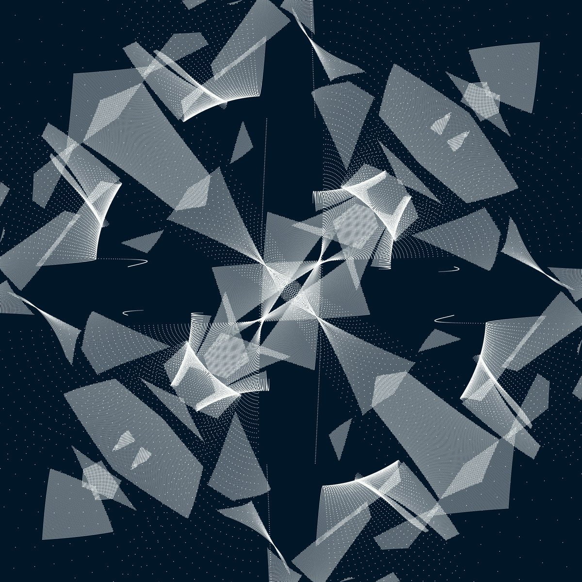

Same idea, but tracing lines between each dot and its original position. (idea from @nudoru 🙏)
I like this idea, because dots version was probably too similar to Murmurations series. What do you think about ? 😊


I like this idea, because dots version was probably too similar to Murmurations series. What do you think about ? 😊


The longer the line, the thicker it is.
I can display more lines using that tips. Moreover, it's easier to know where watch.
Do you think I should continue to play with that idea?
(360k lines on the last one!)


I can display more lines using that tips. Moreover, it's easier to know where watch.
Do you think I should continue to play with that idea?
(360k lines on the last one!)


Try color again: Color depends of line length (Peafowl style right? 😀)
Note sure of that idea. A lot of color combinaisons do not work well...

Note sure of that idea. A lot of color combinaisons do not work well...


I removed too long lines and make force depend of dist^0.6 now.
It starts to look to a symetric flowfield in fur🔥


It starts to look to a symetric flowfield in fur🔥
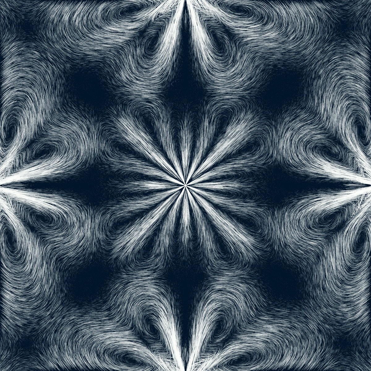


Trying again some rules I tested before. I start to like that 🚀
Dot position is random and helps a lot to have a very organic aspect.


Dot position is random and helps a lot to have a very organic aspect.


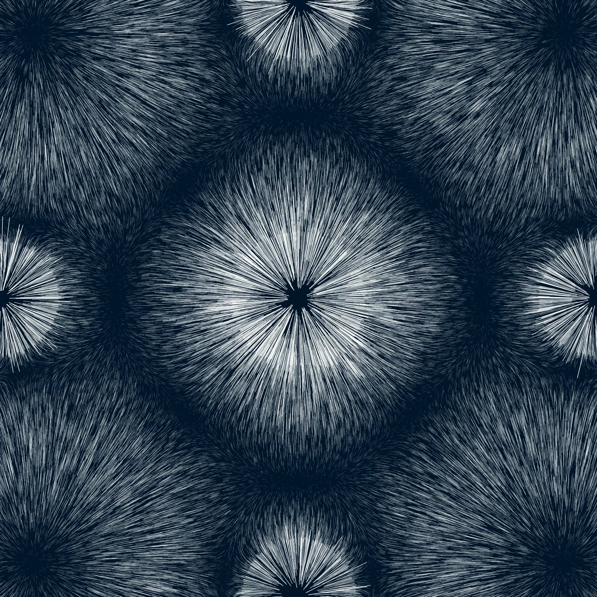
The same with color depending of the orientation (heading) of the line.
It doesn't work that bad with other rules (2 last pictures). Maybe a good way to apply color?


It doesn't work that bad with other rules (2 last pictures). Maybe a good way to apply color?


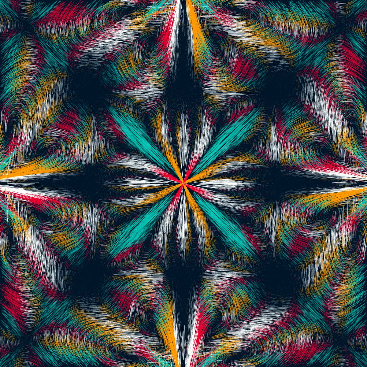
Trying to add random on local disrupter positions except the centered one (each test has more random than previous)
(idea from @0xm4tt1a 🙏)


(idea from @0xm4tt1a 🙏)


Trying with more lines, 2-3 colors, and small white dots at the end of the lines.
An other try with margin

An other try with margin
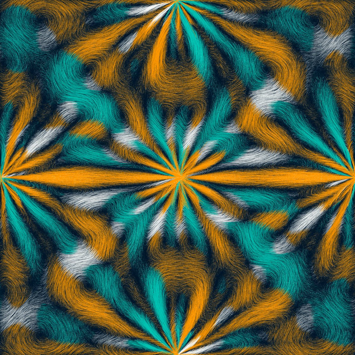

Now I've a little bug... point() weight does not seem to be linear... We can clearly see some steps
I'm using the same weight on lines and it looks OK and still visible when I display both


I'm using the same weight on lines and it looks OK and still visible when I display both


Ok, I've avoid one step using ellipse() instead.
But rect() seems to be better, so I'll rect()! (already used it for drawing dots of murmurations)
And now, it looks perfect! 🎉


But rect() seems to be better, so I'll rect()! (already used it for drawing dots of murmurations)
And now, it looks perfect! 🎉


And an other one!
I have to manage the points too close to the modifiers when I apply a repulsion rule
I have to manage the points too close to the modifiers when I apply a repulsion rule

I'll have to find the good number of points and the line weight
number of points per side in the following exemples: 700, 400, 200 (I tried to adjust weight to look quite the same).
What direction should I take?


number of points per side in the following exemples: 700, 400, 200 (I tried to adjust weight to look quite the same).
What direction should I take?


I'm more happy with the texture.
I'm going to explore
- colors (different rules to set them, bicolor palette...)
- modifiers positions and rules (currently, I set position manually and all modifiers have the same rules and same params, it could be fun to mix some rules)
(1/2)
I'm going to explore
- colors (different rules to set them, bicolor palette...)
- modifiers positions and rules (currently, I set position manually and all modifiers have the same rules and same params, it could be fun to mix some rules)
(1/2)
- point distributions (currently, points are randomly set in a square with margin, but I could not to do a regular distribution, or also do other shapes...)
- modifier shape (for now, they are points, but I could make them be circles, lines, polygons...)
(2/2)
- modifier shape (for now, they are points, but I could make them be circles, lines, polygons...)
(2/2)
Some new rules:
-random
- cos(x+y)
- Perlin noise
- cos (angle + dist)
And now, I refactored the code so it'll be easy to write a LOOOT more :)


-random
- cos(x+y)
- Perlin noise
- cos (angle + dist)
And now, I refactored the code so it'll be easy to write a LOOOT more :)


What to you want me to work on now?
B&W with and without gradient 🔥
I think it's better without since, line weight is already doing a gradient effect :)
I also tried replacing white with other colors too (2 last). It looks maybe too simple right? Gradient versions are better than these I think


I think it's better without since, line weight is already doing a gradient effect :)
I also tried replacing white with other colors too (2 last). It looks maybe too simple right? Gradient versions are better than these I think


What's your favorite option for colors?
New tests 🔥🔥🔥
Will it be my first project with a different palette? Let me know!!
Which palettes do you prefer?


Will it be my first project with a different palette? Let me know!!
Which palettes do you prefer?


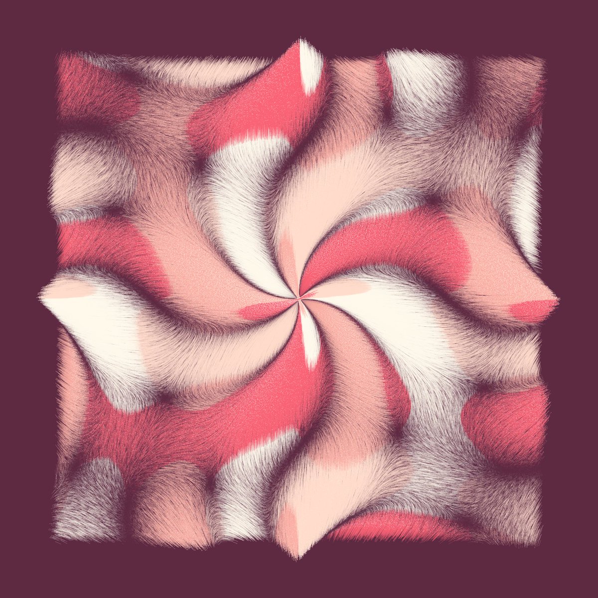
What do you think of that version? (black bg idea is from @0xm4tt1a 🙏) 

Ok, I hesitated to integrate these types of variations but you're a lot to love them, so I keep them and I'll make them quite common :)
https://twitter.com/camillerouxart/status/1487196109646802944?s=20&t=QBWb8SA1cYw9WELwUnLieQ
GM! I continue to work on the project. After trying lots of palettes on friday and start to select some, today, I'm going to try layouts : triptic, circles... and any other interesting we'll have.
As always, feedbacks are always welcome.
First test


As always, feedbacks are always welcome.
First test
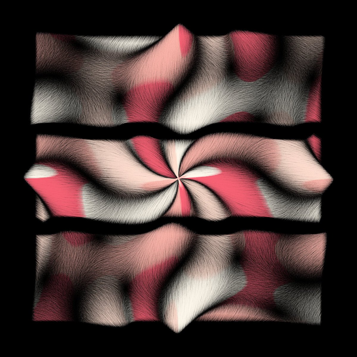


To do that, I had to reimplement how I set the position of each dots. For now, they was randomly set to a position in the image (except margin). Now, they are on a grid and I add some random on the position.
Here are some examples with none, a few, more... random on position.


Here are some examples with none, a few, more... random on position.

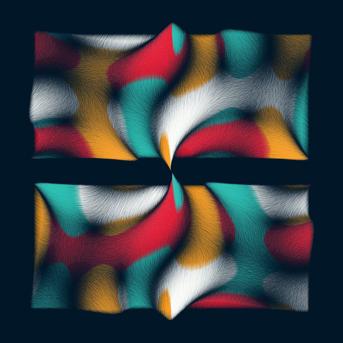


The more divisions there are, the smaller the margins should be...
Do you like divisions? Should I keep them? I like them 😊
Do you like divisions? Should I keep them? I like them 😊

Is that still great or too much ?
I think I like it. I like to see squares deformed with the rules :)
I think I like it. I like to see squares deformed with the rules :)

Tested triangle but it doesn't work because it doesn't fill space enough. Square and circle are probably enough for now:)
Let's work on modifiers positions, it'll change design a lot!
Let's work on modifiers positions, it'll change design a lot!

Other example.
Not sure when they are to much divisions, but basics look great for me :) OK to keep that?


Not sure when they are to much divisions, but basics look great for me :) OK to keep that?


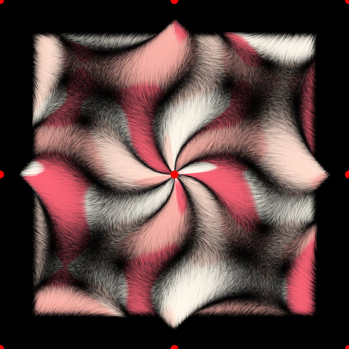
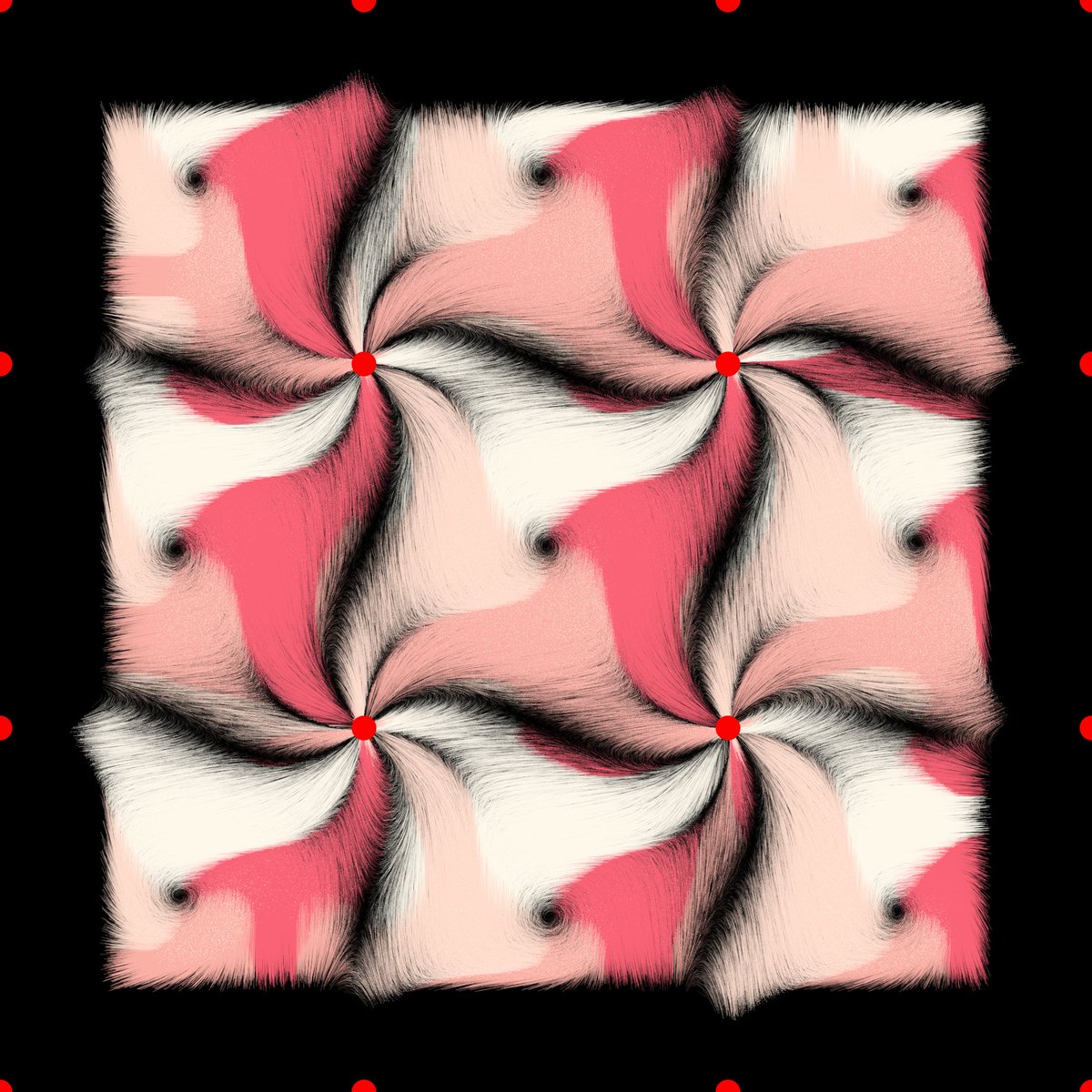
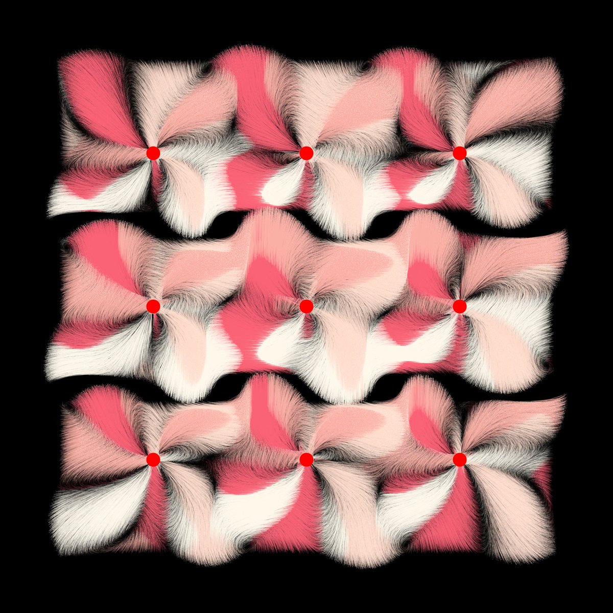
now testing some modifiers layout, always with same rule. I added red points at center to see them easily.
First at all Random !! I like it!


First at all Random !! I like it!


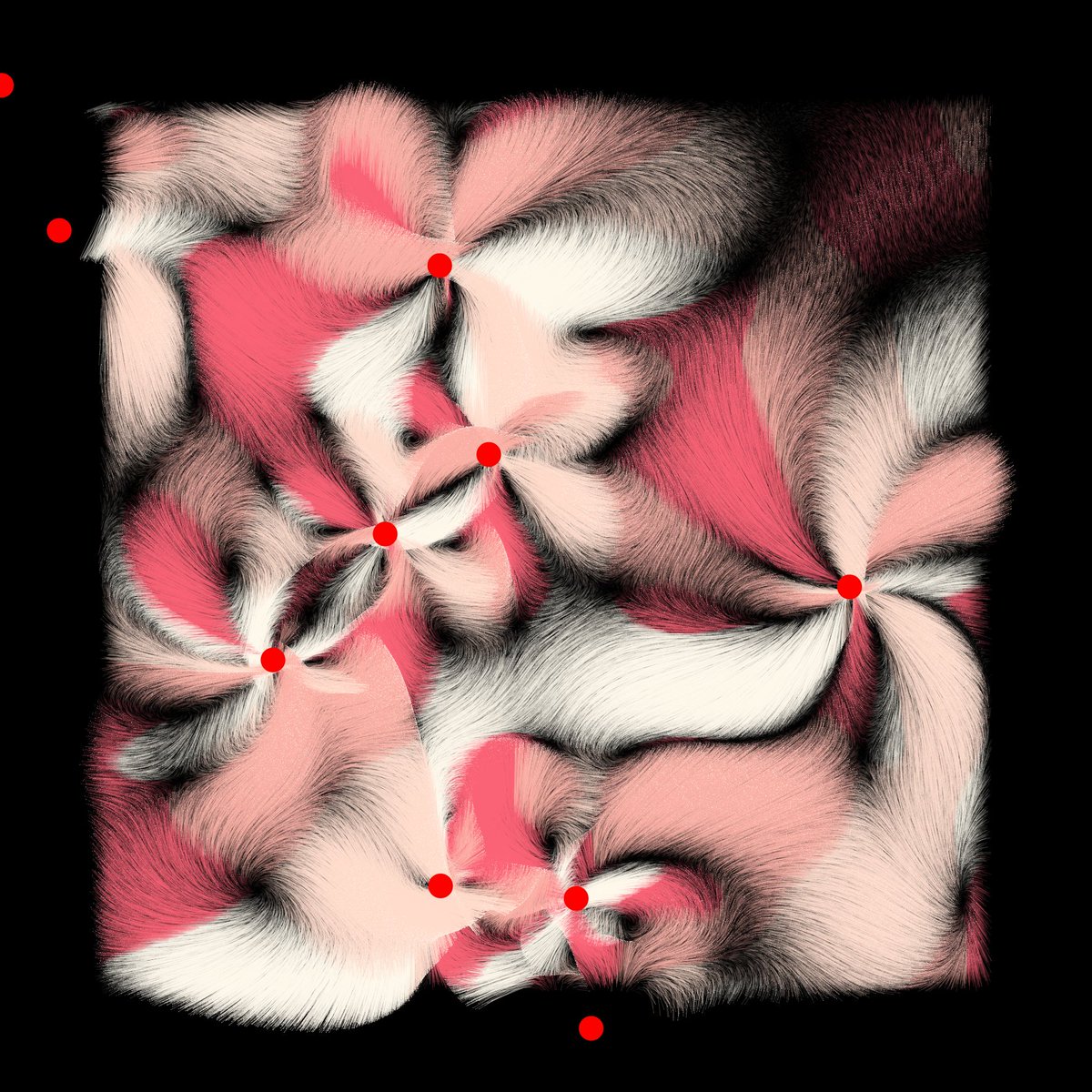

Some examples without debug mode with random values.
I thing we did a big step for entropy today. Thank you for your help 😍


I thing we did a big step for entropy today. Thank you for your help 😍


• • •
Missing some Tweet in this thread? You can try to
force a refresh


