Andy West, PhD Profile picture
Mar 7 4 tweets 3 min read
1/ $AUD ALERT

The RBA today raised expectations it may follow the BoC & pause hikes soon despite inflation still high (but falling).

With the rate spread between AU & US one of the key determinants of the AUD & the #Fed expected to hike 3 more times, this is material...
#macro
2/ On the back of this, we have flowed through a scenario of an AU rate pause to the HQ AUD model, with US rates still rising to 5.3%

This scenario, if it eventuates, knocks >3c off the HQ fair value target for the AUD (Dec 23) to $0.6314 vs FV $0.6680 prior to today...
The prior model had the #RBA hiking in lockstep with the #Fed.

It is by no means certain that an imminent pause is the outcome the RBA settles on & it has said it will be data dependent.

However, opening the door to this scenario is likely to see a probability weighted impact
on the AUD near term.

Note: there are many factors that impact the AUD model & the above examines sensitivity to the rate spread alone assuming other factors remain equal. Commodity price changes are also particularly important for the AUD fair value & can see FV shift quickly

• • •

Missing some Tweet in this thread? You can try to force a refresh
 

Keep Current with Andy West, PhD

Andy West, PhD Profile picture

Stay in touch and get notified when new unrolls are available from this author!

Read all threads

This Thread may be Removed Anytime!

PDF

Twitter may remove this content at anytime! Save it as PDF for later use!

Try unrolling a thread yourself!

how to unroll video
  1. Follow @ThreadReaderApp to mention us!

  2. From a Twitter thread mention us with a keyword "unroll"
@threadreaderapp unroll

Practice here first or read more on our help page!

More from @andycwest

Mar 6
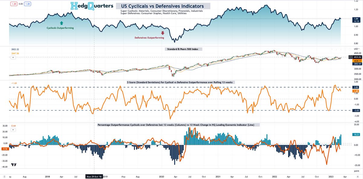
CYCLICALS vs DEFENSIVES:

Renowned investors like Stanley Druckenmiller routinely monitor the performance of Cyclicals vs Defensives as a signal for #stocks, $SPY and #macro economy.

At HQ, we use the following monitor (chart). Whats it telling us now? a 🧵
2/ Lets focus on whats happened, before future expectations

The top panel of the chart shows the relative performance of Cyclical sectors over Defensive sectors ("CDR")

Panel 2 is the #SPX

Panel 3 is the Z-score of the 13 week move in the CDR with 2 std dev movements marked...
3/ The final panel (4) shows the rolling cumulative performance of the CDR mapped against HQ's leading economic leading index ("HQLEI", rolling 13 week chg).

From mid '21, the HQLEI fell for the first time in a yr & this preceded the CDR peaking in Nov 21, signaled by...
Read 10 tweets
Mar 1
HedgQuarters S&P500 EPS Forecast Model Update:

1/ In Oct 22 we released our S&P 500 multi factor earnings forecast model based on data releases up to Sept 22. Now with 4-5 months more data we have updated the model and highlight the interesting changes

$SPY $QQQ #macro #stocks
2/ As always we present 2 scenarios. With variable lags to the impact of rate hikes, these models map out 2 assumption sets:

A. the impact on FUTURE EPS of the latest leading econ data, by extending current settings of leading indicators into the future unchanged "STATIC MODEL"
3/ B. "RECESSION MODEL": the impact on future EPS of both current econ data and a forecast assumption set that maps out a possible recession scenario in the US (assumptions at end)

These 2 models allow investors to assess (1) what a recession may look like to earnings and
Read 17 tweets
Feb 13
INTERPRETING THE CPI NOWCAST & how it works - a 🧵:

I, like many, have seen the rise in the CPI Nowcast over the last month & used it as a basis for expectations for Tuesday's #CPI release.

But how accurate is it at times like these. See chart:

#macro #inflation $SPY $QQQ #SPX
2/ The chart shows that as inflation rose, the Nowcast underestimated it and as it falls, theres been overestimation. Why?

Well the CPI Nowcast is based on an econometric model specified here: clefed.org/40Um5DE

I summarize how it works below and draw conclusions
3/ The Nowcast is computed from 3 core inputs, each of which is based on its own estimation process:

1. Core CPI Nowcast
2. Food CPI Nowcast
3. Gasoline CPI Nowcast

In simple terms, Core & Food are actually based on moving averages from the past 12 months of data...
Read 9 tweets
Feb 10
Have #Fed rate hikes led to the slowdown in #inflation we've seen so far?

That's the conventional wisdom anyway. BUT, the San Francisco Fed's own index actually says "NO"!

Why & implications. A thread...
#macro #Stocks #SPX $QQQ

1/8
2/8

This chart (YoY before & MoM below) breaks out Core PCE #inflation into cyclical & Acyclical components

Cyclical are those influenced by the eco cycle, Acyclical are those that have had a statistically insignificant relationship w/ past cycles

Cyclical inflation...
3/8

hasn't declined yet - at least on YoY basis with MoM measures only recently starting to cool. The real cooling so far has been in the Acyclical parts!

This is because, if you look at what heated up first and to the greatest extent in the first chart, it was typically...
Read 8 tweets
Feb 5
WHATS HAPPENING WITH US EMPLOYMENT / PAYROLLS and implications
a thread:

1/x

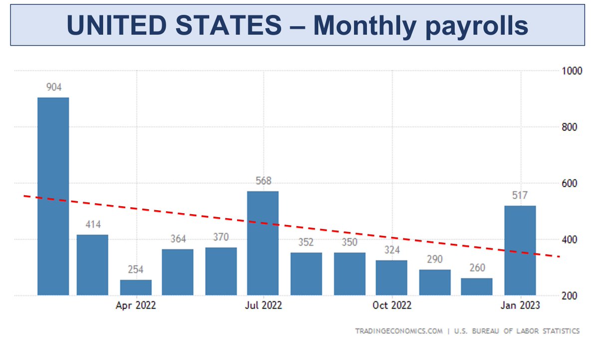
After a +517k Jan 23 payrolls & resilient employment mth after mth despite a year of rate hikes, whats really happening & does it mean soft landing?

read on

#macro #unemployment #stocks $SPY $QQQ
2/x I'm not delving into statistical adjustments, this is about the real backdrop & whats driving overall trends. From that I'll draw some clarifying conclusions.

Here's the recent payrolls numbers charted. The trend shows payrolls normalizing down from elevated levels w/ chop
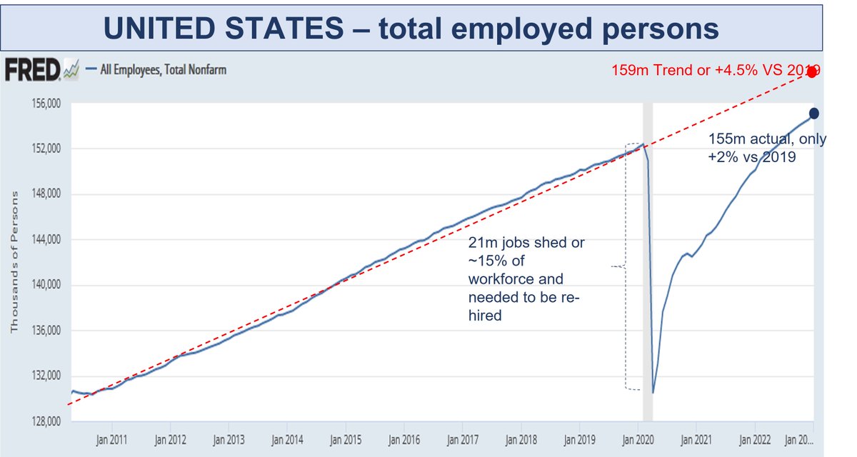
3/x Why were they elevated at the beginning of '22? Its all about the re-hiring of workers laid off during COVID. This is still on going.

The Chart shows US Total Employed. The US shed ~15% of its workforce as COVID hit and only recently surpassed 2019 levels, now +2% vs then.
Read 17 tweets
Feb 3
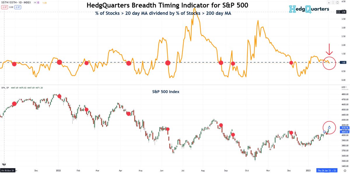
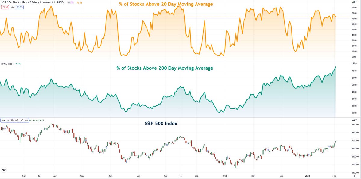
#SPX $SPY Breadth Ratio update 🧵:

This situation continues to get more intriguing. After the rally the last 2 days, I expected this signal to be resoundingly rejected

But the % of stocks > their 20 day MA relative to those above 200 MA has fallen below 1... 1/4
$QQQ #stocks Image
2/4 Whats this really showing?

Individual components of the ratio shown below

An increasing % of #stocks are above their 200 MA as expected in a rally, but the % above their 20 MA is flat potentially presaging declining momentum of the rally...

$SPY $QQQ #SPX Image
3/5 When the % > 200MA is very high like now, but the % > 20 day MA starts to weaken, then we typically conclude the rally is in late stage and at risk

This may not be yet - as seen in orange the % > 20DMA can fluctuate at highs for a while. But given some weakening 2day...
Read 5 tweets

Did Thread Reader help you today?

Support us! We are indie developers!


This site is made by just two indie developers on a laptop doing marketing, support and development! Read more about the story.

Become a Premium Member ($3/month or $30/year) and get exclusive features!

Become Premium

Don't want to be a Premium member but still want to support us?

Make a small donation by buying us coffee ($5) or help with server cost ($10)

Donate via Paypal

Or Donate anonymously using crypto!

Ethereum

0xfe58350B80634f60Fa6Dc149a72b4DFbc17D341E copy

Bitcoin

3ATGMxNzCUFzxpMCHL5sWSt4DVtS8UqXpi copy

Thank you for your support!

Follow Us on Twitter!

:(