
,
51 tweets,
17 min read
Read on Twitter
such a treat to see this in person 


such eats, so healthy.

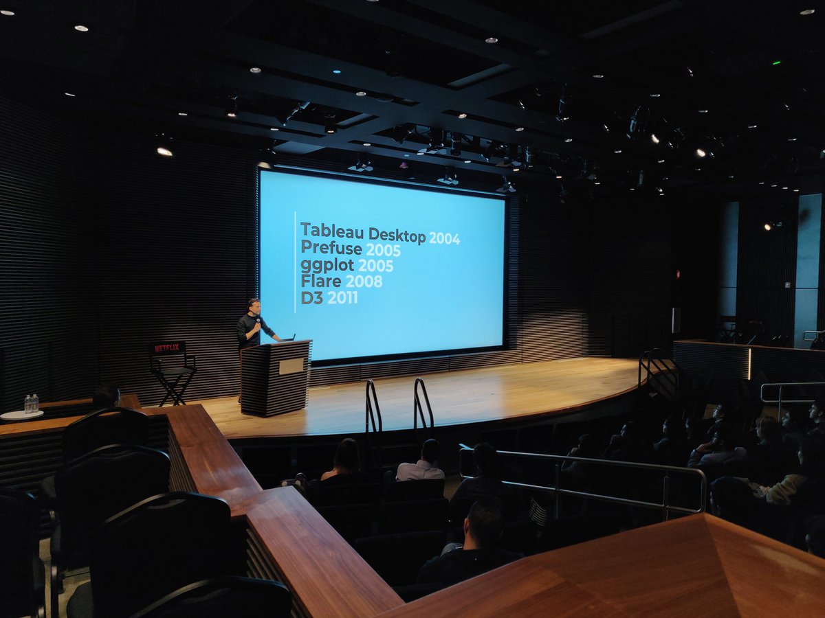
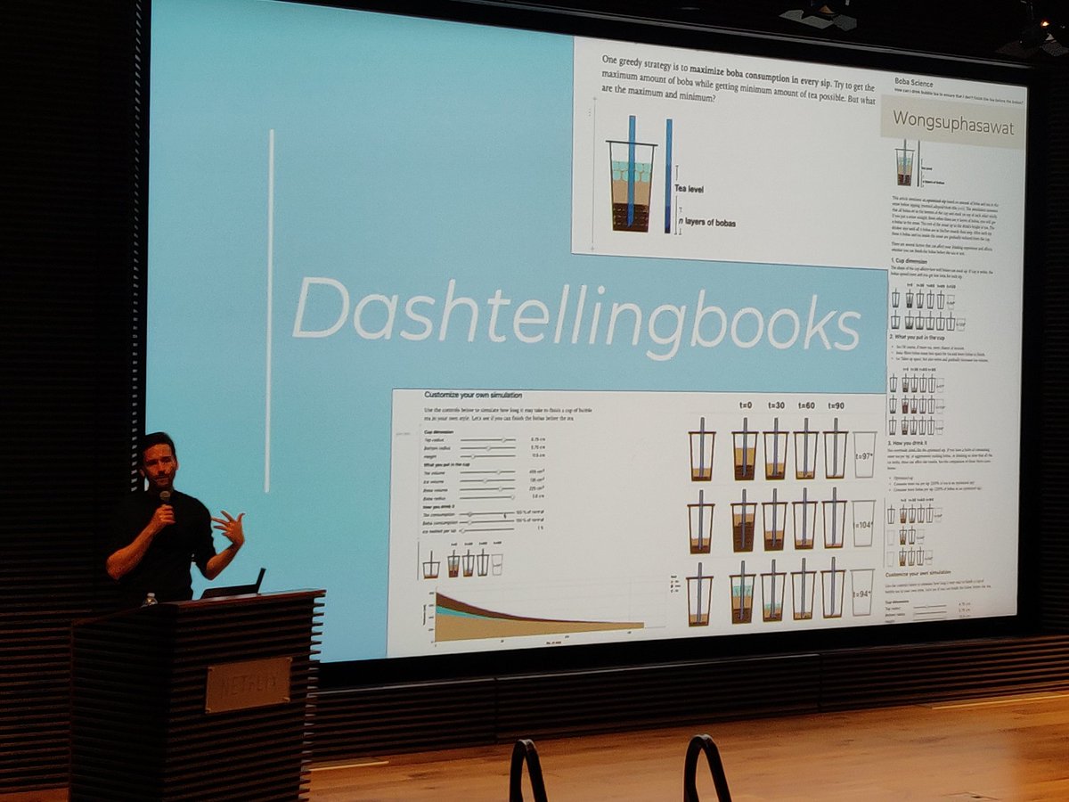
a timeline. didn't know that Prefuse was the first infovis library in Java, or that flare was a Javascript port of Prefuse

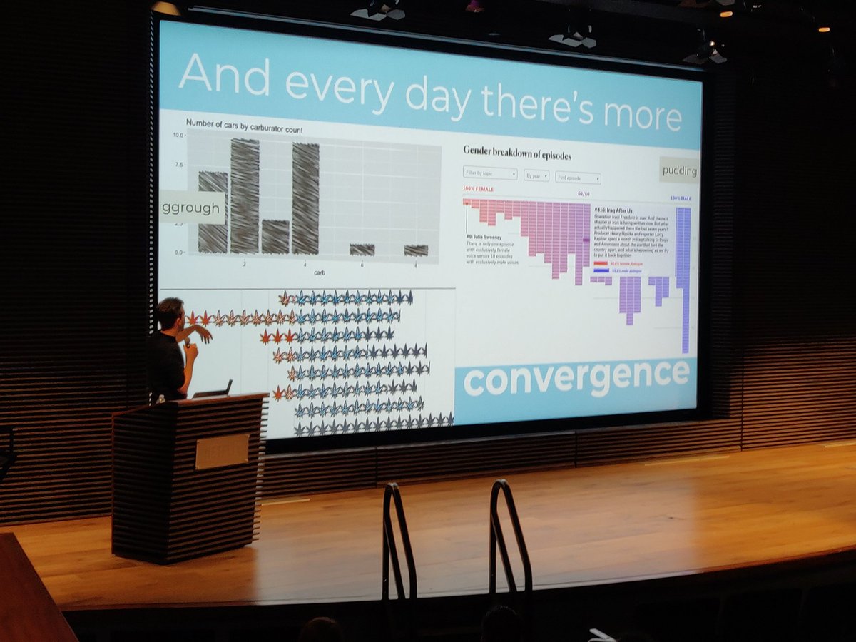
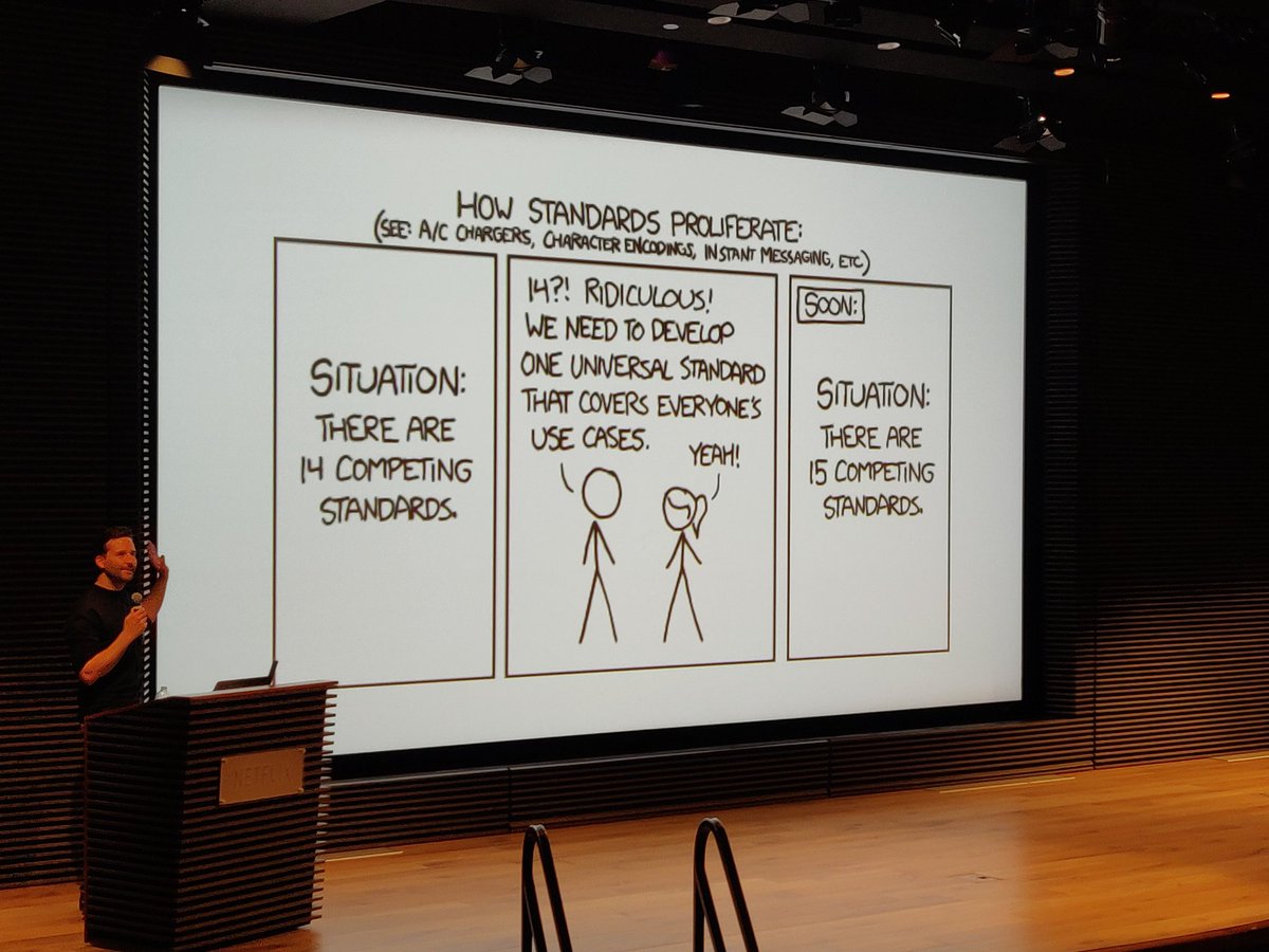
systems and their design spaces. a Cambrian explosion of visualization examples

"I call this a thorn tree. it is the optimal graphic"

even when absurd, some meaning is still encoded in these graphics produced by these visualization systems

10 years building visualizations will take you many places

many places.

broad categories of visualization people, defined by the active constraint on their work
"no one interacts with news graphics"
"no one interacts with news graphics"

other visualization practitioner personas fill in the spaces. "the Italians, while exotic, do exist. I have seen them"

this is seeping into vis at work

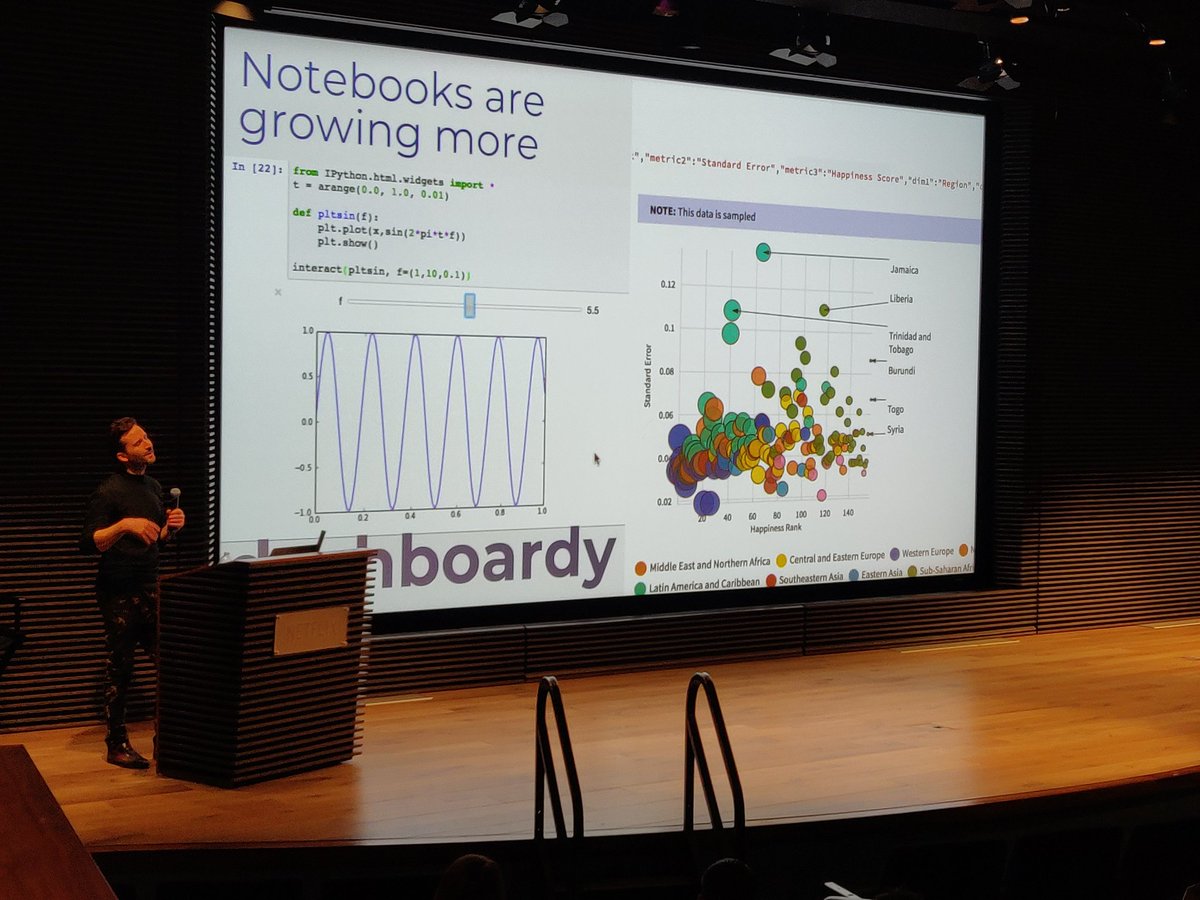
Python & R communities have dashboards too. they are called notebooks 📔
when they ask you to "make it pop"

fictive taste clusters

venn diagrams, box plots, dagres oh my!


"a motif is a piece of a network that is semantically meaningful"

"implemented a connected scatterplot & it was extremely valuable"
subtext: you can teach your stakeholders to read complex encodings. you can do it!
subtext: you can teach your stakeholders to read complex encodings. you can do it!

"if you are in #rstats, you can make sketchy graphs"
tools have matured, can be used for everything else now. good enough at all the other tools' specialities

"a notebook is a lot like a dashboard now. a report is like a dashboard now. reader expectations are converging."

the illiterate linebreak attention hack 💡

this attention economy is not just on twitter, it's inside your company.
whew, a visual respite

often stakeholders have already visualized their own data when @Elijah_Meeks is called in. they conflate the data itself with the first visual representation they made. data _is_ that bar chart 📊
how to proceed then, if first representation and underlying data are so mentally intertwined?
start with the stakeholders' representation and then iterate with them. make all the charts, quickly.

this is what Semiotic does.
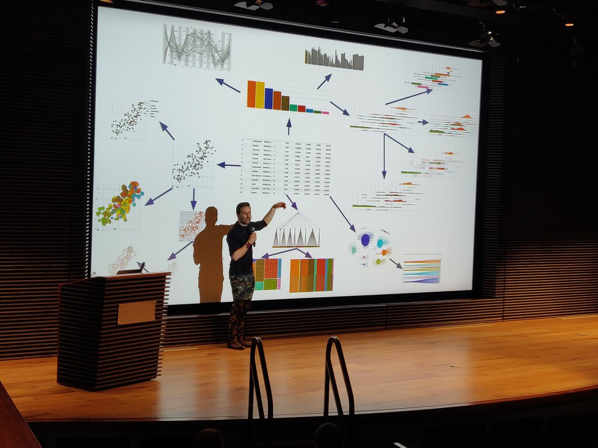
make all the charts, quickly. quickly transition between visual forms, to efficiently explore the design space.
make all the charts, quickly. quickly transition between visual forms, to efficiently explore the design space.


incidentally, these multiple image tweets are when @Elijah_Meeks gets excited and even my swift thumbs cannot keep pace
asparagus running low

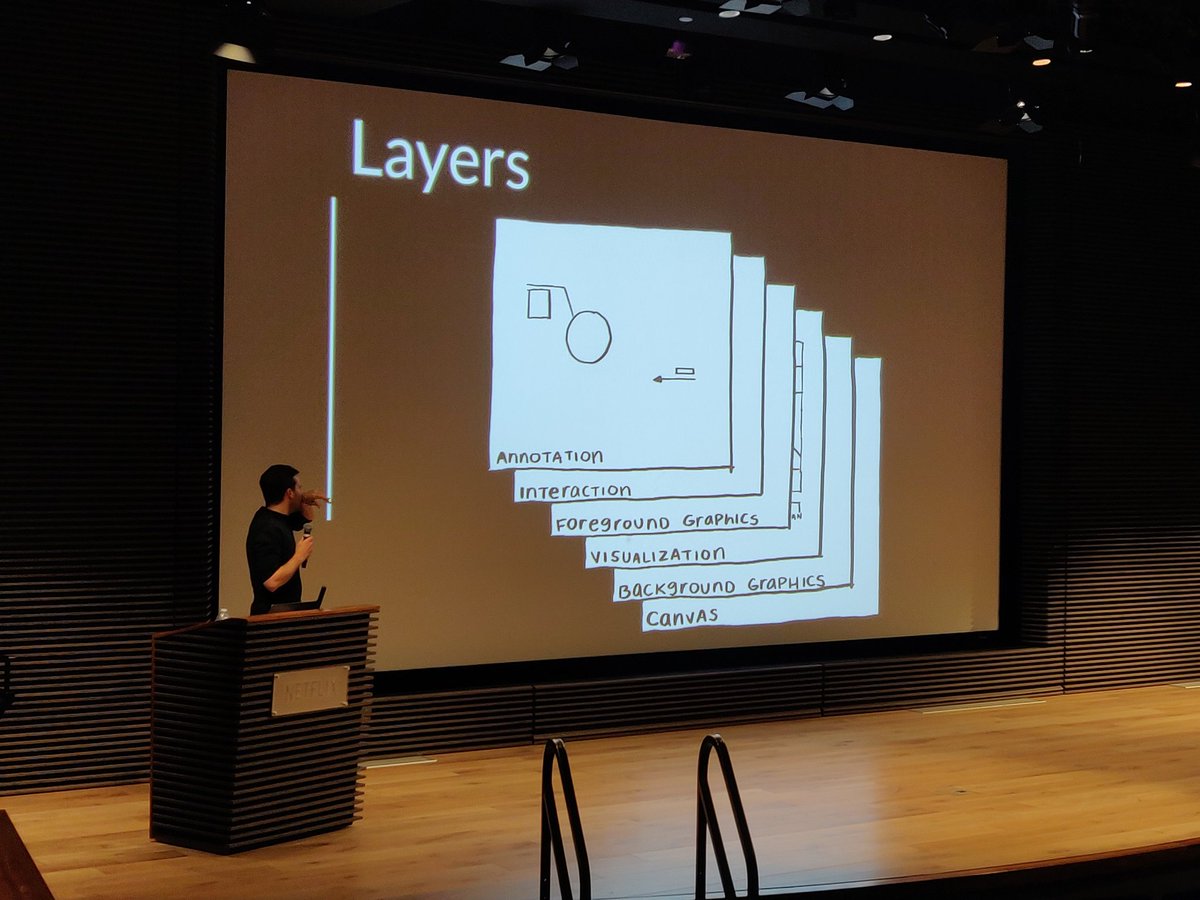
just as user conflate the first representation with the dataset, vis practitioner often conflate the visualization layer of a graphic with the whole interactive graphic itself
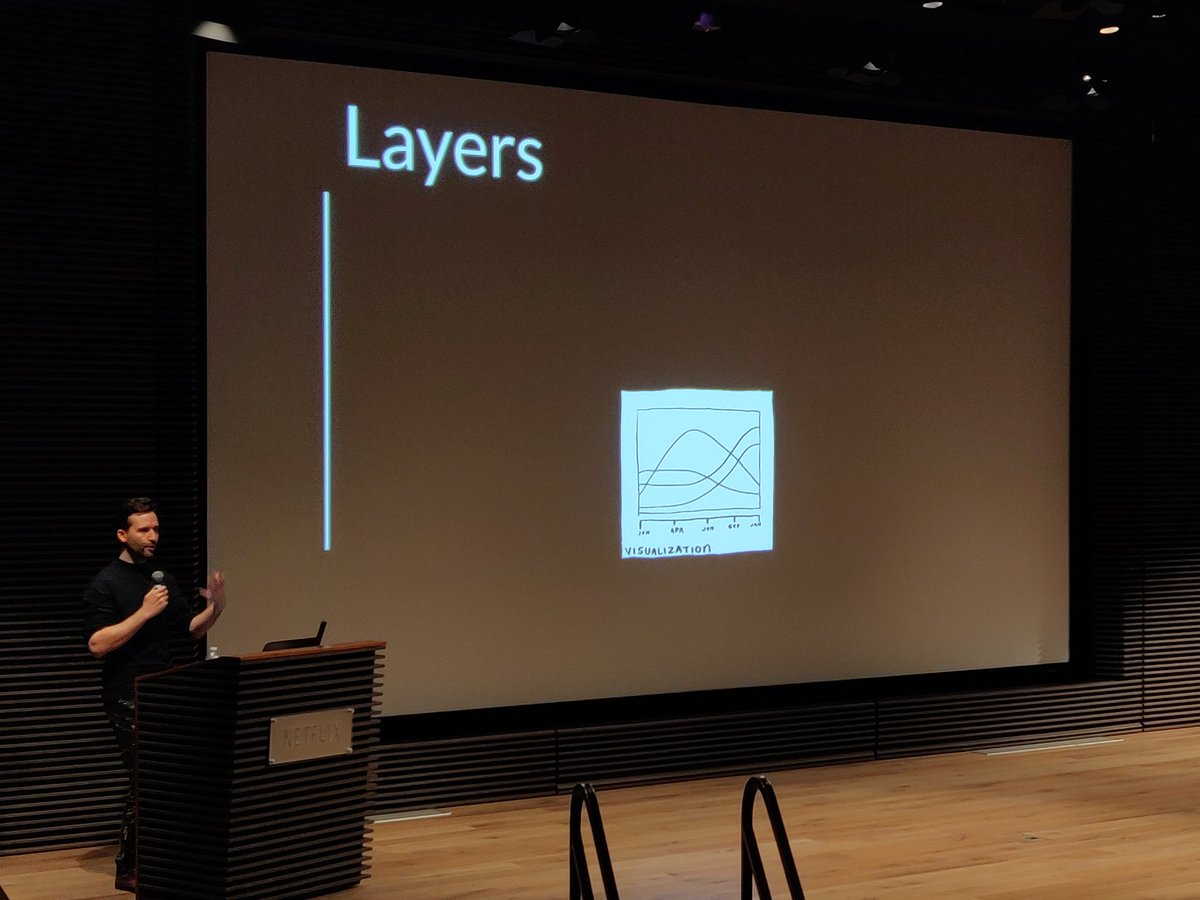
Layers.


"This is my favorite visit visualization that I've built at Netflix."

two asparagus

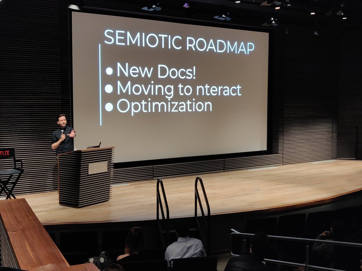
Semiotic Roadmap
- New docs h/t @DataToViz
- tranfer repo to @nteractio github org
- #typescript
- fit for use optimization
- New docs h/t @DataToViz
- tranfer repo to @nteractio github org
- #typescript
- fit for use optimization

"this is the future of data visualization"
data explorer. Semiotic + @nteractio a frame from a screen capture video.
I do this because it's fun for me. honestly, I think that's the motivation for a lot of us visualization practitioners

call to action time

one asparagus

zero asparagus
thanks everyone! now questions.
thanks everyone! now questions.

Q what is the forum for data visualization discussion, in this tool-agnostic future? where does critique happen?
A no good answer. Twitter is the least bad place. hope for new mechanisms for constructive negative critique.
A no good answer. Twitter is the least bad place. hope for new mechanisms for constructive negative critique.
A part two
vis critique is hard because so much of field is made up of vis freelancers whose personal brands are very closely identified with their work. to critique the work is to say "you should never work again"
vis critique is hard because so much of field is made up of vis freelancers whose personal brands are very closely identified with their work. to critique the work is to say "you should never work again"
Q2 how to iterate fast? how to build a dashboard on a deadline?
A2 vis practitioners lack the mechanism to explain why vis feature X is worth so much work. few vis practitioners in management, on the stakeholder side.
A2 vis practitioners lack the mechanism to explain why vis feature X is worth so much work. few vis practitioners in management, on the stakeholder side.
A2 continued. if you are pugnacious by nature, push back and say "good work takes time. it's worth it."
does not work for everyone, many not pugnacious by nature
does not work for everyone, many not pugnacious by nature
@Elijah_Meeks + @DataToViz approach:
give them the thing they want, and then something else they didn't ask for.
build trust and educate. do exploratory design with your user.
give them the thing they want, and then something else they didn't ask for.
build trust and educate. do exploratory design with your user.
fin. thanks for reading everyone 👋
@threadreaderapp unroll
wait, there's more. here's @demartsc's talk on running custom js vis inside a browser pane inside Tableau ✨


