My Authors
Read all threads
My Mozilla Design Journey
________________

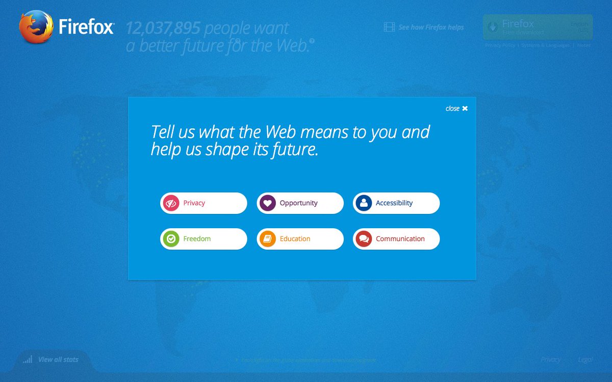
Alright folks, this thread will travel through 141Gb of design files from 2006-2020. Some of the early work will be cringe-worthy, but hopefully this will show how a designer's skills progress over time. Let's get started!
April 27, 2006

This was the initial exploration into concepts for Firefox 2. I'm just going to leave this here and mention you might want to take into consideration the design styles of the time. :)
July 18, 2006

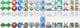
Merged a few ideas and got into the weeds of pixel refining. Things started to look much more cohesive. I'm sparing you the majority of the process, but I have thinks like icon_set_v37_final_FINAL.jpg - you know how it is.
August 12, 2006

This is the preview.png from the folder !!! CLASSIC THEME XP FINAL !!!

*narrators voice* It was not to be the final theme.
September 8, 2006

From the commonly used folder known as REVISIONS, we see the brown house emerge. Behold the pixels in all their umber glory.
November 17, 2006

My original take on Kit was born. I created this first pass using the trackpad during a meeting in the Landings office. Yes, Puss in Boots was inspiration.
April 3, 2007

Bugzilla t-shirt with the first appearance of my illustrated Martell eyebrows. I still really like how the eyes turned out on this one.
December 19, 2007

Another take on Kit, this one in its Mozilla Labs Test Pilot aviator gear. Note: This work was all contributor work up until I joined full-time in January 2009.
July 25, 2008

First pass at the UI for Fennec. I built out these big beefy UI elements in CSS and the goal was to have the UI using CSS on mobile, but the performance wasn't there yet.
September 11, 2008

Behind the scenes evolution of where we later landed with the UI. I was mocking them up in vector, then rebuilding in CSS. The PS3 UI was a big influence on the look of this new icon set.
January 29, 2009

The date I joined Mozilla Labs as a full-time employee. This is where I may start jumping around in the timeline as things start ramping up very quickly. I'll just pick out a few Labs selects next, but you can see many of them here: blog.seanmartell.com/brands/
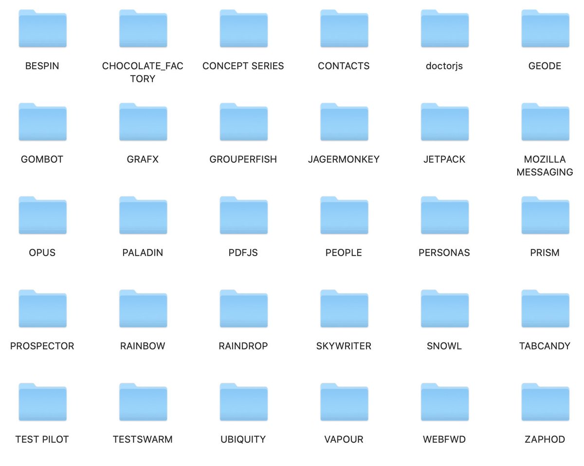
Brief Intermission (read: more coffee)

This... could take some time. Each of these folders has numerous other folders within. And this list goes on below this screenshot. What have I started?
February 13, 2009

The original Personas(!) logo was created on November 21, 2007, but this is the detail update shortly after I joined. Spent a good bit of time on Personas in my Labs years.
March 24, 2009

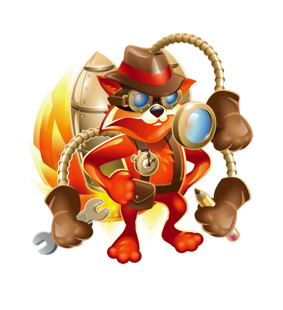
The original add-ons mascot. Inspiration: Inspector Gadget.

This was created in the Mozilla Toronto office - an office that had an article written about it due to how incredibly bland it was.

Note: the building did have a Beer Store on the ground floor.
June 29, 2009

DaVinci fox illustration for the launch of Firefox 3.5. This was a really fun little project. I'm realizing I have many wallpapers I've created with these various art projects, so I may create a repo somewhere to house all of them.
A Web Browser Renaissance
September 15, 2009

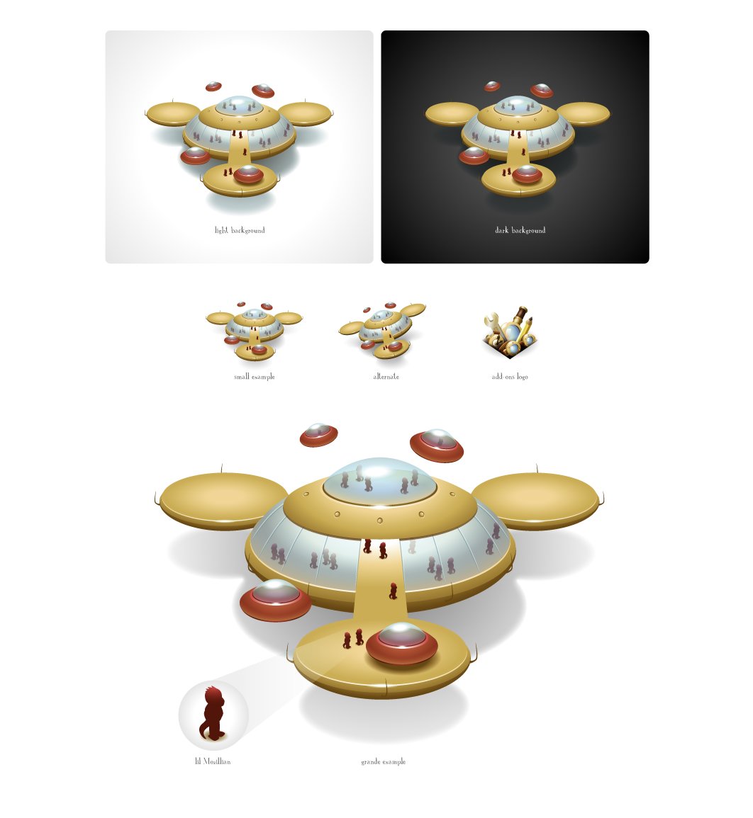
Space, Vectors and wee Mozillians. Calvin and Hobbes + Space Quest III inspired. <3

blog.seanmartell.com/2009/09/15/spa…
June 23, 2009

A short jump back to this version of Kit for Test Pilot. I had so much fun evolving this illustration and it's still one of the images I love the most out of all my work at Mozilla.
November 24, 2009

I'm not entirely sure why this was created, but any reason to have the Fraggle Rock Doozers as inspiration is 100% appropriate in my books. <3 Mozers.
December 3, 2009

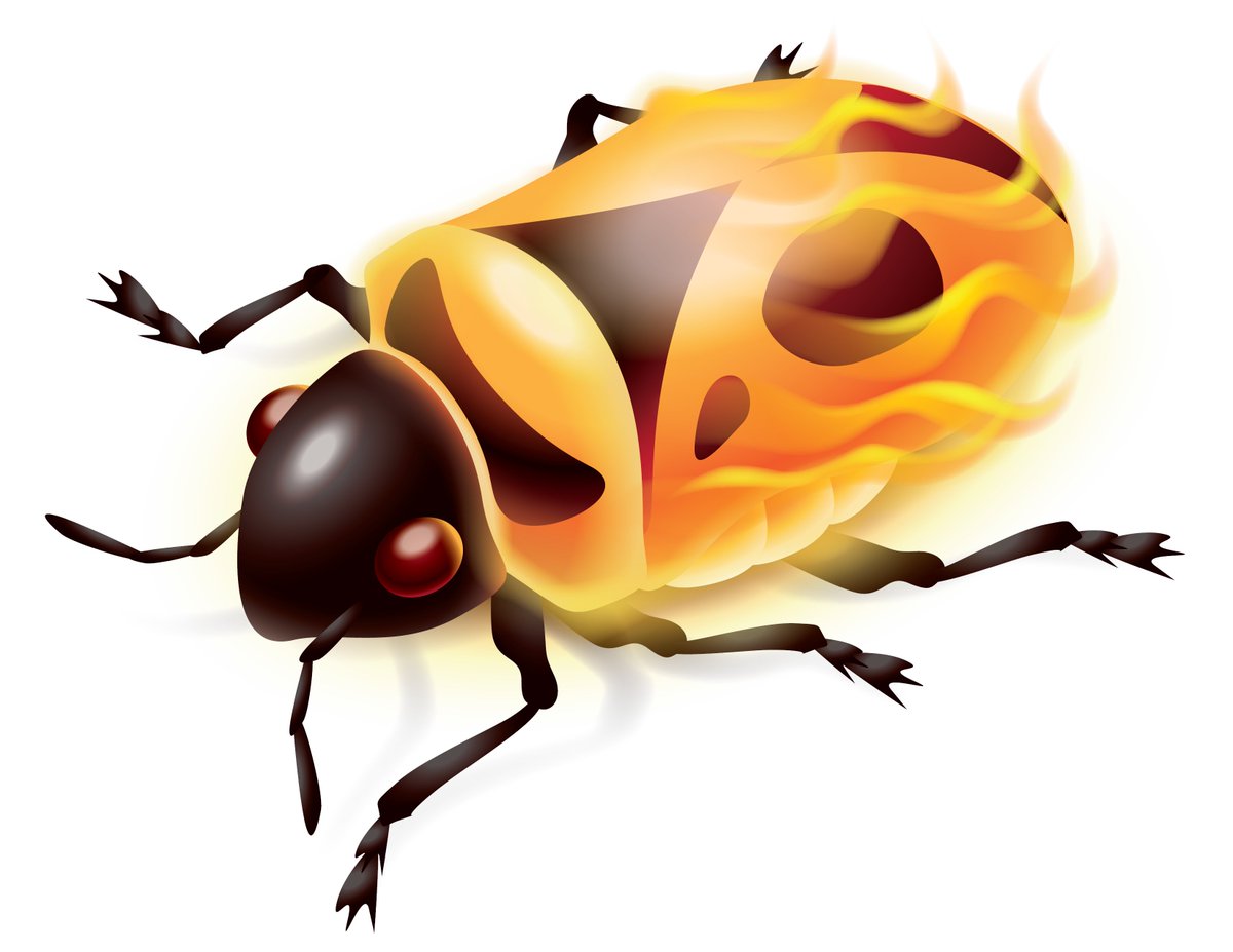
Huge shout out to Firebug and the amazing story of Developer Tools. My hope is people noticed that the logo is an actual firebug, just, you know, with flames added.

A history: getfirebug.com
February 2, 2010

I don't think we ever used this logo for Planet Mozilla, but just wanted to share it since in retrospect is seems purely evil.
March 25, 2010

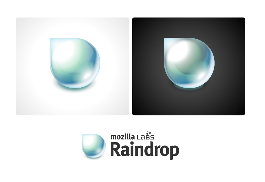
This was an exploration into creating a logo entirely with CSS. I discovered border-radius: 100% and everything fell into place.

You can see it live here: blog.seanmartell.com/2010/03/25/rai…
April 27, 2010

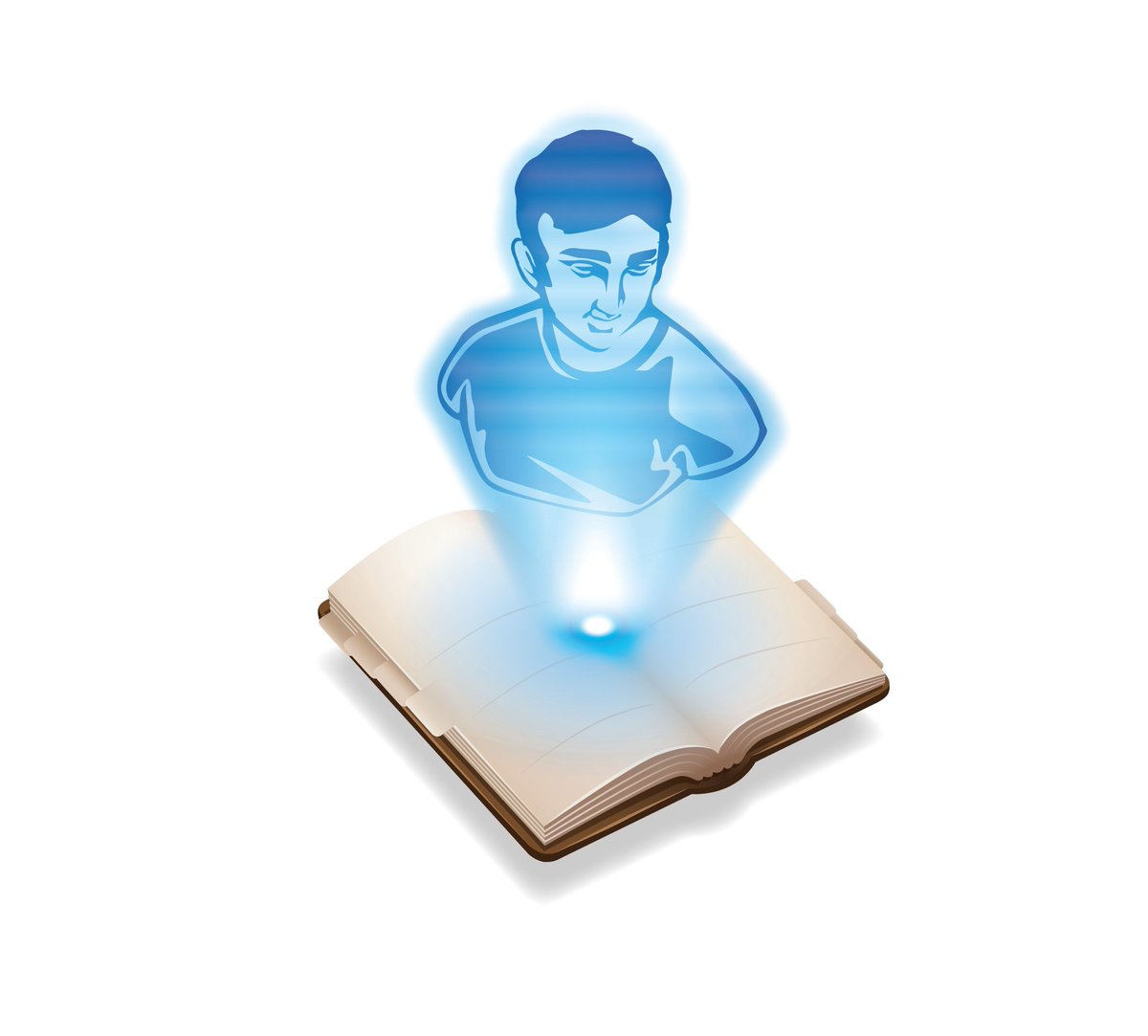
I get a kick out of this People logo mainly because I illustrated myself as a variant of a Venus de Milo bust as a Star Wars hologram.
April 29, 2010

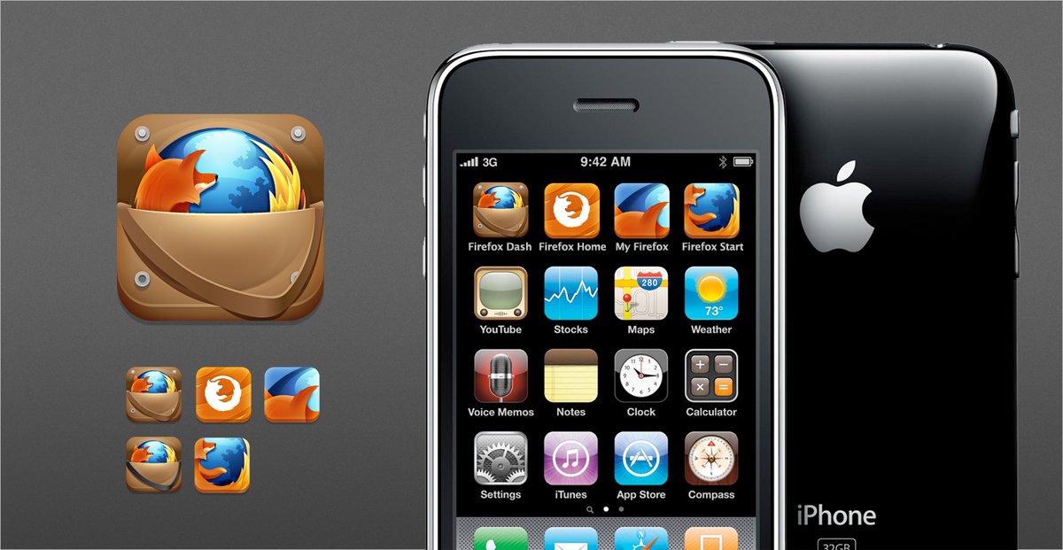
A mockup for an icon of Firefox Dash. I'm not entirely sure but I think that was a naming option for what would become Firefox Home.
June 3, 2010

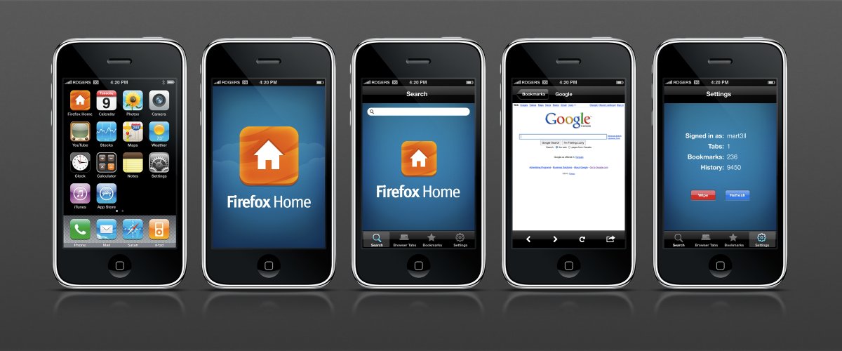
Here is the initial mockup for Firefox Home, using the always amazing @teehanlax iOS GUI PSDs.
August 24, 2010

Here's one few people saw - the original concept for the Rust logo. I kinda went all in on the steampunk vibe with this one.
October 26, 2010

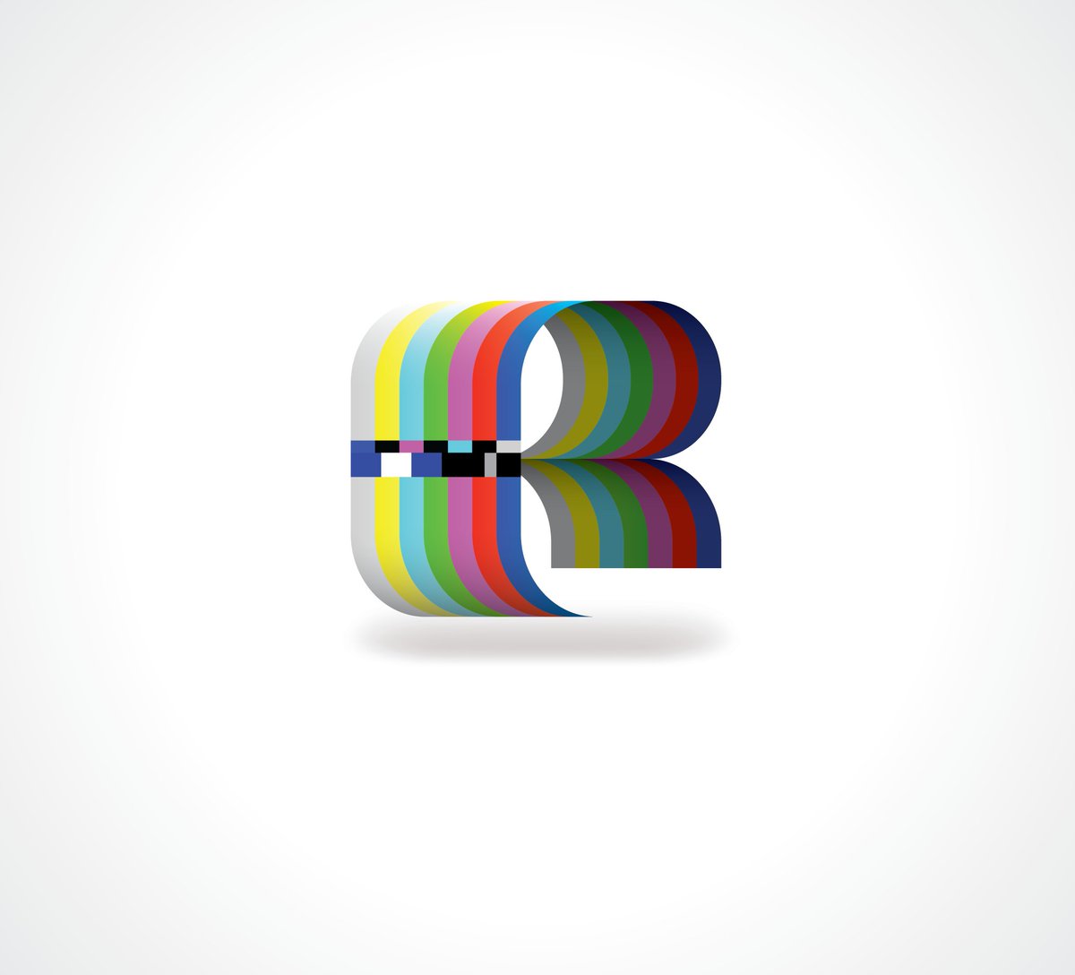
Want to share this Mozilla Labs Rainbow logo as I really like how it turned out.
Various times, 2010

These were some fun pixel icons for our Test Pilot program in Mozilla Labs. 16x16 Kit face makes me giggle.
April 8, 2011

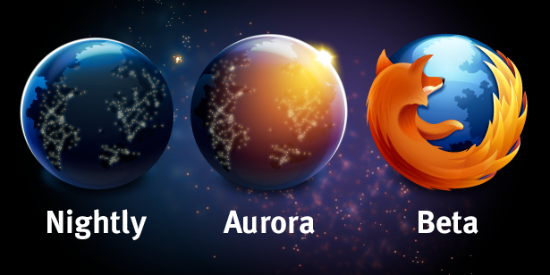
The updated Nightly and all new Aurora logos were created one night in my room at the Avante Hotel in Mountain View. Note: the name Aurora was chosen partly because I lived in a town next to Aurora, Ontario at the time.

blog.seanmartell.com/2011/04/14/a-t…
Late 2010

Missed this one, but really like how it turned out as a t-shirt. Once again, inspired by Space Quest III and the Aluminum Mallard.
Spring 2011

The first 48Hrs of Firefox 4 infographic. Just throwing this one up for ye olde data appreciation.
July 19, 2011

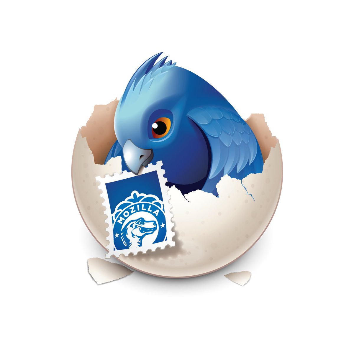
Another one of my favourite illustrations, the Earlybird chick. Love this lil birdie and the Mozilla stamp.
August 26, 2011

This was my first take on the project branding for Boot 2 Gecko. I joke, this was for an internal presentation, mostly. Mostly.
October 6, 2011

The first Mozcamp branding we did. This many voices image would continue to be in use for a few years beyond as the logo for Air Mozilla.
November 2011

Firefox Flicks. I believe this was the second round for this campaign, but not entirely sure. The vector curtains were fun - just a regular linear gradient then added the vignette over top with a transparent radial gradient.

RIP to the link in the poster.
December 2011

This is another one of my favourite images/mashups, for obvious reasons due to my undying love of Calvin and Hobbes. I'll be sharing a few wallpapers of this one as well.
February 2012

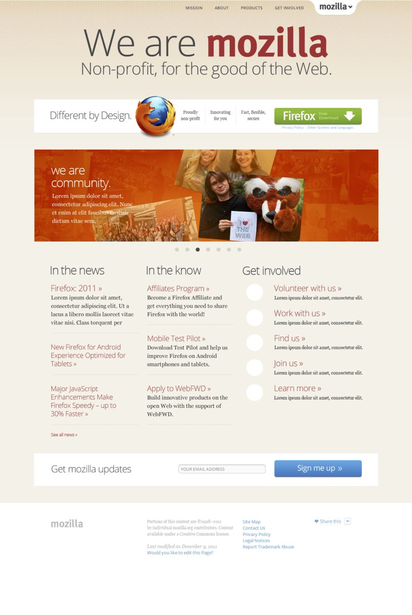
Our take on creating a cohesive design style for all of Mozilla.org brought about the sandstone style (built on bedrock) and tabzilla, the global menu navigation.
February 29, 2012

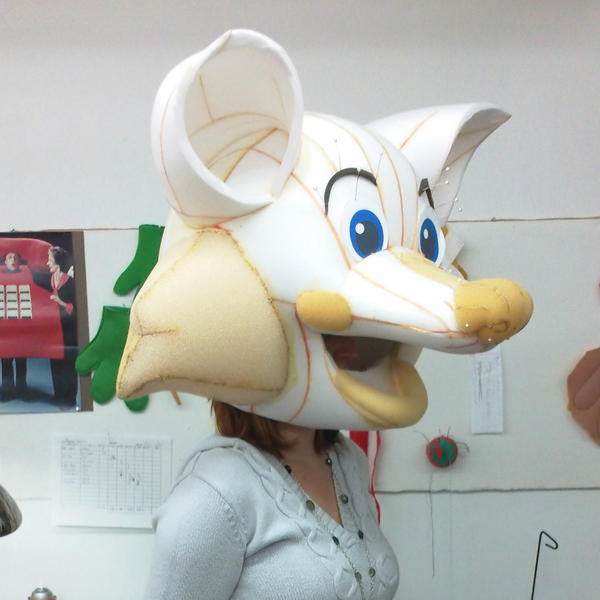
The rebirth of the Firefox mascot. This was a fascinating project in that I got to describe the contours of the Firefox tail at the time as being similar to an artichoke.

blog.seanmartell.com/2012/02/29/the…
June 2012

We were deep into some bigger projects for most of 2012, one of them being the One Mozilla style guide. It was our initial pass at an online guide and was a great learning experience.
September 2012

One of my favourites from helping out Mozilla Foundation was the Webmaker icon. Sure, the knot of thread in the needle is incorrect (as was pointed out later on) but it's a fun visual nevertheless!
March 2013

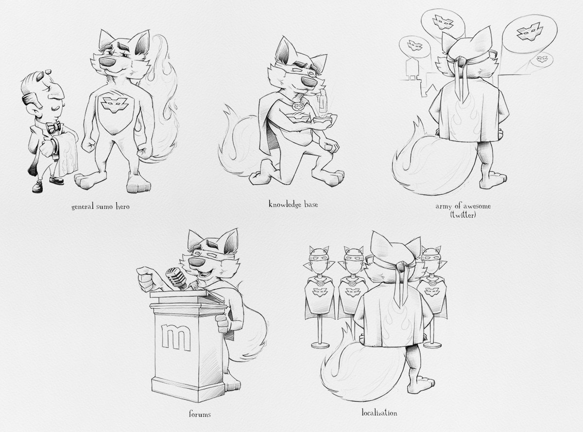
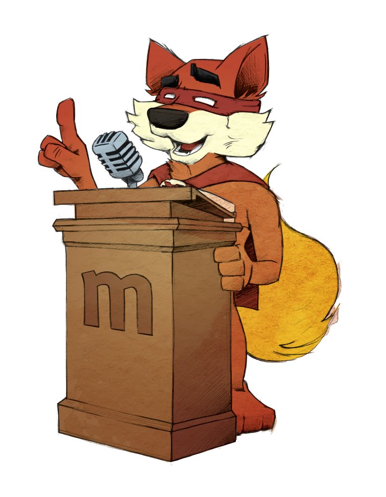
SUMO asked to help with the updated Get Involved section of their website, so I created a superhero fox to help get the message out.
blog.seanmartell.com/2013/03/22/so-…

support.mozilla.org/en-US/get-invo…
March 14, 2013

Created a fun little vector illustration for the WebGL/HTML5 work and GDC - the elemental Firefox tail helping the knight bridge the gap between desktop and mobile.
May 2013

I was approached to see if I could come up with a mashup of Shepard Fairey's HOPE poster and his original Mozilla dino head. Turned out to be a big hit and it continues to hang on the wall above my desk.
June 12, 2013

A good midway point in this tweetfestganza (wait, what ogod you can mute threads btw) to link to my article about designing in the open. I used this article as the framework for a talk I gave at All Things Open in Raleigh.

blog.seanmartell.com/2013/06/12/as-…
June 2013

The introduction of the simplified version of the Firefox logo. We stripped out some detail and added a bunch of new detail for high DPI screens. My first stab at evolving the logo.
September 17, 2013

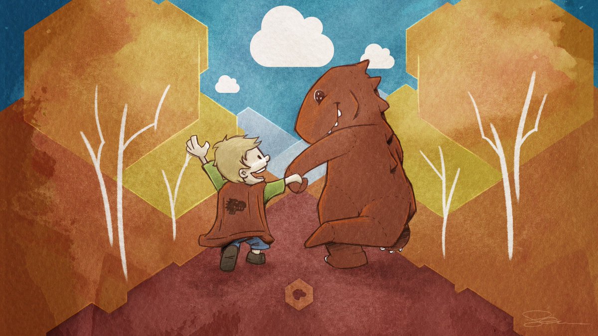
Mozilla is my dinosaur - I almost want to stop here as this is the artwork that I consider my favourite during my entire time at Mozilla. So many things came together to be able to write the poem and make this artwork. <3

blog.seanmartell.com/2013/09/17/moz…
December 13, 2013

such logo! very detail! wow!
March 2014

Getting ready for the launch of the latest Firefox with the all new Australis UI, we started designing another portal to watch downloads.
April 3, 2014
April 2014

Leading up to the launch of Australis, I enlisted the help of @FirefoxUX to create some teaser GIFs. Fair warning, they're big, but glorious.
August 2014

The hunt for a new Mozilla logo began late summer of 2014. Initial idea was a living logo where the bulk of the visual would be created using data from Mozilla. We struggled with this and ended up shelving the idea.

blog.seanmartell.com/2014/08/11/wha…

November 10, 2014

Firefox's 10th birthday! I basically took all of the Firefox OS poses created at Wolff Olins and repurposed the tail art from each to create this long unleashed tail.
I have no idea what this was going to be, but I like it.
December 2014

Portland (Mozlandia) and the return of our all hands trips. I wove some of the angles from our MozID project into the artwork of this event but ultimately it was the last we used of the look.
May 2015

Came up with the branding for the View Source developer conference. It's a rare treat to be able to use John Jacob Jingleheimer-Schmidt and Hank Scorpio in the same mockup.
June 2015

Whistler All Hands - Had some good fun with this art style and turned out to be one of my favourite all hands ever. Loved this palette.
September 2015

Started going on the Orlando (mozlando) All Hands artwork. This was the start of our all hands design system. I'm going to share some of the behind the scenes - things that made the cut and some that didn't. Poster below was the final approved for the event.
October 2015

Some of the tshirt designs for mozlando. I had forgotten about the CTRL YOUR WEB rough. The Internet is what you make it was the winner.
December 2015
February 2016

Getting started in on London all hands. If you notice a pattern here, it's that all hands takes a crapton of work. Huge shoutout to the one and only @lucky_brianna22 as a miracle worker when it comes to event planning and creation. <3 <3 <3
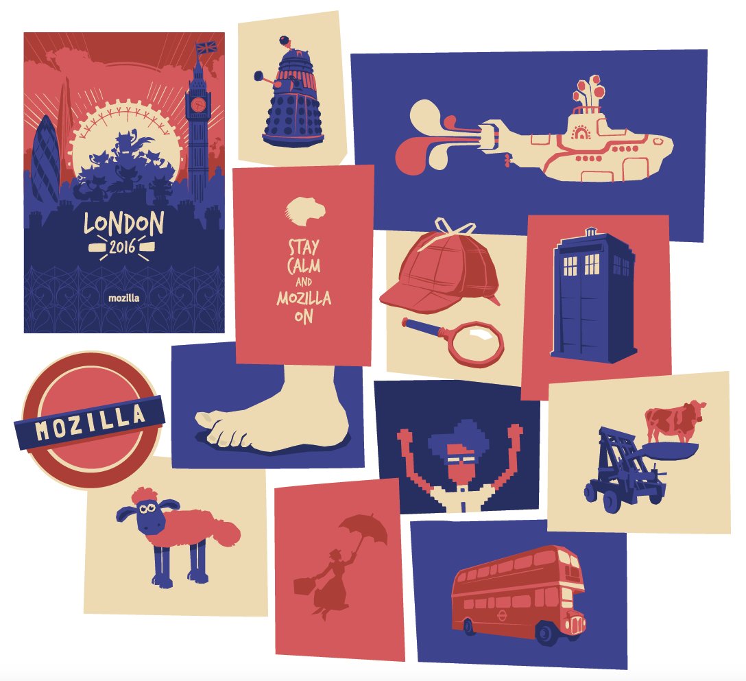
Wow. I'm not sure where I was going with this tshirt. Awkward.
March 2016

Friends and Family Day 2016 tshirt turned out to be another illustrations that I and many others love. Dinos and foxes! A campfire! <3
April 2016

The approved Turing tshirt illustration for the London all hands. Quite pleased with this one as well. Used an online image-to-ascii converter to begin then cleaned it up and added the quote. Simple but effective.
May 2016

Here's a fun evolution series from sketch to final artwork. This was a fun steampunk image to tie into the final night gathering at all hands.
July 2016

DISCLAIMER: I was asked to make this.
October 2016

Started exploring a new style for the fox based on the Mary Blair inspired style I had been using for all hands. This would eventually become the fox used in our comic book (up next!)
November 2016

The Splendid Firefox. This project was amazing and terrifying because print. It also turned my Macbook Pro into a small replica of the surface of the sun. The cover alone was an 800Mb EPS.
November 2016

Some stickers for the Hawaii all hands. Fairey inspired, gecko + fox, Quantum Leap! The sticker economy throughout Mozilla is strong.
December 2016

Adding to our all hands style, Hawaii was a fun illustration too. Seems like forever ago. Ah, Hawaii.

*looks out window at lousy Smarch weather*
March 2017

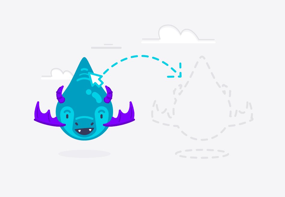
The critters were born in the lead up to the Photon UI overhaul. Dunnosaur later received the nickname Dinope. This was another super fun project injecting whimsy into the browser.
Quite possibly my favourite critter was Drag'n Drop. *giggles and claps*

Shoutout to @abenson for the idea behind this one. Pure. Gold.
June 2017

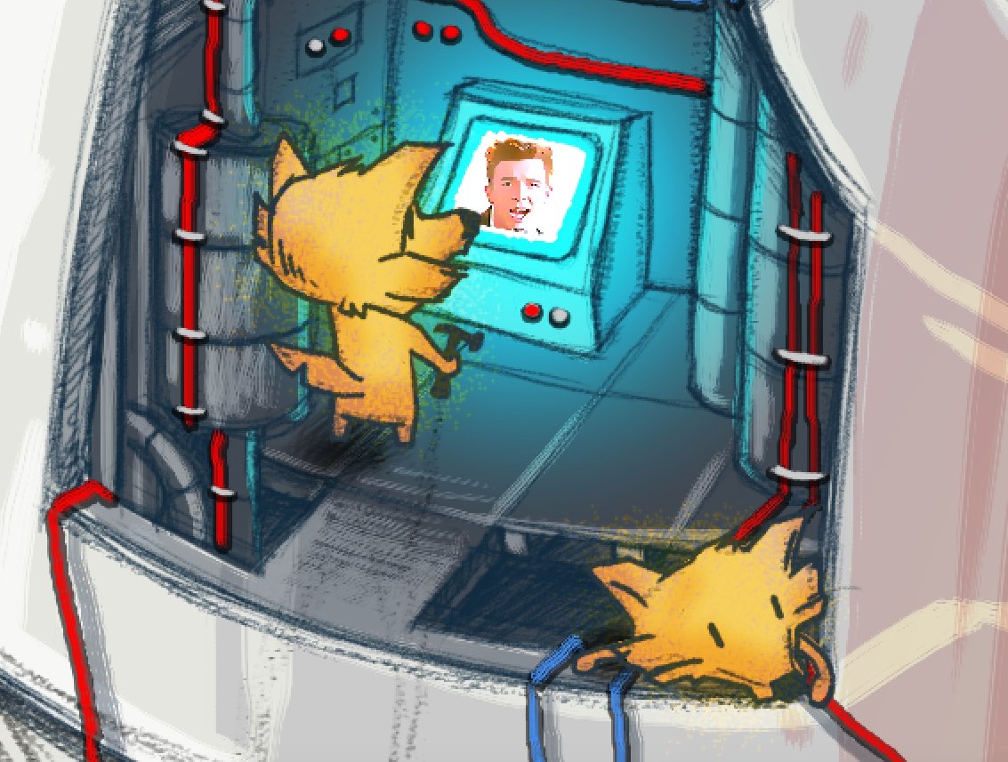
Quantum launch poster. This was another big hit. I went back to the idea of weeee little workers working on something bigger, like the Mozers before them. Loved how this turned out too.
Process stages
Someone made an appearance on the monitor in the final version. Never gonna give up fighting for a healthy Web.
November 2017

The Quantum logo. I love this version of the logo. Huge thanks to @shorlander and @bryanbell for the refinement and work on this one. Team effort!
November 2017

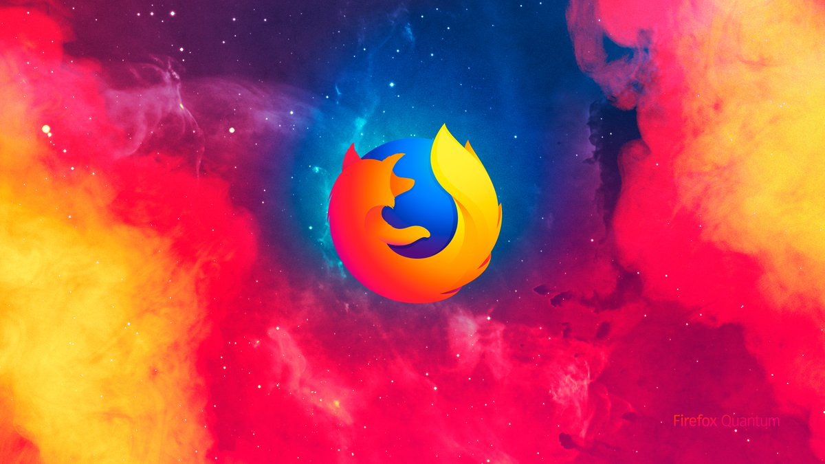
The official launch poster in which the suit, well, launches. Use all the colors!

Kapow! Fwoosh! Zingg!
*pours a whisky, sloshes it around in the glass softly*

We're nearing the end of the journey here as the next 1.5 years are covered mostly by the Firefox brand evolution project.

Who wants to see a heavily truncated behind the scenes of the process?
November 7, 2017

This was my very first exploration into the Firefox evolution process. Playing around with the far too extreme idea of geometric shapes and an underlying O and X as the framework.
December 20, 2017

In this exploration, I was using a stepped gradient to create volume within the shapes. I really liked the organic feel of these.

I was working alongside @Hicksdesign and @ramotion in this process and we were cross-pollinating ideas as we went along.
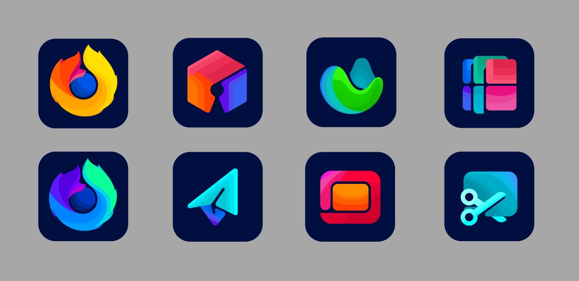
January 25, 2018

Started exploring typography as well. I've always wanted a geometric font for Firefox to reflect the circle of the globe within the icon.

We now use Firefox Sans and Metropolis! <3
March 1, 2018

Started playing around with some of the ideas I saw Jon and Ramotion working on. Really liked Jon's exploration into an outline style so had a go at some tests myself.
March 19, 2018

Started exploring what the parent brand could look like. Also started exploring potential browser variants depending on platform. The stepped colors in the fox were getting much more refined at this point.
May 15, 2018

Really like this set. Had blue highlights reserved for the browser tier, warm hues for the app tier, cool hues for the developer tier.

Again, this is all heavily influenced by work both Jon and Ramotion were doing as well. We were exploring three potential paths.
September 27, 2018

We had a bit of a break in the project as next steps were decided, one being moving forward with the now official Ramotion parent brand and the ribbon app tier style.

Next bit of exploration was how to evolve the browser logo to blend into the system.
October 25, 2018

Things were getting closer here, but I was still trying to retain the Photon tail. I do like the gradient facets in this round.
May 2019

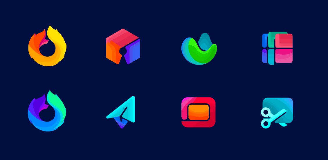
Going to finish up this evolution here with this final image showing some of the measurements and tweaks built into the final logo. I think when you look at them together like this they really do work as companion pieces within the system.
2019-2020

One of my final pieces that I've worked on is a multi-tiered illustration system for use in both Marketing and Product. The style builds off our amazing glyph system (@bryanbell) and builds in our extended color palette.
Well, folks. That's my Mozilla design journey.

Not gonna lie, pretty emotional right now. I've put a lot of love and emotion into this work over the years and I do hope that it has been apparent in my work.
When you design with emotion + empathy, there's a chance you help build brands people love. I hope I've helped there.

Make that connection in your work. Over time you get to know your audience and run with your instincts - designing with your heart.

It's an amazing feeling.
Thank you, @mozilla.

I'm a contributor again! :)
Missing some Tweet in this thread? You can try to force a refresh.

Enjoying this thread?

Keep Current with Sean Martell

Profile picture

Stay in touch and get notified when new unrolls are available from this author!

Read all threads

This Thread may be Removed Anytime!

Twitter may remove this content at anytime, convert it as a PDF, save and print for later use!

Try unrolling a thread yourself!

how to unroll video

1) Follow Thread Reader App on Twitter so you can easily mention us!

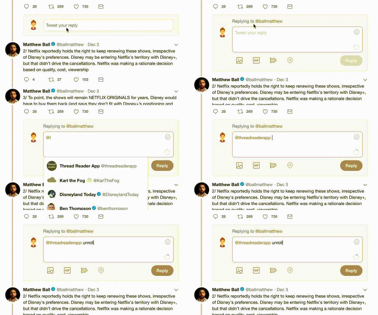
2) Go to a Twitter thread (series of Tweets by the same owner) and mention us with a keyword "unroll" @threadreaderapp unroll

You can practice here first or read more on our help page!

Follow Us on Twitter!

Did Thread Reader help you today?

Support us! We are indie developers!


This site is made by just three indie developers on a laptop doing marketing, support and development! Read more about the story.

Become a Premium Member ($3.00/month or $30.00/year) and get exclusive features!

Become Premium

Too expensive? Make a small donation by buying us coffee ($5) or help with server cost ($10)

Donate via Paypal Become our Patreon

Thank you for your support!