Thread: P&F Super Pattern
An effective price pattern defined using properties of P&F charts.
#Superpattern #Pointandfigure #Definedge
An effective price pattern defined using properties of P&F charts.
#Superpattern #Pointandfigure #Definedge
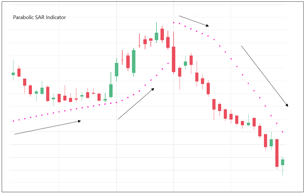
Point & Figure is an oldest charting method where price is plotted vertically, and the chart moves only when price moves. It is a different way of looking at the price, the objective box-value and reversal value offers advantage of identifying objective price patterns.
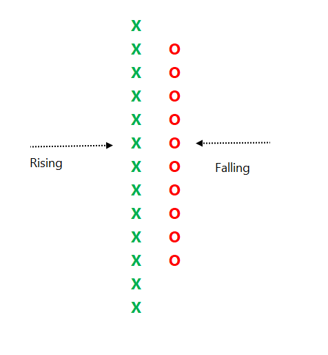
When price is moving up, it is plotted in a column of 'X'. When it is going down, it is plotted in a column of ‘O’. Normally, three-box reversal criteria is used to define the trend & reversal. Unlike a bar or candle, the P&F column can have multiple sessions in it.
Link to know more about the subject:
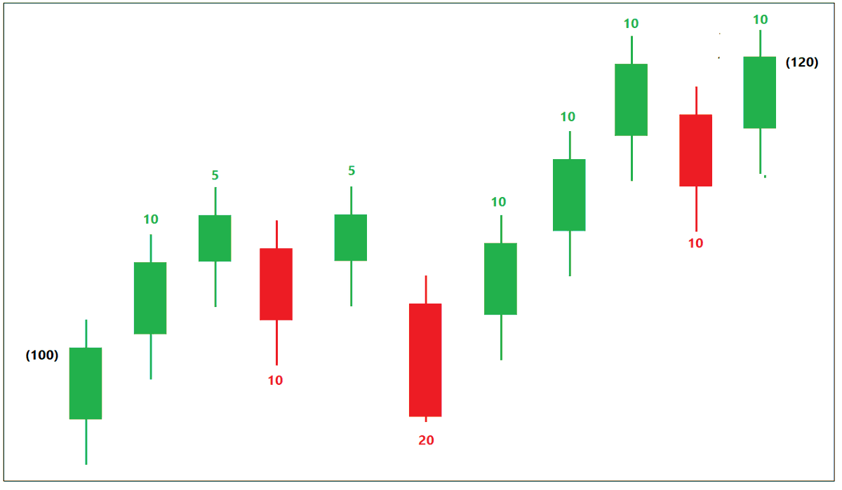
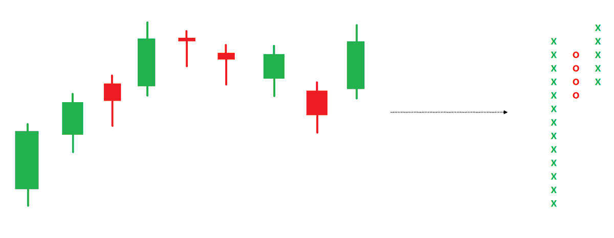
See below chart. Price is in a strong uptrend, P&F chart would produce a long of column of 'X' with more number of boxes in it.
See below chart. Price is in a strong uptrend, P&F chart would produce a long of column of 'X' with more number of boxes in it.
If such a trend is followed by some time bars without meaningful price correct, P&F chart would not move, and it will remain in column of 'X' in such a scenario.
If there is a price correction, P&F chart would turn to column of 'O'. If price correction is not large or significant, boxes in 'O' column would be less.
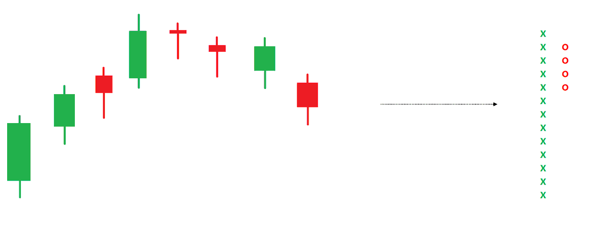
If it turns out to be a shallow correction and price bounces back immediately, it indicates that weak bulls are shaken and weak shorts are in - in a strong uptrend. There is a trade opportunity when price goes above previous high.
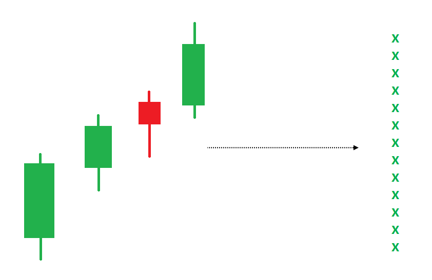
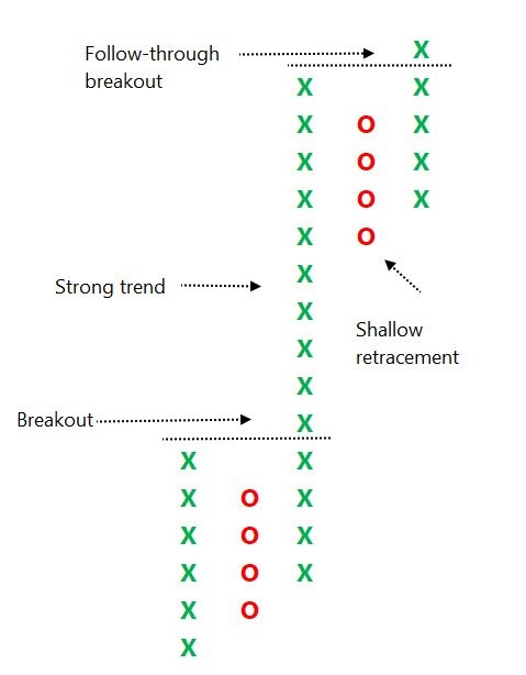
Column of ‘X’ in a P&F chart would go above previous high. It is known as a basic Double-top buy pattern when column of X goes above high price of previous column of X.
The strong trend should not be a corrective move. There has to be a breakout before that.
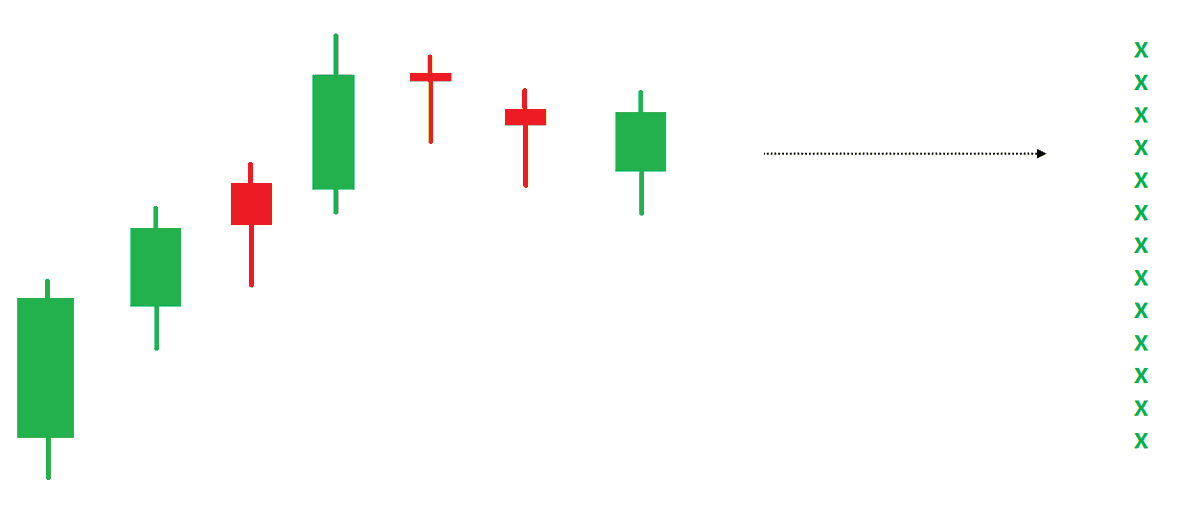
So, the pattern is: Breakout, strong trend, shallow retracement & follow-through price action.
How it is defined clearly and made objective on a P&F chart?
So, the pattern is: Breakout, strong trend, shallow retracement & follow-through price action.
How it is defined clearly and made objective on a P&F chart?
Breakout = Double-top buy
Strong trend= More than 10 boxes of 'X' after breakout
Shallow retracement = Not more than 4 boxes after strong trend
Follow-through = Double-top buy after correction
Strong trend= More than 10 boxes of 'X' after breakout
Shallow retracement = Not more than 4 boxes after strong trend
Follow-through = Double-top buy after correction
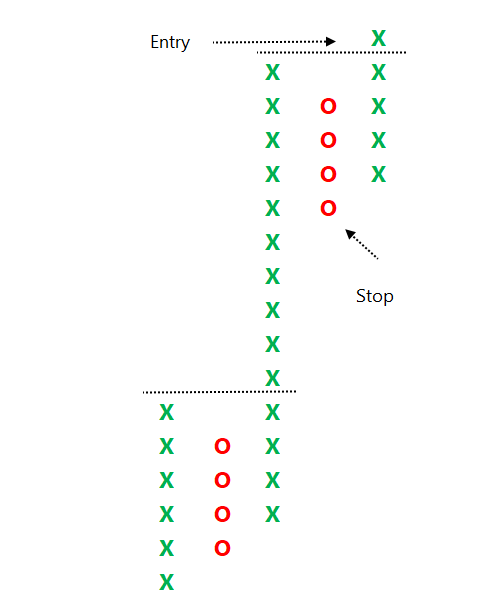
The trade plan is also objective. Buy upon follow-through breakout (double top buy) and place a stop-loss below the bottom of shallow retracement.
Initial stop-loss in affordable and risk-reward is high that makes it a tradeable pattern with positive expectancy.
Initial stop-loss in affordable and risk-reward is high that makes it a tradeable pattern with positive expectancy.
Vice versa for bearish super pattern. The objective definitions can help us in trading this price pattern on any instrument and timeframe. I suggest Daily chart for EOD segment and one-min timeframe for intra & derivative trading. One-min on P&F is v different & useful timeframe.
The pattern was introduced in my book on P&F charts. It has clear entry-exit and risk management rules. The logic and definition is Super, hence I gave that name. I have defined many such price patterns using important properties of different charting methods.
This simple looking pattern & combination is a result of lots of efforts & experience. More filters & variations are possible. It can be traded objectively, or chart analysis can improve the results. It can also be traded in combination with candlestick patterns or other methods.
The pattern can help in identifying stocks in momentum, strong breakout and offer affordable RR. Most of the momentum indicators are in favor during such breakouts. The pattern and setup has stood the test of time for me. Its not about P&F, its about objective price setups.<End>
• • •
Missing some Tweet in this thread? You can try to
force a refresh