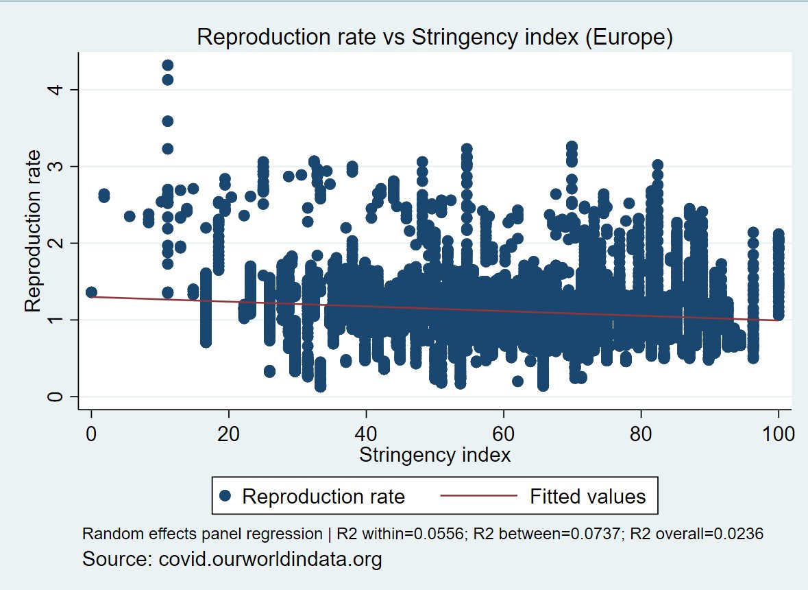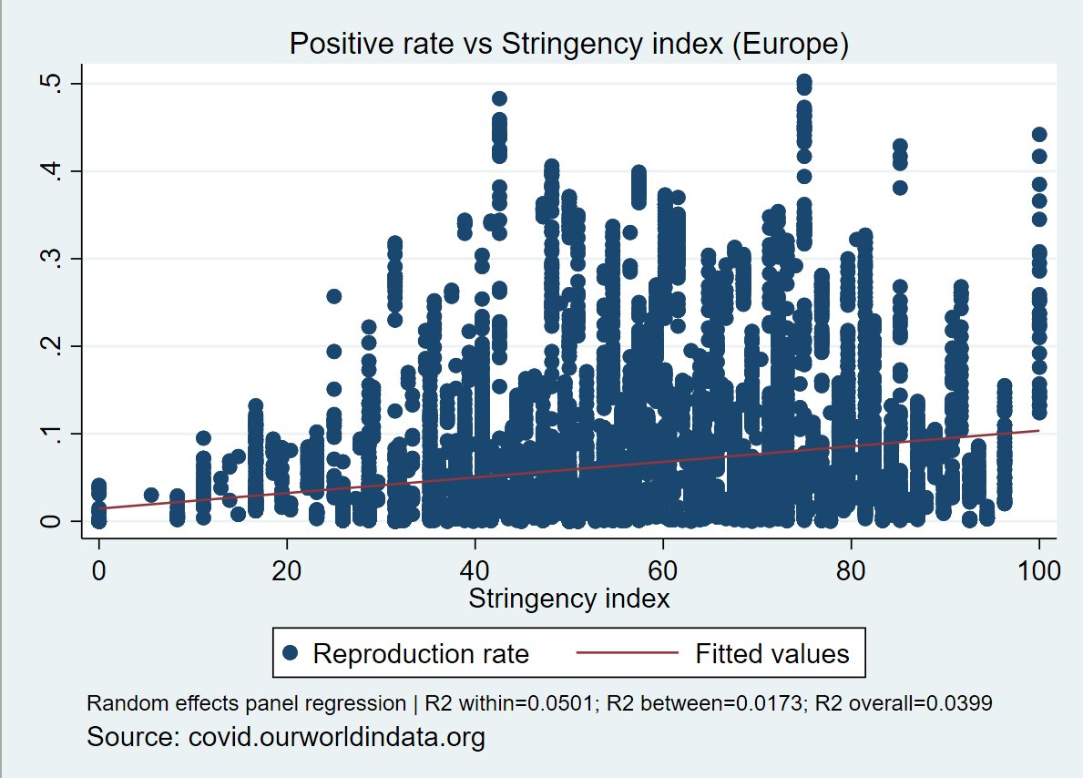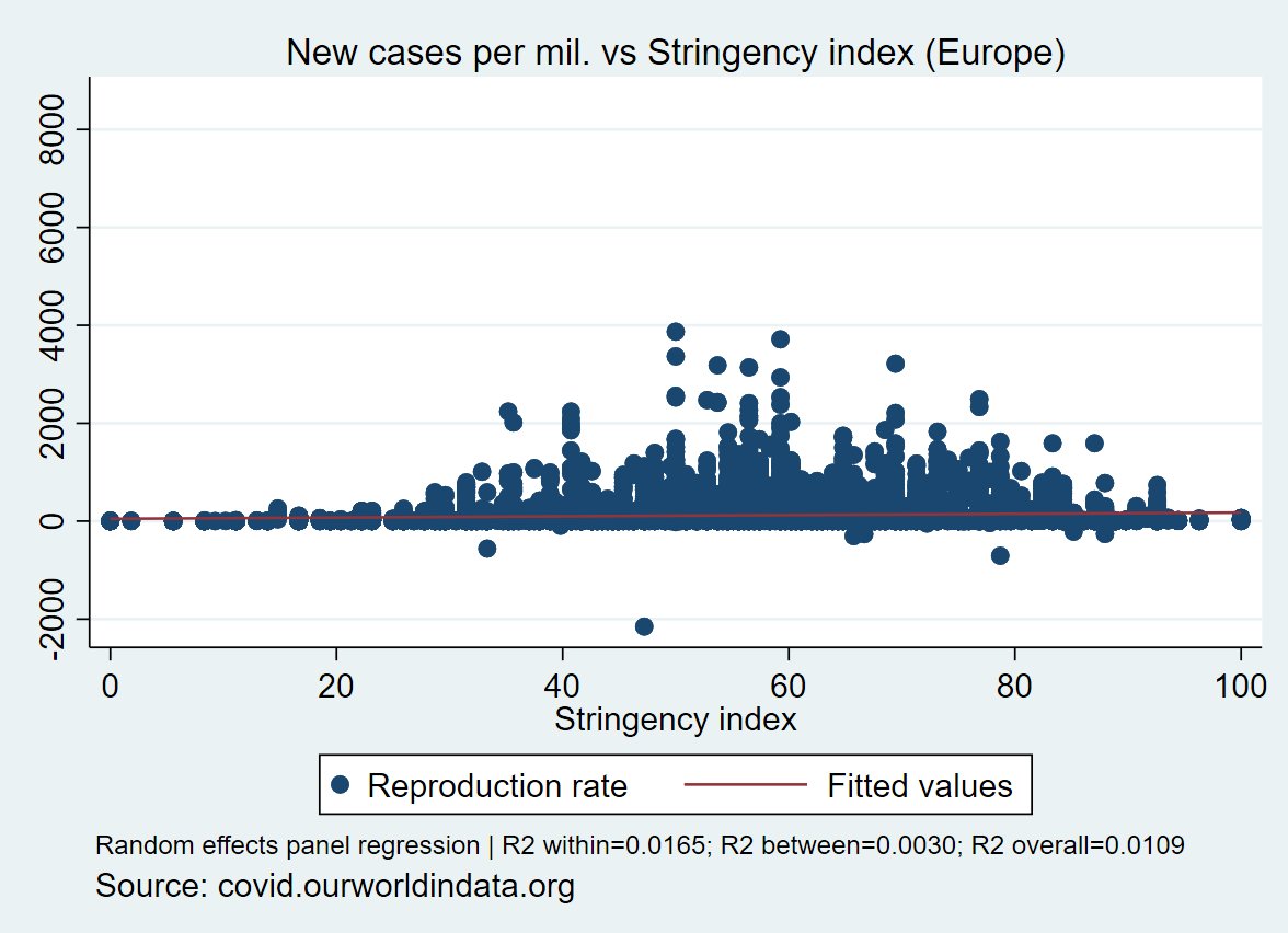
#thread follow up w/r to several threads related to #COVID19 :
1. stringency index "effects" :
2. #lockdowns :
1/n
1. stringency index "effects" :
https://twitter.com/ChrisGodlak/status/1353838559413866497?s=20
2. #lockdowns :
https://twitter.com/ChrisGodlak/status/1354740101461532673?s=20
1/n
5. so how does "health policy" outcomes have evolved since around 2000 as demographics is something you can factor in right ?
let's look at Western Europe using @EU_Eurostat data:
#COVID19
4/n
let's look at Western Europe using @EU_Eurostat data:
#COVID19
4/n
6. Hospitals beds / 100k. hab.:
rather flat...
notice most of depicted countries are below the EU27 average....
hopefully they use them more efficiently (?)
#COVID19
rather flat...
notice most of depicted countries are below the EU27 average....
hopefully they use them more efficiently (?)
#COVID19

7. curative beds / 100k. hab. and the occupancy rate:
curative beds follow the same trend as hospital beds: from flat to decreasing, most countries below EU average
occupancy rate is also rather flat
Netherlands champ !
#COVID19

curative beds follow the same trend as hospital beds: from flat to decreasing, most countries below EU average
occupancy rate is also rather flat
Netherlands champ !
#COVID19


8. so where is the money ?
total healthcare expenditures in € / hab. and as % of GDP:
again rather flat, most countries above EU average
so where is that money going ? how efficiently it is used ?
#COVID19

total healthcare expenditures in € / hab. and as % of GDP:
again rather flat, most countries above EU average
so where is that money going ? how efficiently it is used ?
#COVID19


9. is the money going into "human capital" ?
let check medical doctors and nurses
again it looks rather flat, especially for nurses
so where is the money going ?
#COVID19

let check medical doctors and nurses
again it looks rather flat, especially for nurses
so where is the money going ?
#COVID19


10. let check the specialists: i focus on respiratory medecine, microbiology-bacteriology and pathology:
for respiratory medecine it's a positive trend
for micro-bio rather flat with a bump in BEL while FRA is a champ
flat for pathology with a champ in PRT
#COVID19


for respiratory medecine it's a positive trend
for micro-bio rather flat with a bump in BEL while FRA is a champ
flat for pathology with a champ in PRT
#COVID19


11. let have a look at Physicians...
all flat, except Germany followed by Spain & UK
a shock in Italy (?)
#COVID19
all flat, except Germany followed by Spain & UK
a shock in Italy (?)
#COVID19

12. how old are these physicians ?
64-75: Italy again (?), followed by France, Germany, Spain... rest rather flat
>75: Italy, France up, Switzerland also...
#COVID19

64-75: Italy again (?), followed by France, Germany, Spain... rest rather flat
>75: Italy, France up, Switzerland also...
#COVID19


13. final graph: average length of stay in days of patients:
Finland could teach something !
rest is rather flat, except maybe Italy
#COVID19
Finland could teach something !
rest is rather flat, except maybe Italy
#COVID19

14. these parameters must be taken into account regarding any health or "sanitary" policies as demographics are what they are and you cannot escape that...
(disclaimer: unfortunately data on BMI, smoking, etc. from @EU_Eurostat are available for 2014 only so i didnt use that)
(disclaimer: unfortunately data on BMI, smoking, etc. from @EU_Eurostat are available for 2014 only so i didnt use that)
i am on TG: t.me/s/chrisgodlak
@threadreaderapp unroll
• • •
Missing some Tweet in this thread? You can try to
force a refresh


