1. Here is an up-to-date table of results from the Cambridge University #Covid19UK study of asymptomatics since the start of 2021
2. Some key points about it:
3. The explanation of why this means the much repeated Government claim that “1 in 3 people with the virus has no symptoms” is a massive exaggeration was provided in this previous analysis of the Cambridge study: probabilityandlaw.blogspot.com/2021/02/the-ca…
4. In a paper we are near to completing we show that what MIGHT be true is that “1 in 3 people who test positive have no symptoms”. But, because of false positives, that’s very different to the claim that “1 in 3 people with the virus have no symptoms”
5. And a reminder that “1 in 3 people with the virus have no symptoms” is NOT the same as “1 in 3 people with no symptoms have the virus” (transposed conditional fallacy). But because many assume these are equal I suspect the messaging was deliberate to scare people even more
1. This article nicely explains why (because of possible false positives) a positive LFT test result does NOT mean you certainly have Covid. However, it's focus on false negatives (implying we should also be wary of a negative result) is misleading. theguardian.com/theobserver/co…
2. In fact, with the assumptions used in the article and the current results of the Cambridge University study of asymptomatics, it follows that there's ony a 1 in 10,000 chance a person testing negative with LFT will have the virus
3. The results suggest we should NOT be mass testing asymptomatic people. The lastest Cambridge asymptomatic study results are here: cam.ac.uk/sites/www.cam.…
1. As I pointed out yesterday with this graphic (now updated) the Cambridge study data shows that since December only a miniscule percentage of people without COVID-like symptoms have the virus. But it also exposes massive contradications in the official Government data.
2. First it demonstrates (for one UK city) that the much publicised claim that "1 in 3 people with the virus has no symptoms" cannot be correct if the ONS estimated infection rate is correct. Here's an informal explanation (formal proof follows later in thread)
3. In fact, if the "1 in 3" claim is correct then the ONS estimated infection rate is massively inflated - the currently reported ‘case’ numbers must be at least 8 times greater than the true number of cases.
This has interesting implications for the accuracy of the official #Covid19UK 'case' data and the claim that it is critical to test people even if they don't have any COVID-19 symptoms. No fancy analysis here. Just the raw data from the Cambridge University study of asymptomics
This report says 9,480 of 2,372,358 lateral flow tests in UK 28 Jan - 3 Feb were positive. Given false pos rate for these tests that's about 1 in 1587 true positives. In same period ONS estimated UK infection rate was 1 in 77. gov.uk/government/pub…
1/3. The UK #COVID19 testing data since September by different regions reveals a very close correlation between number of people tested and the proportion who test positive (i.e. the positivity rate)....
2/3 ...not clear what if any causal explanation there is to such a close correlation. But indications are that an increasing positivity rate may not be due to an increase in underlying infection rate... A full discussion is here .. probabilityandlaw.blogspot.com/2020/12/uk-cov…
3/3 ... and lockdown decisions could result purely from decisions to increase testing. All the usual caveats apply (and in this case this analysis has been done in a hurry to get it out, as the results seem so unusual and could not be seen from looking at the overall UK data)
1. Some people taking issue with my earlier plot of daily new covid hospital admissions as % of new cases don't seem to understand the fundamental limitations of ALL the analyses based on the daily data provided by the government - as summarised in this graphic...
2. They thought I didn't understand that the April peak was largely explained because then it was mainly hospitalized people being tested. As I work on CAUSAL modelling and analysis we were highlighting this very problem back in March ... theconversation.com/coronavirus-co…
We have produced numerous reports exposing the flaws of much published statistical analysis on Covid because of the failure to account of causal factors and explanations. My blog post from last week provides some context and links to much of this work. probabilityandlaw.blogspot.com/2020/10/why-we…
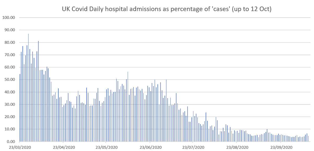
1. (This is a corrected version of tweet I just deleted). Some perspective on #CovidUK hospital admissions. Here's an update of another graph (using data from coronavirus.data.gov.uk) that never seems to be shown. Daily number of new covid admissions as % of new cases.
2. So 87% of 'cases' at March peak resulted in hospital admissions. Now it's just 4.6% and is actually decreasing. And that's despite: increased repeat hospital testing now (so more false positives), and hospital admissions always go up in October.
3. And note: a person entering hospital with a non-Covid condition who, for example, tests positive after 3 weeks and several negative tests, is counted as a Covid admission.