Here’s a great example of how sometimes modelling produces counter-intuitive results: if (under certain conditions) you randomly infect 100,000 people with covid in the next few weeks, you’d save 250 lives. What??? Yes, that’s right, more infections means fewer deaths. 1/
I should be clear before we go any further that I’m not proposing this as a practical suggestion, for reasons that will become clear. It’s more a mathematical curiosity, but it helps to expose a couple of interesting dynamics, so I think it’s worth sharing with you. 2/
So, to start with let’s set up my model with a moderately-sized exit wave, as predicted by the Warwick or Imperial models (NB this is not my central case – I am currently predicting no exit wave, or a very small one – but it’s not impossible). 3/
Now, let’s introduce a “spike” in infections in early May. I do this by pushing R up above its trend for one week, and then pushing it down below trend on week 2 – in order to neutralise the impact of the spike on future cases – and then back to trend from week 3 onwards. 4/
Let’s look at the infection curve in both the original scenario – in blue – and our adjusted scenario (with spike) in orange. It’s a bit hard to see the difference, but perhaps you can just make out the spike in early May, and then a reduction in the height of the exit wave. 5/ 
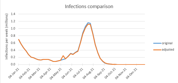
It’s a lot clearer if we just look at the difference between the two infection curves: now you can see the spike very clearly, but also a gradual reduction in the size of the exit wave, and then a slight increase at the end (as the wave is pushed slightly later in time). 6/

As it turns out, the number of extra infections in the spike is around 107,000. But the number of infections in the exit wave is reduced by 195,000. So the net effect of adding the spike has been to *reduce* the total number of infections by about 88,000. 7/

But why is it doing that? Well, simply put the exit wave happens because we’re not yet at the herd immunity threshold when we unlock. And when we do unlock, infections will rise until we reach the HIT, when they peak (with R=1) and then start to decline. 8/

If we unlock at low prevalence, the exit wave will be roughly symmetric around the point where we do hit the HIT. So if we add one infection before we unlock, we’re reducing the gap to HIT by one infection. So that’s one less infection in the left-hand side of the exit wave 9/
…and (with a roughly symmetric wave) also one less in the right-hand side. So we’re exchanging one infection prior to unlocking for (roughly) two after unlocking. That’s a good trade – I can now see how adding a spike might reduce total infections, and hence deaths. 10/
But that’s not the whole story. If we look at the difference in deaths for our two scenarios – original and adjusted – we can see again the spike (with 155 additional deaths) and the reduced exit wave (with 405 fewer deaths). Hence a reduction of 250 deaths overall. 11/

But that’s a bit more than we’d expect. It looks like the ratio of deaths to infections (IFR) is a bit lower in the spike than in the exit wave. So when we trade 1 infection in the spike for ~2 in the exit wave, that’s not the only benefit: the infections we are saving 12/

…later on are more deadly than the one we are adding in the spike. So while we’re saving 1.8 infections for every one we add (1.8 = 195 / 107), we’re actually saving 2.6 deaths for every death we cause in the spike (2.6 = 405 / 155). OK, that’s even better news. But why? 13/
Well, if we plot the IFR over time we can see what’s happening. IFR in my model starts out around 0.8%, and falls as we vaccinate the vulnerable population to a low of about 0.15% in late April. But then it starts to drift up over June & July, reaching 0.24% in September. 14/

OK so mathematically I can see what’s happening, but why is the IFR going back up? To answer that we need to remember that the IFR is not an average over the whole population, but over the people who are infected. And to understand that who gets infected changes over time. 15/
The people who get infected are, by definition, those who are susceptible to the disease. So let’s look at that susceptible group. The number of them is reducing over time, but what we’re interested in here is the composition, so we’ll use a 100% stacked area chart: 16/

We can see that as we vaccinate more, the %ge of susceptibles who have some partial immunity (and are therefore protected against severe disease and death) is growing – see the grey area. By definition the IFR in this group is zero, so as it grows, the overall IFR reduces. 17/
The second effect has to do with the mix of the other categories. Broadly speaking, the higher % that the vulnerable groups (orange & yellow) form of the total, the higher IFR is. And we can see that proportion going down fast in Jan/Feb/Mar as we vaccinate those groups. 18/
But then it reaches a low point in Apr/May, and starts to climb back up again in Jun/Jul as we vaccinate the younger groups. This doesn’t mean those vaccinations are a bad idea –it’s still a big positive overall– but it does have the side-effect of meaning IFR goes up a bit. 19/
So this explains why, if we increase infections in April/May, it has a lower effect on deaths than if we did the same in June/July. And hence why “trading” higher infections in April/May for a lower infection rate in June/July is a good deal. 20/
One way of looking at this is we’ve temporarily created a “Great Barrington”-like situation where the vulnerable are mostly protected, but the young are still susceptible. So if you know you need more infections to get over the HIT, now’s the time to take them. 21/
But now I need to remind you why I’m not actually promoting this as a plan. There are two big reasons:
1) This whole analysis depends on there being an exit wave – without it, there would be no reduction in infections or deaths, and you’d just be adding extra infections 22/
1) This whole analysis depends on there being an exit wave – without it, there would be no reduction in infections or deaths, and you’d just be adding extra infections 22/
…and deaths in the spike. And I’m not expecting there to be an exit wave when we unlock in June.
2) In reality we can’t control R in the way that I have done in the model, to ensure that the ‘spike’ is neutralised and we don’t set off a chain of growing infections. 23/
2) In reality we can’t control R in the way that I have done in the model, to ensure that the ‘spike’ is neutralised and we don’t set off a chain of growing infections. 23/
Without the neutralisation, we give the exit wave more momentum, and we end up killing 2000 extra people, rather than saving 250. So the real-world risks of accidentally making things a lot worse are very high. So it’s really not something I would recommend trying. 24/
But I do think it’s interesting that if you were in govt, convinced by SAGE’s briefing papers that an exit wave was a nailed-on certainty, and someone gave you the choice of pushing infections up for 1 week, or down for 1 week, the correct answer is: make infections go up. /end
• • •
Missing some Tweet in this thread? You can try to
force a refresh