So today’s big covid Twitter debate has been the relative contribution of lockdown (or, more broadly, controls / NPIs) and vaccinations to bringing down case rates. It occurs to me that we already have some numbers – or at least assumptions – that we can look at: 1/4
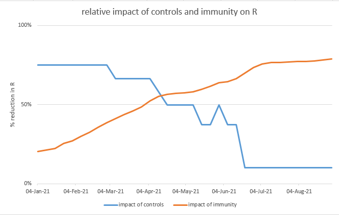
This chart shows the assumptions in my model for the relative reduction in R from controls, and from immunity. As you’d expect, in January it’s nearly all controls – and by June it’s mostly immunity. The cross-over point is in mid-April – in fact, round about now. 2/4
But of course immunity is a composite of vaccination-acquired immunity, and infection-acquired immunity. So let’s split those out. We can see that infections grow slowly, and have already been overtaken by vaccines. But vaccines don’t overtake controls until early June. 3/4
(note the bump on the blue line in late May is half term, as I assume slightly lower R in school holidays. The control reduction after 21/6 is shown as 10%, but could be higher or lower depending what baseline controls the government retains, and how effective they are.) /end
PS it seems I need to clarify my intent here: by showing these graphs, I'm not expecting to convince anyone who doesn't already believe that controls/lockdown have a big impact on R. I'm just being transparent about the assumptions in my model, which some may find interesting.

• • •

Missing some Tweet in this thread? You can try to force a refresh
 

Keep Current with James Ward

James Ward Profile picture

Stay in touch and get notified when new unrolls are available from this author!

Read all threads

This Thread may be Removed Anytime!

PDF

Twitter may remove this content at anytime! Save it as PDF for later use!

Try unrolling a thread yourself!

how to unroll video
  1. Follow @ThreadReaderApp to mention us!

  2. From a Twitter thread mention us with a keyword "unroll"
@threadreaderapp unroll

Practice here first or read more on our help page!

More from @JamesWard73

12 Apr
Here’s a great example of how sometimes modelling produces counter-intuitive results: if (under certain conditions) you randomly infect 100,000 people with covid in the next few weeks, you’d save 250 lives. What??? Yes, that’s right, more infections means fewer deaths. 1/
I should be clear before we go any further that I’m not proposing this as a practical suggestion, for reasons that will become clear. It’s more a mathematical curiosity, but it helps to expose a couple of interesting dynamics, so I think it’s worth sharing with you. 2/
So, to start with let’s set up my model with a moderately-sized exit wave, as predicted by the Warwick or Imperial models (NB this is not my central case – I am currently predicting no exit wave, or a very small one – but it’s not impossible). 3/
Read 25 tweets
9 Apr
I’ve been getting increasingly confident in recent weeks that we’re on the right path to defeating B.1.1.7 in the UK, and stand a good chance of ‘unlocking’ in May/June with a no exit wave, or a very small one. But there’s one thing still bothering me: new variants. 1/
Up ‘til now, I’ve not been sure how worried to be about these. Many people (including some whose opinions and expertise I trust) tell me not to worry, there won’t be much ‘immunity escape’, and in any event T-cells will ensure that we remain protected vs. severe disease. 2/
But the questions still bothering me are: 1) how much ‘immunity escape’ would be needed to cause a problem? 2) and how likely is that to occur? I can’t answer the second question – that’s one for the virologists and immunologists – but I can have a go at the first. 3/
Read 37 tweets
7 Apr
Having spent a good chunk of yesterday going through the recent SPI-M papers including the latest models from Warwick, Imperial and LSHTM, and then come back up for air, what have I learned? Here’s my summary of ten important messages: 1/14
1. While the headlines have once again been full of doom-laden reports of a huge ‘exit wave’ when we unlock in the summer, the reality is that both Warwick and Imperial models are now predicting a much smaller wave with only 15-20k deaths in their central scenarios. 2/14
2. Looking at the Warwick model in more detail, the change from previous iterations is mostly due to improved (more optimistic – or in my view, realistic) assumptions for vaccine rollout, vaccine take-up, vaccine efficacy vs. severe disease, and efficacy vs. infection. 3/14
Read 15 tweets
2 Apr
After yesterday’s model update () a few people have asked: so if there’s no exit wave, or just a small one, does that mean we could open up earlier? And the answer is: maybe, but it’s complicated. If you’re interested in the details, read on… 1/n
All of yesterday’s modelling assumed that we follow the government’s roadmap to 21st June, when we remove all remaining restrictions and controls, and behaviour returns to normal. (note that point: all controls removed on 21st June, it will become important later on). 2/n
But what happens if we vary this date? I’ve adjusted this in the model, bringing it back 1 week at a time up to 5th April, and also extending it the other way to 26th July, for completeness. As you can see (from blue line below), opening on 21st June looks OK, and you could 3/n
Read 15 tweets
1 Apr
I’ve updated my model for recent news, and after a series of assumption changes that mostly net out, it still predicts a very small exit wave with ~4k additional deaths (reduced from 9k previously) – and with a small added dose of seasonality, no exit wave at all. 1/n
The key changes in the model are shown in the waterfall chart below, and explored in more detail in the thread that follows this summary. 2/n
This conclusion feels more solid than before, as no single-factor sensitivity (within plausible ranges of uncertainty) takes the exit-wave deaths over 10k- see 1st chart. To get significantly higher deaths I have to move multiple assumptions at the same time– see 2nd chart. 3/n
Read 17 tweets
24 Mar
I’ve spent a lot of time over the last 2 days going through the most recent paper thelancet.com/action/showPdf… from the Warwick modelling group that feeds into SAGE, and trying to work out why it predicts a large exit wave, when my model (mostly) doesn’t. My conclusions are: 1/12
1. Their model in fact doesn’t guarantee an exit wave: with fast vaccine rollout (4m per week) and high (85%) transmission blocking, and either high (85-95%) vaccine uptake or high (94%) protection vs. severe disease, there is no material exit wave - see the orange line 2/12
2. Their choice of central assumptions is (imo) consistently on the pessimistic side. In fact, my central assumptions frequently correspond closely to their “optimistic” upside scenario. To avoid a very long thread I’ve built a table that compares their assumptions to mine 3/12
Read 13 tweets

Did Thread Reader help you today?

Support us! We are indie developers!


This site is made by just two indie developers on a laptop doing marketing, support and development! Read more about the story.

Become a Premium Member ($3/month or $30/year) and get exclusive features!

Become Premium

Too expensive? Make a small donation by buying us coffee ($5) or help with server cost ($10)

Donate via Paypal Become our Patreon

Thank you for your support!

Follow Us on Twitter!