How have you spent your Saturday? I’ve spent most of mine jumping around in front of a @skynews screen trying to make sense of the actually-rather-interesting local/Scottish/Welsh/London and a few other elections today.
Here’s something I did on Scotland:
Now, in case it wasn’t already clear, the problem with trying to use these election results as an argument either FOR or AGAINST another independence referendum is that, well, there’s no such thing as an automatic trigger or rule about these kinds of things…
On the one hand, the SNP has had another very strong election. They’ve increased their share of the vote for the fourth successive election. Given the extraordinary share of the vote they already have, that’s pretty, well, extraordinary.
On the other hand, the SNP didn’t get more than 50% of the vote. Or an outright majority in Holyrood (as they did in 2011, something which helped precipitate the 2014 referendum). That said, combine the SNP with the Green Party and that’s a pro-indy majority in Holyrood.
But now look at the share of the vote across Scotland’s Holyrood constituencies and you get a different picture. Tot up the constituency votes and the anti-independence parties have more than 50%. Which would seem to argue against there being a “popular mandate”
But it’s not that simple. Don’t forget, this isn’t a simple first past the post election. You vote once for constituency MSP and once for a party list. And while most CONSTITUENCY votes (51%) went to anti-Indy parties, most LIST votes (52%) went to pro-Indy parties.
Finally, let’s tot up EVERY vote, constituency AND list. Now you end up with around 50.5% of total votes for pro-indy parties
In short, both sides can claim a popular majority, depending on how you slice it.
But it’s two out of three for the pro-Indy side.
Does any of this really constitute a mandate anyway?
Were people really voting based only on their appetite or otherwise for independence?
Is this data ultimately a bit meaningless?
Regardless of what you think, one suspects it’ll be chewed over for some time to come…

• • •

Missing some Tweet in this thread? You can try to force a refresh
 

Keep Current with Ed Conway

Ed Conway Profile picture

Stay in touch and get notified when new unrolls are available from this author!

Read all threads

This Thread may be Removed Anytime!

PDF

Twitter may remove this content at anytime! Save it as PDF for later use!

Try unrolling a thread yourself!

how to unroll video
  1. Follow @ThreadReaderApp to mention us!

  2. From a Twitter thread mention us with a keyword "unroll"
@threadreaderapp unroll

Practice here first or read more on our help page!

More from @EdConwaySky

10 May
Thread: In a factory somewhere on the outskirts of Birmingham sits a machine which tells you rather a lot about the UK economy & where it's heading. It cuts & presses little bits of copper alloy, which are then sent on to another company which puts them into car rear view mirrors Image
If you buy a car with a heated rear view mirror anywhere in the world, chances are it’ll be powered by those copper electrodes made just outside Birmingham by @CBrandauer - in that very machine. It’s a crucial cog in an automotive supply chain that bestrides the world.
But the reason it’s worth focusing on that machine is not so much what it does but why it’s there. @CBrandauer bought it in part because of the new Super Deduction policy introduced by @RishiSunak in March’s Budget. The deduction could be a v big deal indeed.
Read 18 tweets
1 May
🪨 Rare earths: everything you ever wanted to know
Or rather: everything never wanted to know but really ought to know, especially since the device you're reading this on almost certainly has rare earths in it. Thread…
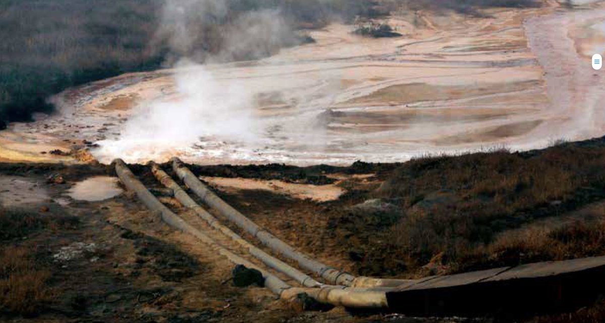
This might look like a satellite image of Mordor but it’s actually ground zero of the 21st century
Without this mine & others like it you wouldn’t have Airpods.
You wouldn’t have electric cars.
Or wind turbines.
Or much modern tech.
Bayan Obo: the world’s biggest rare earths mine
Bayan Obo is in Inner Mongolia. China. First thing you notice is the pollution. Extracting rare earths from ores is an incredibly energy-intensive, dirty business. Many mining processes involve waste tailings and lakes of toxic sludge. But especially rare earth processing.
Read 24 tweets
22 Apr
Anyone fancy an #Earthday data thread?
One of my frustrations with this topic is that all too often it’s portrayed in enormously over-simplistic terms: We need to stop flying! Cutting down forests is killing the planet!
So here’s some charts that show you the numbers that matter
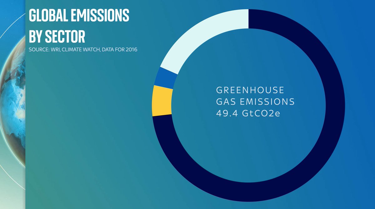
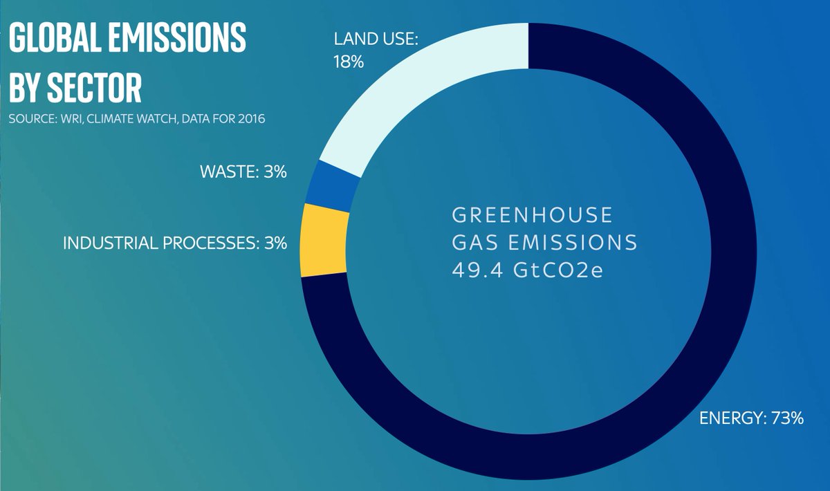
Let’s start with this: this doughnut shows you total global emissions. About 50 gigatonnes of CO2 or equivalent. The numbers are from @WorldResources based on @IEA data which you and I can’t afford to see because they’re stuck behind a mammoth paywall.
First let’s break the doughnut into some primary categories: the vast majority is emissions from energy: everything from power stations to gas boilers to industrial processes. But also note a big chunk is emissions directly coming from the land/farming, and industry/waste
Read 16 tweets
13 Apr
One thing we’ve learnt about #COVID stories:
Often something that looks too scary to be true isn’t quite true when you look at the small print.
Often something that looks too good to be true isn’t quite true when you look at the small print.
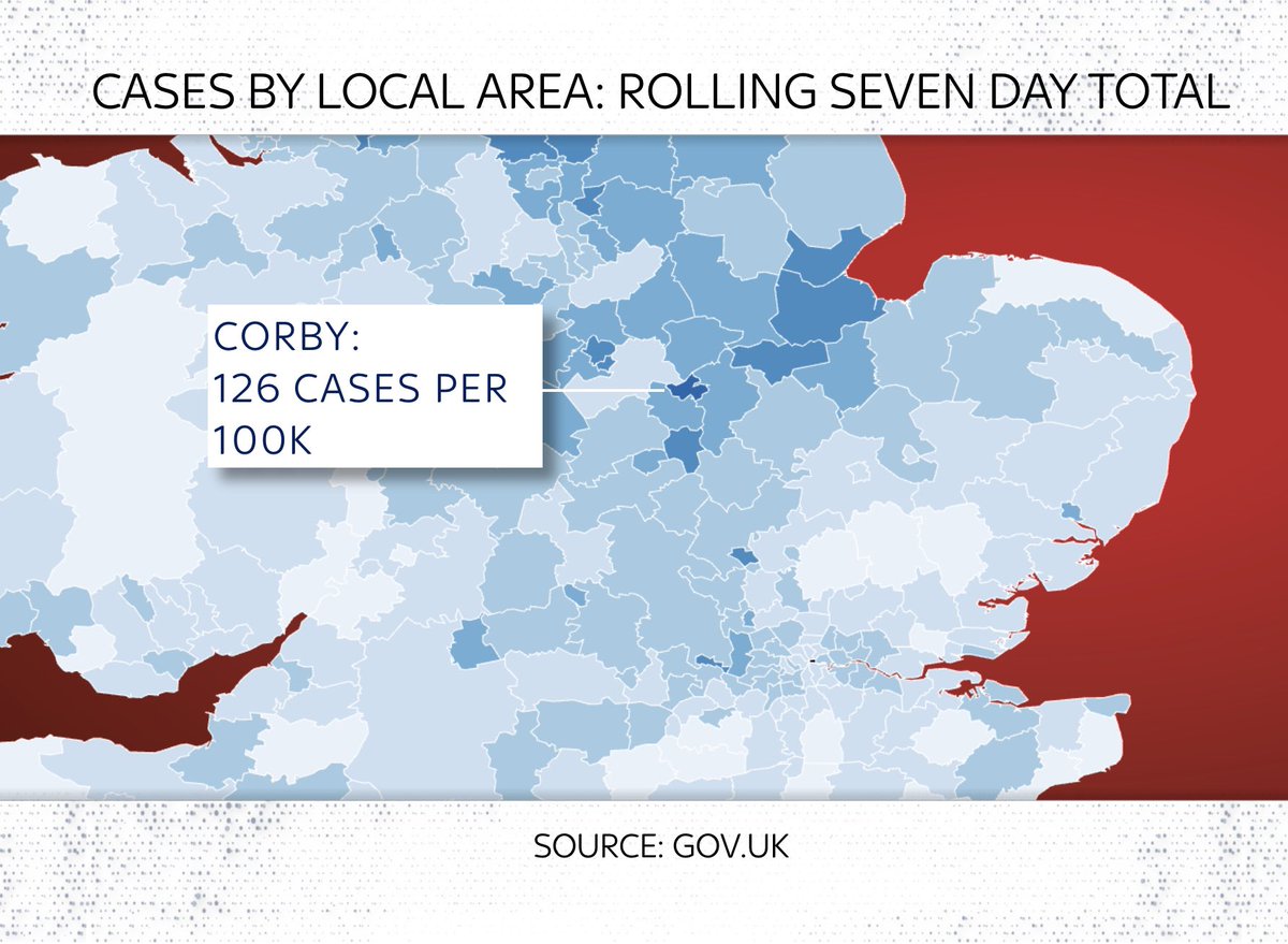
There have been a few scary stories in recent weeks about “hotspots” of #COVID19 around the UK.
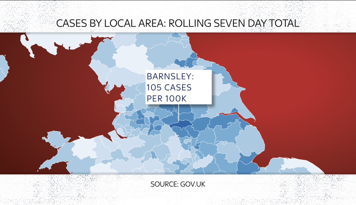
Partly inspired by maps like this (this one from @PHE_uk) which compare local case levels with the national avg. The reddest area here is Barnsley
One problem with heatmaps is that while they do a good job of depicting regional variation, they don’t give you much context.
And they can look more dramatic when the national avg is low (as it is right now). So.
Here are three “hotspots”: Clackmannanshire, Corby & Barnsley:
Read 13 tweets
6 Apr
Breaking: latest IMF World Economic Outlook is out.
Having flicked through, strikes me this is the most positive outlook since the onset of the pandemic (with some important provisos).
- UK, US and most advanced economies get a big vaccine-related upgrade this year & next
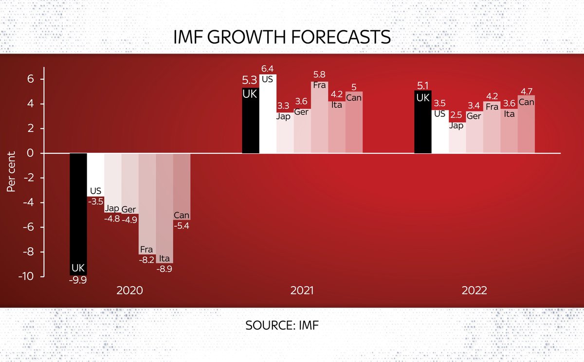
Here are the latest IMF GDP forecasts for G7 members. As you can see, an awful 2020 followed by pretty strong growth in 2022. UK actually strongest in G7 in 2022 (and given the OBR thinks 2022 GDP could be over 7% it’s poss the IMF is undercooking it slightly)
But look at the LEVEL of GDP growth and it’s a somewhat different story. The UK is the second last in the G7 to get back to its pre-crisis peak (Italy the slowest).
Read 9 tweets
1 Apr
Only one of these countries, ranked here by the number of #COVID19 cases, population adjusted, is NOT on the UK govt’s “red list” which stipulates that British travellers should quarantine in a govt-approved hotel upon arrival in the UK.
Can you guess which one?
You guessed it: the answer is France.
Now, cards on the table: I left Uruguay off that chart even though it IS on the red list because, well, I was trying to make a point. Here you can see the full chart of red list countries vs France.
But as for that point…
Clearly case numbers shouldn’t be the only determinant of which countries are on or off the red list.
Clearly some of those countries on the list have dodgy data on COVID.
Clearly this isn’t just about cases but also abt VARIANTS of the virus.
Even so…
Read 4 tweets

Did Thread Reader help you today?

Support us! We are indie developers!


This site is made by just two indie developers on a laptop doing marketing, support and development! Read more about the story.

Become a Premium Member ($3/month or $30/year) and get exclusive features!

Become Premium

Too expensive? Make a small donation by buying us coffee ($5) or help with server cost ($10)

Donate via Paypal Become our Patreon

Thank you for your support!

Follow Us on Twitter!

:(