THREAD: How did we end up here? With the UK’s plans to lift lockdown threatened by a new variant. Just as we taste freedom, it might be stolen from us! Well. It’s a slightly long and circuitous story and, believe it or not, the best place to start is with Brexit…
No. Don’t worry. This is not not a thread about Brexit. But Britain’s departure from the EU is the starting point for one of this govt’s overarching policy objectives: the need to seek out a trade deal with key partners. And one of those key partners is India.
That’s partly why @BorisJohnson made India the destination for his very first International visit. But then #COVID19 got in the way. The first slated trip in Jan was postponed. Then it was rescheduled for Apr 19. But then cases picked up in the Indian sub-continent…
The rise in COVID didn’t go unnoticed in Whitehall. Indeed on Apr 2 govt announced it was adding Pakistan and Bangladesh to the “red list” of countries which means non-residents/citizens cannot enter the UK & those coming in have to do hotel quarantine gov.uk/government/new…
India was not added to the red list at this stage. This was odd. The explanation, as repeated by @BorisJohnson in today’s press conference, was that variants of concern had been detected in Pakistan/Bangladesh but not India (the latest variant was not then officially a VOC). But.
Variants are not the only reason to put countries on the red list. Overall case numbers are also a key factor. And look: case numbers in India were far higher than in Pakistan/Bangladesh on Apr 2. There were numerous reports coming from India of cemeteries being over-capacity 

Weeks passed. The situation in India worsened. During this period Downing Street maintained it was still planning to visit India later in the month. Cases, as you saw from that last chart, mounted to unprecedented levels. Only on Apr 19 did Downing St finally cancel the trip
A few hours after the announcement of the cancellation, India was added to the “red list”. Some 17 days had passed since Pakistan and Bangladesh had been added to that list. It’s hard to know for sure whether the two things - the PM trip and the decision - were linked.
https://twitter.com/BBCPolitics/status/1384156800048517120
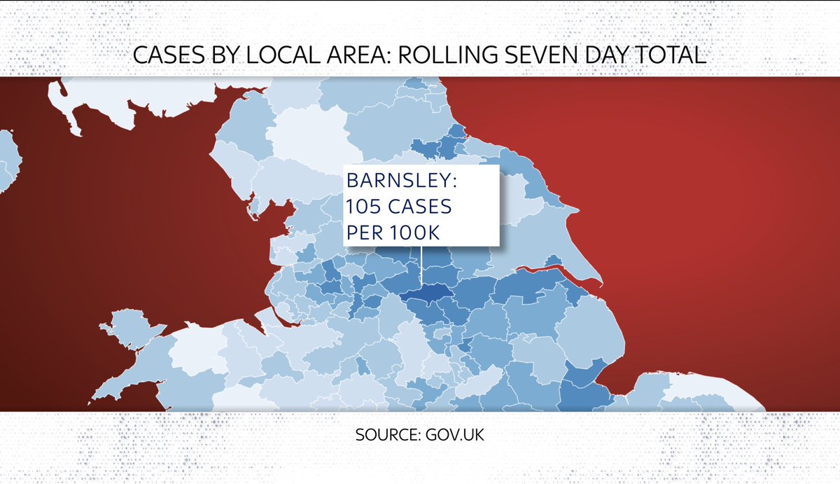
In those 17 days we now know the Indian variant was establishing a foothold in the UK. You get the sense of that from this chart
White bit: cases imported from India. Black bit: domestic cases
So: imported cases in early April began to seed domestic cases
Quite advanced by Apr 19
White bit: cases imported from India. Black bit: domestic cases
So: imported cases in early April began to seed domestic cases
Quite advanced by Apr 19

Acc to data from @PHE_uk the new variant cases were brought into the UK primarily on flights from Mumbai & Delhi. This was happening long after Indian cases had begun to soar, when the country’s terrible crisis was already in the headlines. But it wasn’t on the red list.

And that’s not all. Although the govt announced its plan to put India on the red list on Apr 19, the plan wasn’t to be implemented until 4am on Apr 23. Three and a half days. During this period demand for flights India - UK went through the roof bbc.co.uk/news/business-…
On the basis of @PHE_uk data we now know the single biggest increase in the % of cases testing positive for the new variant of concern (B.1.617.2) happened in this week beginning 19 Apr, as travellers rushed to beat this deadline. (Note the purple bit in the second chart down)

Worth saying: there’s no hard & fast rule abt how quickly govt can implement these red list decisions. The India decision was slightly quicker than usual. But it was a long way from the “we could do this in HOURS” pledge made when the rules were introduced thetimes.co.uk/article/changi…

Still: it does seem in retrospect that it was this critical period in April when the variant gained a foothold in the UK. Raising the question: what next? Before we get to that though it’s worth remembering this chart for context. Cases are REALLY LOW! That’s v good news.

And when you look at the Indian variants (there are actually three though it’s B.1.671.2 people are most worried about) they are still dwarfed by the Kent variant that basically comprises most #COVID19 in this country. But…

The Indian variant is spreading far more quickly than any other variants discovered in recent months. Much faster than S Africa or Brazil, for instance. In fact, it’s on about the same trajectory as Kent - and we know where that ended up.

Here’s a better way of showing that. Same data but this time with a logarithmic axis. You can see those lines are on similar paths. This helps explain why @CMO_England reckons the Indian variant could supplant Kent as the main variant. By some measures it’s MORE transmissible

That q - how transmissible - MATTERS. Assume vaccines are effective (and the news there is promising as we’ll see). Even if you bear this in mind, a 40% more transmissible variant could nonetheless see hospitalisations near peak 1 levels, so says Warwick: assets.publishing.service.gov.uk/government/upl…

That being said, we’ve seen charts like this before. Everyone focuses on the scary lines/areas at the top. Consider this one from Imperial a few months ago when the lockdown lifting plan was announced. 60k hospitalisations! Now (chart 2) look at what HAPPENED…


Let’s hope the same thing happens. And don’t worry: we at @skynews will keep tabs on the figs to keep you up to date on that. The good news is twofold: first, as I said above, overall cases are still v low. We’re talking pockets, not widespread contagion.
Second: data tentatively suggests the vaccines are working well against the Indian variant of concern. Here’s a chart we ran on @skynews last night. Shows case levels in Bolton by age group. Look: while it’s spreading QUICKLY among under-60s, over-60s aren’t seeing a big pick-up.

If you’re interested in more on this, here’s longish read on the @skynews website: The three days in April that could have fuelled the outbreak of the Indian variant in the UK. news.sky.com/story/covid-19…
Btw: was it inevitable the UK would have seen rises in this variant even if it put India on the red list sooner? Not necessarily. While there’s some of the variant (GREEN in these charts) in Ireland and Switzerland (& LOTS in Italy), it’s hardly ubiquitous covariants.org/per-country


Here, for anyone who prefers their analysis in video form, is my @skynews data dive into the current state of play with the Indian variant and, more broadly, #COVID19 in the UK. Apologies: somewhat longer than usual
• • •
Missing some Tweet in this thread? You can try to
force a refresh