How big of a wave of #COVID19 do we expect in the US from the Delta variant? Here I describe a simple approach to this question and attempt a rough back-of-the-envelop estimate. 1/16
First off, epidemic size is determined by two primary factors:
1. Efficiency of onward transmission from an index case, commonly quantified as R0
2. Size of susceptible pool
2/16
Given a specified R0, we can calculate final epidemic size in a simple SIR model with the following equation where Z is final epidemic size. For initial R0 of 1.1, an epidemic is expected to infect 18% of the susceptible population. 3/16
Before we get to Delta, we can see how this logic works with the fall/winter wave in the US. Here, state-level estimates of Rt were ~1.1 in Sep and Oct 2020 and declined to ~0.9 in Mar 2021 as the epidemic ran its course and left a wake of population immunity. 4/16
From Sep through Mar, the US reported 24M cases of COVID-19. If we assume 2.7 infections per reported case (via covid19-projections.com) we arrive at 65M infections in a population of 328M for ~20% of the US infected in the fall/winter wave. 5/16
Notably, the (super rough) math seems to work here. Initial Rt of ~1.1 translated to ~20% of the population infected, which is close to the 18% mathematical expectation. 6/16
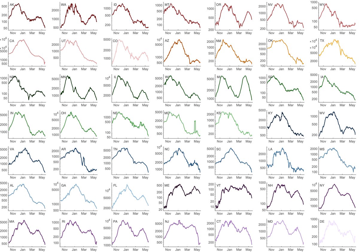
We've recently seen rapid growth of Delta, where it's displacing other circulating viruses in many states. Here, predominance of Delta in Arkansas, Colorado, Missouri and Utah occurred in only ~4 weeks. 7/16
Variant-specific estimates of Rt from @marlinfiggins using @CDCgov case counts and @GISAID sequence data suggests Rt of Delta variant of 1.18 averaged across 20 states analyzed. 8/16
Inputting R0 of 1.18 in the final epidemic size equation yields 29% of the susceptible population infected in the Delta wave. 9/16
CDC lists 46% of the US population as fully vaccinated. Following covid19-projections.com, we take ~30% of the US population as having been infected. Assuming that vaccination and infection are independent yields 46% + 54% x 30% = 62% of the population with immunity. 10/16
This would imply that Delta has a susceptible pool of 38% of the US population and given final size of 29% would suggest 11% of the total US population infected with Delta or 36M people. 11/16
A couple obvious places where this calculation is wrong. First, vaccination and infection are not independent and instead probably anti-correlated. This would imply a larger fraction of the population immune than the 62% used above. 12/16
Second, vaccination is not perfect and vaccine efficacy against symptomatic disease drops from ~89% against Alpha to ~79% against Delta per @PHE_uk report (assets.publishing.service.gov.uk/government/upl…). Breakthrough infections imply a smaller fraction of the population immune than the 62%. 13/16
I'd hope for these two effects to largely come out in the wash. 14/16
Another 11% of the population infected is of course substantial, though we expect lower rates of mortality on a per case basis due to vaccination coverage differing substantially across age groups (cdc.gov/mmwr/volumes/7…). 15/16
Although I don't have a huge amount of faith in this specific 11% estimate, at the moment, just based on what's happening in the UK, I would expect there to be a US wave driven by Delta (figure showing Rt in UK from epiforecasts.io/covid/posts/na…). 16/16
Follow up #1: Prompted by question on Twitter () I just did a simple correlation of total population fully vaccinated against Delta-specific Rt across 20 states with good data. We get a decently strong negative correlation with R^2 of 0.32.
Follow up #2: This supports the expectation that we'll see Delta circulation influenced by degree of regional vaccine coverage.

• • •

Missing some Tweet in this thread? You can try to force a refresh
 

Keep Current with Trevor Bedford

Trevor Bedford Profile picture

Stay in touch and get notified when new unrolls are available from this author!

Read all threads

This Thread may be Removed Anytime!

PDF

Twitter may remove this content at anytime! Save it as PDF for later use!

Try unrolling a thread yourself!

how to unroll video
  1. Follow @ThreadReaderApp to mention us!

  2. From a Twitter thread mention us with a keyword "unroll"
@threadreaderapp unroll

Practice here first or read more on our help page!

More from @trvrb

24 Jun
Jesse Bloom's preprint has, of course, caused quite a stir. I wanted to try to explain a bit about the "rooting issue" discussed in the manuscript and also provide some hopefully clarifying phylogenetic trees. 1/15
For this post, I've made a @nextstrain "build" targeted at SARS-CoV-2 genomes from Dec 2019 through Jan 2020, totaling 549 viruses. All code is here: github.com/blab/ncov-earl… and should be reproducible using a download of @GISAID data. 2/15
There is genetic diversity within these very early samples with much of it arising from a split in early transmission chains into lineage A and lineage B viruses (lineage B as in B.1.1.7). Lineage A and lineage B viruses are separated by mutations at sites 8782 and 28144. 3/15
Read 15 tweets
22 Jun
An update on genomic surveillance in the US and spread of the Delta variant (PANGO lineage B.1.617.2, Nextstrain clade 21A). At this point, 95% of viruses circulating in the US are "variant" viruses that have been designated as "Variant of Concern" or "Variant of Interest". 1/12 Image
This update mirrors how I was looking at the rise of P.1 across the US in May. 2/12
Here, we can look at frequencies of different variant lineages through time and across states where it's clear that variant viruses and in particular B.1.617.2 viruses are continuing to increase in frequency. 3/12 Image
Read 12 tweets
2 Jun
With the publication of the Science letter, the Overton window for discussion of "lab leak" hypothesis has shifted dramatically. We now have mainstream scientific opinions that largely range between "lab leak can be dismissed" and "both zoonosis and lab leak are viable". 1/8
I am in the both are plausible camp. The data (as it exists) is consistent with zoonosis, but it's also consistent with lab leak. Parsing the relative probabilities of the two depends on multiple lines of evidence and is necessarily assumption ridden. 2/8
However, I think that there is a philosophical divide among scientists in how to assess hypotheses that perhaps explains some of the gap in opinion. Ie, is zoonosis the "null" hypothesis that we need significant evidence to reject or are we comparing two competing hypotheses? 3/8
Read 8 tweets
25 May
#COVID19 cases in the US reported by @CDCGov have continued their week-after-week exponential decline that began in mid-April. This is exceptionally welcome news, although I'm now watching closely for variants driving sub-epidemics despite overall cases falling. 1/10
If we look at state-level cases with a log-axis we can see exponential growth and then exponential decline visible as straight lines on the log plot. Some states have had recent precipitous declines (NY, MA, MI), while others have been more stable (WA, CO, OR). 2/10
Using genomic data shared to @GISAID, we can plot frequency of different variant lineages through time and across states to get a sense of competitive dynamics. Here, I'm plotting lineage frequency on a logit axis, so that logistic growth is visible as a straight-line fit. 3/10
Read 10 tweets
11 May
The drivers of the #COVID19 epidemic in India are certainly multifactorial, but we have now seen the viral lineage B.1.617 linked to this epidemic continue to increase in frequency in India and spread rapidly outside of the country. 1/10
Looking within India there are three primary viral lineages of consequence: B.1.1.7 (in blue) and B.1.351 (in green) introduced into India repeatedly from outside the country and B.1.617 (in yellow) emerging endogenously from within India (nextstrain.org/ncov/asia?c=em…). 2/10
Tracking frequencies over time in sequence data shared to @gisaid shows a continued increase in B.1.617, while recent weeks have shown a decline in B.1.1.7. 3/10
Read 10 tweets
7 May
From Aug 2020 to Mar 2021, the lagged case fatality rate (CFR) of the US #COVID19 epidemic had remained largely constant at ~1.5% and provided a simple method to predict subsequent deaths from current cases. 1/6
I've rerun the previous analysis correlating state-level reported cases with state-level reported deaths with different lags. Using @CDCgov data since Aug 2020, I find that a 19 day lag of cases to deaths maximizes average state-level correlation coefficient. 2/6
This shows the resulting projection for deaths where the gray dashed line shows a lookahead projection where 1.5% of reported cases result in reported deaths 19 days later. This can be compared to the solid red line showing realized 7-day average of reported deaths. 3/6
Read 6 tweets

Did Thread Reader help you today?

Support us! We are indie developers!


This site is made by just two indie developers on a laptop doing marketing, support and development! Read more about the story.

Become a Premium Member ($3/month or $30/year) and get exclusive features!

Become Premium

Too expensive? Make a small donation by buying us coffee ($5) or help with server cost ($10)

Donate via Paypal Become our Patreon

Thank you for your support!

Follow Us on Twitter!

:(