Well, it looks like this is the end. We thought it was over when CTP stopped, but then @TheLawyerCraig and his merry band of data volunteers kept us going for 4 more months.
In commemoration, we will post our final chart set.
First, Reported Cases & Hospitalization Census
/1
In commemoration, we will post our final chart set.
First, Reported Cases & Hospitalization Census
/1
https://twitter.com/TheLawyerCraig/status/1411127366861066241

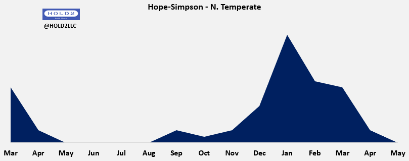
Same chart w/Hope-Simpson overlay.
- Summer stimulus visible again like last year, though 2 weeks later
- Cases bottomed on 6/18 and have risen since but much less than 2020
- Hosp Census followed trend this past week by hitting its inflection point and turning up slightly
/2
- Summer stimulus visible again like last year, though 2 weeks later
- Cases bottomed on 6/18 and have risen since but much less than 2020
- Hosp Census followed trend this past week by hitting its inflection point and turning up slightly
/2

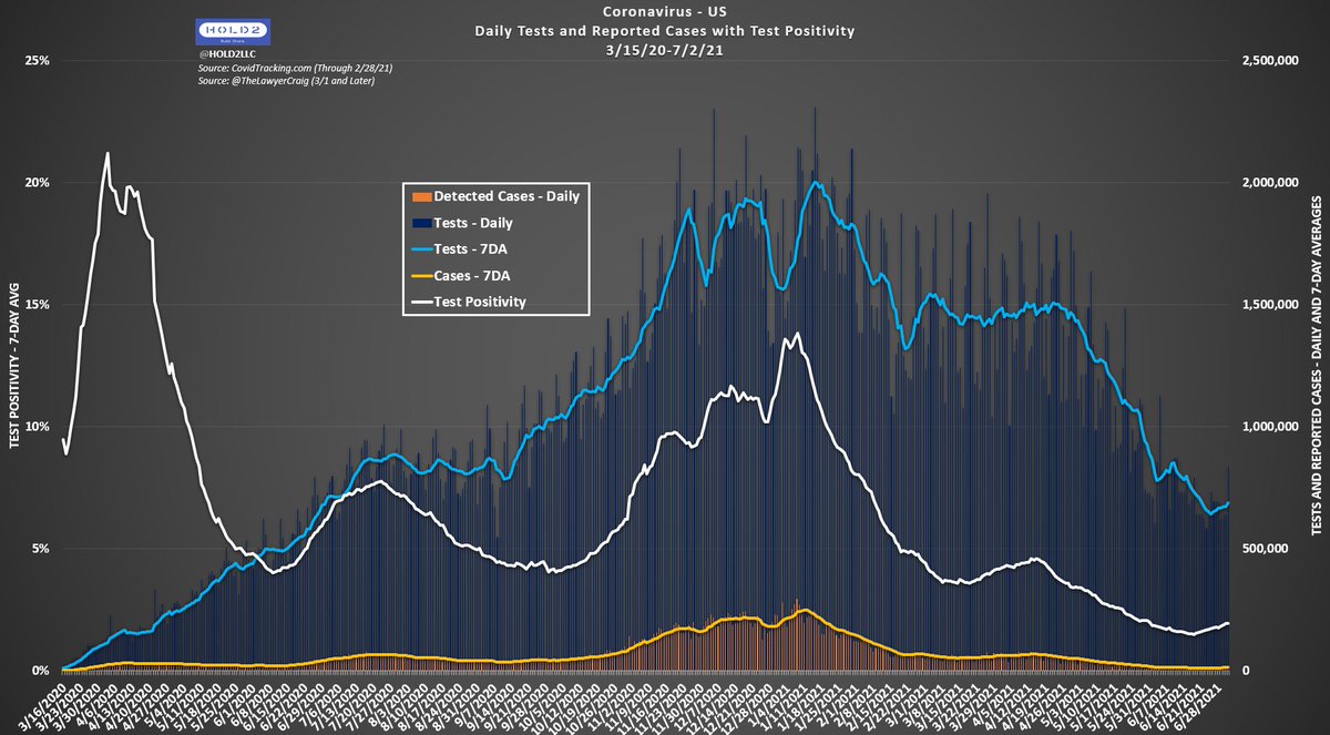
Reported Cases vs. Test Positivity
As is typically the case, Pos% inflected first with Reported Cases following shortly after.
Though turning up like 2020, the Pos% rate increase is much shallower and much lower overall.
/3
As is typically the case, Pos% inflected first with Reported Cases following shortly after.
Though turning up like 2020, the Pos% rate increase is much shallower and much lower overall.
/3


Reported Deaths vs. CFR
Here, you see our Reported Deaths aren't much lower than last year at the same time when considering the amount of community immunity we have.
Some of this is reporting lag, but we had lag last year, too. I expect this gap to expand greatly in July.
/4
Here, you see our Reported Deaths aren't much lower than last year at the same time when considering the amount of community immunity we have.
Some of this is reporting lag, but we had lag last year, too. I expect this gap to expand greatly in July.
/4

The 4 Classics
Here are the 4 charts I used to do every day. Might as well give them a send-off.
/5
Here are the 4 charts I used to do every day. Might as well give them a send-off.
/5


Bonus Charts - Estimated Infections
These are crude and not rigorous evaluations, but they were interesting to try.
1) Estimated Infections (~90M) based on Pos% X 2.4M test/day
2) Estimated Infections based on 0.38% IFR, 0.5%, and 0.62%. All shown on the same Y-axis
/END
These are crude and not rigorous evaluations, but they were interesting to try.
1) Estimated Infections (~90M) based on Pos% X 2.4M test/day
2) Estimated Infections based on 0.38% IFR, 0.5%, and 0.62%. All shown on the same Y-axis
/END


• • •
Missing some Tweet in this thread? You can try to
force a refresh