The latest @ICNARC report on COVID intensive care activity has been published. It's more comprehensive than ever, so this short thread focuses on recent admission trends. (Outcome data is little changed, being second wave totals.)

Of 536 admiss'ns in June, 43% were in the NW.
1/ Image
536 admissions over a month is still a fraction of the volumes seen at the start of the year, but nevertheless, the recent increase can be seen here. It's a slower rise too, which will be the result of vaccinations (of which more later).

2/ Image
Another reason why the national increase has been slower is it's mainly been concentrated in just one area. You can see here the rise in the NW, compared with figures that, at least so far, barely register in other regions.

3/ Image
The proportion of general COVID admissions becoming an ICU admission jumped suddenly in June to its highest level since April 20, (although has fallen back slightly again). We saw a similar increase at the start of the second wave too.

4/ Image
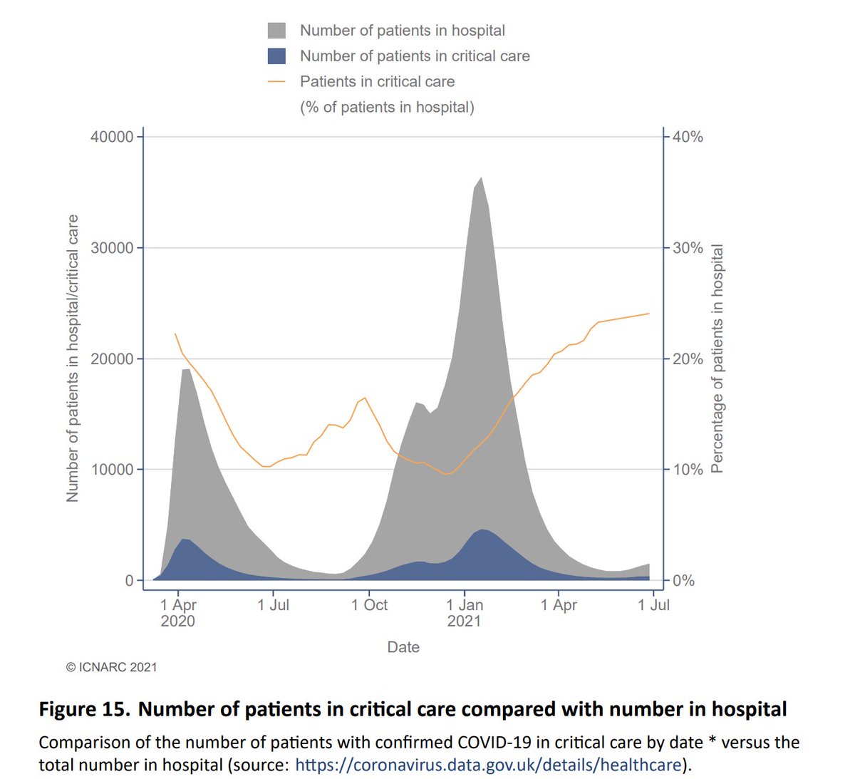
Turning to numbers in critical care at any time (as opposed to admissions), we can see how the second wave topped the first, and was longer too. Again, the decline has been reversed, albeit the increase is slower than we saw in the autumn as the second wave took hold.

5/ Image
Of interest, the relative proportions of critical care beds occupied is at its highest, nearly 25%. This might suggest that many non-ICU patients are having shorter stays, thus limiting the increase in general beds?

6/ Image
Most patient demographic data is still aggregated from the start of the second wave. You can see here the age distribution over that period. We would expect though that as vaccination worked down the age groups, this would have changed....

7/ Image
... and in the top graph here, we can see how the older age bands have reduced as a proportion of the total admissions, reflecting the move to a younger age distribution.

8/ Image
Indeed, the mean age has fallen from around 60 by 10 years over the period of the vaccination roll out. Note though that it appears to have stopped falling, and may be starting to rise again. This is to be expected once all adults have had the opportunity to be vaccinated.

9/ Image
Analysing by vaccine priority group, we can see the relatively faster fall in the first groups (1-4 and 5-9) as the programme took effect. Although they are now starting to increase again, as are those for the balance (under 50s).

(Note this is a log scale graph.)

10/ Image
Here we see how 28 day mortality is higher during peak periods of pressure, and reduces as capacity improves. It's good to see the most recent data points at their lowest, albeit that the fall does appear to have levelled off.

11/ Image
As noted much of the outcome data is aggregated, so has changed little of late. In summary though, 41% of those who entered critical care in the second wave died, 56% were discharged to continue their recovery at home, and 3% remain in hospital.

12/ Image
At 112 pages, I've only scratched the surface here, and the extent of the data is hugely impressive, so a big shout out to all of those involved in collecting and analysing it.

13/
icnarc.org/Our-Audit/Audi…
And finally, a big thank you to all intensivists and indeed other hospital and health and care staff for their continuing efforts to protect and care for so many patients over the last 16 months. Thank you!

14/14

• • •

Missing some Tweet in this thread? You can try to force a refresh
 

Keep Current with John Roberts

John Roberts Profile picture

Stay in touch and get notified when new unrolls are available from this author!

Read all threads

This Thread may be Removed Anytime!

PDF

Twitter may remove this content at anytime! Save it as PDF for later use!

Try unrolling a thread yourself!

how to unroll video
  1. Follow @ThreadReaderApp to mention us!

  2. From a Twitter thread mention us with a keyword "unroll"
@threadreaderapp unroll

Practice here first or read more on our help page!

More from @john_actuary

8 Jul
The latest #REACT survey (interim Rd 13) has been published and shows a big jump in infection levels, particularly amongst men.⚽️

Overall levels 🔼from 0.15% to 0.59%, and within Rd 13 doubling time is put at 6 days, (R=1.87).

Rates are 3x higher in the unvaccinated.

1/ Image
Starting with the overall data - this interim report is very up to date, running to the 5th July (Wow! Speedy work @imperialcollege), and you can see the quadrupling of levels since Round 12.

The previous chart shows how they judge that the increase is accelerating.

2/ Image
Between rounds 12 and 13, R is put at 1.32 (doubling time 15 days), but within round 13 it is estimated at 1.87, with a doubling time of just 6 days. These latter estimates do have wider CI's though.

3/ Image
Read 10 tweets
7 Jul
The latest #antibody study from @ONS is out, and shows continued increases in all four countries, with 🏴󠁧󠁢󠁷󠁬󠁳󠁿 now topping 90%. 👏👏

E🔼from 86.6% to 89.8%
W🔼from 88.7% to 91.8%
NI🔼from 85.4% to 87.2%
S🔼from 79.1% to 84.7%

Here's a visual summary of the last three reports.

1/ Image
Note that although the reports are fortnightly, the last one moved the data on three weeks, this one only one week. So that's one reason why the increases are lower. Also, as we get closer to 100%, there will be a natural limit to the increase possible.

2/
You can see that in the youngest age groups, the level of antibodies is around twice the vaccination coverage, with naturally acquired antibodies making up the difference. (ie they have had COVID at some stage.)

3/ Image
Read 7 tweets
5 Jul
Monday vaccine update:

Back after a short Cornish break, during which the run rate has continued to fall.

189k total doses is down 28%, and 1st doses of 77k are down nearly a half. The 7D total has fallen under 1m, as the number left to do declines, as we'll see next.

1/ Image
18-39 progress:

Over 30 there's little movement now. Under 30, we've probably got around 1.1m still to jab, assuming a final take-up of 72.5%.

Let's look how the numbers have moved over the last week next.

2/ Image
You can see here how little movement there's been in the last week over 30, probably now mainly picking up those making slightly late decisions to get the jab. It's disappointing how poor NI is in comparison to the other countries though.

3/ Image
Read 8 tweets
26 Jun
Sat vaccine update (excl 🏴󠁧󠁢󠁷󠁬󠁳󠁿)

359k reported today, down 12% on last week, with both 1st and 2nd doses lower.

1st doses of 200k were 8% lower. I estimate there's just over 2m of unsatisfied demand for 1st doses outstanding, so around 11 days worth at the current rate.

1/ Image
Take-up for U40s here. It's a bit strange that NI is so far behind for 30-39, but broadly the same as E and S under 30.

2/ Image
We can see here that the NI figure for 30-39 isn't really moving much, so maybe it will end with a considerably lower take-up?

Under 30, E & S are adding between 1.5% and 2% daily, but again NI is much slower at 0.5%.

3/ ImageImage
Read 4 tweets
25 Jun
Fri vaccine update:

A poor day today, with just under 400k total doses being 15% lower on a week ago.

First doses of 222k were down 9%, which is the real disappointment as we push to complete the younger age groups.

1/ Image
Just a quick summary of the younger ages position today. Under 30, England has now passed 50%. Image
2nd doses of 178k are predictably down 20% on last week, and the 7D total has fallen below 1.2m, consistent with the low run rate of 1st doses 8 weeks ago.

3/ Image
Read 4 tweets
25 Jun
The latest #infection survey from @ONS shows a dramatic increase in S, with increases also in W and E and a small fall in NI.

E 🔼from 0.19% to 0.22% (1 in 440)
W 🔼from 0.07% to 0.12% (1 in 830)
NI 🔽from 0.16% to 0.14% (1 in 720)
S 🔼🔼🔼from 0.17% to 0.46% (1 in 220)

1/ Image
Here's the data, along with the Confidence Intervals.
It's clear that whilst the CI's are much wider for W/S/NI, the S increase is still very significant.

W has bounced around recently but seems to be on an upward trend too, as is E. NI appears more stable.

2/ Image
Regionally, the NW and NE are still on the increase, whereas elsewhere it's a mixed picture. Albeit at lower levels the SW and East are rising too, others appear stable or even possibly falling.

3/ Image
Read 6 tweets

Did Thread Reader help you today?

Support us! We are indie developers!


This site is made by just two indie developers on a laptop doing marketing, support and development! Read more about the story.

Become a Premium Member ($3/month or $30/year) and get exclusive features!

Become Premium

Too expensive? Make a small donation by buying us coffee ($5) or help with server cost ($10)

Donate via Paypal Become our Patreon

Thank you for your support!

Follow Us on Twitter!

:(