After the first bang of the @IPCC_CH AR6 report, it's time to look at my favorite part of the report:
visuals in the SPM.

It was a privilege to work with a team of #dataviz and information design experts @angelamorelli @tomhal99 @jordanharold on these visuals
(1/n)
The first visual shows us that human influence has warmed the climate at a rate unprecedented in at least 2000 years.

I really like how it contrasts the climate our societies were used to during their development with the evidence that we are responsible.
(2/n)
The second visual shows how observed warming is driven by emissions from human activities.

It shows that greenhouse gases alone would already have warmed the planet by 1.5°C, but air pollution is currently cooling it. Both need to be tackled.
(4/n)
Climate change is already affecting us our activities contribute to many observed changes in weather and climate extremes.
Each red hexagon represents a world region in which observed hot extremes have increased, with the number of dots representing our confidence.
(6/n)
This visual was actually too large to fully fit in a single tweet. Here is the same visual for heavy precipitation and droughts.

We see it's happening and we know it's us.
(7/n)
Combined again in a single visualisation (8/n)
The fourth visual shows scenarios that help @IPCC_CH describe the implications of our emission reduction choices.

They cover a full range from very high emissions that require a roll-back of climate policies to very low emissions that require deep cuts in the next decade. (9/n)
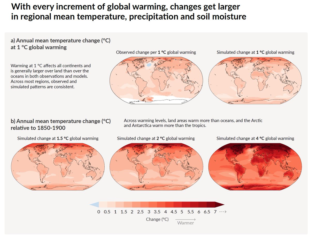
The final visual for today shows that every increment of warming matters for climate impacts.

That is true for temperatures. (10/n)
As well as for precipitation and soil moisture - important for the impact heatwaves have on society and crops.
(11/n)
Enough for today. Stay tuned for the second part of visual over the next days. (end)

• • •

Missing some Tweet in this thread? You can try to force a refresh
 

Keep Current with Joeri Rogelj

Joeri Rogelj Profile picture

Stay in touch and get notified when new unrolls are available from this author!

Read all threads

This Thread may be Removed Anytime!

PDF

Twitter may remove this content at anytime! Save it as PDF for later use!

Try unrolling a thread yourself!

how to unroll video
  1. Follow @ThreadReaderApp to mention us!

  2. From a Twitter thread mention us with a keyword "unroll"
@threadreaderapp unroll

Practice here first or read more on our help page!

More from @JoeriRogelj

19 Aug
Visuals in the latest #IPCCReport are a marvel I cannot stop talking about!

Here's part 2 of my overview of @IPCC_CH AR6 SPM visuals.

Kudos once again to @angelamorelli @tomhal99 @jordanharold and @MelichatGo for helping to visualize our insights (1/n)
After yesterday, we now landed on changes in extremes🌡️⛈️🥵🧺!

And although I don't like to pick favorites, I do like this visual very much.

Too big for a single tweet, this one shows how hot extremes over land change compared to when our great-grandparents were alive. (2/n)
Did you notice in the previous figure: a heat extreme that our great-grandparents would have experienced once in their lifetime, will occur about once every 4 years in a 2°C warmer world. It will be the norm in a 4°C warmer world.

I like the clarity of this figure! :)
(3/n)
Read 12 tweets
9 Aug
Carbon budgets tell us how much CO2 we can still emit while keeping warming below specific limits.

The latest @IPCC_CH report provides updated estimates of these budgets.

Here’s an insider's view with a deep dive looking at how they have changed since previous reports. (1/n)
I have been involved in the estimation of carbon budgets since the IPCC Fifth Assessment Report in early 2010s.

And since the first IPCC estimates published in 2013, we have learned a lot and have gotten much better at estimating remaining carbon budgets. (2/n)
The scientific basis underlying a carbon budget is our robust scientific understanding that global warming is near-linearly proportional to the total amount of CO2 we ever emit as a society.

This is shown in Fig. SPM10, both for the past and future projections. (3/n)
Read 25 tweets
27 May
EXPLAINER: new projections for the next 5 years by @metoffice and @WMO indicate that there's a high chance that one of these years is 1.5°C warmer than average preindustrial levels.

What does this mean?
A short explainer.

#ClimateAction

(1/n)
hadleyserver.metoffice.gov.uk/wmolc/
The 1.5C level in the @metoffice announcement should not be confused with the 1.5C limit in the Paris Agreement.

The Paris targets refer to global warming - that is, the temperature increase of our planet once we smooth out important year-to-year variations (see👇)
(2/n)
Even in a stable climate, global temperatures differ from year to year because of noise in the climate system.

(3/n)
Read 8 tweets
18 May
*Great NEWS*
Today @IEA published its #NetZero2050Roadmap-a scenario that brings global CO2 emissions down to #NetZero by 2050.

This is the first time IEA presents a detailed picture of how the global economy can be transformed in line with 1.5C (1/n)

iea.org/reports/net-ze…
A detailed look at the report shows that @IEA has done a thorough job.

Modelling choices underpinning the pathway are well argued, reliance on speculative technologies is limited, and the carbon budget is in line with the most ambitious pathways available in the literature (2/n)
In addition, the report also presents a unique collaboration between two of the core flagship teams of @IEA: The World Energy Outlook and the Energy Technology Perspectives.

This in itself presents an exciting development.

Congrats, @Laura_Cozzi_, @TimurGuel and team (3/n)
Read 11 tweets
31 Mar
Today's news from Australia's @Science_Academy latest climate report: "limiting climate change to 1.5°C is now virtually impossible"

I'm quite confused by their finding & scientific evidence backing it up is questionable at best.
#auspol

- a thread (1/n)
smh.com.au/environment/cl…
The @Science_Academy's analysis starts from carbon budgets reported in @IPCC_CH's 1.5°C Special Report's Table 2.2 (orig. below).

Then makes adjustments & updates.

Having had the pleasure to compile Table 2.2 for #SR15, let's compare and try to make sense of the numbers

(2/n)
The @Science_Academy's table starts from IPCC's 1.5C carbon budget for a 50% chance.

(Note1: the table quotes either a wrong likelihood or a wrong number, but that's a detail)
(Note2: IPCC Table 2.2 is in GtCO2, the table below in GtC. Multiply by 3.6 to convert to GtCO2)

(3/n)
Read 14 tweets
17 Mar
How can #NetZero targets be made rigorous, fair and transparent?

We published 10 guidelines that can help

Details are buried in the supplement of our @nature comment.

Here I'll be going through them, one per day

@COP26 @topnigel @PEspinosaC

(1/n)

The supplement contains an overview table (👇) and a detailed set of guidelines for #NetZero targets

They cover:
I. Scope (of target)
II. Adequacy & Fairness
III. Long term roadmap

It's a long list - so let's get through it one day at a time

(2/n)

nature.com/articles/d4158… Image
Point I.1: Define the global climate goal your #NetZero target contributes to

The #ParisAgreement aims to hold warming "well below 2°C" and pursues to limit it to 1.5°C. Rigorous targets should be more specific than that.

(3/n) Image
Read 17 tweets

Did Thread Reader help you today?

Support us! We are indie developers!


This site is made by just two indie developers on a laptop doing marketing, support and development! Read more about the story.

Become a Premium Member ($3/month or $30/year) and get exclusive features!

Become Premium

Too expensive? Make a small donation by buying us coffee ($5) or help with server cost ($10)

Donate via Paypal Become our Patreon

Thank you for your support!

Follow Us on Twitter!

:(