If you want to create great data visualizations, you need to understand color palettes.
Here are a few quick tips:
[1/n]
#datascience #datavisualization #Python #rstats
Here are a few quick tips:
[1/n]
#datascience #datavisualization #Python #rstats
[2/n]
For data that has a sequential ordering (i.e., low to high), you should use sequential color scales.
matplotlib.org/stable/tutoria…
#Python #matplotlib
For data that has a sequential ordering (i.e., low to high), you should use sequential color scales.
matplotlib.org/stable/tutoria…
#Python #matplotlib

[3/n]
Sequential color scales incrementally change saturation or lightness.
For example, this is a red-sequential color palette:
Sequential color scales incrementally change saturation or lightness.
For example, this is a red-sequential color palette:

[4/n]
Having said that, there are a variety of sequential color palettes in Matplotlib (and a similar set in R).
#datascience #datavisualization #Python #rstats
Having said that, there are a variety of sequential color palettes in Matplotlib (and a similar set in R).
#datascience #datavisualization #Python #rstats

[5/n]
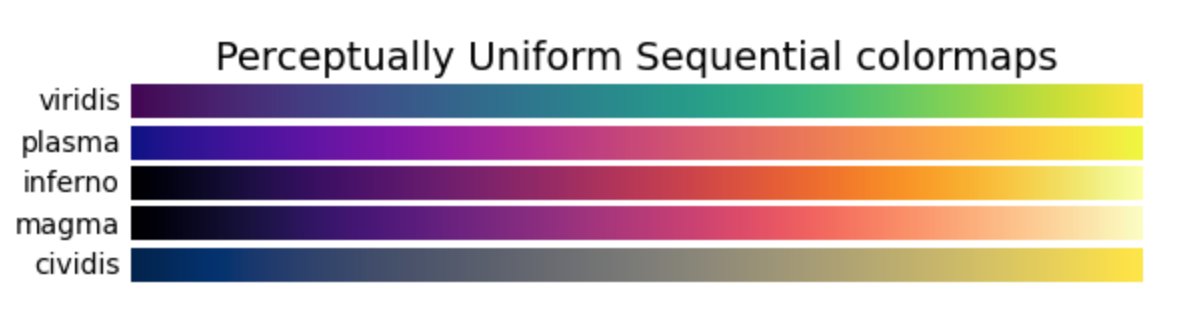
There are also "perceptually uniform" sequential palettes.
In a perceptually uniform palette, equal steps in data are perceived as equal steps in color space.
#datascience #datavisualization
There are also "perceptually uniform" sequential palettes.
In a perceptually uniform palette, equal steps in data are perceived as equal steps in color space.
#datascience #datavisualization

[6/n]
The end result, is that visualizations with perceptually uniform color palettes are typically much easier to interpret.
They're also typically very beautiful (I created these in R using the "viridis" palette).
#datascience #datavisualization #rstats
The end result, is that visualizations with perceptually uniform color palettes are typically much easier to interpret.
They're also typically very beautiful (I created these in R using the "viridis" palette).
#datascience #datavisualization #rstats


[7/n]
Now, let's talk about a different type of color palette: diverging palettes.
#data #datascience #DataVisualization
Now, let's talk about a different type of color palette: diverging palettes.
#data #datascience #DataVisualization
[8/n]
Diverging palettes typically have three main colors:
– 2 anchor colors (one at either end of the palette)
– 1 midpoint color (somewhere in the middle of the palette)
Between the anchor colors, the palette changes and the colors "meet" in the middle at a central color.
Diverging palettes typically have three main colors:
– 2 anchor colors (one at either end of the palette)
– 1 midpoint color (somewhere in the middle of the palette)
Between the anchor colors, the palette changes and the colors "meet" in the middle at a central color.

[9/n]
Here are a few examples of diverging color palettes
seaborn.pydata.org/tutorial/color…
#data #datascience #DataVisualization
Here are a few examples of diverging color palettes
seaborn.pydata.org/tutorial/color…
#data #datascience #DataVisualization

[10/n]
Notice in the examples above that the two anchor colors are more "colorful"
And the central color is typically black, white, or grey.
Notice in the examples above that the two anchor colors are more "colorful"
And the central color is typically black, white, or grey.
[11/n]
In more technical terms, the two end colors are "saturated" colors.
And the midpoint color is a "desaturated" color.
In more technical terms, the two end colors are "saturated" colors.
And the midpoint color is a "desaturated" color.
[12/n]
That's typically how a diverging palette works:
The two end colors are "saturated" "colorful" hues (like red, blue, purple, etc) ...
That's typically how a diverging palette works:
The two end colors are "saturated" "colorful" hues (like red, blue, purple, etc) ...
[13/n]
And the palette changes decreases saturation until it reaches the midpoint, where there's typically a desaturated color like white, black, or grey.
#data #datascience #DataVisualization
And the palette changes decreases saturation until it reaches the midpoint, where there's typically a desaturated color like white, black, or grey.
#data #datascience #DataVisualization

[14/n]
There are also diverging palettes that change *lightness* instead of or along with saturation.
Common examples of this are diverging palettes with yellow at the midpoint.
#data #datascience #DataVisualization
There are also diverging palettes that change *lightness* instead of or along with saturation.
Common examples of this are diverging palettes with yellow at the midpoint.
#data #datascience #DataVisualization

[15/n]
So when do we use diverging palettes?
As you might guess, the best use of diverging palettes is when there is a natural midpoint.
#data #datascience #DataVisualization
So when do we use diverging palettes?
As you might guess, the best use of diverging palettes is when there is a natural midpoint.
#data #datascience #DataVisualization
[16/n]
So for example, you can use a diverging palette where you the data have a bad/OK/good ranking.
Here's one such visualization I made of the "Best States For Business":
So for example, you can use a diverging palette where you the data have a bad/OK/good ranking.
Here's one such visualization I made of the "Best States For Business":

[17/n]
Diverging palettes are perhaps most commonly used in US political maps, where we show % republican vs % democrat
Here's a beautiful example of an election map by @htmldon that uses a Red-Grey-Blue diverging palette.
Diverging palettes are perhaps most commonly used in US political maps, where we show % republican vs % democrat
Here's a beautiful example of an election map by @htmldon that uses a Red-Grey-Blue diverging palette.

[18/n]
Note:
You can find my full analysis of that visualization in this thread:
Note:
You can find my full analysis of that visualization in this thread:
https://twitter.com/Josh_Ebner/status/1337500632895410179?s=20
[19/n]
Diverging color palettes can be a little harder to use, because you sometimes need to wrangle your data so the right colors map to the right data values.
Diverging color palettes can be a little harder to use, because you sometimes need to wrangle your data so the right colors map to the right data values.
[20/n]
This is particularly true for setting the midpoint color.
Sometimes the midpoint color is set to 0, and sometimes it's set to something else like a mean or median value.
This is particularly true for setting the midpoint color.
Sometimes the midpoint color is set to 0, and sometimes it's set to something else like a mean or median value.
[21/n]
So diverging color palettes can be a little harder to use.
So diverging color palettes can be a little harder to use.
[22/n]
But if you use them properly ...
Diverging palettes are extremely valuable for telling certain types of stories with your data.
But if you use them properly ...
Diverging palettes are extremely valuable for telling certain types of stories with your data.
[23/n]
Again: In particular, you often need diverging palettes for any data where there are natural endpoints, along with a natural midpoint.
#data #datascience #DataVisualization
Again: In particular, you often need diverging palettes for any data where there are natural endpoints, along with a natural midpoint.
#data #datascience #DataVisualization
• • •
Missing some Tweet in this thread? You can try to
force a refresh