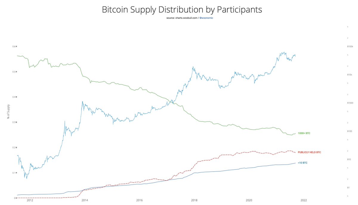
I posted this map of the BTC supply distribution, but many asked "but what does this mean?".
Well, it says quite a lot, this is the whole ecosystem talking to us. Since people didn't see what I though was in plain sight, I'll break it down and add a bit more colour.
Bitcoin continues to distribute coins evenly. Publicly held and retail entities continue to gain more control of the supply while whales are reducing their control.
Remember the gold standard failed as a monetary standard due to centralisation of the supply
2) Retail drives macro cycles. When retail stack their sats at an increased rate, like they are doing right now, it's the fundamentals saying we are in the middle of a bull market.
I repeat; middle of a bull market. Traders in disbelief 2 months ago when this data was shown.
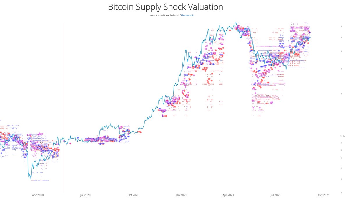
Ethereum supply shock well and truly at all time highs.
Looks like the market overpriced it in May but is probably underpricing it July / August.
Switching to an oscillator view of this, it's moving out of its no-brainer buy zone with the latest rally. But importantly, despite short term technicals being quite warm, it's far from over-bought on fundamentals.
Note: the latest supply burn from EIP-1559 is not accounted for in Glassnode data. But it should not impact these metrics just yet (~0.01% impact on this indicator for now). Glassnode will be rolling in EIP-1559 burn data soon.
Just a matter of patience and time before $42k breaks.
Strong HODLers, the Rick Astleys of this world, have been taking this opportunity to scoop large amounts of coinage while we're under the resistance ceiling.
Mid-macro view:
90 day moving average of coins moving to Mr Astley about to cross bullish.
The movement of coins to and from Mr Astley brought to you via forensic clustering of on-chain data courtesy of @glassnode.