My Lord, things change RAPIDLY with #omicron.
And they are not changing for the good.
Your 12/22 #COVID19 update.
#Cases and #Hospitalizations.
As always, Florida-centric with some national context.
Brace yourselves.
covid19florida.mystrikingly.com
1/14
And they are not changing for the good.
Your 12/22 #COVID19 update.
#Cases and #Hospitalizations.
As always, Florida-centric with some national context.
Brace yourselves.
covid19florida.mystrikingly.com
1/14
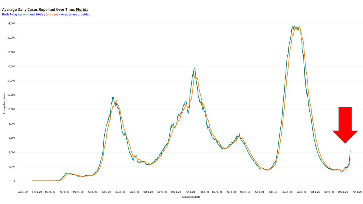
Purview of 7-day avg daily cases over the past 8 wks.
In the first 6 wks in this window, <2000 per day.
Last wk, 2702 per day.
Most recent wk of reported data, 10,904 per day.
# of cases in today's report (20,194) exceeded the WEEKLY TOTAL over any of the past 7 wks.
2/14
In the first 6 wks in this window, <2000 per day.
Last wk, 2702 per day.
Most recent wk of reported data, 10,904 per day.
# of cases in today's report (20,194) exceeded the WEEKLY TOTAL over any of the past 7 wks.
2/14
To appreciate the rapid rise, here's a map showing change in avg daily cases compared to just 2 weeks ago.
FL - 499% increase (3rd highest: DC, Hawaii)
Detailed #Florida numbers at bottom right of figure.
3/14
FL - 499% increase (3rd highest: DC, Hawaii)
Detailed #Florida numbers at bottom right of figure.
3/14

FL was lowest in the most recent 7-day avg daily cases not too long ago, after built-up immunity from a terrible Delta surge.
We're now back up to 23rd highest, middle of the pack.
But look at those trajectories in NY, DC, and basically where all those red arrows are.
4/14
We're now back up to 23rd highest, middle of the pack.
But look at those trajectories in NY, DC, and basically where all those red arrows are.
4/14

Here's the other way to view how pronounced the recent per capita infection rate is (y-axis) compared to how pronounced the recent changes in avg daily cases (x-axis) has been.
I mean look at those % increases for NYC, DC, FL, and HI!
5/14
I mean look at those % increases for NYC, DC, FL, and HI!
5/14

It's important to remember what you're seeing with the pronounced increase in use of at-home tests.
If there is no follow-up PCR, or illness the drives a person to seek health care, are county/state health depts even learning of those cases?
What about re-infections?
6/14
If there is no follow-up PCR, or illness the drives a person to seek health care, are county/state health depts even learning of those cases?
What about re-infections?
6/14
Either way, it ain't just cases.
Since December 1:
We're up in adults now hosp with confirmed C19 from 977 to 1457. Even adults in the ICU up 61 patients.
Kids not much better, up from 17 to 45.
As expected, new daily admissions also rising, from 160 to 304 in 3 weeks.
7/14
Since December 1:
We're up in adults now hosp with confirmed C19 from 977 to 1457. Even adults in the ICU up 61 patients.
Kids not much better, up from 17 to 45.
As expected, new daily admissions also rising, from 160 to 304 in 3 weeks.
7/14

In whom are new confirmed C19 hosp admissions increasing?
These plots show the total admissions over the past 7 days, per 100,000 people, by age group since Dec 1.
As you can see, increases in pretty much every age group, including our most vulnerable (according to age).
8/14
These plots show the total admissions over the past 7 days, per 100,000 people, by age group since Dec 1.
As you can see, increases in pretty much every age group, including our most vulnerable (according to age).
8/14

This plot shows how pronounced the recent C19 per capita hospitalization rate is (y-axis) compared to how pronounced the recent changes in avg daily admissions (x-axis) have been.
FL is comparatively in the lowest quartile of states in current rate, but increasing rapidly.
9/14
FL is comparatively in the lowest quartile of states in current rate, but increasing rapidly.
9/14

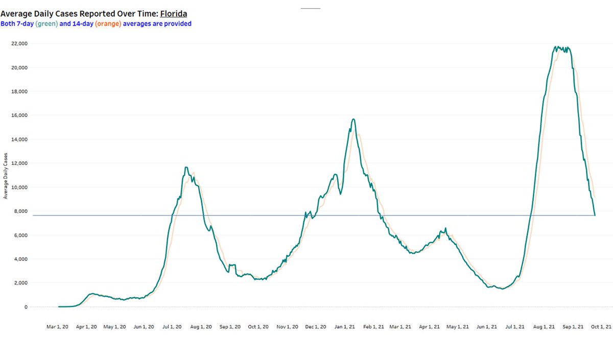
Finally, this is how avg daily cases (left axis) have tracked w avg daily hospital admissions (right axis) in FL since July 2020.
We compare cases 'today' vs. hosps 5 days later (lagged). So, my graph stops before the last 5 days of the most rapid case increases.
cont'd
10/14
We compare cases 'today' vs. hosps 5 days later (lagged). So, my graph stops before the last 5 days of the most rapid case increases.
cont'd
10/14

What remains to be seen is the extent to which these two lines continue to track together, or diverge.
Knowing how that case line is increasing, and seeing how hospitalizations tracked cases during #delta, we should all pray for considerable divergence.
11/14
Knowing how that case line is increasing, and seeing how hospitalizations tracked cases during #delta, we should all pray for considerable divergence.
11/14

Maybe one bright spot? (and, yes, I'm grasping at straws here)
During December, the % of the US pop optimally immunized is slowly increasing, meaning that newly vax and boosters are outpacing waning immunity from people overdue for boosters.
Still a LONG way to go.
12/14
During December, the % of the US pop optimally immunized is slowly increasing, meaning that newly vax and boosters are outpacing waning immunity from people overdue for boosters.
Still a LONG way to go.
12/14

These metrics are scary, but no state data with stratification by vax or prior infection status. Any luck elsewhere?
@bethlinas @nataliexdean @angie_rasmussen @berthahidalgo @EpiEllie @BillHanage @bhrenton @ashtroid22 @Cleavon_MD @choo_ek @Theresa_Chapple @WhitneyEpi
13/14
@bethlinas @nataliexdean @angie_rasmussen @berthahidalgo @EpiEllie @BillHanage @bhrenton @ashtroid22 @Cleavon_MD @choo_ek @Theresa_Chapple @WhitneyEpi
13/14
These metrics are scary, but no state data with stratification by vax or prior infection status. Any luck elsewhere?
@paimadhu @sarahzhang @firefoxx66 @K_G_Andersen @kakape @Craig_A_Spencer @lucystats @PWGTennant @_stah @gregggonsalves @HelenBranswell @florian_krammer
14/14
@paimadhu @sarahzhang @firefoxx66 @K_G_Andersen @kakape @Craig_A_Spencer @lucystats @PWGTennant @_stah @gregggonsalves @HelenBranswell @florian_krammer
14/14
• • •
Missing some Tweet in this thread? You can try to
force a refresh