In the post, I noted that in June 2021, the COVID death rate in the reddest decile of the U.S. was "only" 43% higher than in the bluest decile, but by August it was running an astonishing 7.3x higher in the reddest 10th of the country than the bluest 10th: 2/
For the full 6-month period (June - December), the death rate in the reddest decile averaged around 5.8x higher than in the bluest decile.
More recently I noted that the #OmicronVariant is a whole new chapter, with case rates running higher in *blue* counties than red ones... 3/
...and so, now that we're into February, here's what the same graph looks like for January 2021 *only*.
Yep, it's basically "reset" so that the COVID death rate is back down to being "only" 30% higher in the reddest 10th of the country again.
Stay tuned. /4
• • •
Missing some Tweet in this thread? You can try to
force a refresh
If you estimated how many Trump/Biden voters have died of COVID since the 2020 election based on the national popular vote, you'd assume that the Biden toll was ~4.4 points higher since he won the popular vote by 4.4 points nationally.
HOWEVER, that's clearly not the case. 2/
If you adjust this by the 2020 election results at the *state or county* level, it comes out ranging between ~6K more Biden voters to ~17K more Trump voters having died since then.
📣 A *LOT* of people are ripping this new @nytimes piece by @benjmueller and Eleanor Lutz for not mentioning, even in passing, the partisan gap in vaccinations & COVID deaths or the coordinated anti-vaxx campaign by the GOP/FOX News behind the headline. 1/ nytimes.com/interactive/20…
Now, maybe they were told not to mention that, or perhaps an overzealous editor removed it. I don't know what the policy is at the Times these days.
.@benjmueller follows me on Twitter, but he hasn't actually tweeted anything since mid-November, so in case he sees this... 2/
...here's the 2-dose vaxx rate of all 3,144 counties in the 50 U.S. states +DC, broken out by 2020 Trump vote.
For stats folks: The R^2 & slope have *both* climbed steadily since the day COVID vaccines were made available to all adults. 3/ acasignups.net/22/02/02/weekl…
As I've been expecting, while #Omicron slammed the urban blue centers of the U.S. first, it's now started shifting back towards the rural red parts of the country.
What's remarkable about this graph is how closely the partisan & vaxx rate measures hew to each other over time:
FWIW, here's what the same graph looks like when you use June 30th as the starting point. Unfortunately I haven't plugged in the vaxx-rate lines yet, but trust me, they'd hew pretty closely to the red/blue lines here as well.
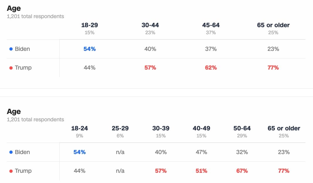
📣 Head's Up: This week I'll be re-running my partisan COVID death rate estimates again, but with *age* factored in.
Should be interesting to see how this compares w/my previous "just shift the results red 20% to account for GOP voters being older" spitball.
Note: The data will be as official/concrete as possible (based on data from the CDC, Census Bureau, FEC, etc), but the one factor I'm debating is which age-based 2020 exit poll source to use.
Pew has a good *national* study but I need it for each state. Suggestions welcome.
For instance, in Alabama, here's NY Times, CBS, ABC & CNN.