Jason L. Salemi, PhD, FACE Profile picture
May 6, 2022 7 tweets 6 min read Read on X
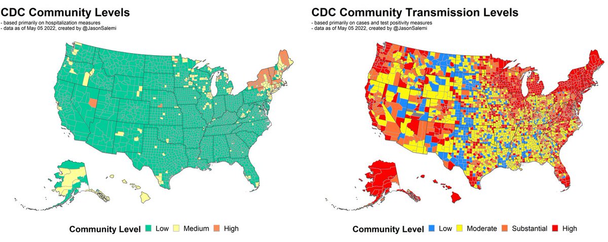
1. New county-level #risk indicators released by @CDCgov last night.

Here's your look at weekly #transmission levels since Feb 24.

After looking much better in March, we're continuing to see rates of newly reported cases increasing in most US regions.
2. But, as has been the case for a while, when basing risk level on #hospitalization rates and hospital capacity, at least visually, the story is very different.
3. This shows CHANGE in each metric yesterday compared to 1 week prior. Many more places worsening than improving.

14% of the population worsened on the hospital-based measure; only 1% improved.

23% of the population worsened on the transmission-based measure; only 6% improved.
4. Nearly 80% of people live in a county classified as #substantial or #high community transmission, up from 46% 4 weeks prior.

Also, now nearly 1 in 4 people live in a county classified as #medium or #high risk on the hospital-based metric, up from only 3% 4 weeks prior.
5. Here's that same figure (changing risk level over time) by state. This is the #hospital-based measure.

84% of the population in Florida still resides in a county classified as a "low level".
6. And here's that same figure (changing risk level over time) by state. This is the #transmission-based measure.

Northeast speaks for itself, but Florida now has 93% of its population in a substantial or high transmission area over the past week.
7. The #northeast continues to see the worse of the current state of COVID-19 affairs, but also starting to see much of the population move our of the green ("low" level) in places like #Illinois, #Michigan, #Wisconsin, #Minnesota, #Washington, and #Oregon.

/END

• • •

Missing some Tweet in this thread? You can try to force a refresh
 

Keep Current with Jason L. Salemi, PhD, FACE

Jason L. Salemi, PhD, FACE Profile picture

Stay in touch and get notified when new unrolls are available from this author!

Read all threads

This Thread may be Removed Anytime!

PDF

Twitter may remove this content at anytime! Save it as PDF for later use!

Try unrolling a thread yourself!

how to unroll video
  1. Follow @ThreadReaderApp to mention us!

  2. From a Twitter thread mention us with a keyword "unroll"
@threadreaderapp unroll

Practice here first or read more on our help page!

More from @JasonSalemi

Sep 26, 2023
Brief COVID update

When speaking with NPR last week, I said the plateauing of hospitalizations for 3 weeks made me feel like a downturn was coming.

In FL, the data are suggestive of improvements in the # of people being hospitalized w/ COVID.

1/ Image
The state-specific trends in the COVID hospital census since June 1 also suggest we are seeing a recent decrease in FL (dk purple), the US as a whole (black), and a number of states.

Yes, FL still has among the highest rates, but we also have one of the oldest populations.

2/ Image
If we indeed see a prolonged decrease in COVID hospitalization census, many of the largest states, who have been below previous pandemic years, will start their decrease right as they approach (but do not exceed) 2022 rates.

3/ Image
Read 11 tweets
May 29, 2023
Sorry for the delay everyone, a lot going on personally. But I have modified my dashboard to accommodate the CDC reporting changes.

My site focuses on:
1) Hospitalization-based county risk levels
2) Detailed hosp trends
3) Deaths

with links out for wastewater, variants, vax

1/
The "Risk Indicators" page is similar to the older page, but the data upon which indicators are based has changed. There are no longer "risk levels" and "transmission levels", rather levels based exclusively on "confirmed" COVID hospital admission rates over the prior 7 days.

2/ ImageImageImageImage
The "Hospitalizations" page has not changed much. Still starts out with a Florida-centric look and then gives a lot of state- and age-specific census and admission numbers, rates, and rankings.

3/ ImageImageImageImage
Read 14 tweets
Feb 24, 2023
It's been a while since I've done a #COVID update.

These are national weekly @CDCgov "community levels" based primarily on hospitalization rates.

This past week has been the "best" since April of last year with <1% of the population living in a high-level county.

1/ Image
Of course, this comes with the following caveats according to the CDC, with likely underestimation of levels in Hawaii and Mississippi, and overestimation in several counties in Georgia and Arizona.

2/ Image
Transmission levels are likely to be grossly underreported, but as we look at them over time, are showing modest improvement (LEFT).

This is in agreement with the regional wastewater monitoring data, which also shows improvements over the last 6 weeks (RIGHT).

3/ ImageImage
Read 12 tweets
Dec 2, 2022
1/ Updated my #COVID19 dashboard - wanted to do a quick thread on some clearly emerging trends.

covid19florida.mystrikingly.com
2/ Below are adult inpatient hospital census rates for each state since May 1, 2022. Only "confirmed" (as opposed to suspected) COVID hospitalizations are included.

The orange and red coloring suggests recent increases over the past week. Image
3/ But for context, below are the inpatient census stats for adults throughout the pandemic - for most states, we remain well below the worst parts of the pandemic (not that that should be the bar we are trying to avoid). Image
Read 11 tweets
Oct 16, 2022
1/ I've continued to see graphics like the one below served as evidence that COVID vaccines do not work.

Why? Because the NUMBER of COVID-19 deaths among vax people is nearly the same (or even more than) among unvaccinated people.

Quick 11-tweet thread on why this is misleading
2/ I'm going to keep this SIMPLE. This is NOT about infection-acquired immunity vs. vax-acquired immunity. This is just about counts vs. rates.

Assume that vax efficacy is 90% in people 65+.

Monthly COVID mortality rates:
- not vaccinated (20 per 100k)
- vaccinated (2 per 100k)
3/ Assume 3 different vax realities among seniors in the US, and assume pop of 50 million.

Vax rates of 5%, 50%, and 95%.

In the figure, under each scenario, I show the vax vs. non-vax distribution of:
1. the population
2. COVID deaths
Read 12 tweets
Oct 14, 2022
@cmzimmer1803 - a few thoughts

1/ We absolutely should be concerned with the changing proportions of variants that are ESTIMATED to be circulating in recent weeks.

Due to their characteristics and increasing make-up of new cases, the pose a threat.
2/ Clearly, part of our genomic surveillance efforts are to have TIMELY information when more concerning variants are increasing in relative prevalence. In this case, it appears we lost some time (I was wondering why those variants were not yet showing up).
3/ BUT, I don't tend to jump to an accusation of something nefarious.

The beginning of the footnote states that variants circulating <1% are grouped into "other". Image
Read 6 tweets

Did Thread Reader help you today?

Support us! We are indie developers!


This site is made by just two indie developers on a laptop doing marketing, support and development! Read more about the story.

Become a Premium Member ($3/month or $30/year) and get exclusive features!

Become Premium

Don't want to be a Premium member but still want to support us?

Make a small donation by buying us coffee ($5) or help with server cost ($10)

Donate via Paypal

Or Donate anonymously using crypto!

Ethereum

0xfe58350B80634f60Fa6Dc149a72b4DFbc17D341E copy

Bitcoin

3ATGMxNzCUFzxpMCHL5sWSt4DVtS8UqXpi copy

Thank you for your support!

Follow Us!

:(