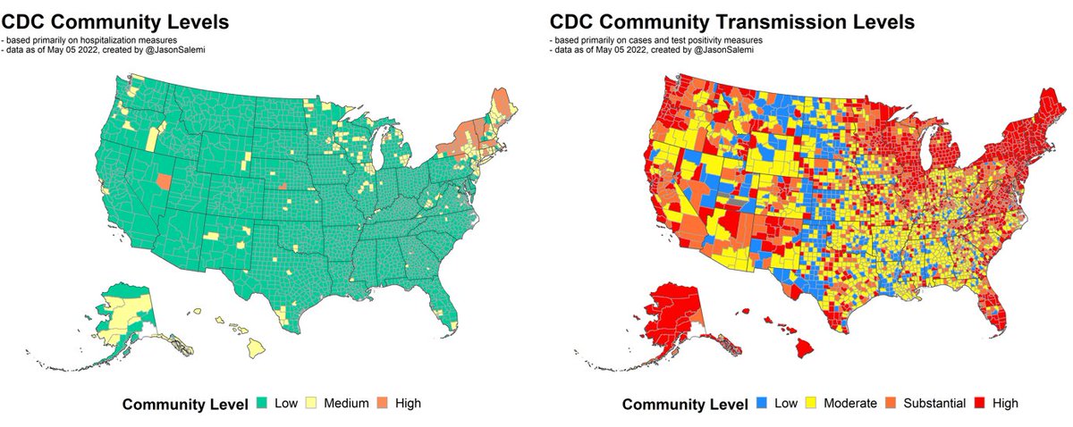
1. New county-level #risk indicators released by @CDCgov last night.
Here's your look at weekly #transmission levels since Feb 24.
After looking much better in March, we're continuing to see rates of newly reported cases increasing in most US regions.
Here's your look at weekly #transmission levels since Feb 24.
After looking much better in March, we're continuing to see rates of newly reported cases increasing in most US regions.
2. But, as has been the case for a while, when basing risk level on #hospitalization rates and hospital capacity, at least visually, the story is very different. 

3. This shows CHANGE in each metric yesterday compared to 1 week prior. Many more places worsening than improving.
14% of the population worsened on the hospital-based measure; only 1% improved.
23% of the population worsened on the transmission-based measure; only 6% improved.
14% of the population worsened on the hospital-based measure; only 1% improved.
23% of the population worsened on the transmission-based measure; only 6% improved.

4. Nearly 80% of people live in a county classified as #substantial or #high community transmission, up from 46% 4 weeks prior.
Also, now nearly 1 in 4 people live in a county classified as #medium or #high risk on the hospital-based metric, up from only 3% 4 weeks prior.
Also, now nearly 1 in 4 people live in a county classified as #medium or #high risk on the hospital-based metric, up from only 3% 4 weeks prior.

5. Here's that same figure (changing risk level over time) by state. This is the #hospital-based measure.
84% of the population in Florida still resides in a county classified as a "low level".
84% of the population in Florida still resides in a county classified as a "low level".

6. And here's that same figure (changing risk level over time) by state. This is the #transmission-based measure.
Northeast speaks for itself, but Florida now has 93% of its population in a substantial or high transmission area over the past week.
Northeast speaks for itself, but Florida now has 93% of its population in a substantial or high transmission area over the past week.

7. The #northeast continues to see the worse of the current state of COVID-19 affairs, but also starting to see much of the population move our of the green ("low" level) in places like #Illinois, #Michigan, #Wisconsin, #Minnesota, #Washington, and #Oregon.
/END
/END
• • •
Missing some Tweet in this thread? You can try to
force a refresh


