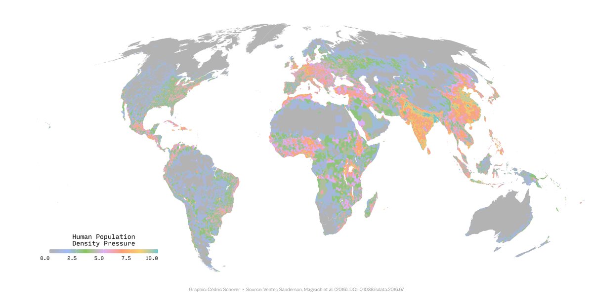
Guess I got a bit side-tracked while creating some (mostly bad) color palette examples for a #datviz training...
1. sequential
2. diverging
3. rainbow
4. qualitative (used for quantitative data)


1. sequential
2. diverging
3. rainbow
4. qualitative (used for quantitative data)


A bit of additional information:
* for quantitative data like this we usually want to use a sequential (map 1+2) or diverging (map 3+4) color palette


* for quantitative data like this we usually want to use a sequential (map 1+2) or diverging (map 3+4) color palette


* for sequential palette, the colors with the highest visual weight should be mapped to the values of interest: usually the darker color for higher values on a light background (and vice versa).
Maps 1+3 put weight on areas with high pressures,
maps 2+4 on low-pressure areas.


Maps 1+3 put weight on areas with high pressures,
maps 2+4 on low-pressure areas.


* when switching to diverging palettes, we focus on both extreme
* for diverging palettes the middle value should be light on a light background (map 1) and dark on a dark background (map 3)
A good article on this by @lisacmuth: blog.datawrapper.de/diverging-vs-s…


* for diverging palettes the middle value should be light on a light background (map 1) and dark on a dark background (map 3)
A good article on this by @lisacmuth: blog.datawrapper.de/diverging-vs-s…


* don't use a rainbow or related color palettes as they are highly misleading due to perceptual problems (map 1) computer.org/csdl/magazine/…
* there is an improved (but not perfect) rainbow palette called turbo if you need one (map 2) ai.googleblog.com/2019/08/turbo-…

* there is an improved (but not perfect) rainbow palette called turbo if you need one (map 2) ai.googleblog.com/2019/08/turbo-…


* don't use qualitative color palettes for quantitative data as, by definition, the colors do not follow a perceptual order. It's easy to extrapolate these palettes and the maps are often very colorful—but not interpretable at all... 


• • •
Missing some Tweet in this thread? You can try to
force a refresh


