Stock Chart Patterns ↗️↔️↘️
Stock chart patterns often signal transitions between rising and falling trends.
These patterns can be as simple as trendlines and as complex as double head-and-shoulders formations.
Stock chart patterns often signal transitions between rising and falling trends.
These patterns can be as simple as trendlines and as complex as double head-and-shoulders formations.

Since price patterns are identified using a series of lines or curves, it is helpful to understand trendlines and know how to draw them. Trendlines help technical analysts spot support and resistance areas on a price chart. 

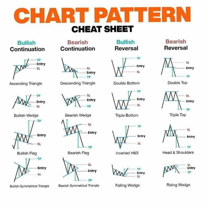
A chart pattern is a shape within a price chart that helps to suggest what prices might do next, based on what they have done in the past. 

Chart patterns are the basis of technical analysis and require a trader to know exactly what they are looking at, as well as what they are looking for. 📊 👀 

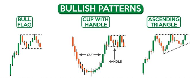
A continuation pattern can be considered a pause during a prevailing trend. This is when the bulls catch their breath during an uptrend or when the bears relax for a moment during a downtrend. 

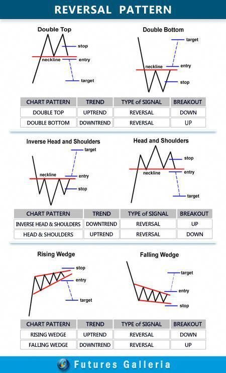
Reversal patterns are those chart formations that signal that the ongoing trend is about to change course. If a reversal chart pattern forms during an uptrend, it hints that the trend will reverse and that the price will head down soon. 

Learn more about Best chart patterns 👇
by @valuelevels
Head and shoulders
Double top
Double bottom
Rounding bottom
Cup and handle
Wedges
Pennant or flags
Ascending triangle
Descending triangle
Symmetrical triangle
by @valuelevels
https://twitter.com/valuelevels/status/1477171154670403585
Head and shoulders
Double top
Double bottom
Rounding bottom
Cup and handle
Wedges
Pennant or flags
Ascending triangle
Descending triangle
Symmetrical triangle
#stocks #nifty #niftybank #trading
#banknifty #niftyoptions #niftyfuture
#niftytoday #stockmarketindia
#stockmarketnews #stockmarket
#breakingnews #TradingView
@rattibha
@threadreaderapp
@UnrollHelper
#banknifty #niftyoptions #niftyfuture
#niftytoday #stockmarketindia
#stockmarketnews #stockmarket
#breakingnews #TradingView
@rattibha
@threadreaderapp
@UnrollHelper
• • •
Missing some Tweet in this thread? You can try to
force a refresh


