✨Hello! ✨
I've been given the all clear to post the art test that I did whilst applying for Blizzard, so thought I could use it as an opportunity to show how these things can go, what to expect, and how I approached it.
Here goes! 🧵
#gamedev #art #vfx #gameart #vfxartist
I've been given the all clear to post the art test that I did whilst applying for Blizzard, so thought I could use it as an opportunity to show how these things can go, what to expect, and how I approached it.
Here goes! 🧵
#gamedev #art #vfx #gameart #vfxartist
the brief was very simple and just asked me to make 'an explosion' that could fit in a Blizzard game world.
could have been anything really, so i started with researching WoW schools of magic for inspiration and settled on using "Arcane" and "Nature" as my guiding words. 🔮🌿
could have been anything really, so i started with researching WoW schools of magic for inspiration and settled on using "Arcane" and "Nature" as my guiding words. 🔮🌿
then i looked just lists of existing abilities in WoW to get an idea for their effects, and just randomly saw one called "Alter Time".
Without looking at what the effect actually did, I just used those words as a springboard to start concepting! 🎨
Without looking at what the effect actually did, I just used those words as a springboard to start concepting! 🎨
this was the first and only sketch i did haha. cutting it into the 4 beats I wanted the effect to have.
the idea being an Hourglass being used like a grenade to alter the sands of time.
- charge up ⏲
- go explodey 💥
- hold everything in stasis field ⏳
- drop to the ground 🎉
the idea being an Hourglass being used like a grenade to alter the sands of time.
- charge up ⏲
- go explodey 💥
- hold everything in stasis field ⏳
- drop to the ground 🎉

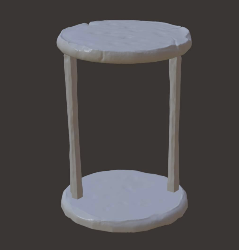
the idea of the hourglass just came immediately and formed the basis of a lot of my decisions from there, as i really wanted something *physical* in the effect. so i modelled/uv'd/sculpted/baked/textured a prop.
this was very rough, but just to get the idea across! ⌛


this was very rough, but just to get the idea across! ⌛


now to the effect! so into Unity.
i immediately split it into 3 sections:
- Charge Up
- Explosion
- End
This part is a bit nebulous I just started by adding elements with rough timing, etc. and just a process of adding layer upon layer.
i immediately split it into 3 sections:
- Charge Up
- Explosion
- End
This part is a bit nebulous I just started by adding elements with rough timing, etc. and just a process of adding layer upon layer.

starting with trying to recreate the basic feel of the concept i'd made, and hitting the 4 beats.
this is very rough at this stage, and the textures can be as polished as you like. but i always go fast as hell until i start getting the feel i like.


this is very rough at this stage, and the textures can be as polished as you like. but i always go fast as hell until i start getting the feel i like.


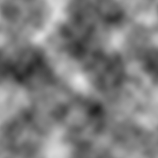
i wanted to set myself a challenge of only using 1 very simple noise texture as I wanted to try to prove interesting things without too much time on textures, so, trying to keep things simple and not overcomplicate it. so here is my Photoshop Render > Clouds in all its beauty. 

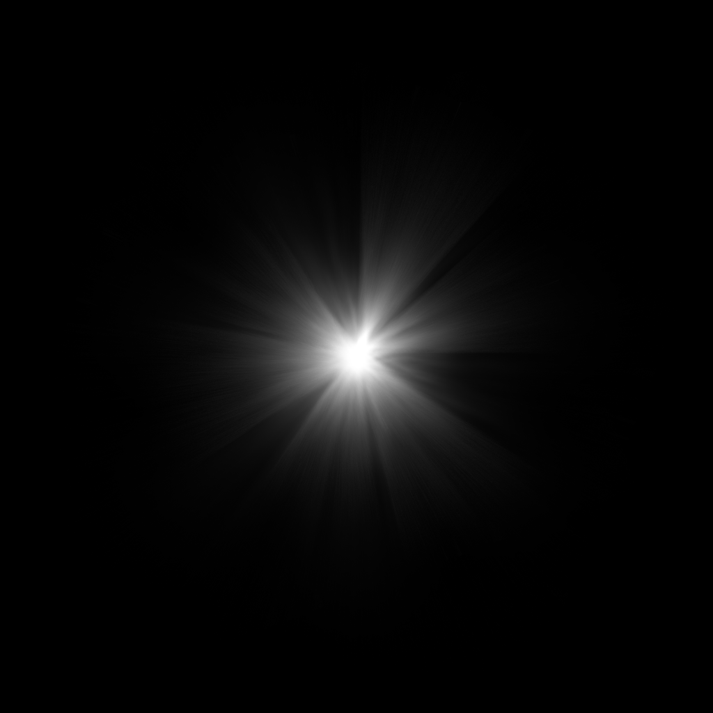
for the rest, we have a wavy sand texture just to get the effect of ripples within sand dunes, a Rune circle to bring the Arcane magic tone in. a very simple lens-flare for all my flashes, and then a light-ray texture. 


now I'm just adding lots of elements, layering things things together and doing all of the timing in a Timeline animation.
there were so many layers I had to drag the window to my vertical monitor cus I couldn't see the frames any more and even then it was too big (picture 4)😂


there were so many layers I had to drag the window to my vertical monitor cus I couldn't see the frames any more and even then it was too big (picture 4)😂


i realised i was gonna need some small rocks/debris so then modelled 4 very simple rocks.
one of the rocks' normals was messed up to hell but i didnt care enough to fix it, so it was a spicy weird normal map 🤗


one of the rocks' normals was messed up to hell but i didnt care enough to fix it, so it was a spicy weird normal map 🤗


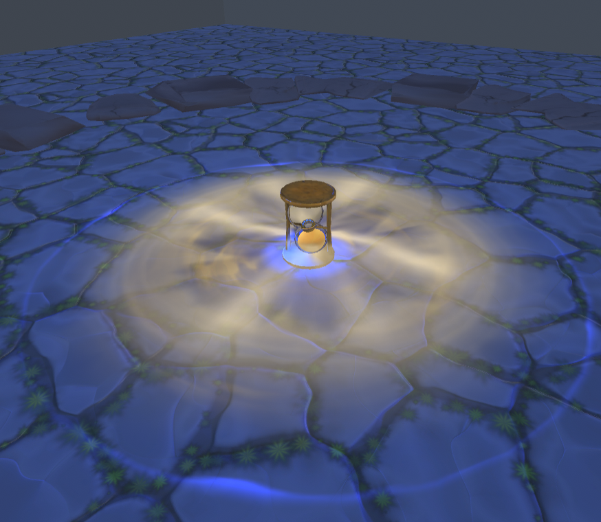
then thinking about demonstration, I wanted to show the effect off in multiple ways, to show that i was thinking about how it would work on multiple backgrounds, dark, light environments, then also on a more busy textured floor too, so to Substance Designer 🎉 


at this point, its pulling everything together and just timing and retiming things for infinity until you get what you want and again testing it in context to make sure it looks how you want. 👁👁
as a bonus video, I also included another shot with
- different angle
- no textured floor
- no camera shake
just to demonstrate I wasnt trying to pull any trickery/smoke and mirrors and that it only worked because of these additional elements.
- different angle
- no textured floor
- no camera shake
just to demonstrate I wasnt trying to pull any trickery/smoke and mirrors and that it only worked because of these additional elements.
For me, I wanted to find as many opportunities to show different skills. Even if some of those skills aren't as strong, just to show willing and enthusiasm so I used:
Unity, Photoshop, Substance Designer/Painter, Maya, Procreate, Marmoset, Nomad Sculpt in total.
Unity, Photoshop, Substance Designer/Painter, Maya, Procreate, Marmoset, Nomad Sculpt in total.
and that's it! 🎉
I spent around 18-20 hours (over 3 days) on this effect and had a lot of fun making it.
ultimately, I would of course make some changes now, but I hope this helps demonstrate the kind of thing you might be expected to make for a games VFX Art test! 💚
I spent around 18-20 hours (over 3 days) on this effect and had a lot of fun making it.
ultimately, I would of course make some changes now, but I hope this helps demonstrate the kind of thing you might be expected to make for a games VFX Art test! 💚
forgot to mention, the *reason* i wanted the physical hourglass, was so I could use it as part of the telegraph animation, and also for the sand rising/decreasing for an in-world way of communicating the duration of the ability too 😁
• • •
Missing some Tweet in this thread? You can try to
force a refresh


