Half through sorting the #dataviz bookmarks and still haven't found the links I am looking for (the curse of over bookmarking).
But here are 10+1 super amazing, interactive, and midn-blowing🤯 #environment, #climate, #trade, #emissions related websites that are just 🤩
👇👇
But here are 10+1 super amazing, interactive, and midn-blowing🤯 #environment, #climate, #trade, #emissions related websites that are just 🤩
👇👇
1/ The #WorldBank's #SDG atlas covers each #SDG goal in detail with some great datavizzes inside each of them. Check it out! Really a lot of effort went into this.
datatopics.worldbank.org/sdgatlas/
datatopics.worldbank.org/sdgatlas/

2/ @ChathamHouse brings an interactive resource website that allows you to explore bi-lateral #trade linkages. Data currently ranges from 2000-2020.
resourcetrade.earth
resourcetrade.earth

3/ Of course discussing trade and interaction won't be complete without the Observatory of Economic Complexity (@OECtoday):
oec.world
I have been a huge fan of this project since its inception. Even have the treemaps in an early hardcopy version of the data.
oec.world
I have been a huge fan of this project since its inception. Even have the treemaps in an early hardcopy version of the data.

4/ The #UN #BiodiversityLab has produced this great interative website where you can display various remote sensing layers. Biodiversity has now also become a key topic in climate econ.
map.unbiodiversitylab.org/earth
map.unbiodiversitylab.org/earth

5/ The @Microsoft #PlanetaryComputer is an awesome project that provides processed satellite data:
planetarycomputer.microsoft.com
Related is also the Climate Impact Lab (@impact_lab)
impactlab.org
that has further indicators using downscaled #CMIP6 scenarios 🤩
planetarycomputer.microsoft.com
Related is also the Climate Impact Lab (@impact_lab)
impactlab.org
that has further indicators using downscaled #CMIP6 scenarios 🤩


6/ The GRACED carbon monitor website is just beautiful infographics on near realtime daily CO2 emissions.
carbonmonitor-graced.com
carbonmonitor-graced.com

7/ The @esa has several interactive websites but this one is one my fav ones with near realtime display of recent #GHG concentrations:
maps.s5p-pal.com/no2/
You can click on the tabs above to change the emissions.
maps.s5p-pal.com/no2/
You can click on the tabs above to change the emissions.

8/ The @HarvardGrwthLab has put together this amazing #Metroverse website that explores urban development, product composition, and technologies, and future pathways. Pick a city and start exploring!
metroverse.cid.harvard.edu
metroverse.cid.harvard.edu

9/ Where are all the coal power plants operating? This interactive map by @CarbonBrief is a visual treat!
carbonbrief.org/mapped-worlds-…
carbonbrief.org/mapped-worlds-…
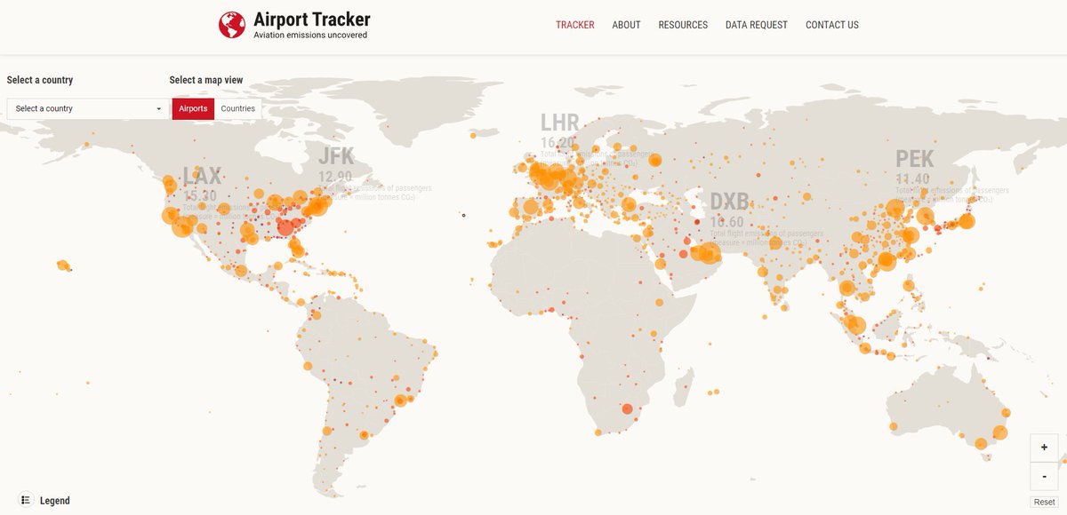
10/ Speaking of coal, want to see how much of the #emissions revolve around #airports?
Check this website out!
airporttracker.org
Click on an airport and see the breakdown by different flight types. E.g. JFK emissions = 3 coal power plants.
Check this website out!
airporttracker.org
Click on an airport and see the breakdown by different flight types. E.g. JFK emissions = 3 coal power plants.
11/ A special mention to this great website, the Migration Trail (@migrationtrail)
migrationtrail.com
It's a story-telling website, which traces the journey of two fictional refugees David and Sarah, from Africa to Europe, completely annotated with their lived experiences.
migrationtrail.com
It's a story-telling website, which traces the journey of two fictional refugees David and Sarah, from Africa to Europe, completely annotated with their lived experiences.

And that's it! Back to sorting. There are of course a lot more websites, but these ones were selected for their interactivity and not so much on the getting the data part. For that one needs a separate thread 🙂
/END
/END
• • •
Missing some Tweet in this thread? You can try to
force a refresh