Profile picture
Joe Radak @NotGDC :( @Fr0z3nR
, 45 tweets, 13 min read Read on Twitter
So, after going through nearly THREE HUNDRED games on my Steam Discovery queue, I have some examples of good and not-so-good game trailers. If you're in the process of trailer editing for your game, please consider the following.

A thread on indie game trailer does and don't.
Start off with one I don't think are that great 👎

Convoy -
Starts off with positive quotes from PCGamer, Subset Games & Vlambeer folk. Great, definitely have them in the trailer, but not at the front. I don't think the avg gamer knows these folks.
Beyond that, it was 8s of accolades, 5s of a ship crashing, and then the first gameplay we see is UI with lots of reading. Is this a UI driven game? I don't want to read in a trailer, I want to see what the gist of the game is - which I believe is 19s into the trailer! Yuck!
The trailer on YT has 55k views, and looks like a solid game, but if I wasn't looking for not-great trailers, I would've skipped through soon after accolades.
Another example of a not-so-great-trailer 👎

Breach and Clear -
This trailer looks extremely well produced. The effects are great, but it's not until AFTER 20s of fancy effects, company logos, the name of the game and A LIST OF FEATURES, do I see gameplay
They list out features in the trailer. Why do I need a 10s list at the start, when you could include them with gameplay, like after 20s? There's 30s of just effect, social media stuff and the games logo, you can put the gameplay in that. The rest can go down in the video desc
"But what if the video host doesn't do descriptions!?" - put them all up on a single screen with a *call to action.* A call to action would be like "Follow us for more news on <game name>! and vanity URL all the social media outlets/groups/etc.
One last not-so-great trailer example 👎

Knight Online - store.steampowered.com/app/389430/Kni…
Don't use the cloudy embery background with text - really cliche in my opinion. Little "windows" into gameplay can work in some cases, but when they're small, and don't show anything - why use them?
Also - be careful with the video that you capture. They use the same footage a couple times over in this trailer, and it's obvious. You want your footage to say things that you can't easily fit in. This is why gameplay is GREAT.
The SECOND video on their store page is much better than the first. It starts off with the logo - fine, but cuts IMMEDIATELY to a call to action with ingame footage. It keeps pushing through with big groups and fights - that looks exciting. third and fourth are better too.
I know that one isn't an indie game, and is really old, but it was still a good example of things that I don't think you should do with you trailer.

Anyways, onto the good trailers.
An example of a good trailer 👍
Death Road to Canada -

Right off, you get gameplay that shows something, into gameplay that shows the core 'fun' of the game. Each clip doesn't feel drawn out that long, and they all present something new about the game.
The clips show both positives, and negatives, and weird quirky things that make you think "why is that happening?" it shows - hey, you can interact with the environment, you kill zombies, you have a team who does it with you. It shows off the style and tone of the game too, well.
I think the one thing I would say would be nice to have more of - is something a little more explicit in telling what the core of the game is. This is where text might play a bit better, or some shots of doing team management or something. Still though, a good example.
Example #2 of a good trailer 👍
Kingdom: New Lands -
It might have 10s of text at the start, but it is in the same exact style of the game, has a character, and sets the tone/background of the game instantly.
It also tells a bit of a story, all while showing the premise of the game, mechanics, etc. It leans a lot on the story feel, which is great and works well. You can do that too, if you can tell the story and explain the game at the same time.
Another good trailer example 👍
Beastmancer -

3s of logo, and boom! Gameplay that shows what the game is about. Small, animated slides draw your eyes to short info about the game, all while being non-intrusive, or ever losing a beat.
Last good trailer example 👍
Stick Fight: The Game -

I wanted to point out this one for the music, While showing you a series of full matches, it times the combat to the music high beats. Big orchestra crashes with big visual hits. Pick your music first!
If you're making your games trailer - watch trailers, Lots of them. New or old, watch a be critical. Why did you like one trailer over another, Did the trailer leaving wanting to see more? Why? Did it drive you to go to their storepage? Did you buy/wishlist? Why was that?
Do this, and your trailer will have a huge leg up on everyone elses. Trailers are important - don't let them fall to the wayside!
Bonus cat.
Going to add onto this a little with some crazy trailers I find (I'm still trawling, yo).

X-Plane 11 makes flight sim sound like an epic adventure across skyrim.

store.steampowered.com/app/269950/XPl…
One Shot 👍 store.steampowered.com/app/420530/One…
Does 28+ seconds of just text, but I watched the WHOLE trailer when it popped up because the text, and the music really played well with each other. I'm actually kind of really liking the trailer music a whole lot.

Music's important!
Fantasy Tales Online 👎 store.steampowered.com/app/442710/Fan…
Good trailer, but spends waaay too much time on each of the features it covers. If you want to spend time focusing on features, semi-extensively, consider doing a video for each feature, rather than doing it all in a trailer.
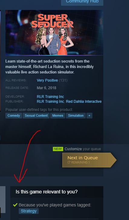
Super Seducer: How to talk to girls 👎 👎 👎 👎 👎 👎🤮
store.steampowered.com/app/695920/Sup…
Don't tell the story of your games development in your trailer. Don't be really creepy with your trailer. Don't use font you can't read.

Also, LOL. It was recommended because I like Strategy games.
Rogue Port - Red Nightmare 👎
store.steampowered.com/app/467310/Rog…

Not having full 16:9 for your trailer is ok, and can work in some ways.
Don't use scrolling words over and over and over.
Like, ever, unless you're riffin' a cheesy infomercial. (See Black Mesa Trailer)
WARTILE 👍👍👍
store.steampowered.com/app/404200/WAR…

Both trailers here are great. The first one works REALLY well with the music, builds suspense, makes me want to see more. Maybe a little long.

Second trailer: Like, all gameplay - and pretty good gameplay shots too. Nice job @wartilegame
(You're also on #UE4, so bonus 👍 from me because I'm 100% not biased)
Getting Over It with Bennett Foddy 👍
store.steampowered.com/app/240720/Get…

I know I said don't narrate over your games trailer with a story of the development... BUT you SHOULD if it's kind of the main story of your game. (See also: The Beginners Guide, maybe Stanely Parable)
Low Magic Age 👎
store.steampowered.com/app/576770/Low…

LOGOS👎
Shows a lot of gamplay, which is 👍, but very hard to follow. Text over it all doesn't help. If you're game is fast paced, or has a lot of stuff on the screen - really try to slow things down to help the viewer know whats going on
Heat Signature 👍
store.steampowered.com/app/268130/Hea…
(How did I forget this?)

Narration works really well here because it's a game that could have a lot going on, so the narration explains whats going on & it gives the style of the game & it's entertaining. Narration takes work to get👍
So far I'm finding that narrative games can get a little more creative with the trailers. Their main selling point is the story, so they want to push that more than the gameplay (in some cases).

tl;dr You trailer should be putting your games selling points in NEON FUCKING LIGHTS
Thread repair >
The Escapists 2 👍
store.steampowered.com/app/641990/The…

I like this because it starts off interesting - quote of a guard with some obvious dramatic irony. It does quick shots through everything thats quirky about escapes. It's timed well with the music. Main draw from this would be (cont)
(cont w/ Escapists 2) - Main draw from this would be how they cut between everything, and each thing is interesting, different and makes you go "What the hell, why are they falling from the sky in a raft?! Dolphins!?"

It plays into its outrageousness and diverse outcomes well.
Something else to consider!

Your trailer, will NOT be viewed at 1920x1080 most of the time. Steam, Youtube, Vimeo do not default to that res. Make it so that you can see EVERYTHING important in your trailer- text, gameplay, etc- at like, a playback res of 800x600.
AKA - Sorry, I can't see your teeny tiny font of the stuff you're doing in your UI heavy game.
And something I thought of overnight - please consider subtitles! Youtube Auto-generates them, and you can add them to your trailer via text slides so they're ALWAYS there.
I'm still watching trailers (pushing near 1,000 in total since the discovery queue started D:) and I there's something I notice that some indie story-based trailers do. They show things that the player can't do. Don't do this! Players see something, they expect that something.
For example - (not so indie, but it's a GOOD example) - the Team Fortress 2 Jungle Inferno Trailer (or any TF2 trailer), specifically the last bit -

It shows the mercenaries in gear that you can get in game, using the items, as they would work in-game.
You can exaggerate a lil bit for narrative reasons if necessary. If the Pyro didn't get the Jetpack in the update, but Jetpacked was in the trailer, then players would be disappointed/confused/upset that is no bueno. HOWEVER - there is an exception that Valve uses *sometimes* -
If you're doing a game-for-service, or long-term dev game, put items into trailers, in the background or in a way that the player characters don't interact with them. Assuming you have a big, attentive community, then they could help provide some ideas on what that item could be.
Blizzard kind of did this with Doomfist and Valve allegedly did this with the mini sentry - and probably various other TF2 weapons.

I'm sure there's other games that did it, but those are the two big ones I know for sure.

Anywho, back to trailer watching.

(help)
Car Mechanic Simulator 👍
store.steampowered.com/app/645630/Car…

2 good trailers. 1st is a mix of enviro, gameplay cuts over top music that I assume is from the game? Good beat, makes me super interested to watch. 2nd - Narrative trailer, but it shows the premise of the game + things you do.
Post Human W.A.R 👍
store.steampowered.com/app/462240/Pos…

This one has a bunch of stuff that I've talked about before - use of creative narration, plays up its humor while showing + explaining how things work, kind of breaking the fourth wall. Not sure how this only has 26 reviews.
Missing some Tweet in this thread?
You can try to force a refresh.

Like this thread? Get email updates or save it to PDF!

Subscribe to Joe Radak @NotGDC :(
Profile picture

Get real-time email alerts when new unrolls are available from this author!

This content may be removed anytime!

Twitter may remove this content at anytime, convert it as a PDF, save and print for later use!

Try unrolling a thread yourself!

how to unroll video

1) Follow Thread Reader App on Twitter so you can easily mention us!

2) Go to a Twitter thread (series of Tweets by the same owner) and mention us with a keyword "unroll" @threadreaderapp unroll

You can practice here first or read more on our help page!

Did Thread Reader help you today?

Support us! We are indie developers!


This site is made by just three indie developers on a laptop doing marketing, support and development! Read more about the story.

Become a Premium Member and get exclusive features!

Premium member ($3.00/month or $30.00/year)

Too expensive? Make a small donation by buying us coffee ($5) or help with server cost ($10)

Donate via Paypal Become our Patreon

Thank you for your support!