, 58 tweets, 17 min read Read on Twitter
Started to read The Smarter Screen: Surprising Ways to Influence and Improve Online Behavior, by @shlomobenartzi with @jonahlehrer

goodreads.com/book/show/2349…
Typical subject using simulated version of healthcare.gov chose a plan that was $888 more expensive than it needed to be.

Bhargava et al (2017) The costs of poor
health (plan choices) &
prescriptions for reform google.com/url?sa=t&sourc…
In experiment after experiment (on drone operating teams), the surplus of digital information creates blind spots on the screen

tandfonline.com/doi/abs/10.108…
People think very fast on screens, miss Uber notice on surge pricing:

Jerry Seinfeld's Wife Spent $415 During Uber's Surge Pricing To Make Sure Her Kid Got To A Sleepover
businessinsider.com/jerry-seinfeld…
This book is on possible solutions, e.g.:
Health care plan: use choice tournament
Blind spots: zoom out, provide fewer details
Uber surge pricing: deploy ugly font
On the choice tournament:
Besedes et al - Reducing Choice Overload Without Reducing Choices
netspar.nl/publicatie/red…
On fewer details:
In a real-world study conducted in Israel, providing less-detailed feedback led to big improvements in decision making among investor.

I summarized the cited paper on my blog: wilte.wordpress.com/2018/12/07/the…
We can use tools and tactics of behavioral science to improve our online behavior

Boost quality of our digital decisions

My hope is that we can use the scale of technology to bring more fixes to more people in far less time
Caveat: to take advantage of digital nudges, we need to tailor them for our new online environment

Update our behavioral toolkit for the digital age
Herbert Simon: "a wealth of information creates a poverty of attention"
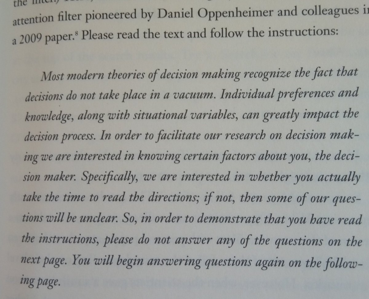
Attention filter in online surveys; inthe middle of instruction: "do not answer next question"

Oppenheimer et al (2009) Instructional Manipulation Checks

Pen&paper: 14-29% fail
Computer screen: 46% fail check

papers.ssrn.com/sol3/papers.cf…
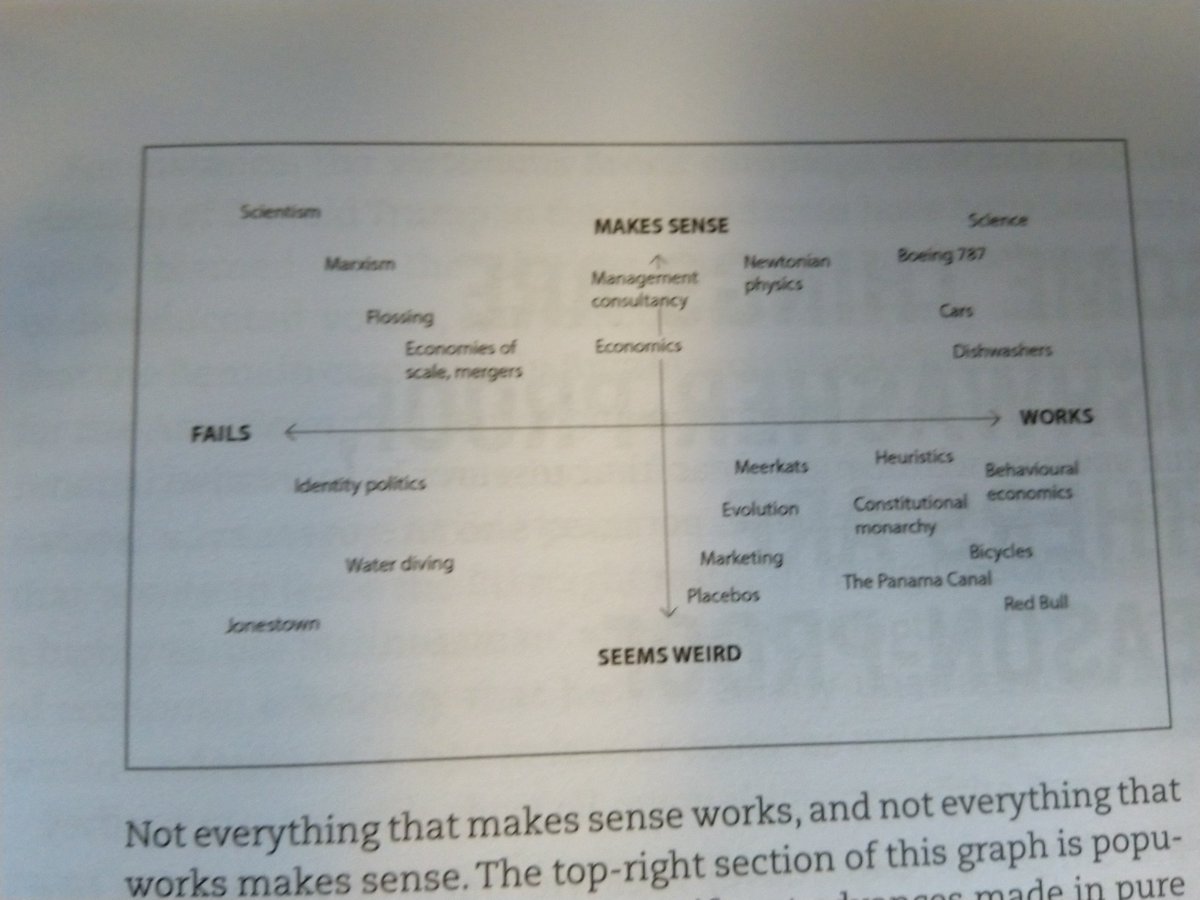
George Miller (1956) The magical number seven, plus or minus two"

Psychologist Nelson Cowan argued that the true magical number is actually four (+/-1); most tests of working memory showing that we start to miss crucial information whenever the number of bits exceeds 4
Memorizing 7 digits is hard, not enough mental resources left to resist cake.

Experiment: memorize 7 (control: 2) digits, walk to other room and in the hall between rooms, choose between cake and fruit.

7 digits: 63% choose cake (vs 41% for 2-digit group)
Subjects that score high on implulsivity:
Memorizing 7-digits: 84% chose cake, vs 2-digit: 38%

Source: Shiv & Fedorikhin (1999)
Heart and Mind in Conflict: Interplay of Affect and Cognition in Consumer Decision Making
gsb.stanford.edu/faculty-resear…
Singh et al on alerts for Veteran Affairs doctors on abnormal test results (typical doc receives >60/day): amount of info doesn't just create scarcity attention - makes it harder to deploy whatever attention we have (p.27)
McDonald commentary on Singh's work: "If everything is important, then nothing is".

JAMA (2013) Toward Electronic Medical Record Alerts That Consume Less Physician Time
jamanetwork.com/journals/jamai…
Mani, Mullainathan, Shafir, Zhao (2013): Policy-makers should beware of imposing cognitive taxes on the poor just as they avoid monetary taxes on the poor

Possible solution: smart defaults, prefilled forms
science.sciencemag.org/content/341/61…
Benartzi p.34: "if we want to help people make better decisions in the future, then we need to understand the psychology of screens, and how people make choices in an age of too much information and too little working memory."
Chapter 2.
Speculative hypothesis: world of screens makes it easier for us to act on superficial first impressions

People think faster on screens; more reliant on our instinctive responses and initial impressions (even if incorrect)
Online price discrimination: average cost of Home Depot produxt after desktop search: $120. Mobile: $230

Hannak et al (2014) Measuring Price Discrimination and Steering on E-commerce Web Sites
ftc.gov/system/files/d…
Hannak et al method:
Proxy Auto-Config (PAC) file routes all traffic to the sites under
study to an HTTP proxy controlled by us (...)
any cookies that the user’s browser had previously been assigned would automatically be forwarded in our searches.
Hannak et al methods:

Whenever the proxy observes a search request, it fires off two identical searches using PhantomJS
(with no cookies) and saves the resulting pages. The results
from PhantomJS serve as a comparison and a control result.
Reinecke and Gajos (2014) model only using 'colorfulness' and 'visual complexity' explained 48% of variation in aesthetic preferences for a given website
eecs.harvard.edu/~kgajos/papers…
Reinecke & Gajos: Demographics and nationality strongly influenced our aesthetic preferences

Designers will be able to maximize appeal of ther website with quantitative model of our first impressions

Future: aesthetic algorithm customizing appearance of every site you see
Aesthetics affect perceptions of usability and trustworthiness.

Function follows form
Chapter 3
Middle bias. Christenfeld found:
4 identical options: 71% choose one of two in middle (chance would be 50%)

4 stalls public restroom: middle ones 50% more used (as measured by need for toilet paper refresh)
Elena Reutskaja et al: Screen filled with 9 snack options, subjects 60% more likely to choose food in the center, regardless of what it was.

Worst snack in middle: only 30% find best snack. If in middle: 91%

In the digital world, screen location is a hugely important variable
Consumers' acquisition patterns strongly affected by format. Information is processed in fashion which is easiest, given the display used

Effects of information presentation format on consumer information acquisition strategies.

Bettman & Kakkar, J Consumer Research, 1977
Chapter 4: the new mirror

Meta-study on 607 experiments; in 38% of cases, feedback actually led people to do worse.

Feedback: one can have too much of a good thing

Kluger, A. N., & DeNisi, A. (1996). The effects of feedback interventions on performance. Psychological Bulletin
Myopic loss aversion: investors make mistake (i.e. sell) based on short-term losses in portfolio, even when they should have a long-term investment plan (and hold).

Thanks to high frequency of investing feedback; myopic loss aversion amplified by the online world (p 93)
Benartzi: "What's more, digital devices make it even easier to act on these errant instincts driven by too much feedback" (p.95)
Anonymous devices (computer, mobiles) seem to make us more honest (disinhibition effect), they also lead us to indulge in irresponsible behaviors.

Eg: online ordered pizzas contain 33% more toppings, 6% more calories, bacon sales +20%

papers.ssrn.com/sol3/papers.cf…
7 principles effective digital feedback @shlomobenartzi:

1 time it right
2 make it personal
3 avoid feedback overdose
4 trigger a feeling (affect heuristic)
5 incorporate action plan
6 encourage, don't criticize
7 follow the evidence (test it)
Or as acrostic DIGITAL:

D dosage
I easy
G good
I intuitive
T timing
A actionable
L learning
Chapter 5: Desirable Difficulty

Hard to read texts/fonts; higher student performance (Oppenheimer) or scores on Cognitive Reflection Test (Alter et al).

Pen is mightier than the keyboard for note taking: pdfs.semanticscholar.org/6b6a/25a7a6d95…
Best design balances demands for cognitive ease with the benefits of desirable difficulty

Easy is good, but sometimes hard is even better (p.135)
Chapter 6: Digital Tailoring

According to Cordova and Lepper, personalization enhances attention and enjoyment:
1 increases intrinsic motivation (info is self-relevant)
2 higher perceived competence
psycnet.apa.org/record/1996-06…
Personalization is persuasive

Digital world dramatically expands possibilities of personalization
Example from @B_I_Tweets:
Drawing the attention of those who fail to pay road tax
When letters to non-payers of car tax included a picture of the offending
vehicle, payment rates rose from 40 to 49%.

A (attractive) from EAST
bi.team/publications/e…
Personalized videos from Idomoo led to sevenfold increase in loan applications (p.149)

idomoo.com/drum-roll-plea…
Timing is everything
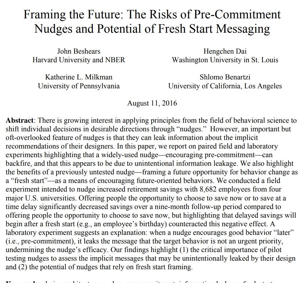
Increase pension savings rate after a personalized landmark (eg birthday)

Beshears, Dai, @katy_milkman, @shlomobenartzi:
Framing the Future: The Risks of Pre-Commitment Nudges and Potential of Fresh Start Messaging
static1.squarespace.com/static/5353b83…
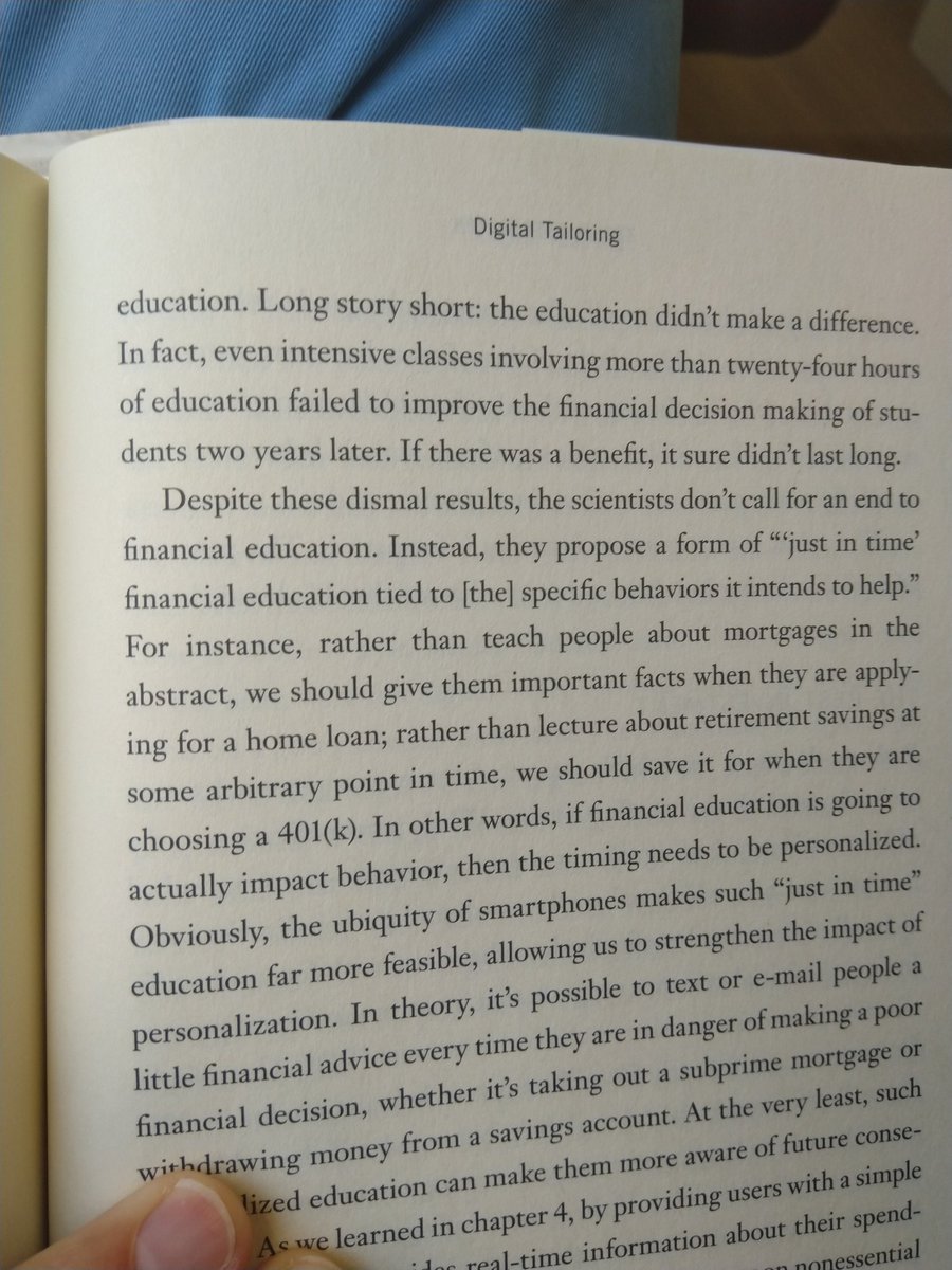
Financial education meta-study: education didn't make a difference.

Call for "just in time" financial education, tied to specific behavior

Fernandes et al (2014) Financial Literacy, Financial Education and Downstream Financial Behaviors 

papers.ssrn.com/sol3/papers.cf…
Chapter 7 The Choice Opportunity

Shah & Wolford (2007); assortment of pens ~$2 each. Discount rate: $1, who buys a pen?

90% when 10 pens, 40% when 2 or 20 pens. Seems optimal number of choices

Buying Behavior as a Function of Parametric Variation of
Number of Choices
Giving people a large choice set of mutual funds lowered participation rates in 401(k) pension plans; for every 10 additional funds, participation rate -2%

Iyengar et al (2003) How Much Choice is Too Much?: Contributions to 401(k) Retirement Plans
semanticscholar.org/paper/How-Much…
Not enough to offer lots of possibilities; make it easier for consumers to make a smart choice (p.170)
Consideration sets (narrowed down list of options consumer will consider) are rational response to a world with too many alternatives and too little time (John Hauser)
Benartzi not convinced by Itamar Simonson statement: "brands are less needed when consumers can assess product quality using better sources of information such as reviews from other users, expert opinion, or information from ppl they know on social media"
hbr.org/2014/01/three-…
In a world of nearly infinite choices and information people are forced to rely on mental shortcuts to carve out their consideration set (p174-175)

However, if website has effective choice architecture, and takes advantage of categorization, Simonson's theory might hold
We don't want endless possibility. What we really crave is effective curation.
Joshua Porter - Testing the Three-Click Rule: some users visited as many as 25 pages before ending their tasks; others only visited two or three before stopping.
articles.uie.com/three_click_ru…
Porter: "When users find what they want they don’t complain about number of clicks."
p177-182 on the Besedes tournament model (also covered in @rorysutherland
's book Alchemy)
twitter.com/wilte/statuses…
People prefer low deductible & higher monthly payments

"Our primary finding is that the majority (61%) of the 23,894 employees in our sample selected financially dominated plans"

Choose to Lose: Health Plan Choices from a Menu with Dominated Option academic.oup.com/qje/article-ab…
We can help people make better choices online by applying research on:
Categories
Tournament
Closure
Lot of research to back up recommendations, but do test actual user experience
Chapter 8 Thinking Architecture

How Mobile Phones Can Solve the Retirement Savings Crisis
scientificamerican.com/article/how-mo…
Thinking Architecture
Query theory: we arrive at decisions via internally posed questions.

RCT @B_I_Tweets showed most effective messag: "if you needed an organ transplant would you have on? If so please help others"
bi.team/publications/a…
Appendix: the complete list of 42 tools

General:
Use science to drive your design and A/B testing
Whiteboard excercise
Medium shapes the message
Missing some Tweet in this thread?
You can try to force a refresh.

Like this thread? Get email updates or save it to PDF!

Subscribe to Wilte Zijlstra
Profile picture

Get real-time email alerts when new unrolls are available from this author!

This content may be removed anytime!

Twitter may remove this content at anytime, convert it as a PDF, save and print for later use!

Try unrolling a thread yourself!

how to unroll video

1) Follow Thread Reader App on Twitter so you can easily mention us!

2) Go to a Twitter thread (series of Tweets by the same owner) and mention us with a keyword "unroll" @threadreaderapp unroll

You can practice here first or read more on our help page!

Follow Us on Twitter!

Did Thread Reader help you today?

Support us! We are indie developers!


This site is made by just three indie developers on a laptop doing marketing, support and development! Read more about the story.

Become a Premium Member ($3.00/month or $30.00/year) and get exclusive features!

Become Premium

Too expensive? Make a small donation by buying us coffee ($5) or help with server cost ($10)

Donate via Paypal Become our Patreon

Thank you for your support!