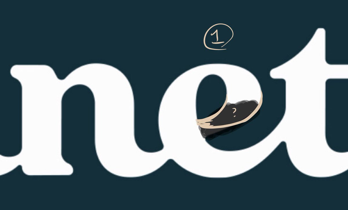
Ahoy, Paul! Happy to offer a second set of eyes. I like where this is going: personally I’m not seeing anything wrong with the E-T join, but maybe this is what you’re seeing (& a way out)? —>
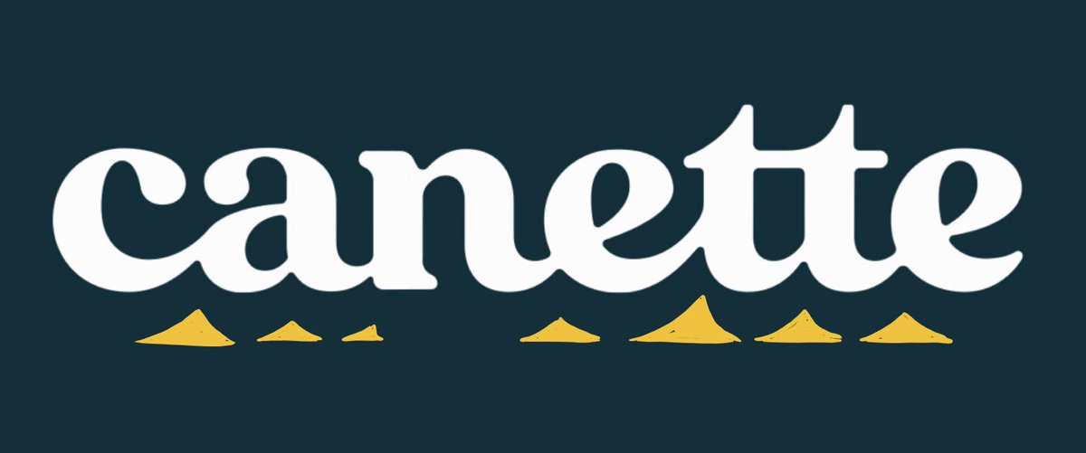
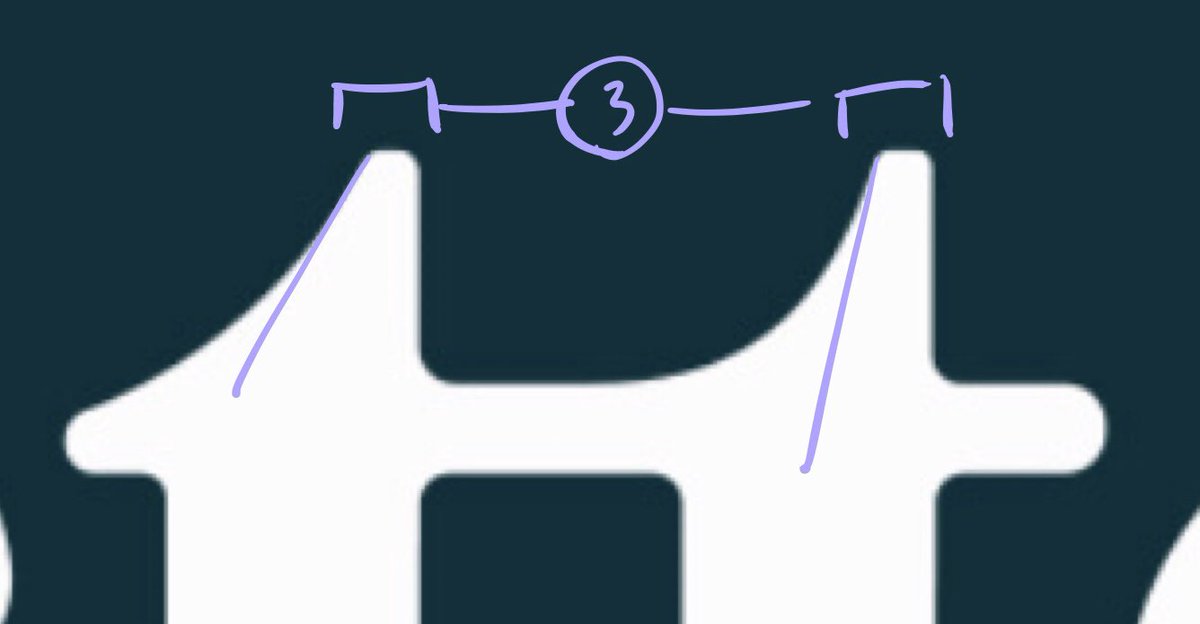
Here’s a look at the comparative size of the joins between letters. Not necessarily a problem, but the E-T is the biggest: wonder if that’s what’s making it look odd to you? —> 
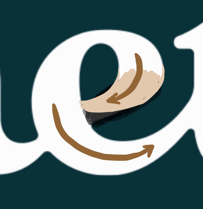
I suppose the obvious way to change this would be to lower the exit stroke of the E, but... —>

...this could invite something else, too: changing the angle of the top stroke, so that it’s a little juicier, like the other curves in the logo. —>

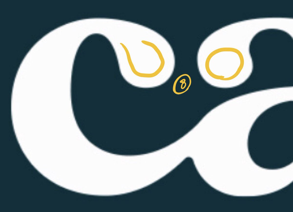
In fact, maybe it’s the counter (enclosed by the top loop) that could benefit from this, more than the exit stroke? I suspect you share my same desire not to break the continuity of the N-E, but I think it’s safe to try, and definitely supported by your C-A decision. —>
Another way of looking at this E is to compare the “speed” of these two curves. Maybe this adjustment helps make them more comparable? (If it’s something you want, that is.) —>
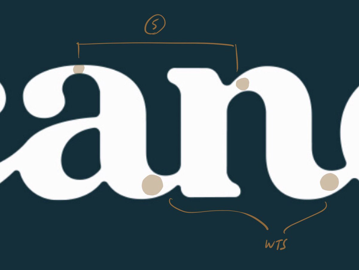
Some other thoughts, in case they’re useful. A few adjustments to the fit might help: I’m especially feeling that the first E is drifting right, between the N and T, and that C-A could be looser. See the small size version to get the overall gestalt of the fit. —>
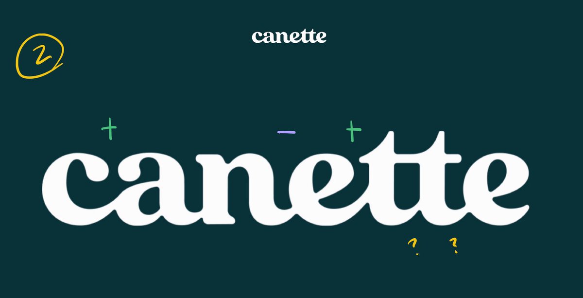
Also, I noticed that these two Ts were different, in terms of the treatment of their tips & the tangency of their curves. It’s not a problem — certainly every Old Style “ff” ligature has intentionally different peaks — but I wanted to point it out, in case it was an accident. —>
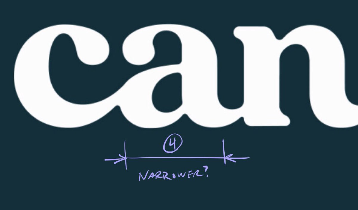
Also, to my eye, the A is a little wide. It might be worth spacing it between Ns to give you a “control” for your typical spacing: try an “nnann” with your letters, & see what you think. —>
I’d also keep an eye on these weights, which might vary a little more than they need to. A single-storey A is always going to be a monster to resolve, and heavying the hairlines too much will make it sluggish, but you might be able to push it a little more. Worth a try, maybe. —>
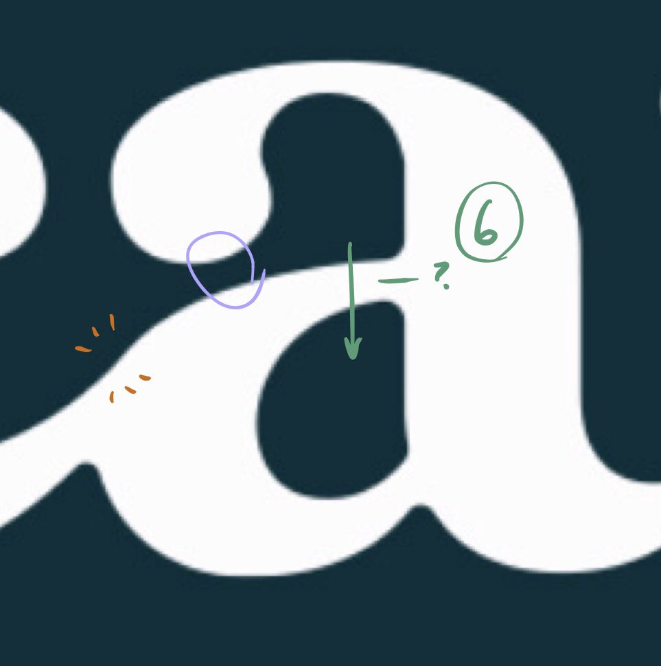
If you’re noodling with the A anyway, I’d be curious to see what happens if the center stroke moves down, to reduce the counter. It might change the personality too much, & not be what you want, though it also might help with tight channels & that tricky inflection point. —>
Two final thoughts, and I’m really picking nits here, but in case you’re seeing what I am, here goes. I have a feeling that moving this point to the right — really, really slightly — will smooth out your C. And, finally, —>
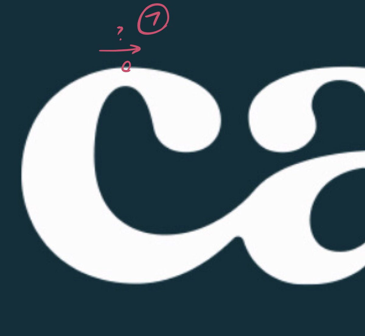
I found myself noticing that you’re using two different approaches to the terminals: the A is very round, its right side curving back in to meet the hairline, where the C is more lachrymal (50¢ word, “tear-shaped) instead. Not a problem, but perhaps an oppty for resolution? —>
Anyway, that’s what I’ve got. Hope this helps! I really like the personality of this mark. Get your client to commission a lighter version, too: it’ll be useful at smaller sizes, but moreover you’ll have fun drawing it. :) —Jonathan