We have been tracking the coronavirus/COVID19 outbreak VERY closely since it started in #China in January, and we have learnt a fair bit about what data to use and not use in the process = A THREAD.
A key point: There is no single source of data that is the best. The data is collected in a decentralized way. Hence, you have to think about which data is best for each jurisdiction (though it is nearly impossible to track them all individually).
Initially, the focus was on #China, and we relied on the official press release from the CDC in China and key individual provinces for the analysis of new cases and deaths and details about how the statistics were changing (diagnostic criteria etc).
nhc.gov.cn/yjb/s3578/2020…
nhc.gov.cn/yjb/s3578/2020…
Eventually the news wires caught up, and it became more efficient to look at aggregators to collect the data, rather than going to dozens of individual web pages. We used (not well known) BNO and and Johns Hopkins for this purpose early on.
As the outbreak in China matured, it was crucial to look at disaggregated data, as the improving trends were visible first in the provinces, while the outbreak in #Wuhan was much harder to get under control.
When the outbreak moved to #Korea, we again relied on the (high quality) official data from Korean sources, using a detailed regional breakdown (with testing information and all that...)

In the critical phase of the outbreak (close to the peak), the official local data, with good breakdown for many provinces became very valuable, especially since it had good up to date information on testing. You just needed some color from locals to figure out the testing lag. 
The trick, in terms of using aggregators, is to generate time-series data based on consistent 24 hour cycles. Johns Hopkins does not technically allow that, but we have created a process to get around this, and that is how we have been using that data.
But it is important to remember that there is no single source of "truth" in the numbers at a given point in time. For effectively all sources it is not necessarily the case that the confirmed case figures represent patients that were diagnosed on that specific day/date.
Rather the confirmed case counts from many aggregators represent merely the latest available estimate on the day/date they are reported.
Careful study of these sources will show what time of day they themselves update their data, and in many cases, the max number of confirmed cases for a given source occurs at 11:59PM in a given timezone in which they operate.
But what matters for constructing a consistent time series and tracking the trend in the outbreak (rather than the latest maximum number of cases) is a consistent point-in-time approach based on consistent 24 hour cycles.
It can also be important for evaluating time series trend how you deal with 'zero days' which are unlikely to reflect the 'truth', but show up frequently nevertheless. We think a form of interpolation is better than no interpolation here.
In this regard (and many others), the US data has been a nightmare, as the CDC does not do a great job aggregating data in a timely way. Hence, we have to rely on data from individual states, which report at different times of day (and do not all report on all days).
It is telling that perhaps not even US policy makers rely in CDC data in their policy making
news.bloomberglaw.com/coronavirus/wh…
news.bloomberglaw.com/coronavirus/wh…
Better aggregators have now emerged in the US, so we do not have to do our own collecting/scraping. We find The Covid Tracking Project to be reliable and transparent in this regard, and it is currently our main source for the US on new cases/testing (+other metrics for US states)
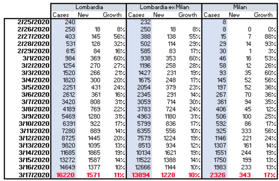
For the international data, we are increasingly finding that the news based aggregators (Johns Hopkins and Worldometer) are subject to noise. For example, the French data has been dramatically distorted by lumpy reporting from nursing homes.

Against this background, we have recently moved our international data collection to rely on Our World in Data, which relies mostly on the official statistical sources. The disadvantage of this source is that it is fairly slow (12-18 hours late than other sources).
Hence, we are supplementing with an additional 24 hour snap from Johns Hopkins to have a timely preliminary read on the day for all countries we cover. (but that does run the risk of noise in the last data point).
This is not always perfect, hence we do pay manual/human attention to the official sources as well as color on variation in the data, such as the huge spike in #Ecuador recently. Adjusting for zero days is part of this process too.
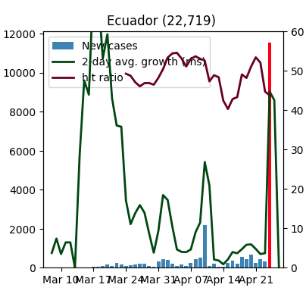
This is not always perfect, hence we do pay manual/human attention to the official sources as well as color on variation in the data, such as the huge spike in Ecuador recently.
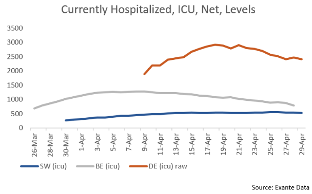
Looking ahead, it remains critical, especially over the next 4-6 weeks, to track not just the trends in confirmed cases but also in testing, fatalities and hospitalizations for signs of whether measures to reopen the economy can be sustained without reigniting the outbreak.
The key for investors and policy-makers will be monitoring and moderating the size and speed of any reacceleration in case growth to keep pressure on public health systems at what will likely remain stressed but manageable levels.
The real interesting analysis from here will be done in the intersection between tracking of outbreak dynamics and quantifying the relevant degree of #socialdistancing. Hence, we now use a lot of alternative data on social mobility.
We will leave at that...THREAD END.
We will leave at that...THREAD END.