Charts tracking trigger points in Victoria's roadmap to recovery: (thread, 1/5).
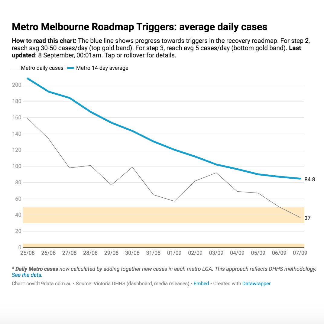
1. Avg daily cases in metro Melbourne. Goal: blue line to reach gold band (30-50 / day, 14-day trailing avg).
#COVID19Victoria #COVID19Vic #COVID19Aus #COVID19
1. Avg daily cases in metro Melbourne. Goal: blue line to reach gold band (30-50 / day, 14-day trailing avg).
#COVID19Victoria #COVID19Vic #COVID19Aus #COVID19

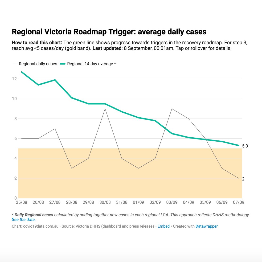
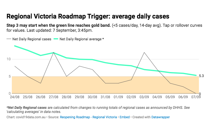
2. Avg. daily cases in regional Victoria. Goal: green line going for gold. (<5 / day, 14-day trailing avg).

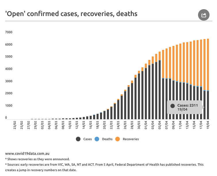
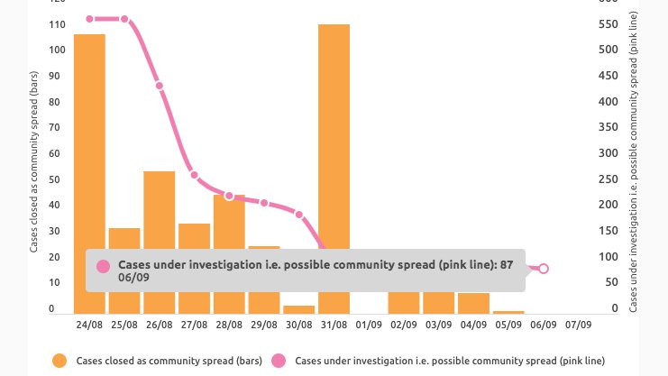
3. Community spread (orange) + still under investigation (pink line).
*Metro Step 2 contingent on these*. Metro Step 3 may start with <5 unknowns in last 2 weeks. Regional Step 3 may start with 0 unknowns in regional VIC (tho geo data re community spread not provided).
*Metro Step 2 contingent on these*. Metro Step 3 may start with <5 unknowns in last 2 weeks. Regional Step 3 may start with 0 unknowns in regional VIC (tho geo data re community spread not provided).
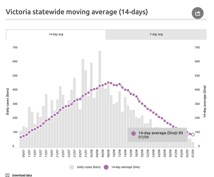
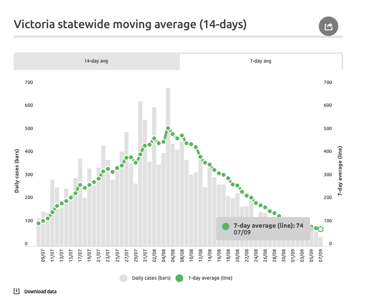
4. 14-day moving avg of all cases statewide.
Various sites / sources will likely have different avgs depending on which daily case input they use.
It could be 1 of 3 - New, net, or true cases based on notification dates. I use last. Metro / regional split only given in net.
Various sites / sources will likely have different avgs depending on which daily case input they use.
It could be 1 of 3 - New, net, or true cases based on notification dates. I use last. Metro / regional split only given in net.
Keeping 7-day average on the site based on request.
covid19data.com.au
covid19data.com.au/victoria
Sending Sydney love and respect to all Victorians, especially those in extended lockdown. 💙
covid19data.com.au
covid19data.com.au/victoria
Sending Sydney love and respect to all Victorians, especially those in extended lockdown. 💙
Update: @VictorianCHO report today will give 14-day averages, which will be great for clarity. They'll use true daily case notification data for metro / regional cases, which we do not have (we get net changes to totals). Will add those official avgs to these charts.
Update 2: @VictorianCHO report has been released and the daily averages are 5.3 for regional Vic and 84.8 for metro Melbourne. The regional chart's calculations are accurate. Here it is updated this afternoon.
The metro chart's inputs were too high - a good example of how tracking net changes to running tallies doesn't reflect the true epicurve. In the absence of @VicGovDHHS releasing the true case data for metro, this is tricky to track.
This calculation uses true daily cases based on case notification date minus regional cases. It is close. It's possible that when the dashboard is updated and duplicate cases removed, it will be correct. Will have to update you.

Another update! Finally cracked the underlying calculations behind these avgs. These charts now reflect the exact avgs announced by @VictorianCHO and have 2-week history. Data is public and linked from the charts. Sorry for the yo-yo-ing! Live charts here: covid19data.com.au