A thread on the modelling and analysis used to suggest scenarios for what *could* happen if we do nothing. And commentary on this slide. 
The slides that were presented in the Number 10 press conference on 31 October are here:
gov.uk/government/pub…
gov.uk/government/pub…
Firstly, commentary on the modelling. Modelling for Covid-19 is performed by a number of academic groups around the country. They use different modelling techniques. Some of these models are used to come up with the R value.
Firstly, the SPI-M *medium term* modelling.
From assets.publishing.service.gov.uk/government/upl…
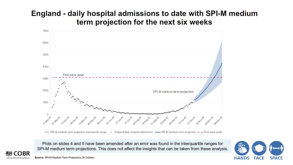
"These projections represent SPI-M-O’s best assessment of the potential trajectory of the epidemic over the next six weeks, based on current trends and the data available up to 26th October. ...
From assets.publishing.service.gov.uk/government/upl…
"These projections represent SPI-M-O’s best assessment of the potential trajectory of the epidemic over the next six weeks, based on current trends and the data available up to 26th October. ...
"The projections are not forecasts or predictions. They represent a scenario in which the trajectory of the epidemic continues to follow current trends and do not account for the impact of future policy or behaviour changes."
Note this is *a scenario"
Note this is *a scenario"
"The delay between infection, developing symptoms, hospitalisation and death means the projections cannot fully reflect changes in transmission that might have occurred over the past two to three weeks"
Some deaths are already 'baked into' the system
Some deaths are already 'baked into' the system
SPI-M-O has a number of groups that each perform their own modelling and produce a projection (a projection being looking forward from the time of their analysis).
But how do we know the modelling is 'good'?
But how do we know the modelling is 'good'?
Well, we can look at how the models have performed when they were projections, and see how their model matched up against the (actual, not modelled) *data*.
Look at this projection produced on 6 October. Red lines are what was known when the model was produced. The blue area shows a *range* of the projection going forward. The data (produced after the model was run) tracks the blue line/range very well.

The projection of 27 October shows the modelled trajectory. Note that these look mild, but they are plotted on a *log scale*. That means small increases on the graph are large increases in reality.

The other type of projection done by SPI-M is *longer term* winter forecasts. Think of them as longer term weather forecasts. These can be used for planning.
"These models generated a range of possibilities describing what might happen in a worst case scenario under the assumption of no further policy changes and increased seasonal contact patterns.
"HM Government requires estimates of the future epidemic that allow for short, medium, and longer-term planning for a range of operational and policy purposes.
Note that HMG requires these estimates.
Note that HMG requires these estimates.
These are the assumptions used in these medium term models:
"R estimates were in the range 1.3 to 1.5 at the start of these scenarios, with different prevalence of infection in different age groups.
"R estimates were in the range 1.3 to 1.5 at the start of these scenarios, with different prevalence of infection in different age groups.
"• To reflect a deterioration of the circumstances over the winter, modelling groups included some seasonal changes through the months of November, December, and January; for example, increased contacts between people leading to approximately a 10% increase in transmission.
"• No additional mitigations beyond those in place in early October were modelled. These scenarios therefore did not include the subsequent introduction of the system of medium, high, and very high tiers, i.e. local COVID-19 alert levels.
"• All models assume complete and permanent immunity to the virus after infection. The peak seen is a result of depletion of susceptible individuals in the population in the context of the current R value. ...
"The peak is determined by the combination of immunity, behaviours, and intervention; its timing and size are very sensitive to these assumptions.
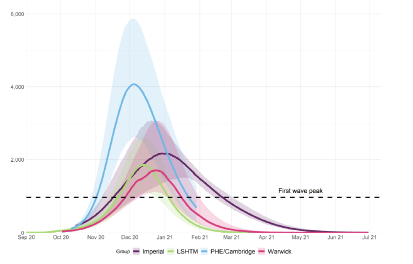
These are the projections performed between 9 - 19 October by various groups including Cambridge/PHE, Imperial College, LSHTM, and Warwick.
These are *extremely* competent groups.
These are *extremely* competent groups.

You will see on that chart several things. First note that these are not precise predictions - they show preparatory work for one set of potential scenarios. All models have assumptions. And we are told what these are.
What you can see is that each of these independent groups has their own projection. You can also see that there is not a central line, but a *range* of the projection (the shaded areas).
*All* of the models project with confidence that the first wave peak will be exceeded
*All* of the models project with confidence that the first wave peak will be exceeded
There was an earlier projection made by the Academy of Medical Sciences on 14 July that projected double the number of deaths in the first wave.
More on that here:
More on that here:
https://twitter.com/Dr_D_Robertson/status/1306631814849626117
All models have assumptions. There are things outside the model - exogenous factors.
For example, we have seen the abandonment of the Contain framework
For example, we have seen the abandonment of the Contain framework
https://twitter.com/Dr_D_Robertson/status/1321518550402609153
And we have also seen that Tier levels that were due to be imposed are now not imposed, for example West Yorkshire was due to go into Tier 3 on Monday, but that also didn't happen.
bbc.co.uk/news/uk-englan…
bbc.co.uk/news/uk-englan…
We also saw this slide from the NHS. It's a complex slide which I discuss here:
https://twitter.com/Dr_D_Robertson/status/1323340533570424835

And it is worth noting that SAGE advocated a circuit breaker on 21 September which could have coincided with half term, increasing the effectiveness of #Lockdown2
https://twitter.com/Dr_D_Robertson/status/1322317444871036928
• • •
Missing some Tweet in this thread? You can try to
force a refresh