1/ Other Coronaviruses vs. #SARSCov2 in 🇨🇦 (continued)
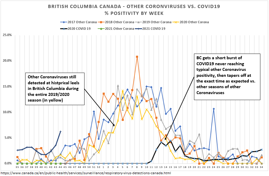
Original thread below. Most striking observation was low circulation of Other Coronaviruses prior to #SARSCov2 “official” arrival in Feb/Mar 2020 in parts of Canada.
Additional observations follow…
Original thread below. Most striking observation was low circulation of Other Coronaviruses prior to #SARSCov2 “official” arrival in Feb/Mar 2020 in parts of Canada.
Additional observations follow…
https://twitter.com/rubiconcapital_/status/1327759386916368387?s=20
2/ Canada-wide
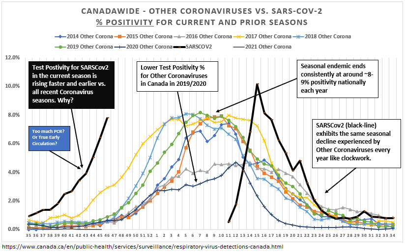
Now showing prior 6 Coronavirus Seasons ('14-'20) vs. #SARSCov2
Coronavirus seasons occur like clockwork. Similar endemic peaks (~8%pos) / time frames.
%pos for #SARSCov2 in current ‘wave’ occurring much earlier vs. all prior years. PCR excess?
(see chart notes)
Now showing prior 6 Coronavirus Seasons ('14-'20) vs. #SARSCov2
Coronavirus seasons occur like clockwork. Similar endemic peaks (~8%pos) / time frames.
%pos for #SARSCov2 in current ‘wave’ occurring much earlier vs. all prior years. PCR excess?
(see chart notes)
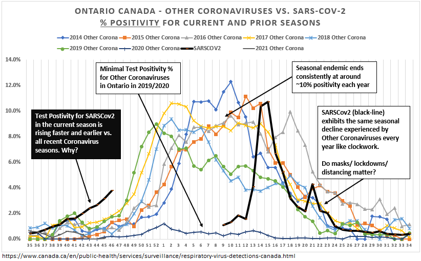
3/ Ontario
Similar trends. Note the seasonal decline in first “wave” of #SARSCov2 vs. timing of decline of every other Coronavirus season. Do lockdowns/restrictions really make a difference? Were we already heading down the curve when we locked down?
Similar trends. Note the seasonal decline in first “wave” of #SARSCov2 vs. timing of decline of every other Coronavirus season. Do lockdowns/restrictions really make a difference? Were we already heading down the curve when we locked down?
4/ BC & Prairies
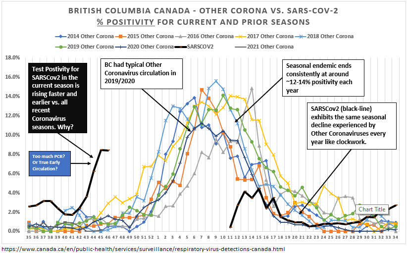
Similar trends again. Interestingly, BC and the Prairies did have regular Other Coronavirus seasons in 2019/2020 (according to the data at least), and #SARSCov2 peak positivity was lower in BC/Praries (4-6%).
Current ‘wave’ occurring well before prior years.

Similar trends again. Interestingly, BC and the Prairies did have regular Other Coronavirus seasons in 2019/2020 (according to the data at least), and #SARSCov2 peak positivity was lower in BC/Praries (4-6%).
Current ‘wave’ occurring well before prior years.

5/ Finally, Quebec
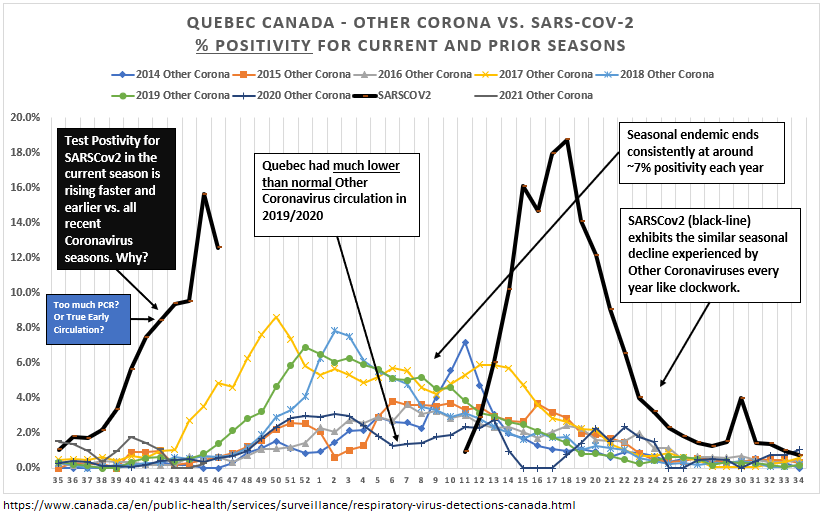
Data not as clean/robust, but overall similar annual trends like clockwork.
This year, very early and high surge of #SARSCov2 PCR positivity in the current ‘wave’, well before any previous Coronavirus season of the past.
Data not as clean/robust, but overall similar annual trends like clockwork.
This year, very early and high surge of #SARSCov2 PCR positivity in the current ‘wave’, well before any previous Coronavirus season of the past.
6/ Quick disclaimer: I’m not making any claims, just asking questions.
#SARSCoV2 PCR positivity is occurring everywhere and to a greater magnitude and well-before other Coronavirus seasons; despite masking / distancing / restrictions / lockdowns. Why?
#SARSCoV2 PCR positivity is occurring everywhere and to a greater magnitude and well-before other Coronavirus seasons; despite masking / distancing / restrictions / lockdowns. Why?
7/ And what is to be made of the historical consistency of the endemic peak positivity rate of ~10% nationally (8-12% regionally) *every year* for Coronavirus season?
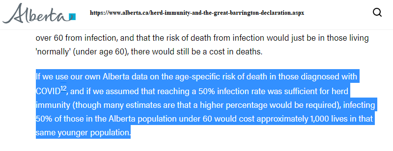
Why won’t #SARSCoV2 follow the same path? Why do some assume 50%+ of the population needs to be infected?
Why won’t #SARSCoV2 follow the same path? Why do some assume 50%+ of the population needs to be infected?
8/ End Thread. Thanks for reading.
• • •
Missing some Tweet in this thread? You can try to
force a refresh

