1/16 Interesting analysis by @btconometrics 🔥
TL;DR: The #Bitcoin market appears to be moving in 4-year halving-related cycles. Based on a power regression using cycle bottoms & tops, this current cycle's top is estimated at $149,053.85.
Thread with summary & some thoughts 👇
TL;DR: The #Bitcoin market appears to be moving in 4-year halving-related cycles. Based on a power regression using cycle bottoms & tops, this current cycle's top is estimated at $149,053.85.
Thread with summary & some thoughts 👇
https://twitter.com/btconometrics/status/1340646333279924229
2/16 #Bitcoin's largest and most well-known cycle is the halving cycle, which is the result of the block rewards (the newly minted coins that miners receive when they win the rights to create a new block) being cut in half every 210.000 blocks (~4 years). 

3/16 If you divide the maximum price of each cycle by its minimum, you get the 'max to min price ratio'.
If you do a power regression on this (n=3) data, you get the attached figure.
Assuming $8,591 is this cycle's bottom, the model suggests that $149,053.85 will be its top.
If you do a power regression on this (n=3) data, you get the attached figure.
Assuming $8,591 is this cycle's bottom, the model suggests that $149,053.85 will be its top.

4/16 @btconometrics rightfully points out that the predicted number needs to be taken with a grain of salt, since the prediction uses a model that is based on just 3 data-points.

5/16 Since the month-to-month difference in the (log) #Bitcoin price appears to be stationary (e.g., doesn't trend up or down over time), it is possible to leave 'time domain' and do 'frequency domain' analyses instead, transforming our view of reality.

6/16 The 'Fourier Transformation' can be used for this.
A Fourier transform decomposes a function of time into constituent frequencies that can then be used to analyse the time series in a different manner. E.g., to assess the cyclicality of the #Bitcoin price over time.
A Fourier transform decomposes a function of time into constituent frequencies that can then be used to analyse the time series in a different manner. E.g., to assess the cyclicality of the #Bitcoin price over time.
7/16 The resulting 'spectral density function' peaks near 0.021 cycles per month, which is 48 months per cycle and thus 4-years per cycle.
Did @btconometrics just prove that the #Bitcoin market indeed moves in 4-year cycles as we'd expect based on the halving schedule thesis? 🤯
Did @btconometrics just prove that the #Bitcoin market indeed moves in 4-year cycles as we'd expect based on the halving schedule thesis? 🤯

8/16 Finally, @btconometrics introduces the Robust Probability Estimator (RoPE), a 'non-parametric estimate for the likelihood of a return given the previous halving cycles closes' that can be used to estimate short term (next day) returns.
ELI5-version:
ELI5-version:
https://twitter.com/btconometrics/status/1340650877841903617?s=20


9/16 The full article, including the HTML/Javascript for the #Bitcoin RoPE indicator can be found here:
medium.com/coinmonks/the-…
medium.com/coinmonks/the-…
10/16 Now some of my own thoughts.
First off, I'd like to take my hat off for @btconometrics, who continues to impress & surprise me by using a seemingly infinite diversity of statistical approaches in his analyses.
If you also enjoy this sorta thing, Nick is a must-follow.
First off, I'd like to take my hat off for @btconometrics, who continues to impress & surprise me by using a seemingly infinite diversity of statistical approaches in his analyses.
If you also enjoy this sorta thing, Nick is a must-follow.
11/16 The most obvious limitation was already pointed out; a model that is based on n=3 needs to be taken with a grain (or bucket?) of salt.
IMO, this applies to the notion that the model implies that we'll see diminishing cycle returns and the $149k cycle top prediction.
IMO, this applies to the notion that the model implies that we'll see diminishing cycle returns and the $149k cycle top prediction.
12/16 The expectation of diminishing relates back to Trololo's 2014 logarithmic regression curve, later popularized as the rainbow model by @ercwl.
Who knew that @btconometrics (who rebutted it heavily) would later come up with a similar prediction? 😉
Who knew that @btconometrics (who rebutted it heavily) would later come up with a similar prediction? 😉
https://twitter.com/ercwl/status/1250074228520628233?s=20
13/16 Another model that was built on the same underlying principles and also predicted diminishing cycle returns is the log growth model, which was statistically falsified by both @btconometrics himself (medium.com/coinmonks/fals…) and @M4rc3lBurg3r (medium.com/burgercrypto-c…).
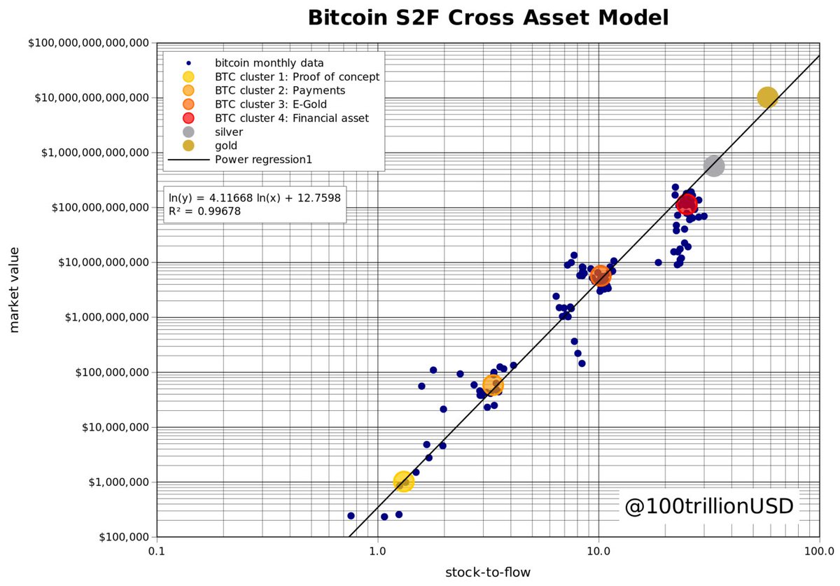
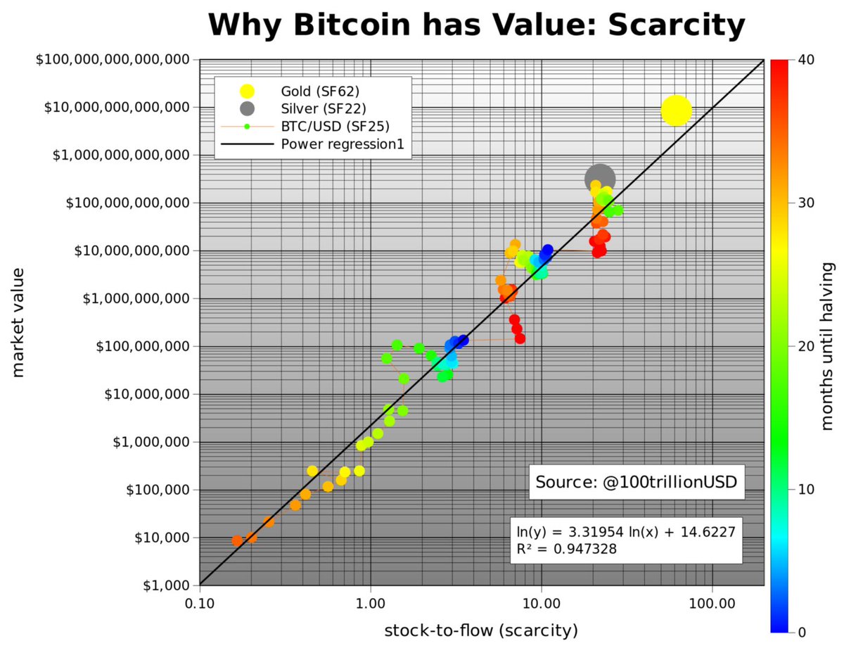
14/16 The diminishing cycle returns expectation contrasts heavily with @100trillionUSD's S2F & S2FX models, who were intensively researched by @btconometrics as well.
A brief history on the S2F & S2FX models and both gentlemen's role in the process: medium.com/swlh/modeling-…
A brief history on the S2F & S2FX models and both gentlemen's role in the process: medium.com/swlh/modeling-…
15/16 Since none of these models is ultimately decisive, time will tell if we'll indeed see a logarithmic regression curve like gradual slowdown of the #Bitcoin price growth, or S2FX-like 🚀's.
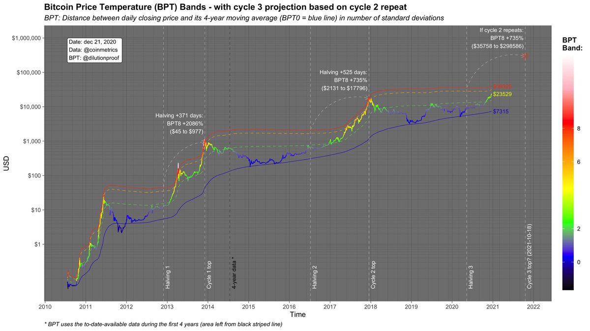
So far, the current cycle doesn't seem to be slowing down:
So far, the current cycle doesn't seem to be slowing down:
https://twitter.com/dilutionproof/status/1339562766735183874?s=20)
16/16 I found @btconometrics's Fourier analysis result that the #Bitcoin market indeed moves in an apparent 4-year cycle the most interesting finding. 👀
To a degree, it substantiates my choice for a 4-year time window in the Bitcoin Price Temperature:
To a degree, it substantiates my choice for a 4-year time window in the Bitcoin Price Temperature:
https://twitter.com/dilutionproof/status/1338942312437706756?s=20
• • •
Missing some Tweet in this thread? You can try to
force a refresh