Large-cap growth stocks took the lead in recent weeks, propelling the S&P 500 to new highs. So let’s take a look at the “nifty fifty” largest stocks. Here, the relative return of the 50 largest vs. the next 450 (monthly data) since 1962. (THREAD/1)
Over the very long term, mega caps tend to lag the market, presumably because they tend to be rather boring quality stocks with high P/Es and steady but unexciting earnings growth. But, interspersed along that declining trendline are a few notable eras of mega-cap leadership. /2
The mega-cap growth period since 2014 is the 3rd such regime in six decades, with the previous two consisting of the original Nifty Fifty era of the early 1970s & the boom/bubble in tech stocks during the late 1990s. /3
In my view, the latest era has been driven by the need for free cash flow in a slow-growth world with low interest rates./4
This current era may or may not have come to an end following the presidential election. Why? The market understood that a new secular regime of coordinated fiscal and monetary policy was likely. /5
That, combined with the gradual reopening of the economy from pandemic-induced lockdown, quashed the relative return of mega caps. Since then, the top 50 stocks have underperformed the bottom 450 by 1455 basis points after having outperformed by 4865 bps since 2014. /6
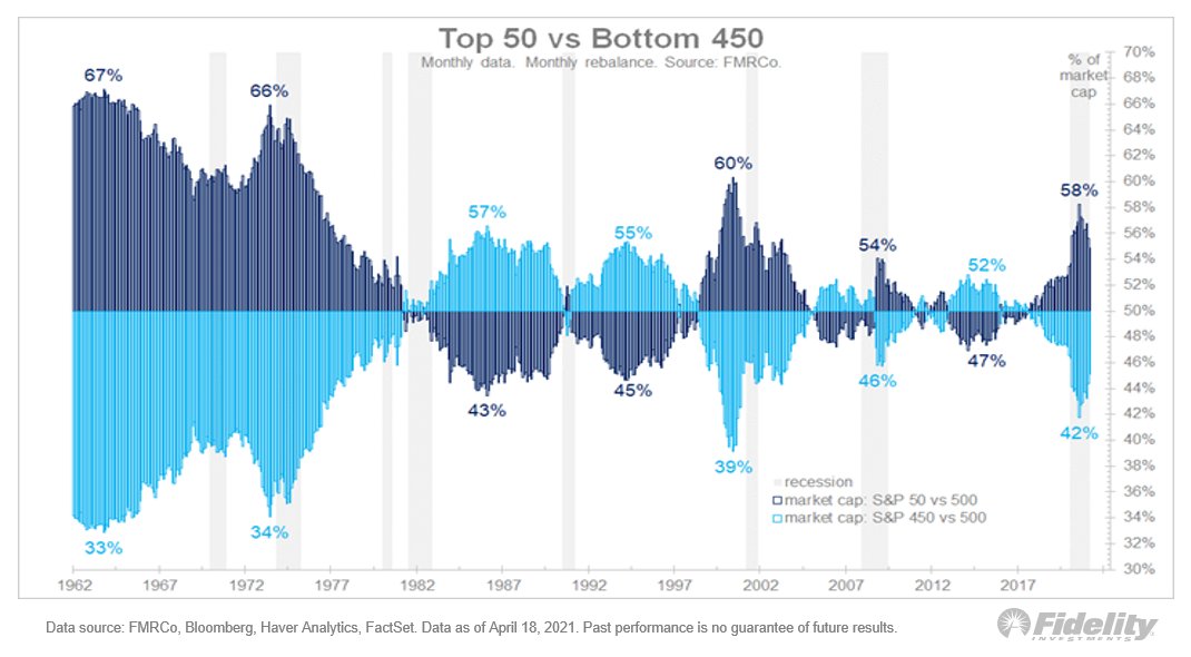
As the next chart shows, at its peak, the nifty fifty comprised 58% of the market cap of the S&P 500. As of March it was 55%. That peak was just shy of the 60% in 2000 and well shy of the 66% in 1973. /7
At their peak, the "growthier" sectors made up 72% of the top 50, while they comprised only 30% of the bottom 450. As this next chart illustrates, those numbers are right in line with the 2000 extreme. /8
Meanwhile, the more value-oriented sectors comprised a mere 10% of the top 50, while making up 52% of the bottom 450, as this chart shows. /9
Here are all eleven sectors over time. /10
The current era looks a lot like the late 90s in terms of overall performance and sector composition. But: In 2000, the top 50 stocks traded at a P/E of 40.5x while the bottom 450 were 19.9x. That gap closed during the bear market that followed. /11
Today, as this next chart illustrates, the top 50 trade at a 32.9x multiple while the bottom 450 trade at 30.7x P/E. No huge gap this time around. /12
I think the out-performance of mega caps since 2014 has been justified by an (almost) equally strong gain in relative earnings. So unlike 1998-2000, the current mega-cap leadership is, in my view, likely more sustainable. /13
So, I don't see a valuation bubble. Even if there is a secular regime shift toward small caps and value (a distinct possibility based on history), it may not produce the catastrophic under-performance in mega cap growth names which occurred following the 2000 peak. /END

• • •

Missing some Tweet in this thread? You can try to force a refresh
 

Keep Current with Jurrien Timmer

Jurrien Timmer Profile picture

Stay in touch and get notified when new unrolls are available from this author!

Read all threads

This Thread may be Removed Anytime!

PDF

Twitter may remove this content at anytime! Save it as PDF for later use!

Try unrolling a thread yourself!

how to unroll video
  1. Follow @ThreadReaderApp to mention us!

  2. From a Twitter thread mention us with a keyword "unroll"
@threadreaderapp unroll

Practice here first or read more on our help page!

More from @TimmerFidelity

14 Apr
Bitcoin vs Gold: Let’s take my hypothetical exercise () one step further by bringing gold into the mix. (THREAD)
Let’s take the above models and convert them into projected market values. The gray line shows the market cap of above-ground gold. We only have data through 2020, but I took the liberty of extrapolating this series using two simple assumptions. /2
The first is that gold production continues at the same rate of 100 million oz, as it has done in recent years. The second is that the price of gold will advance by the same 8% CAGR that it has since it started to trade freely in the early 1970s. /3
Read 9 tweets
13 Apr
It was four months ago that I first wrote about bitcoin, and a lot has happened (and a lot has been learned) since then. So here is a refresh of my take on the topic. (THREAD)
In my view, there are at least two dimensions to what makes bitcoin unique: an asymptotic supply curve and an exponential demand curve. At the intersection of the two lies a parabolic price discovery curve for this unique asset class. /2
The supply curve is best described by the stock-to-flow (S2F) model, originated by @100trillionUSD. The higher the S2F, the higher the valuation. From what I understand, the S2F model is basically a power regression between bitcoin’s price and it’s inflation rate. /3
Read 14 tweets
2 Apr
Here are nominal returns for various investments during key periods of history. Note the 1940s' big returns for small caps and value. Bonds were repressed back then, with a cash-like return for a cash-like volatility. Could this be part of the Fed’s playbook in years ahead? Image
For clarification, I picked the 5 regimes for specific reasons to highlight possible analogs to today’s markets. 2009-2021 is the current post-GFC “monetary inflation” regime, which, in my opinion, is also a secular bull market that may have a ways further to go. (1/4)
1982-2000 was the previous secular bull market, driven in part by disinflation. 1949-1968 was the secular bull market before that, driven by post-depression/WWII productivity and demographics. (2/4)
Read 5 tweets
31 Mar
Let’s compare two important historical market regimes to the post-GFC era. Here, I isolate the era of financial repression from 1942-51, and the secular rise in inflation from the early 1960s to the early 1980s. (THREAD /1)
I am showing these charts as a scatter plot of nominal returns (x) and real returns (y). It’s an unusual format (without the time scale) but it shows the trends clearly. /2
The financial repression era started in 1942 w/ the buildup to WWII & ended when the Fed gained independence in 1951. The federal debt tripled & the Fed monetized it all while pushing real rates firmly negative via rate caps. That same conversation appears to be happening now. /3
Read 15 tweets
8 Mar
Bitcoin is in the spotlight these days but let’s not rule out #gold. Let’s assume that in coming years the current fiscal/monetary regime were to produce the same kind of 10% growth rate (CAGR) in the money supply that the 1930s/1940s & the 1970s produced (THREAD/1)
Looking back, both periods produced a 10% CAGR for M2 that lasted at least 10 years and that took M2 from below its long-term exponential trendline to above it. Both these previous periods produced a strong advance in the above-ground market value of #gold relative to M2. /2
What if we see this pattern again? What do I think that would that mean for the price of gold and how might this dynamic change now that #bitcoin has entered the scene and seems to be cannibalizing gold? /3
Read 7 tweets
15 Dec 20
Earnings & the #Fed. I assumed the 1930s weren’t a good analog for 2020 b/c the fiscal/monetary policy response this year was greater & faster than ever, except perhaps the ‘40s. Policy response matters & in 2020 it blew away steps taken in ’08. How it started… (THREAD/1) Image
#Earnings & the #Fed. How it’s going… /2 Image
During volatile March, the 1987 crash was a better analog in the speed of the decline in stock prices & in the spike in the #VIX—VXO then. Also: the 1987 episode produced a full retest & pretty slow recovery. The analog worked in helping identify the market’s exhaustion point. /3
Read 7 tweets

Did Thread Reader help you today?

Support us! We are indie developers!


This site is made by just two indie developers on a laptop doing marketing, support and development! Read more about the story.

Become a Premium Member ($3/month or $30/year) and get exclusive features!

Become Premium

Too expensive? Make a small donation by buying us coffee ($5) or help with server cost ($10)

Donate via Paypal Become our Patreon

Thank you for your support!

Follow Us on Twitter!